the term regional bonus often means something else (for example, a bonus for the number of regions held, such as +1 for every 3 regions), so replace it in the legend by main cuts or something more appropriate.
ian.
Moderator: Cartographers
![]() by iancanton on Thu Dec 29, 2011 3:14 am
by iancanton on Thu Dec 29, 2011 3:14 am


![]() by dana1971 on Thu Dec 29, 2011 2:41 pm
by dana1971 on Thu Dec 29, 2011 2:41 pm


![]() by AndyDufresne on Thu Dec 29, 2011 3:52 pm
by AndyDufresne on Thu Dec 29, 2011 3:52 pm
dana1971 wrote:Hey thanks to everyone who posted constructive criticism.
I'll look at this more closely and work on a new version.
In terms of the 88, I guess that's why it needs the extra large sticker. Keep in mind I have seen other maps that don't fit three digit armies.
So you know, the last version I posted was the smaller version of the map, but I agree the tail area needs more space.
Best Wishes,
Dana


![]() by dana1971 on Thu Dec 29, 2011 7:33 pm
by dana1971 on Thu Dec 29, 2011 7:33 pm
![]() by thenobodies80 on Thu Dec 29, 2011 7:40 pm
by thenobodies80 on Thu Dec 29, 2011 7:40 pm
Army Numbers - Army numbers are an essential component of every CC map. Their placement is important - it must be clear which 'territory' each army belongs to, and there must be enough room to fit a three digit number without compromising legibility of borders or labels. You may wish to use CC Army Digit Images to see how the map looks with the addition of army numbers, and to check the placement of 'army circles' if you choose to use them.


![]() by koontz1973 on Fri Dec 30, 2011 3:11 am
by koontz1973 on Fri Dec 30, 2011 3:11 am
dana1971 wrote:In terms of the 88, I guess that's why it needs the extra large sticker. Keep in mind I have seen other maps that don't fit three digit armies.
So you know, the last version I posted was the smaller version of the map, but I agree the tail area needs more space.


![]() by ndrs on Fri Dec 30, 2011 9:02 am
by ndrs on Fri Dec 30, 2011 9:02 am


![]() by Flapcake on Fri Dec 30, 2011 9:16 am
by Flapcake on Fri Dec 30, 2011 9:16 am
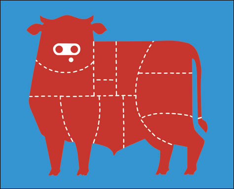
ndrs wrote:To free up more space on the animal, perhaps you could use a more compact version of a bull?
Something like this:
You could even remove some meat terts and add more playability to the surroundings instead. A butchers shop or something. Or portray the meats way to the table by transports / problems with mass production of livestock / CO2 emissions / diseases...
I think that angle would make the map more interesting.


![]() by dana1971 on Thu Jan 05, 2012 6:22 pm
by dana1971 on Thu Jan 05, 2012 6:22 pm
thenobodies80 wrote:From guidelines:Army Numbers - Army numbers are an essential component of every CC map. Their placement is important - it must be clear which 'territory' each army belongs to, and there must be enough room to fit a three digit number without compromising legibility of borders or labels. You may wish to use CC Army Digit Images to see how the map looks with the addition of army numbers, and to check the placement of 'army circles' if you choose to use them.
![]() by dana1971 on Thu Jan 05, 2012 6:56 pm
by dana1971 on Thu Jan 05, 2012 6:56 pm
![]() by AndyDufresne on Fri Jan 06, 2012 10:52 am
by AndyDufresne on Fri Jan 06, 2012 10:52 am
dana1971 wrote:
In terms of the surrounding area, it's been suggested that I have a lot of wasted space? I don't agree. Look at the classic map. Should the big areas of sea be considered wasted space because you can't conquer it? This map should look like a cow and I don't want to clutter the image by forcing more gameplay elements into the corners and sides. (Perhaps I'm misunderstanding the comment?)
![]() by iancanton on Sat Jan 07, 2012 5:42 pm
by iancanton on Sat Jan 07, 2012 5:42 pm
dana1971 wrote:The way I saw Prime Beef working was that players would go for the easy bonuses in the legs, tail and head first. Then they would expand into the center of the body to try and grab bigger bonuses.
dana1971 wrote:I could see big forces piling up in the legs and the grass is there to allow one leg to attack another through the back door, but in a fog of war game you would never know what is on the other side of the grass. To keep that element of surprise, the grass resets itself.
dana1971 wrote:I saw the cow pat as the wold card spot. If you can hold the tail and the cow pat for long enough you could build up a large army which can only attack the hind leg. That army could then spread to the next leg if it was big enough. A bit like how foot and mouth was spread.
dana1971 wrote:The best maps have easy bonuses to hold and hard bonuses to hold. I'm not interested in making a map where the whole map has equally balanced bonuses.
![]() by dana1971 on Sat Jan 07, 2012 6:33 pm
by dana1971 on Sat Jan 07, 2012 6:33 pm
![]() by thenobodies80 on Sat Jan 07, 2012 8:50 pm
by thenobodies80 on Sat Jan 07, 2012 8:50 pm
![]() by DiM on Sat Jan 07, 2012 8:57 pm
by DiM on Sat Jan 07, 2012 8:57 pm
thenobodies80 wrote:Hope to see you work on a better project soon,


![]() by MrBenn on Wed Jan 11, 2012 3:30 pm
by MrBenn on Wed Jan 11, 2012 3:30 pm
DiM wrote:i completely agree with tnb80 on this one. i've been saying this from the start. the theme is a joke (a bad one) but the graphics are nice. unlike many other wannabes you actually have skill and it's a shame to see it wasted on a cow map.
so to end with some very true words:thenobodies80 wrote:Hope to see you work on a better project soon,


![]() by iancanton on Thu Jan 12, 2012 5:12 pm
by iancanton on Thu Jan 12, 2012 5:12 pm
![]() by dana1971 on Fri Jan 13, 2012 7:13 pm
by dana1971 on Fri Jan 13, 2012 7:13 pm
DiM wrote:i completely agree with tnb80 on this one. i've been saying this from the start. the theme is a joke (a bad one) but the graphics are nice. unlike many other wannabes you actually have skill and it's a shame to see it wasted on a cow map.
![]() by dana1971 on Fri Jan 13, 2012 7:21 pm
by dana1971 on Fri Jan 13, 2012 7:21 pm
![]() by Bruceswar on Sun Jan 15, 2012 10:05 pm
by Bruceswar on Sun Jan 15, 2012 10:05 pm


![]() by The Bison King on Sun Jan 15, 2012 10:54 pm
by The Bison King on Sun Jan 15, 2012 10:54 pm
dana1971 wrote:DiM wrote:i completely agree with tnb80 on this one. i've been saying this from the start. the theme is a joke (a bad one) but the graphics are nice. unlike many other wannabes you actually have skill and it's a shame to see it wasted on a cow map.
I'm surprised you feel this was DIM. You made a really cool abstract map with yarn. I love it because it's different and stands out.
Not sure why your map theme is any more valid than mine?
I've put a fair bit of time and effort into this map and think it would be fun to play not because of the theme but because of the game-play.
I will have to have one more pass at it before the powers at be undoubtedly can it.


![]() by Butters1919 on Mon Jan 16, 2012 10:27 am
by Butters1919 on Mon Jan 16, 2012 10:27 am
Bruceswar wrote:I cannot wait for this one to come out. While some might not like it, I certainly do.


 23
23
![]() by Victor Sullivan on Mon Jan 16, 2012 4:48 pm
by Victor Sullivan on Mon Jan 16, 2012 4:48 pm


![]() by dana1971 on Mon Jan 23, 2012 6:11 pm
by dana1971 on Mon Jan 23, 2012 6:11 pm
![]() by natty dread on Mon Jan 23, 2012 6:22 pm
by natty dread on Mon Jan 23, 2012 6:22 pm


Users browsing this forum: No registered users
|
|||||||
| Conquer Club is not associated with RISK online in any way. Copyright © 2006-2025 by Big Wham LLC | |||||||
