The Great Lakes -- [Quenched]
Moderator: Cartographers
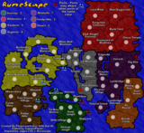
![]() by spinwizard on Sun Apr 15, 2007 7:12 am
by spinwizard on Sun Apr 15, 2007 7:12 am
can the lakes attack eachother??? if not can u add "the lakes can not attack each other" somewhere on the map

-

 spinwizard
- Posts: 5016
- Joined: Sun Dec 10, 2006 9:52 am


![]() by cairnswk on Sun Apr 15, 2007 7:16 am
by cairnswk on Sun Apr 15, 2007 7:16 am
WM...great looking map...I haven't seen this for a few pages and changes are well adjusted. Glad u removed the flag in background of each region. Looks much cleaner now.
I have to say however, I'm not a fan of the 'no border' happeneing between the lakes and some territories. I feel there should be some definition there, to be consistent with other territories bordering the lakes.
I have to say however, I'm not a fan of the 'no border' happeneing between the lakes and some territories. I feel there should be some definition there, to be consistent with other territories bordering the lakes.

* Pearl Harbour * Waterloo * Forbidden City * Jamaica * Pot Mosbi
-

cairnswk
- Posts: 11510
- Joined: Sat Feb 03, 2007 8:32 pm
- Location: Australia


![]() by WidowMakers on Sun Apr 15, 2007 7:54 am
by WidowMakers on Sun Apr 15, 2007 7:54 am
I guess I don't understand. There are only a few territories that have the ability to attack lakes. Those are depicted with arrows and a gradient shoreline. Technically all of the lakes border many land territories but can only attack/be attacked where there is an arrow.cairnswk wrote:WM...great looking map...I haven't seen this for a few pages and changes are well adjusted. Glad u removed the flag in background of each region. Looks much cleaner now.
I have to say however, I'm not a fan of the 'no border' happening between the lakes and some territories. I feel there should be some definition there, to be consistent with other territories bordering the lakes.
That is like asking can territories attack each other. There is no text that says they can't. So they can. Follow the rivers connecting them to find out which ones can attack each other.spinwizard wrote:can the lakes attack eachother??? if not can u add "the lakes can not attack each other" somewhere on the map

-
WidowMakers
- Posts: 2774
- Joined: Mon Nov 20, 2006 9:25 am
- Location: Detroit, MI


![]() by mibi on Sun Apr 15, 2007 8:14 am
by mibi on Sun Apr 15, 2007 8:14 am
sammy324 wrote:Another possibilty for "watertown" could be Lake Placid. It's not a big town, but for its olympic history and reputation as a touristy place, it should be considered.
Agreed, Lake Placid has hosted two winter Olympics!
Watertown claim to fame is that .. well... actually, they dont have one.
-

mibi
- Posts: 3350
- Joined: Thu Mar 01, 2007 8:19 pm
- Location: The Great State of Vermont

![]() by WidowMakers on Mon Apr 16, 2007 7:29 pm
by WidowMakers on Mon Apr 16, 2007 7:29 pm
Watertown is out. Lake Placid is in. Is there anything else.
I will:
Fix the wobbly text once the names are agreed upon.
Start the XML when the names and borders are done.
Any other suggestions?

I will:
Fix the wobbly text once the names are agreed upon.
Start the XML when the names and borders are done.
Any other suggestions?
-
WidowMakers
- Posts: 2774
- Joined: Mon Nov 20, 2006 9:25 am
- Location: Detroit, MI
![]() by wrightfan123 on Mon Apr 16, 2007 7:38 pm
by wrightfan123 on Mon Apr 16, 2007 7:38 pm
I love it more than my girlfrined (unless she looks at this post)
-

wrightfan123
- Posts: 601
- Joined: Sat Jan 06, 2007 2:58 pm
- Location: Looking over every baseball team's schedule to try to determine who will win the World Series.


![]() by vakEirn79 on Mon Apr 16, 2007 8:31 pm
by vakEirn79 on Mon Apr 16, 2007 8:31 pm
I like the border-less solution for port territories, but there are two borders which look a bit off:
- Green Bay has that peninsula, which looks really fuzzy without an "inner" border (the v-shaped border covering the East side of the main landmass and the West side of the peninsula). The peninsula has a long border on the East side anyway, which should be plenty long enough to make the effect clear, so maybe adding in part of that inner border would give the peninsula some definition?
- The arrow between Detroit and Lake Erie pretty much obscures all of the non-border, while the solid border right above the arrow makes it seem as if Detroit has a solid border all around. I think removing the Detroit border between the two arrows would make it more clear that Detroit is also a port territory. Since there's also the Windsor-Detroit arrow to separate Erie from Huron, removing that border shouldn't cause people to think Detroit can attack Lake Huron as well
About the crooked text, I've said all along that I like the effect of the text conforming to the topography of the map. I don't think they're disruptive enough to affect anyone's ability to read the names at a glance. Not sure what the popular opinion on that is though.
Lastly, I just noticed that the map lacks a compass. I almost never look at the compass on any map (obviously), and it's pretty clear which direction is North on this map. Not sure if you intended to put one in though, so I'm just pointing it out in case you forgot.
-
vakEirn79
- Posts: 46
- Joined: Sun Jan 28, 2007 4:52 pm
![]() by WidowMakers on Mon Apr 16, 2007 9:29 pm
by WidowMakers on Mon Apr 16, 2007 9:29 pm
I will fix thisvakEirn79 wrote:- Green Bay has that peninsula, which looks really fuzzy without an "inner" border (the v-shaped border covering the East side of the main landmass and the West side of the peninsula). The peninsula has a long border on the East side anyway, which should be plenty long enough to make the effect clear, so maybe adding in part of that inner border would give the peninsula some definition?
I can take the border away between the arrows too.vakEirn79 wrote:- The arrow between Detroit and Lake Erie pretty much obscures all of the non-border, while the solid border right above the arrow makes it seem as if Detroit has a solid border all around. I think removing the Detroit border between the two arrows would make it more clear that Detroit is also a port territory. Since there's also the Windsor-Detroit arrow to separate Erie from Huron, removing that border shouldn't cause people to think Detroit can attack Lake Huron as well
vakEirn79 wrote:About the crooked text, I've said all along that I like the effect of the text conforming to the topography of the map. I don't think they're disruptive enough to affect anyone's ability to read the names at a glance. Not sure what the popular opinion on that is though.
It seems the text is popular this way. I will keep it and if there is any issue we will have a poll for it.
Good idea I did not think of that. I will probably try something nad stick it on the east side of the map.vakEirn79 wrote:Lastly, I just noticed that the map lacks a compass. I almost never look at the compass on any map (obviously), and it's pretty clear which direction is North on this map. Not sure if you intended to put one in though, so I'm just pointing it out in case you forgot.
-
WidowMakers
- Posts: 2774
- Joined: Mon Nov 20, 2006 9:25 am
- Location: Detroit, MI

![]() by Coleman on Mon Apr 16, 2007 9:46 pm
by Coleman on Mon Apr 16, 2007 9:46 pm
Evil Pope wrote:I think that the borderless ports look really bad. I think that the anchors and an explaination would work best.
I wouldn't mind that except that not everyone was understanding the explanation correctly and nobody was able to come up with an explanation that everyone could understand.
I think the way it is now is the way most maps handle this sort of thing and that it looks pretty good. We're really at the point where something like that is an opinion thing and not something that needs to be fixed or changed.
Warning: You may be reading a really old topic.
-

Coleman
- Posts: 5402
- Joined: Tue Jan 02, 2007 10:36 pm
- Location: Midwest


![]() by WidowMakers on Mon Apr 16, 2007 10:02 pm
by WidowMakers on Mon Apr 16, 2007 10:02 pm
Some people complained that hey were not clear enough. But making them more clear made it harder to read the text. I just took them out.Unit_2 wrote:what happened to the flags of the states in the back-ground?
As Coleman said, some people, no matter how you try to word the text, will not understand things. These arrows, while maybe not as fancy or pretty as the anchors, are easy to understand. If someone looks at this map ans does not know what ans arrow means then TOO BAD!Evil Pope wrote:I think that the borderless ports look really bad. I think that the anchors and an explaination would work best.
Plus not having the text makes the map cleaner. Currently this is the easiest way to draw and explain the ports. And now we really don't even need to explain the ports. Look at the arrows would really be the only text we need. And that would be dumb (IMHO).
-
WidowMakers
- Posts: 2774
- Joined: Mon Nov 20, 2006 9:25 am
- Location: Detroit, MI
![]() by Will_Liam on Tue Apr 17, 2007 4:22 pm
by Will_Liam on Tue Apr 17, 2007 4:22 pm
I think there are way too many "continents". You could remove some or join them together and change the bonuses. E.g. Seaside, Eastern U.S. etc.
I probably don't like you, if you don't belive me, look in the mirror
-

Will_Liam
- Posts: 96
- Joined: Fri Mar 30, 2007 2:31 pm
- Location: Somewhere...
![]() by Coleman on Tue Apr 17, 2007 4:28 pm
by Coleman on Tue Apr 17, 2007 4:28 pm
Will_Liam wrote:I think there are way too many "continents". You could remove some or join them together and change the bonuses. E.g. Seaside, Eastern U.S. etc.
Well this definitely isn't World 2.1 So many of these are only worth 2 anyway. As long as it isn't 7 or 8 super continents I don't see this being a problem.
Also, really odd choice for a first post. But I like that it was in the foundry. And that is a really awesome shot of Ichigo's Hollowization.
Warning: You may be reading a really old topic.
-
Coleman
- Posts: 5402
- Joined: Tue Jan 02, 2007 10:36 pm
- Location: Midwest
![]() by wrightfan123 on Tue Apr 17, 2007 4:53 pm
by wrightfan123 on Tue Apr 17, 2007 4:53 pm
Coleman wrote:Will_Liam wrote:I think there are way too many "continents". You could remove some or join them together and change the bonuses. E.g. Seaside, Eastern U.S. etc.
Well this definitely isn't World 2.1 So many of these are only worth 2 anyway. As long as it isn't 7 or 8 super continents I don't see this being a problem.
Also, really odd choice for a first post. But I like that it was in the foundry. And that is a really awesome shot of Ichigo's Hollowization.
I agree. That's the only problem I have with some of these maps. It's two '2' bonuses, one '3', and then the rest are huge.
-
wrightfan123
- Posts: 601
- Joined: Sat Jan 06, 2007 2:58 pm
- Location: Looking over every baseball team's schedule to try to determine who will win the World Series.
![]() by BizzleHawk67 on Tue Apr 17, 2007 7:12 pm
by BizzleHawk67 on Tue Apr 17, 2007 7:12 pm
wrightfan123 wrote:Coleman wrote:Will_Liam wrote:I think there are way too many "continents". You could remove some or join them together and change the bonuses. E.g. Seaside, Eastern U.S. etc.
Well this definitely isn't World 2.1 So many of these are only worth 2 anyway. As long as it isn't 7 or 8 super continents I don't see this being a problem.
Also, really odd choice for a first post. But I like that it was in the foundry. And that is a really awesome shot of Ichigo's Hollowization.
I agree. That's the only problem I have with some of these maps. It's two '2' bonuses, one '3', and then the rest are huge.
ok there are 4 '2' bonuses: pennsylvania, new york, indiana, and minnesota - not 2 of them
-

BizzleHawk67
- Posts: 8
- Joined: Mon Mar 05, 2007 7:42 pm
- Location: EL
![]() by WidowMakers on Tue Apr 17, 2007 7:27 pm
by WidowMakers on Tue Apr 17, 2007 7:27 pm
Updated maps
-I fixed the two shorelines (Detroit and Chicago)
-Added A compass
With flags

Without Flags

-I fixed the two shorelines (Detroit and Chicago)
-Added A compass
With flags
Without Flags
-
WidowMakers
- Posts: 2774
- Joined: Mon Nov 20, 2006 9:25 am
- Location: Detroit, MI
![]() by unriggable on Tue Apr 17, 2007 7:32 pm
by unriggable on Tue Apr 17, 2007 7:32 pm
with flags but make the winsconsin and michigan flags more subtle.

-

unriggable
- Posts: 8037
- Joined: Thu Feb 08, 2007 9:49 pm

![]() by KEYOGI on Tue Apr 17, 2007 9:38 pm
by KEYOGI on Tue Apr 17, 2007 9:38 pm
I think I prefer the map without the flags, but I don't really mind in the end... it's a great looking map regardless.
Could you possibly do something about the colours of Michigan/Indiana/Ohio? You've got three purple continents all next to each other. I can distinguish between them, but unless there's a specific reason they are these colours I find it a bit strange.
I'm not sure about the actual colour on the borders either. Perhaps if they were to fade more gradually? I don't really know what it is, but something seems a bit off. It's more noticeable without the flags though, so if you keep the flags I guess it's a moot point.
I like the arrows/borderless territory look but there's a few things to consider. I find the Chicago/Lake Michigan arrow very easy to identify, but the St. Ignace/Mackinac arrow almost gets lost up there. Perhaps try and darken up the outline/shadow of the arrows so they stand out more? Also, I find it a bit odd how the outlines of territories just stop on those bordering the lakes. Maybe if the lines were to gradually fade out it would look better.
The new title works, but just above it you seem to have a line across the top of the map where your white cloud look is missing.
I'm still not sure about the double legend and especially the need for a mini-map now that the continents are more easily identifyable. It's your call though. Also, perhaps consider swapping the mountain and river in the impassable key down the bottom. It looks as though the mountains are peaks breaking through the mist (nice effect ), and are part of the mountain range that actually make up the map.
Any chance you could bump up the Toronto army shadow a pixel or two to give it some space. Perhaps see if you can get Mackinac's army shadow within the territory as well.
Anyway, that's enough picking at the map for now. Good work WidowMakers, keep it up.
Could you possibly do something about the colours of Michigan/Indiana/Ohio? You've got three purple continents all next to each other. I can distinguish between them, but unless there's a specific reason they are these colours I find it a bit strange.
I'm not sure about the actual colour on the borders either. Perhaps if they were to fade more gradually? I don't really know what it is, but something seems a bit off. It's more noticeable without the flags though, so if you keep the flags I guess it's a moot point.
I like the arrows/borderless territory look but there's a few things to consider. I find the Chicago/Lake Michigan arrow very easy to identify, but the St. Ignace/Mackinac arrow almost gets lost up there. Perhaps try and darken up the outline/shadow of the arrows so they stand out more? Also, I find it a bit odd how the outlines of territories just stop on those bordering the lakes. Maybe if the lines were to gradually fade out it would look better.
The new title works, but just above it you seem to have a line across the top of the map where your white cloud look is missing.
I'm still not sure about the double legend and especially the need for a mini-map now that the continents are more easily identifyable. It's your call though. Also, perhaps consider swapping the mountain and river in the impassable key down the bottom. It looks as though the mountains are peaks breaking through the mist (nice effect
Any chance you could bump up the Toronto army shadow a pixel or two to give it some space. Perhaps see if you can get Mackinac's army shadow within the territory as well.
Anyway, that's enough picking at the map for now. Good work WidowMakers, keep it up.
-
KEYOGI
- Posts: 1632
- Joined: Tue Oct 10, 2006 6:09 am


![]() by PimpCaneYoAss on Wed Apr 18, 2007 12:04 am
by PimpCaneYoAss on Wed Apr 18, 2007 12:04 am
The flags seem too dark i think and the one in PA isnt dark enough if your going to leave it. i would also bump the brightness down a little bit. . Also are the army circles going to be big enough?
-

PimpCaneYoAss
- Posts: 185
- Joined: Fri Feb 16, 2007 3:04 pm
- Location: Connecticut
![]() by wrightfan123 on Wed Apr 18, 2007 2:40 pm
by wrightfan123 on Wed Apr 18, 2007 2:40 pm
BizzleHawk67 wrote:wrightfan123 wrote:Coleman wrote:Will_Liam wrote:I think there are way too many "continents". You could remove some or join them together and change the bonuses. E.g. Seaside, Eastern U.S. etc.
Well this definitely isn't World 2.1 So many of these are only worth 2 anyway. As long as it isn't 7 or 8 super continents I don't see this being a problem.
Also, really odd choice for a first post. But I like that it was in the foundry. And that is a really awesome shot of Ichigo's Hollowization.
I agree. That's the only problem I have with some of these maps. It's two '2' bonuses, one '3', and then the rest are huge.
ok there are 4 '2' bonuses: pennsylvania, new york, indiana, and minnesota - not 2 of them
Not this map in particular. Just some maps that people have suggested.
-
wrightfan123
- Posts: 601
- Joined: Sat Jan 06, 2007 2:58 pm
- Location: Looking over every baseball team's schedule to try to determine who will win the World Series.
Who is online
Users browsing this forum: No registered users
|
|||||||
| Conquer Club is not associated with RISK online in any way. Copyright © 2006-2025 by Big Wham LLC | |||||||