jiminski wrote:E) all the way for the Legend!
Edit:
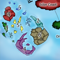
i just looked at the new map with the extra islands, it will take a little while for me to get used to it but i think it looks great. There is a lot more going on, so it may be the the option E) legend could prove to be too much/distracting with the extra Islands. (i would have to see them together to be sure.)
E) may only work if you were to add a border to ensure that you could differentiate between map islands and legend islands.
I like the concept of E, but I think it just turned out weird and I'm not sure that anything can be done. Even with adding a border...
t-o-m wrote:that green is WAY too strong!
I didn't like the green at first, but after a minute it kind of grew on me. I'd rather it be bold than washed out. Let's see what other people think.
t-o-m wrote:maybe something a little like...

but less ocpacity
[...]
i think that you should put clouds all over the map but very low ocpacity ones, it would give the map more theme like i was talking about much much earlier
I don't like clouds. They muddle the area and make it harder to see and really serve no purpose. We're making this map as clear and clean as possible using bright colors and a very easy to read font. Yes, adding clouds would make it more realistic, but it is completely against the theme we're building.
jiminski wrote:hmm magical clouds over a mythical isle ... i really like that! or maybe a coral border of something; with the coral-reef breaking the surface of the sea? ... it needs to be discernible from the main map.
I think a coral border is better. One thing the poll options didn't have that they were supposed to is an island in a neutral color with the word "Legend" or "Bonuses" in it. That would key people in to what the islands actually are, and should help to separate them from the main playing area. If that's not enough, we could add a border, either with a reef or by some other means.
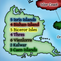
Mr. Squirrel wrote:I know before I said that you would want to put the names of the islands in the legend, but after seeing what it looks like, I think version B looks great.
I agree, though I think the islands could be resized so they don't take up as much room. If this option wins, then that's something to think about.
Mr. Squirrel wrote:t-o-m wrote:that green is WAY too strong!
What makes green too strong? it looks fine to me.
Yeah, it is a bit strong at first, but I think it gets better after a short time.
Mr. Squirrel wrote:Also, Zeak, on the map, it looks like you started to make a border between Basela and Niagis, but you never finished it. You will want to fix that before next update.
Will fix that, thanks.
Mr. Squirrel wrote:By the way, I like the forest green color. I wonder who thought that up.


Any comments on the new bonuses and attack lines?