Conquer Club

Gilgamesh; Coordinates on pg 20

Care to peruse completed maps? Take a stroll through the Atlas.

Moderator: Cartographers

Forum rules
Please read the Community Guidelines before posting.

Re: Gilgamesh; small & large pg 12

Postby oaktown on Sun May 17, 2009 2:04 pm

Click image to enlarge.
image


MrBenn wrote:My only real concerns as far as the graphics are concerned are actually fairly minor ones, and I think they all relate to the mountains - not the style, which I think works well with the map, but the colouring of them in particular locations...

Fixed the points you noticed as well as others. One was missing the stroke, did a lot of dodging and burning. Holler at me if you see any more.
Image
User avatar
Captain oaktown
 
Posts: 4451
Joined: Sun Dec 03, 2006 9:24 pm
Location: majorcommand

Re: Gilgamesh; small & large pg 12

Postby MrBenn on Sun May 17, 2009 4:27 pm

I think you missed this one:
Image

The other thing I wonder, is about the colour of the territory text, which feels a little bit too bright-white? Perhaps either switch the colour to the beige that you've used for the pictograms, or add a grunge layer to the text (I think you can do that to all the text at once if the text layers are all grouped, but I'm not completely certain) - either should make the text feel older.
Image
PB: 2661 | He's blue... If he were green he would die | No mod would be stupid enough to do that
User avatar
Lieutenant MrBenn
 
Posts: 6880
Joined: Wed Nov 21, 2007 9:32 am
Location: Off Duty

Re: Gilgamesh; small & large pg 12

Postby oaktown on Sun May 17, 2009 7:11 pm

Click image to enlarge.
image


MrBenn wrote:The other thing I wonder, is about the colour of the territory text, which feels a little bit too bright-white?

Great minds think alike... I was noticing the same thing with the last update. How's this?
Image
User avatar
Captain oaktown
 
Posts: 4451
Joined: Sun Dec 03, 2006 9:24 pm
Location: majorcommand

Re: Gilgamesh; small & large pg 12

Postby AndyDufresne on Mon May 18, 2009 5:00 pm

In regards to the text color, I think I actually prefer the white over this option. But maybe something in between the two I could live with.


--Andy
User avatar
Corporal 1st Class AndyDufresne
 
Posts: 24919
Joined: Fri Mar 03, 2006 8:22 pm
Location: A Banana Palm in Zihuatanejo

Re: Gilgamesh; small & large pg 12

Postby MrBenn on Mon May 18, 2009 5:06 pm

AndyDufresne wrote:In regards to the text color, I think I actually prefer the white over this option. But maybe something in between the two I could live with.

--Andy

Image
Also, for consistency, I wonder if the text at the bottom (on the legend) should be the same colour as on the map?? :-k I actually have no idea if it even matters :lol:
Image
PB: 2661 | He's blue... If he were green he would die | No mod would be stupid enough to do that
User avatar
Lieutenant MrBenn
 
Posts: 6880
Joined: Wed Nov 21, 2007 9:32 am
Location: Off Duty

Re: Gilgamesh; small & large pg 12

Postby saaimen on Mon May 18, 2009 6:03 pm

Hi guys!

I'm all new to this topic... Though I made quite some promo for Gilgamesh on the Centerscape competition :lol:
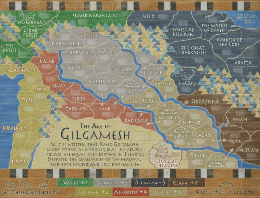
First of all, oaktown, great work =D>
Then, to hop onto the train:
MrBenn wrote:
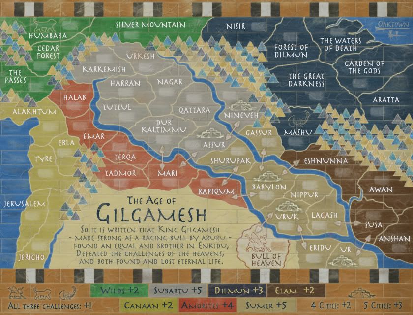
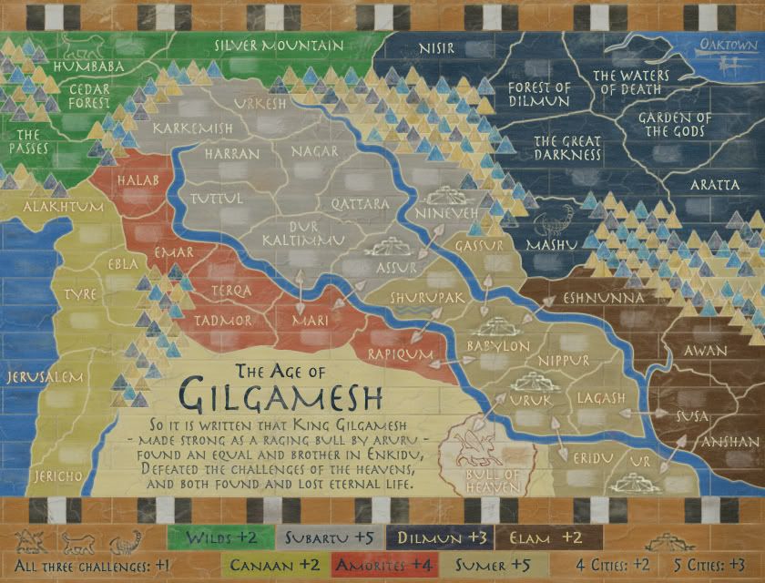
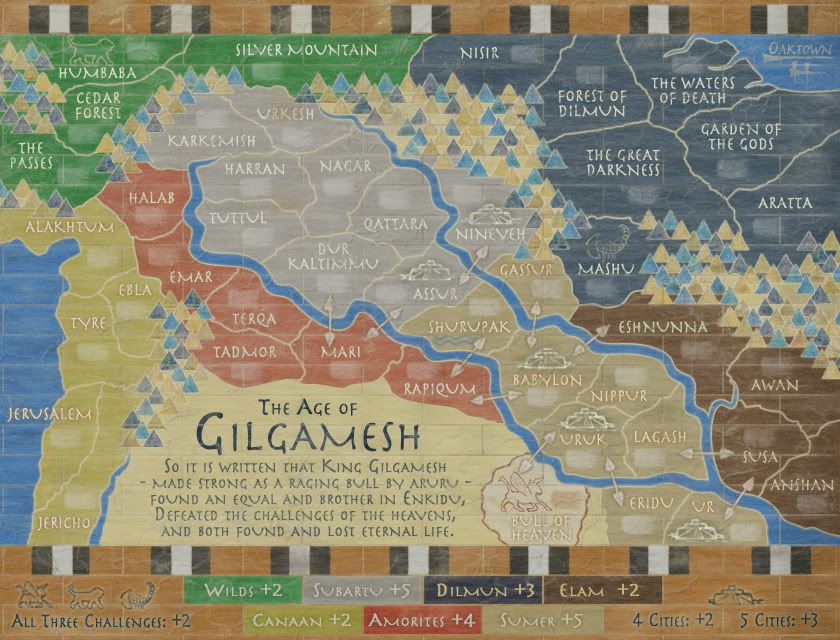
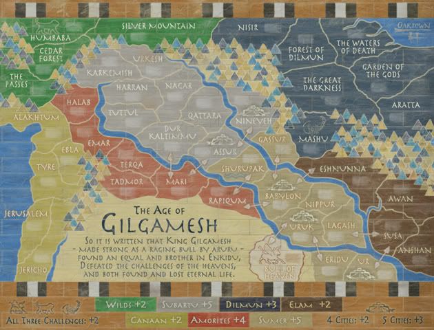
3. Between Nisir and The Great Darkness are two diagonal lines of beige/blue; I'd be inclined to mix up those colours a fraction to make them look more random
4. Arrata - there is a diagonal line of three beige mountains that blend into the non-playable area, and I would make one of them darker.

I think in general, the coloring of the mountain 'ridges' (there are a quite a few diagonal lines in all the big chunks of mountain) could and should be made more random. Either that, or just the placement of the actual mountains. I didn't look it up again, but I think in the original Centerscape revamp, they looked nicely spread out in a (sort of) natural way. I'm not very much into this alignment, especially if it's accented by the colors.

Secondly, (once again, compared to the original,) you've changed the region colors quite a bit, right? I find them a bit too 'saturated' or 'full'. I'm not a graphics man so I hope these terms make sense... They used to be more pale, 'washed off'. Mind you, I'm not trying to change everything back to the way it used to be ;) Maybe it's just that the paler colors seemed to be 'sandier', matching the concept of A) a wall painting B) in a desert-ish region...

Then I'd like to make one gameplay suggestion. I know it's been stamped recently but maybe this makes sense.
How would you feel about changing one city location from Ur to Susa? I don't know if there's any historical background for Ur being a big city or something, I haven't read all 12 pages. IMHO, the city bonus should be a not-so-easy extra, and this works better if all cities have >3 borders. I know Nineveh also has two, but somehow that doesn't feel bad to me :-k If you changed Ur to Susa, you'd also be rid of the easy Sumer + cities combo and you could go back to +4 for 5 cities which you've changed recently.
I hope this makes sense :) Just lemme know if it doesn't ;)
ImageImage
Winner of "As Easy As 1, 2, 3! - Africa I", "Championship Series: British Isles",
"1v1 Battle to Rule Doodle Earth 2", "Connect 4 (Restarted)" and "Blind Fold Buddy - BeNeLux"
Sergeant 1st Class saaimen
 
Posts: 476
Joined: Thu Nov 29, 2007 10:04 pm

Re: Gilgamesh; cities simplified pg 7

Postby iancanton on Wed May 20, 2009 5:18 pm

congrats on having solved the issue of the cities by using appropriate start positions and a preset neutral!

iancanton wrote:the cities and - critically for the storyline - the challenges will no longer be unattractive targets if we increase their bonuses by 3 each, that is to +4 for the 3 challenges (to compensate for having to kill 3 neutrals), +5 for 4 cities and +7 for all 6 cities. this is nowhere near enough to make them game-winning objectives, but saves them from being as unloved as the cities on the scotland map.

the challenges are still very much in danger of being ignored though. with a bonus of only +1 for holding three widely-scattered regions, who is actually going to bother with them?

ian. :)
Image
User avatar
Colonel iancanton
Foundry Foreman
Foundry Foreman
 
Posts: 2427
Joined: Fri Jun 01, 2007 5:40 am
Location: europe

Re: Gilgamesh; small & large pg 12

Postby oaktown on Sat May 23, 2009 6:17 pm

Click image to enlarge.
image


saaimen wrote:I think in general, the coloring of the mountain 'ridges' (there are a quite a few diagonal lines in all the big chunks of mountain) could and should be made more random. Either that, or just the placement of the actual mountains. I didn't look it up again, but I think in the original Centerscape revamp, they looked nicely spread out in a (sort of) natural way.

The color pattern has been the same from start - alternating colors, blue yellow. I think that what has happened - and it has happened so gradually that I haven't noticed it - is that I've been filling in more mountains to nicely frame regions, and the more mountains that I add the more the lines of color stand out. I've started strategically removing some mountains and darkening/lightening others. I hope this breaks it up a bit.

saaimen wrote:Secondly, (once again, compared to the original,) you've changed the region colors quite a bit, right? I find them a bit too 'saturated' or 'full'. I'm not a graphics man so I hope these terms make sense... They used to be more pale, 'washed off'. Mind you, I'm not trying to change everything back to the way it used to be ;) Maybe it's just that the paler colors seemed to be 'sandier', matching the concept of A) a wall painting B) in a desert-ish region...

Again, this has happened gradually over the past months... I've washed out the colors a bit, and turned up the opacity of the dust and scratch layers that I have over the entire image.

I've also brought the territory text back up to a light gray, from the background sand color that proved hard to read. Text in the legend is also lighter.

saaimen wrote:How would you feel about changing one city location from Ur to Susa? I don't know if there's any historical background for Ur being a big city or something, I haven't read all 12 pages.

I tried removing Ur, but I was quickly criticized. All of the regions depicted within/around the rivers are historical city states, but Ur was among the first and remains one of the most well known. I'd say a good case can be made for keeping it.

saaimen wrote:the challenges are still very much in danger of being ignored though. with a bonus of only +1 for holding three widely-scattered regions, who is actually going to bother with them?

I wouldn't be opposed to turning it up, but note that the challenges don't start neutral as you said way back - I believe the plan is now to code them as starts, so in two and three player games these are the territories that i promose you will NOT start neutral (well, in a 1v1 there is a 1 in 3 chance that ONE of them will start neutral, but the other two will be assigned.) So, +2? That makes them the same as holding four cities, which I can live with.

Another thought I had was to allow the Bull of Heaven - who represents drought - to bombard all of the cities. :?:
Image
User avatar
Captain oaktown
 
Posts: 4451
Joined: Sun Dec 03, 2006 9:24 pm
Location: majorcommand

Re: Gilgamesh; small & large pg 12

Postby AndyDufresne on Sat May 23, 2009 7:20 pm

oaktown wrote:Another thought I had was to allow the Bull of Heaven - who represents drought - to bombard all of the cities. :?:

Though interesting, I'm not sure it'd really add to the game play in any meaningful way (I.E. Naval Superiority works out nicely because of its meaningfulness)--and may be just more of a gimmick. Just a thought.


--Andy
User avatar
Corporal 1st Class AndyDufresne
 
Posts: 24919
Joined: Fri Mar 03, 2006 8:22 pm
Location: A Banana Palm in Zihuatanejo

Re: Gilgamesh; pg 13

Postby Incandenza on Sat May 23, 2009 7:57 pm

Plus it would massively overpower the terit, meaning that it would have to start neutral (like the armor in berlin).
THOTA: dingdingdingdingdingdingBOOM

Te Occidere Possunt Sed Te Edere Non Possunt Nefas Est
User avatar
Colonel Incandenza
 
Posts: 4949
Joined: Thu Oct 19, 2006 5:34 pm
Location: Playing Eschaton with a bucket of old tennis balls

Re: Gilgamesh; pg 13

Postby oaktown on Sun May 24, 2009 5:20 pm

Click image to enlarge.
image

Challenges are up to +2. Yes, the four cities are also +2 and you have to hold more of them, but tell me which bonus you'd rather have? Challenge bonus is hard to hold and not at all strategic, but could look awfully tempting to the player that wraps up green early.

And mountains. After many comments I've mixed up the mountains a bit. Gone are the straight lines of blue or yellow cutting through the mountain ranges.

Just in case one of our graphics people wanders by, here's a small image...
Click image to enlarge.
image
Image
User avatar
Captain oaktown
 
Posts: 4451
Joined: Sun Dec 03, 2006 9:24 pm
Location: majorcommand

Re: Gilgamesh; staggered mntns, pg 13

Postby the.killing.44 on Sun May 24, 2009 6:38 pm

Yeah I wandered by ā€¦ ;)

Just a note, the challenges are rather hard to see. I'd say the same about the water but because that has no effect on the GP then it's fine, but adding the black glow you have on the other elements of the map (text, cities) then that'd be much better.

Lookin' good,
.44
User avatar
Captain the.killing.44
 
Posts: 4724
Joined: Thu Oct 23, 2008 7:43 pm
Location: now tell me what got two gums and knows how to spit rhymes

Re: Gilgamesh; staggered mntns, pg 13

Postby MrBenn on Sun May 24, 2009 6:41 pm

I find the 'Bull of Heaven' territory name difficult to read - it's because it's a light colour on a light background... perhaps make that name orange like you did with everything else on it? ;-)
Image
PB: 2661 | He's blue... If he were green he would die | No mod would be stupid enough to do that
User avatar
Lieutenant MrBenn
 
Posts: 6880
Joined: Wed Nov 21, 2007 9:32 am
Location: Off Duty

Re: Gilgamesh; staggered mntns, pg 13

Postby saaimen on Sun May 24, 2009 7:34 pm

On the small map, I think the territ names in Sumer and Canaan are quite a bit harder to read than in the other regions.
Once again, because this is the sand-ish background color.
How about brightening up the territory names in those two regions? When you look from Dilmun to Canaan, the names in Canaan suddenly seem to be darker (due to less contrast with the background, I suppose).
ImageImage
Winner of "As Easy As 1, 2, 3! - Africa I", "Championship Series: British Isles",
"1v1 Battle to Rule Doodle Earth 2", "Connect 4 (Restarted)" and "Blind Fold Buddy - BeNeLux"
Sergeant 1st Class saaimen
 
Posts: 476
Joined: Thu Nov 29, 2007 10:04 pm

Re: Gilgamesh; staggered mntns, pg 13

Postby oaktown on Mon May 25, 2009 11:18 am

Click image to enlarge.
image

Click image to enlarge.
image


Changes to this version are subtle... some titles lighter, most have an added outer glow. Moved some more mountains, brightened up the challenges a bit both on the map and the legend. Hopefully this addresses visibility issues?
Image
User avatar
Captain oaktown
 
Posts: 4451
Joined: Sun Dec 03, 2006 9:24 pm
Location: majorcommand

Re: Gilgamesh; staggered mntns, pg 13

Postby AndyDufresne on Mon May 25, 2009 12:35 pm

I'm pretty satisfied with the visibility of most everything. :)


--Andy
User avatar
Corporal 1st Class AndyDufresne
 
Posts: 24919
Joined: Fri Mar 03, 2006 8:22 pm
Location: A Banana Palm in Zihuatanejo

Re: Gilgamesh; staggered mntns, pg 13

Postby saaimen on Mon May 25, 2009 1:37 pm

oaktown wrote:Changes to this version are subtle... some titles lighter, most have an added outer glow. Moved some more mountains, brightened up the challenges a bit both on the map and the legend. Hopefully this addresses visibility issues?

Yup :)

And I completely dig the randomness of the mountains =D>
ImageImage
Winner of "As Easy As 1, 2, 3! - Africa I", "Championship Series: British Isles",
"1v1 Battle to Rule Doodle Earth 2", "Connect 4 (Restarted)" and "Blind Fold Buddy - BeNeLux"
Sergeant 1st Class saaimen
 
Posts: 476
Joined: Thu Nov 29, 2007 10:04 pm

Re: Gilgamesh; staggered mntns, pg 13

Postby MrBenn on Tue May 26, 2009 10:25 am

When did you add those waves to Shurupak? I've only just noticed them :oops:

I'm sure somebody will wonder what they are there for, thinking they mean something :lol:

What's the 'H' for beneath your signature?
Image
PB: 2661 | He's blue... If he were green he would die | No mod would be stupid enough to do that
User avatar
Lieutenant MrBenn
 
Posts: 6880
Joined: Wed Nov 21, 2007 9:32 am
Location: Off Duty

Re: Gilgamesh; staggered mntns, pg 13

Postby oaktown on Sat Jun 06, 2009 9:36 pm

MrBenn wrote:When did you add those waves to Shurupak? I've only just noticed them :oops:
I'm sure somebody will wonder what they are there for, thinking they mean something :lol:

They've been there for a few weeks... they represent nothing in terms of gameplay, but anybody familiar with the epic might appreciate them. If folks think they'll be confusing I can make them more subtle.

MrBenn wrote:What's the 'H' for beneath your signature?

Eh, I was just trying to make the sig look like cuneiform writing. Again, an unnecessary visual element and one i can easily live without.

Is that all you guys have got? Latest image has been up for two weeks without any other comments.
Image
User avatar
Captain oaktown
 
Posts: 4451
Joined: Sun Dec 03, 2006 9:24 pm
Location: majorcommand

Re: Gilgamesh; staggered mntns, pg 13

Postby the.killing.44 on Sat Jun 06, 2009 9:43 pm

Yes, maybe making the waves a bit more blended in would be best. I'll stare at the map for a bit later, but this I'm confident I could stamp this (after discussion of course ;) )

.44
User avatar
Captain the.killing.44
 
Posts: 4724
Joined: Thu Oct 23, 2008 7:43 pm
Location: now tell me what got two gums and knows how to spit rhymes

Re: Gilgamesh; staggered mntns, pg 13

Postby oaktown on Sun Jun 07, 2009 11:21 am

Click image to enlarge.
image


86'ed the cuneiform scribblings under my sig, lightened the waves, tweaked a few other things.
Image
User avatar
Captain oaktown
 
Posts: 4451
Joined: Sun Dec 03, 2006 9:24 pm
Location: majorcommand

Re: Gilgamesh; staggered mntns, pg 14

Postby AndyDufresne on Sun Jun 07, 2009 3:14 pm

You know what? I'm not sure I've anything additional to suggest. Could lighten the legend text for the Challenges and Cities to match the lighter/softer icons above the text, or vice versa darken the icons a little to match the text.

That's all I can see. Otherwise this looks dandy.


--Andy
User avatar
Corporal 1st Class AndyDufresne
 
Posts: 24919
Joined: Fri Mar 03, 2006 8:22 pm
Location: A Banana Palm in Zihuatanejo

Re: Gilgamesh; staggered mntns, pg 14

Postby saaimen on Sun Jun 07, 2009 5:29 pm

I'm not sure why there is still a border of a few pixels below the legend and above the 'coloured bricks'. It looks a bit awkward up there especially.
But that's really nitpicking, it's beautiful =D>
ImageImage
Winner of "As Easy As 1, 2, 3! - Africa I", "Championship Series: British Isles",
"1v1 Battle to Rule Doodle Earth 2", "Connect 4 (Restarted)" and "Blind Fold Buddy - BeNeLux"
Sergeant 1st Class saaimen
 
Posts: 476
Joined: Thu Nov 29, 2007 10:04 pm

Re: Gilgamesh; staggered mntns, pg 14

Postby iancanton on Tue Jun 09, 2009 7:54 pm

oak

as a matter of good form, can u put a gp in the title and something about the start positions in the first post? putting n3 on babylon to mark the position of the fixed starting neutral on each future update will also be helpful for anyone who hasn't been following this thread closely.

nice work on randomising the mountains.

ian. :)
Image
User avatar
Colonel iancanton
Foundry Foreman
Foundry Foreman
 
Posts: 2427
Joined: Fri Jun 01, 2007 5:40 am
Location: europe

Re: Gilgamesh; staggered mntns, pg 14

Postby the.killing.44 on Wed Jun 10, 2009 7:05 pm

Small v please?

.44
User avatar
Captain the.killing.44
 
Posts: 4724
Joined: Thu Oct 23, 2008 7:43 pm
Location: now tell me what got two gums and knows how to spit rhymes

PreviousNext

Return to The Atlas

Who is online

Users browsing this forum: No registered users