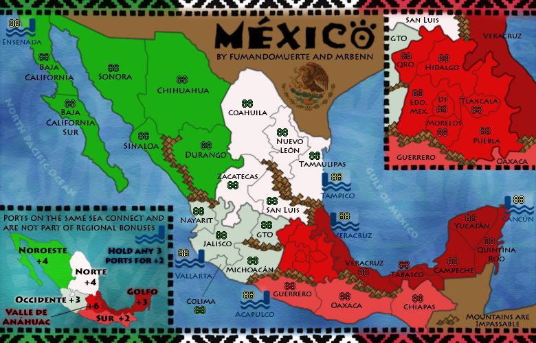
The Bison King wrote:Looks sharp. I like the seal. Might I suggest that Veracruz the sea port and Veracruz the territory have different names. It might get confusing.
You're not the first person to mention it - I had already conceded the point that they'll need to be named differently in the XML, so they'd be differentiated that way (similar to how the ports are labelled on Age of Merchants). I'd rather not add more text to the territory names unless absolutely necessary, as it could look pretty crammed in.
Industrial Helix wrote:Valle de Anáhuac is a bit too bright of a red I think and Occidente would look better as a light gray rather than a greenish white.
Personally I think the red works well, as it echoes the colours of the flag - which is the look I was going for. If anybody else agrees with you I'll look at tweaking it a fraction - although it will only be slight as it has to contrast with the other two reds. As for the green/grey, I keep flitting between the two, and prefer the slight bit of colour - although will look at making it slightly more grey and less green.
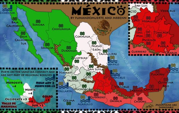
Industrial Helix wrote:I'd still rather see the ocean names in spanish.
It's a simple change to make, if others are of the same opinion. I seem to recall having them in Spanish at some point (although that may just be a figment of my imagination).
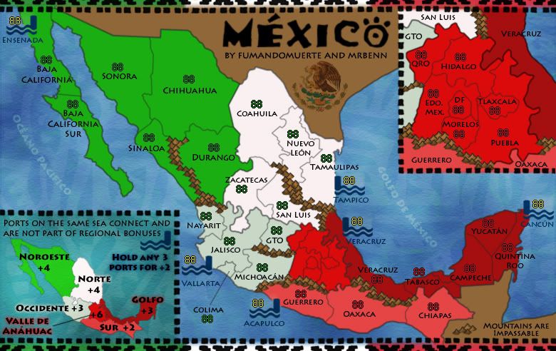
Industrial Helix wrote:The bit saying mountains are impassable seems like it would be more in place above the legend.
I'm going to disagree on this point, as the mountains would look slightly out of place hovering over the sea - I like them down in that otherwise-dead space, and plan on keeping them there