this is looking gr8, keep up the good work, I been waiting 3 years or so for this map, ask inc
now I just need some one to make me a map of the strip of las vegas and its casino's
Atlantis - v43 - BETA - P32[D,Gp,Gr,FF,XML,BETA]
Moderator: Cartographers


Re: Atlantis - v28 Page 20 [AdvD, D, Gp]
![]() by gimil on Sun Jun 14, 2009 2:05 pm
by gimil on Sun Jun 14, 2009 2:05 pm
Your graphically ability to make a map isn't what I am judging here, just to make that clear before we go on.  I can see that are more than capable of using your software effectively. What I am judging is your eye for design. One thing that has constantly got to me with this map is that it doesn't flow together nicely. Everything just seems to sit on top of one another, there is no integration. You need to think about different textures, effects and blending options so that your land looks like it is part of the overall map rather than floating on top of the water.
That is just my opinion, but here is a sample of me using bevel&emboss, two textures and a few blending options. The key is to make things flow better.
That is just my opinion, but here is a sample of me using bevel&emboss, two textures and a few blending options. The key is to make things flow better.
What do you know about map making, bitch?
Top Score:2403
natty_dread wrote:I was wrong
Top Score:2403
-

 gimil
gimil
- Posts: 8599
- Joined: Sat Mar 03, 2007 12:42 pm
- Location: United Kingdom (Scotland)


Re: Atlantis - v28 Page 20 [AdvD, D, Gp]
![]() by NemesisChild on Sun Jun 21, 2009 9:38 am
by NemesisChild on Sun Jun 21, 2009 9:38 am
Gimil
I agree i am probably not the graetest with design, but I like the way it sits at the moment, I think if we go with the way you suggested in your post we will just end up with something that looks just like Land and sea, which is a great looking map, but is not what I wanted, I think what we have stands out, its not replicating the design of any other map, our own independant touch if you will!
As I said the only thing I really am having a problem with or don't like is the borders, any help with that would be much appreciated.
Nem
Blackadder: Awh, God, God, God. What on earth was I drinking last night? My head feels like there's a Frenchman living in it. Where am I?
Click here to discover the lost islands of Atlantis...

Click here to discover the lost islands of Atlantis...
-

NemesisChild
- Posts: 147
- Joined: Tue Oct 02, 2007 7:39 am
- Location: Wiltshire


Re: Atlantis - v28 Page 20 [AdvD, D, Gp]
![]() by Premier2k on Mon Jun 22, 2009 12:43 am
by Premier2k on Mon Jun 22, 2009 12:43 am
NemesisChild wrote:Gimil
I agree i am probably not the graetest with design, but I like the way it sits at the moment, I think if we go with the way you suggested in your post we will just end up with something that looks just like Land and sea, which is a great looking map, but is not what I wanted, I think what we have stands out, its not replicating the design of any other map, our own independant touch if you will!
As I said the only thing I really am having a problem with or don't like is the borders, any help with that would be much appreciated.
I agree with Nem, we want to avoid making it look like other maps by using the same styles and techniques. Our map is supposed to be different. I have to agree with Nem on the borders.
Danyael wrote:it look great only nitpick is that i cannot see the borders in the Kamuri Kandam this is most likly my colour blindness as i tried to change my monitor setting to see if there is a border there
but this is one nice looking map
Nem's trying to sort the colours for you! Thanks for the comments!
Premier2k
-

Premier2k
- Posts: 492
- Joined: Tue Oct 02, 2007 5:53 am


Re: Atlantis - v28 Page 20 [AdvD, D, Gp]
![]() by MrBenn on Fri Jul 03, 2009 3:06 pm
by MrBenn on Fri Jul 03, 2009 3:06 pm
I think what gimil was suggesting, was that the map looks too much like it's been cut and pasted together from different places.
The sea texture is nice, but it looks out of place with the islands on top of it - it looks like the islands have been cut from somewhere and laid on top...
Experiment with outer/inner glows on some of the landmasses, and see if you can make the different design elements gel together a bit more.
You've done the hard work in getting the gameplay stamp - all we need to do now is to add some polish to the map, and just lift the quality of it a degree or two.
You're so close now

PB: 2661 | He's blue... If he were green he would die | No mod would be stupid enough to do that
-

MrBenn
- Posts: 6880
- Joined: Wed Nov 21, 2007 9:32 am
- Location: Off Duty


Re: Atlantis - v28 Page 20 [AdvD, D, Gp]
![]() by Tisha on Sun Jul 05, 2009 4:30 pm
by Tisha on Sun Jul 05, 2009 4:30 pm
some of the colored borders are messy.. some go tot he black border, others not as close. the border between Lyonesse 1 and 3 kinda spreads out on the end, as well as between Thule 8 and 9. where Lyonesse 5, 6 and 7 come together there area couple spots.. that don't really look like water, one darker and one lighter.
not really the font I think of when I think Atlantis.. what are you going for with that font? something handwritten? something ancient?
not really the font I think of when I think Atlantis.. what are you going for with that font? something handwritten? something ancient?
-

Tisha
- Posts: 1065
- Joined: Sat Dec 23, 2006 12:41 am


Re: Atlantis - v28 Page 20 [AdvD, D, Gp]
![]() by NemesisChild on Wed Jul 15, 2009 7:14 am
by NemesisChild on Wed Jul 15, 2009 7:14 am
Tisha wrote:some of the colored borders are messy.. some go tot he black border, others not as close. the border between Lyonesse 1 and 3 kinda spreads out on the end, as well as between Thule 8 and 9. where Lyonesse 5, 6 and 7 come together there area couple spots.. that don't really look like water, one darker and one lighter.
As already stated in previous messages the borders are a main area we are looking at, have recieved a very helpfull offer from cartographer extrodanaire
Tisha wrote: not really the font I think of when I think Atlantis.. what are you going for with that font? something handwritten? something ancient?
Which Font??
If you mean the title and scrolls then i'm afraid you are mistaken as pretty much any book based on atlantis has used that style (or very similar) in its title ( and I have read a few)
as did the TV series Starget Atlantis.


If that blocky Capitalised angular style of font is acceptable for those i think it fits nicely in the map
If you mean the Continent names then I agree it is not a historic style but I like it as do many other so it is staying
Blackadder: Awh, God, God, God. What on earth was I drinking last night? My head feels like there's a Frenchman living in it. Where am I?
Click here to discover the lost islands of Atlantis...
Click here to discover the lost islands of Atlantis...
-
NemesisChild
- Posts: 147
- Joined: Tue Oct 02, 2007 7:39 am
- Location: Wiltshire
Re: Atlantis - v28 Page 20 [AdvD, D, Gp]
![]() by Tisha on Wed Jul 15, 2009 11:52 pm
by Tisha on Wed Jul 15, 2009 11:52 pm
okay then,.. sorry to post in your thread.. 
-
Tisha
- Posts: 1065
- Joined: Sat Dec 23, 2006 12:41 am
Re: Atlantis - v28 Page 20 [AdvD, D, Gp]
![]() by MrBenn on Fri Jul 17, 2009 2:00 pm
by MrBenn on Fri Jul 17, 2009 2:00 pm
If there was a font that looked like it had just emerged from underwater, and was dripping wet, then I definitely think that would be appropriate....
PB: 2661 | He's blue... If he were green he would die | No mod would be stupid enough to do that
-
MrBenn
- Posts: 6880
- Joined: Wed Nov 21, 2007 9:32 am
- Location: Off Duty
Re: Atlantis - v28 Page 20 [AdvD, D, Gp]
![]() by Incandenza on Sat Jul 18, 2009 3:23 am
by Incandenza on Sat Jul 18, 2009 3:23 am
Well, since you guys already have a pretty Greek theme for the map, perhaps if you Greeked the title up a bit, that would pass muster?
THOTA: dingdingdingdingdingdingBOOM
Te Occidere Possunt Sed Te Edere Non Possunt Nefas Est
Te Occidere Possunt Sed Te Edere Non Possunt Nefas Est
-

Incandenza
- Posts: 4949
- Joined: Thu Oct 19, 2006 5:34 pm
- Location: Playing Eschaton with a bucket of old tennis balls


Re: Atlantis - v28 Page 20 [AdvD, D, Gp]
![]() by Gustaf Wasa on Fri Jul 31, 2009 5:01 am
by Gustaf Wasa on Fri Jul 31, 2009 5:01 am
I find it odd that Thule, which was the Roman name for the North, is in the south on this map!
-

Gustaf Wasa
- Posts: 198
- Joined: Mon Apr 09, 2007 1:32 pm
- Location: The Swedish outpost of Atlantis


Re: Atlantis - v28 Page 20 [AdvD, D, Gp]
![]() by Premier2k on Fri Jul 31, 2009 6:25 am
by Premier2k on Fri Jul 31, 2009 6:25 am
Gustaf Wasa wrote:I find it odd that Thule, which was the Roman name for the North, is in the south on this map!
I didn't know that! Look at it this way, it's north of the bottom of the map..
We actually got the name from another ancient land called Thule
Wikipedia wrote:Thule (pronounced /ˈθuːli/, us dict: thōō′·lē; Greek Θούλη, Thoulē; also spelled in various sources Thile, Tile, Tilla, Toolee, Tylen, Thula, Thyle, Thylee, Thila, Thulii, Thyilea, Tula, and Tila) is, in classical literature, a place, usually an island. Ancient European descriptions and maps locate it either in the far north, often Iceland,[1] possibly the Orkney Islands or Shetland Islands or Scandinavia, or in the Late Middle Ages and Renaissance Iceland or Greenland. Another suggested location is Saaremaa in the Baltic Sea.[2]
Again, it does suggest it's position was northern but we aren't using the name Thule as a reference, more as a nod to other mythical islands/lands.
Premier2k
-
Premier2k
- Posts: 492
- Joined: Tue Oct 02, 2007 5:53 am
Re: Atlantis - v28 Page 20 [AdvD, D, Gp]
![]() by Hopscotcher on Sat Aug 01, 2009 2:14 am
by Hopscotcher on Sat Aug 01, 2009 2:14 am
Looks pretty interesting.... the way the continents are separated is pretty cool and could get pretty interesting. I have a few thoughts, though and then it's off to bed with me....
1. Doesn't it make sense that since Zeus is the Sky God and Poseidon is the Sea God that Zeus should hit Docks and Poseidon hit Boats?
2. I hope the territories aren't going to be named as numbers.
3. I think in general the graphics look a little... cartoony? not sure if that is the right word. I think if you could give some edge or depth to it. Make the continents look more like cliffs or something....
anyway, I go sleep now
ttfn,
Hopper
-

Hopscotcher
- Posts: 733
- Joined: Wed Oct 29, 2008 9:06 pm
- Location: Colorful Colorado


Re: Atlantis - v28 Page 20 [AdvD, D, Gp]
![]() by Gustaf Wasa on Thu Aug 06, 2009 7:15 pm
by Gustaf Wasa on Thu Aug 06, 2009 7:15 pm
Premier2k wrote:Gustaf Wasa wrote:I find it odd that Thule, which was the Roman name for the North, is in the south on this map!
I didn't know that! Look at it this way, it's north of the bottom of the map..
We actually got the name from another ancient land called ThuleWikipedia wrote:Thule (pronounced /ˈθuːli/, us dict: thōō′·lē; Greek Θούλη, Thoulē; also spelled in various sources Thile, Tile, Tilla, Toolee, Tylen, Thula, Thyle, Thylee, Thila, Thulii, Thyilea, Tula, and Tila) is, in classical literature, a place, usually an island. Ancient European descriptions and maps locate it either in the far north, often Iceland,[1] possibly the Orkney Islands or Shetland Islands or Scandinavia, or in the Late Middle Ages and Renaissance Iceland or Greenland. Another suggested location is Saaremaa in the Baltic Sea.[2]
Again, it does suggest it's position was northern but we aren't using the name Thule as a reference, more as a nod to other mythical islands/lands.
Premier2k
Wikipedia is a wealth of accuracy.
Thule was always about the northernmost part of Europe, and so when the Romans found (more accurately, heard about, because the historian Tacitus didn't actually travel that far north) Scandinavia, they used the name Thule for Scandinavia. They thought it was an island or group of islands, because they didn't have satellite photographs showing them that it was a peninsula.
Anyway, of course the Thule on your map isn't supposed to be the real Thule. But it's just that the name is connected with the North as much as the Arctic is.
-
Gustaf Wasa
- Posts: 198
- Joined: Mon Apr 09, 2007 1:32 pm
- Location: The Swedish outpost of Atlantis
Re: Atlantis - v28 Page 20 [AdvD, D, Gp]
![]() by neanderpaul14 on Tue Aug 11, 2009 1:01 am
by neanderpaul14 on Tue Aug 11, 2009 1:01 am
I love it and can't wait for it, but shouldn't Poisiden attack ships and Zeus attack ports???

High score: 2724/#163 on scoreboard/COLONEL
-

neanderpaul14
- Posts: 1216
- Joined: Wed Aug 06, 2008 3:52 pm
- Location: "Always mystify, mislead and surprise the enemy if possible." - Thomas J. Jackson


Re: Atlantis - v28 Page 20 [AdvD, D, Gp]
![]() by Premier2k on Tue Aug 11, 2009 1:00 pm
by Premier2k on Tue Aug 11, 2009 1:00 pm
neanderpaul14 wrote:I love it and can't wait for it, but shouldn't Poisiden attack ships and Zeus attack ports???
Maybe, but we've changed this around a lot and most people seem happy with it. Now that we have the gameplay stamp we're not going to make anymore changes like this.
We're now looking at the map and trying to make it look a little better, we were hoping to get some help with that but unfortunately it hasn't happened. But we'll keep perservering and get it to you as soon as we can!
Premier2k
-
Premier2k
- Posts: 492
- Joined: Tue Oct 02, 2007 5:53 am
Re: Atlantis - v29!! A long time coming! P. 22 [AdvD, D, Gp]
![]() by Premier2k on Wed Sep 23, 2009 3:34 am
by Premier2k on Wed Sep 23, 2009 3:34 am
At last, here it is version 29.
Both myself and Nemesischild would like to offer a big thanks to samuelc812 for his help with polishing this version. He has done a great job and we're just looking for comments on the borders seperating the territories. Specifically are there any colourblind issues?
We want to do a final push at getting this finished now.
Here it is!

What do you guys think?
Premier2k
Both myself and Nemesischild would like to offer a big thanks to samuelc812 for his help with polishing this version. He has done a great job and we're just looking for comments on the borders seperating the territories. Specifically are there any colourblind issues?
We want to do a final push at getting this finished now.
Here it is!
What do you guys think?
Premier2k
-
Premier2k
- Posts: 492
- Joined: Tue Oct 02, 2007 5:53 am
Re: Atlantis - v29!! A long time coming! P. 22 [AdvD, D, Gp]
![]() by Danyael on Wed Sep 23, 2009 10:53 pm
by Danyael on Wed Sep 23, 2009 10:53 pm
looking damn sweet
the title looks great with the overall map
i can see all boarders clearly i have no Colourblind issues at all
personal nitpick the boats look a little floaty
but i think its best the way its unless you make it very subtle
I think this needs a good stamp
the title looks great with the overall map
i can see all boarders clearly i have no Colourblind issues at all
personal nitpick the boats look a little floaty
but i think its best the way its unless you make it very subtle
I think this needs a good stamp
-

Danyael
- Posts: 352
- Joined: Fri Jul 04, 2008 4:26 pm
- Location: Winnipeg, Manitoba


Re: Atlantis - v29!! A long time coming! P. 22 [AdvD, D, Gp]
![]() by the.killing.44 on Wed Sep 23, 2009 11:01 pm
by the.killing.44 on Wed Sep 23, 2009 11:01 pm
Great! The only little things I pick out are: that the +8 is a bit glaring on the eyes; the saturation levels can fix that. The boats seem to pop up above the water—maybe it's better if you made the hulls half-submerged? I like the bridges a lot, hmm, the way that the land overlaps the scroll in the bottom right corner is unpleasing, should be an easy fix. Much better with the names, though if you could move "Kamuri Kandum" into that little cove a bit to the south, it'd be closer to the land and look nicer. The last thing I see is that you could give the circles a bit of a dark outer glow, as atm they're a bit just "on there."
Fantastic work though!
Fantastic work though!
-

the.killing.44
- Posts: 4724
- Joined: Thu Oct 23, 2008 7:43 pm
- Location: now tell me what got two gums and knows how to spit rhymes


Re: Atlantis -- v31 -- P. 22 [AdvD, D, Gp]
![]() by Premier2k on Thu Sep 24, 2009 8:40 am
by Premier2k on Thu Sep 24, 2009 8:40 am
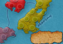
Version 31 is here! (at last)
We are now looking for minor graphical issues. Gameplay has been finalised and we have our Gameplay stamp. The XML is being finalised and the army number tests will be posted up for all to see. (Using 1, 10 and 100 armies)
Changes made
Some changes made by Samuel, including border changes and title changes
Some suggestions also made by the.killing.44 which have been implemented
The Map!

We are now looking for minor graphical issues. Gameplay has been finalised and we have our Gameplay stamp. The XML is being finalised and the army number tests will be posted up for all to see. (Using 1, 10 and 100 armies)
Changes made
Some changes made by Samuel, including border changes and title changes
Some suggestions also made by the.killing.44 which have been implemented
- Softened boats (to make them less floaty!!!)
Mini map numbers are slightly softened
Moved Lemuria and Kamuri continent names
Also separated Mariny and scrap & modified borders slightly to make them clearer on Ys
added dark outer glow to Circles as recomended
+8 softened slightly
The Map!
- Click image to enlarge.

-
Premier2k
- Posts: 492
- Joined: Tue Oct 02, 2007 5:53 am
Re: Atlantis -- v31 -- P. 22 [AdvD, D, Gp]
![]() by RjBeals on Thu Sep 24, 2009 3:59 pm
by RjBeals on Thu Sep 24, 2009 3:59 pm
i don't think the scroll or that little ripped piece of paper fit well with the graphics of the map. I don't have a suggestion to improve, but just thought i'd voice my opinion.

-

RjBeals
- Posts: 2506
- Joined: Mon Nov 20, 2006 5:17 pm
- Location: South Carolina, USA


Re: Atlantis -- v31 -- P. 22 [AdvD, D, Gp]
![]() by Premier2k on Thu Sep 24, 2009 4:14 pm
by Premier2k on Thu Sep 24, 2009 4:14 pm
Thanks RJBeals,
Nemesischild has already voiced his concerns over how the scroll looks with the map. I think he's going to look at trying to do something different with it.
Nemesischild has already voiced his concerns over how the scroll looks with the map. I think he's going to look at trying to do something different with it.
-
Premier2k
- Posts: 492
- Joined: Tue Oct 02, 2007 5:53 am
Re: Atlantis -- v31 -- P. 22 [AdvD, D, Gp]
![]() by ender516 on Thu Sep 24, 2009 9:33 pm
by ender516 on Thu Sep 24, 2009 9:33 pm
Quite the handsome looking map. But unless you know something I don't about XML, I think the starting positions for a 2-player game mentioned in Section 2.1.1 of the initial post is incorrect: I believe it will break down as 17 random territories per player and 18 neutral territories.
-

ender516
- Posts: 4455
- Joined: Wed Dec 17, 2008 6:07 pm
- Location: Waterloo, Ontario


Re: Atlantis -- v31 -- P. 22 [AdvD, D, Gp]
![]() by RedBaron0 on Thu Sep 24, 2009 11:04 pm
by RedBaron0 on Thu Sep 24, 2009 11:04 pm
ender516 wrote:Quite the handsome looking map. But unless you know something I don't about XML, I think the starting positions for a 2-player game mentioned in Section 2.1.1 of the initial post is incorrect: I believe it will break down as 17 random territories per player and 18 neutral territories.
ender is correct, a 2 player game is divided just like the 3 player game. The third "player" is neutral. So it would be 17 territories for each player and 19 random neutrals, which is good!
The scroll I could probably live with... but why not try something carved into stone? Atlantis is supposed to go back 10-12,000 years into prehistory, the Stone Age, although Atlantis is supposed to be advanced far beyond that, which could be another angle to work graphically on. It was mentions a page or 2 ago that a possible missing element could be a little something that is Greek. The story of Atlantis is supposed to be present in many cultures around the world, but is most well known is in an epic written by Plato. Maybe a direct quote from Plato about Atlantis, and maybe to add a bit of the Greek language, instead of numbers for each territory lower case Greek letters, α, β, γ, etc...
Honestly though, you probably don't need to change too much, just get though some nitpicks. Just throwing some ideas at you to give something to try.


-

RedBaron0
- Posts: 2657
- Joined: Sun Aug 19, 2007 12:59 pm
- Location: Pennsylvania


Re: Atlantis -- v32 -- P. 22 [AdvD, D, Gp]
![]() by Premier2k on Fri Sep 25, 2009 6:51 am
by Premier2k on Fri Sep 25, 2009 6:51 am
Ok, we've taken the suggestions on board and changed the legend to a sandy beach, we've also updated the fonts on the legend and on the scrap.
In the next version the numbers will be replaced with greek characters to give it more of a greek feel.
So what about this? Getting better? Almost there?
Changes made
Changes in next version
Changing territ numbers to Greek Alphabet
How does this look? Do you prefer numbers or the greek equivilent?

The Latest Map!

Premier2k
In the next version the numbers will be replaced with greek characters to give it more of a greek feel.
So what about this? Getting better? Almost there?
Changes made
- New Legend Background
Updated font on legend and Scrap
Changes in next version
Changing territ numbers to Greek Alphabet
How does this look? Do you prefer numbers or the greek equivilent?
The Latest Map!
- Click image to enlarge.

Premier2k
-
Premier2k
- Posts: 492
- Joined: Tue Oct 02, 2007 5:53 am
Who is online
Users browsing this forum: No registered users
|
|||||||
| Conquer Club is not associated with RISK online in any way. Copyright © 2006-2025 by Big Wham LLC | |||||||