I agree to make the map balanced I need something like the fly swarm, cow pat, and grass. Someone mentioned replacing the grass with a sale sticker, I may do something like that.
Perhaps several special offer stickers will do the job.
I like the idea of blood stains but that goes against other comments asking for a clean realistic butcher shop that you may buy meat from.
In terms of the knives, I have an idea of how they could work to replace the fly swarm, but not sure it will work.
Best Wishes,
Dana
4 Star Meats [Quenched]
Moderator: Cartographers

Re: 4 Star Meats [March 10th] page 24
![]() by dana1971 on Sat Mar 10, 2012 7:13 pm
by dana1971 on Sat Mar 10, 2012 7:13 pm
Hi all,
Still lots to do but here's the latest. I decided to concentrate on a general layout that helps establish the theme.
I probably don't need so many chalk boards but you get the idea.
Also think I may need to cut down on the artwork around the playable area, so the map is more compact.
Still to add bonuses, and mark out regions with color.
I've got a special offer sticker instead of the grass. The idea is that there is a special offer on Tongue and hoofs, so it acts as a portal to those regions, but the special offer resets itself every round because it's a limited offer.
Thought the map logo/title could replace the flies, and there is now a loyalty reward sticker to replace the poo which can be one way attacked from the company logo/title because that's where you would get you loyalty points. The points can only be used to attack the back hoof. You can also attack loyalty points from the tail, because the shop is having a sale on the tail, and is giving away extra loyalty points if you buy the tail.
Best Wishes,
Dana
Still lots to do but here's the latest. I decided to concentrate on a general layout that helps establish the theme.
I probably don't need so many chalk boards but you get the idea.
Also think I may need to cut down on the artwork around the playable area, so the map is more compact.
Still to add bonuses, and mark out regions with color.
I've got a special offer sticker instead of the grass. The idea is that there is a special offer on Tongue and hoofs, so it acts as a portal to those regions, but the special offer resets itself every round because it's a limited offer.
Thought the map logo/title could replace the flies, and there is now a loyalty reward sticker to replace the poo which can be one way attacked from the company logo/title because that's where you would get you loyalty points. The points can only be used to attack the back hoof. You can also attack loyalty points from the tail, because the shop is having a sale on the tail, and is giving away extra loyalty points if you buy the tail.
- Click image to enlarge.
Best Wishes,
Dana
-

 dana1971
- Posts: 200
- Joined: Wed Aug 25, 2010 7:33 am
- Location: Scotland


Re: 4 Star Meats [March 10th] page 24
![]() by DoomYoshi on Sat Mar 10, 2012 8:30 pm
by DoomYoshi on Sat Mar 10, 2012 8:30 pm
It needs more colour coding of different regions, methinks.
░▒▒▓▓▓▒▒░
-

DoomYoshi
- Posts: 10728
- Joined: Tue Nov 16, 2010 9:30 pm
- Location: Niu York, Ukraine


Re: 4 Star Meats [March 10th] page 24
![]() by koontz1973 on Sun Mar 11, 2012 2:10 am
by koontz1973 on Sun Mar 11, 2012 2:10 am
dana, wow, really going in the right direction now and it is still a cow map.
Can I get you to do 2 things for me. Add 88's to the board (just to make sure they fit in all regions with space as you have to do the small one as well) and get the GP rules onto the board. You might have trouble with that (the space) you have is very small now. If you do have trouble, you could move the map left or right and haave one larger black board for the rules at the side instead of 3 small ones.
Graphically speaking, the photos you have used for the meat and counter will not get the graphics stamp as is, so start looking at the ways you can improve these now. No need to wait for later. Also, the font for the legend/prices needs to have a more for a written feel to it. Less neat but not messy. Have a look over at dafont for some.
Good luck.

-

koontz1973
- Posts: 6960
- Joined: Thu Jan 01, 2009 10:57 am


Re: 4 Star Meats [March 10th] page 24
![]() by Oneyed on Sun Mar 11, 2012 4:09 am
by Oneyed on Sun Mar 11, 2012 4:09 am
I like your last version. nice idea with butcher 
some colours would help to bonuses.
Oneyed
some colours would help to bonuses.
Oneyed
-

Oneyed
- Posts: 1058
- Joined: Sat Dec 10, 2011 12:29 pm


Re: 4 Star Meats [March 10th] page 24
![]() by Flapcake on Sun Mar 11, 2012 6:59 am
by Flapcake on Sun Mar 11, 2012 6:59 am
Dana, this looks real nice. This bucther theme match the poster greate and you have build every thing in real nice, the price bord are outstanding as bonus legend.
Only one thing but thats cosmetic and easy to solve, the meat hanging from the ceiling are kind of blurry or out of focus, but you probably know that,
greate work, thumbs up
Only one thing but thats cosmetic and easy to solve, the meat hanging from the ceiling are kind of blurry or out of focus, but you probably know that,
greate work, thumbs up

-

Flapcake
- Posts: 756
- Joined: Tue Jan 11, 2011 8:22 am
- Location: beyond the unknown


Re: 4 Star Meats [March 10th] page 24
![]() by Gillipig on Sun Mar 11, 2012 12:01 pm
by Gillipig on Sun Mar 11, 2012 12:01 pm
Nice !
AoG for President of the World!!
I promise he will put George W. Bush to shame!
I promise he will put George W. Bush to shame!
-

Gillipig
- Posts: 3565
- Joined: Fri Jan 09, 2009 1:24 pm


Re: 4 Star Meats [March 10th] page 24
![]() by natty dread on Sun Mar 11, 2012 1:13 pm
by natty dread on Sun Mar 11, 2012 1:13 pm
I'm a bit worried that some territories are too small for army numbers when scaled to the small version.
The small version should be about 70-80% the size of the large...
As for gameplay, the special offer only attacks tongue and hoof... it doesn't seem very useful from a gameplay perspective. Especially since it's a killer neutral.
I think a better idea would be to use the butcher knives as special territories that attack various points on the map.

-

natty dread
- Posts: 12877
- Joined: Fri Feb 08, 2008 8:58 pm
- Location: just plain fucked


Re: 4 Star Meats [March 10th] page 24
![]() by AndyDufresne on Mon Mar 12, 2012 2:15 pm
by AndyDufresne on Mon Mar 12, 2012 2:15 pm
natty dread wrote:I'm a bit worried that some territories are too small for army numbers when scaled to the small version.
The small version should be about 70-80% the size of the large...
Mmhm. It might be worthwhile expanding the playable region further to the left and bottom, since right now it is only aesthetic flair that it would be replacing.
Look forward to seeing this idea further develop.
--Andy
-

AndyDufresne
- Posts: 24935
- Joined: Fri Mar 03, 2006 8:22 pm
- Location: A Banana Palm in Zihuatanejo


Re: 4 Star Meats [March 10th] page 24
![]() by The Bison King on Mon Mar 12, 2012 5:55 pm
by The Bison King on Mon Mar 12, 2012 5:55 pm
Hey alright! this is looking good. Obviously it needs color. I like the Special offer, that's a nice touch.
Well I think it would be better to increase the size of the playable area a bit.
However why "4 Star Meats"? is there some connection I'm not making? where did this title come from?
Also think I may need to cut down on the artwork around the playable area, so the map is more compact.
Well I think it would be better to increase the size of the playable area a bit.
However why "4 Star Meats"? is there some connection I'm not making? where did this title come from?
-

The Bison King
- Posts: 1957
- Joined: Thu Aug 27, 2009 5:06 pm
- Location: the Mid-Westeros


Re: 4 Star Meats [March 10th] page 24
![]() by dana1971 on Mon Mar 12, 2012 6:37 pm
by dana1971 on Mon Mar 12, 2012 6:37 pm
The Bison King wrote:However why "4 Star Meats"? is there some connection I'm not making? where did this title come from?
The title has no special meaning. Basically wanted the title to be the name of the Butcher shop and small companies like to get their names in the front of the phone book, or these days the online phone books, so starting the name with a number made sense, thought the start would be a good place to put troops, and 5 start meats was already taken:)
Thanks for the comments, all I am working on a new version with color and plan to put the rules in next time to see how much space I really have.
The graphics will still be rough in places but I will put in the 88's marking out regions.
Best Wishes,
Dana
-
dana1971
- Posts: 200
- Joined: Wed Aug 25, 2010 7:33 am
- Location: Scotland
Re: 4 Star Meats [March 10th] page 24
![]() by dana1971 on Mon Mar 12, 2012 6:42 pm
by dana1971 on Mon Mar 12, 2012 6:42 pm
koontz1973 wrote:Graphically speaking, the photos you have used for the meat and counter will not get the graphics stamp as is, so start looking at the ways you can improve these now. No need to wait for later. Also, the font for the legend/prices needs to have a more for a written feel to it. Less neat but not messy.
I have a question about the graphic stamp. If a painted a photo real backdrop would that be a problem? Does it need to look graphical, or drawn to get a graphics sticker?
I am capable of making a photo real image if I put the time in. I'm not stating a preference just wondering what the rules are for a graphic stamp.
I found a nice font called "Eraser" I will use for the chalk boards.
Best Wishes,
Dana
-
dana1971
- Posts: 200
- Joined: Wed Aug 25, 2010 7:33 am
- Location: Scotland
Re: 4 Star Meats [March 10th] page 24
![]() by RjBeals on Mon Mar 12, 2012 9:15 pm
by RjBeals on Mon Mar 12, 2012 9:15 pm
yeah those hanging meats don't fit too well. They look like you applied a basic filter to a photo. Photo or artwork, doesn't matter what you use to graphic stamp, as long as it's pleasing to the eye. A little color would also be nice - love this map still !

-

RjBeals
- Posts: 2506
- Joined: Mon Nov 20, 2006 5:17 pm
- Location: South Carolina, USA


Re: 4 Star Meats [March 10th] page 24
![]() by koontz1973 on Thu Mar 15, 2012 11:37 am
by koontz1973 on Thu Mar 15, 2012 11:37 am
dana1971 wrote:I have a question about the graphic stamp. If a painted a photo real backdrop would that be a problem? Does it need to look graphical, or drawn to get a graphics sticker?
I am capable of making a photo real image if I put the time in. I'm not stating a preference just wondering what the rules are for a graphic stamp.
I found a nice font called "Eraser" I will use for the chalk boards.
Best Wishes,
Dana
If by photo real, you mean you take a photo of the web, you need to make sure it is free to use. As long as you can prove that the image is free to use if asked, or you have permission to use it, you are fine. It might be better though to try and come up with an original image yourself. Look at what would fit within the map itself. You could go for a realistic look or even a more comic book effect.
If you go the photo way, go to your local butchers and ask to take a photo.
-
koontz1973
- Posts: 6960
- Joined: Thu Jan 01, 2009 10:57 am
Re: 4 Star Meats [March 10th] page 24
![]() by natty dread on Thu Mar 15, 2012 3:03 pm
by natty dread on Thu Mar 15, 2012 3:03 pm
Real images of meat woul be too tasteless and grotesque I think.
-
natty dread
- Posts: 12877
- Joined: Fri Feb 08, 2008 8:58 pm
- Location: just plain fucked
Re: 4 Star Meats [March 10th] page 24
![]() by dana1971 on Sun Mar 25, 2012 5:35 am
by dana1971 on Sun Mar 25, 2012 5:35 am
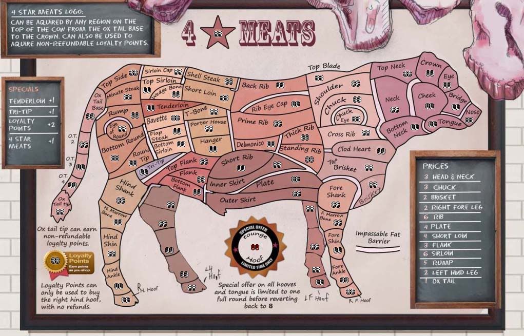
Here is the latest.
Still needs work, but I thought I'd post this now to show people that I am still working on it.
I dropped the meat counter because, to me it was just using up to much space.
I plan to color code the prices to match the bonuses.
Need to label the new legs and put them on the bonus board.
Tenderloin, and Tri-Tip will start as neutral 3's
4 star meat logo will start as a neutral 3
Loyalty points will start as a neutral 6
Any suggestions on changing bonus numbers would be great. My general rule of thumb is that a regions bonus is directly related to the amount of regions you need to hold to protect your bonus area.
Anyway, still working on it.
Best Wishes,
Dana
Still needs work, but I thought I'd post this now to show people that I am still working on it.
I dropped the meat counter because, to me it was just using up to much space.
I plan to color code the prices to match the bonuses.
Need to label the new legs and put them on the bonus board.
Tenderloin, and Tri-Tip will start as neutral 3's
4 star meat logo will start as a neutral 3
Loyalty points will start as a neutral 6
Any suggestions on changing bonus numbers would be great. My general rule of thumb is that a regions bonus is directly related to the amount of regions you need to hold to protect your bonus area.
- Click image to enlarge.
Anyway, still working on it.
Best Wishes,
Dana
-
dana1971
- Posts: 200
- Joined: Wed Aug 25, 2010 7:33 am
- Location: Scotland
Re: 4 Star Meats [March 25th] page 25
![]() by The Bison King on Sun Mar 25, 2012 7:37 am
by The Bison King on Sun Mar 25, 2012 7:37 am
Alright nice update.
I think you need something in the legend that connects the bonus names to their regions. Either a mini-map, or for the chalk to be colored, or for the bonus regions to be labeled in the main map.
I think you need something in the legend that connects the bonus names to their regions. Either a mini-map, or for the chalk to be colored, or for the bonus regions to be labeled in the main map.
-
The Bison King
- Posts: 1957
- Joined: Thu Aug 27, 2009 5:06 pm
- Location: the Mid-Westeros
Re: 4 Star Meats [March 25th] page 25
![]() by koontz1973 on Sun Mar 25, 2012 11:42 pm
by koontz1973 on Sun Mar 25, 2012 11:42 pm
Very nice dana.
Mini map is out. Using coloured chalk would work but not sure how easy it would be to see with the current colours. You could change the colour of the writing on the poster to match or add a coloured glow to the names.
Will have a look at the GP aspects later today.
Mini map is out. Using coloured chalk would work but not sure how easy it would be to see with the current colours. You could change the colour of the writing on the poster to match or add a coloured glow to the names.
Will have a look at the GP aspects later today.
-
koontz1973
- Posts: 6960
- Joined: Thu Jan 01, 2009 10:57 am
Re: 4 Star Meats [March 25th] page 25
![]() by dana1971 on Wed Mar 28, 2012 7:46 am
by dana1971 on Wed Mar 28, 2012 7:46 am
koontz1973 wrote:Very nice dana.
Mini map is out. Using coloured chalk would work but not sure how easy it would be to see with the current colours. You could change the colour of the writing on the poster to match or add a coloured glow to the names.
Will have a look at the GP aspects later today.
Thanks for the feedback,
I was planning to make the chalk colour match the bonus colour, and I agree a lot of the colours are very similar so will be hard to tell them a part.
Here's my problem, I can do a wider range of colours but then the map pallet won't look as nice. So some of my previous versions where there is a wider range of colour.
I've thought about putting an outline of colour that way the colour is used as an accent rather than dominating the body of the cow a bit like the Napoleon map.
I'll try a few things.
look forward to hearing game play comments.
Best Wishes,
Dana
-
dana1971
- Posts: 200
- Joined: Wed Aug 25, 2010 7:33 am
- Location: Scotland
Re: 4 Star Meats [March 25th] page 25
![]() by DoomYoshi on Thu Mar 29, 2012 11:42 pm
by DoomYoshi on Thu Mar 29, 2012 11:42 pm
Is tounge in the special offer area a typo? Or is it just something I don't understand...?
░▒▒▓▓▓▒▒░
-
DoomYoshi
- Posts: 10728
- Joined: Tue Nov 16, 2010 9:30 pm
- Location: Niu York, Ukraine
Re: 4 Star Meats [March 25th] page 25
![]() by dana1971 on Fri Mar 30, 2012 6:40 pm
by dana1971 on Fri Mar 30, 2012 6:40 pm
OOOPs that's a typo. Thanks for spotting it.
-
dana1971
- Posts: 200
- Joined: Wed Aug 25, 2010 7:33 am
- Location: Scotland
Re: 4 Star Meats [March 25th] page 25
![]() by Gillipig on Sat Mar 31, 2012 10:14 am
by Gillipig on Sat Mar 31, 2012 10:14 am
Tenderloin has a little too strong colour compared to it's neighboring bonuses. Could you make it a little less colourful? I first thought it was the in the same bonus as flank.
AoG for President of the World!!
I promise he will put George W. Bush to shame!
I promise he will put George W. Bush to shame!
-
Gillipig
- Posts: 3565
- Joined: Fri Jan 09, 2009 1:24 pm
Re: 4 Star Meats [March 25th] page 25
![]() by koontz1973 on Tue Apr 03, 2012 2:41 am
by koontz1973 on Tue Apr 03, 2012 2:41 am
dana, sorry for the delay in getting back in here, but my son was in hospital.
Game play suggestions for you to consider.
You only have two 3 territ regions, these will be the centre of all games along with the small auto deploys, so who ever take the flank will then grab the tri tip auto. They will then dominate the back very fast. Try to add another 1 or 2 small bonus regions. The tail comes to mind as the easiest.
The four star meats logo (+1auto). This auto can be attacked by 8 regions so will be very hard to grab and hold, so no one will do it. Also, having it attack only one territ, another auto deploy, makes this one completely pointless. You have the space in the black board, so make it say something like - Four Star logo can only be attacked by certain meats. Then put the star from the logo on 5 or 6 territs around the cow. Give it the +1 auto and have it attack the stars again. This makes it far more relevant and allows you to cross the map very quickly.
Sorry, but this makes the loyalty points pointless so take it out. But you can make the special offer territ an auto deploy and not a killer neutral. Still the highish neutral and +1 auto. Bring in the ox tail tip and you again have 6 territs that can attack it and be attacked by it. Tongue, hooves and ox tail tip.
Tri tip / Tenderloin -3 neutral +1 auto
Logo / Special offers - 5 neutral +1 auto
Programme into the xml a 2 neutral on Flank and Brisket. This will stop those two being dropped as a bonus in small games.
You impassables seem OK
When GP is nearly done, we can look at the bonuses as they are very low in places. Hope this helps somewhat.
-
koontz1973
- Posts: 6960
- Joined: Thu Jan 01, 2009 10:57 am
Re: 4 Star Meats [March 25th] page 25
![]() by isaiah40 on Sun Apr 29, 2012 10:46 pm
by isaiah40 on Sun Apr 29, 2012 10:46 pm
[Moved]
It would appear that development of this map has stalled. If the mapmaker wants to continue with the map, then one of the Foundry Moderators will be able to help put the thread back into the Foundry system, after an update has been made.
It would appear that development of this map has stalled. If the mapmaker wants to continue with the map, then one of the Foundry Moderators will be able to help put the thread back into the Foundry system, after an update has been made.
-
isaiah40
- Posts: 3990
- Joined: Mon Aug 27, 2007 7:14 pm


Re: [Vacation - valid until Oct 2012] - 4 Star Meats
![]() by dana1971 on Tue May 01, 2012 5:52 pm
by dana1971 on Tue May 01, 2012 5:52 pm
I do plan to continue, I've just had a lot on at the moment. Hoping to make another pass this weekend if I can get some spare time.
Life keeps getting in my way.
Best Wishes,
Dana
Life keeps getting in my way.
Best Wishes,
Dana
-
dana1971
- Posts: 200
- Joined: Wed Aug 25, 2010 7:33 am
- Location: Scotland
Who is online
Users browsing this forum: No registered users
|
|||||||
| Conquer Club is not associated with RISK online in any way. Copyright © 2006-2025 by Big Wham LLC | |||||||