Japan - 日本 - Quenched
Moderator: Cartographers
Re: Japan - 日本 (D, Gp) V9.6 (Upd 11-14)pg29 Working on Graphics
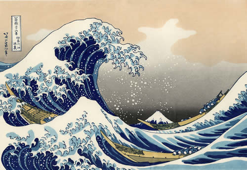
I think you are onto something. Keep in mind some classical Japanese Art (especially woodblocks---perhaps this map can have the feel/theme?)---the colors, the form, the style---etc.
http://cdn1.ioffer.com/img/item/892/822 ... -Fight.jpg
http://www.yachigusaryu.com/blog/pics/p ... adies2.jpg
http://www.cafepress.com/emwfinearts
--Andy
http://cdn1.ioffer.com/img/item/892/822 ... -Fight.jpg
http://www.yachigusaryu.com/blog/pics/p ... adies2.jpg
http://www.cafepress.com/emwfinearts
--Andy
-

 AndyDufresne
- Posts: 24935
- Joined: Fri Mar 03, 2006 8:22 pm
- Location: A Banana Palm in Zihuatanejo


Re: Japan - 日本 (D, Gp) V9.6 (Upd 11-14)pg29 Working on Graphics
Fantastic idea, and some great art on that site referenced. Red, a lot of those old works of art are domain free. I would certainly suggest that you look into it.AndyDufresne wrote:I think you are onto something. Keep in mind some classical Japanese Art (especially woodblocks---perhaps this map can have the feel/theme?)---the colors, the form, the style---etc.
http://cdn1.ioffer.com/img/item/892/822 ... -Fight.jpg
http://www.yachigusaryu.com/blog/pics/p ... adies2.jpg
http://www.cafepress.com/emwfinearts
--Andy

-

 porkenbeans
- Posts: 2546
- Joined: Mon Sep 10, 2007 4:06 pm


Re: Japan - 日本 (D, Gp) V9.6 (Upd 11-14)pg29 Working on Graphics
I love the font. However, it seems some of the letters are darker than others... is it just the font or did you have to mix fonts or something?
But you need to bring some color into this map without going too bright. Or, perhaps you could add a hatching background ala Berlin 1961 style... but with a more Japanese flavor.
The mountains look like an improvement to me, though the green might not fit. I'd say add color to the bonus regions, then decide whether or not to keep the green.
As for the woodblock... I tried something similar in my own attempt at a Japan map which in hindsight, might have been the only cool thing about it. Red, ifyou want to go with something similar, feel free, if not, that's cool.
Sketchblog [Update 07/25/11]: http://indyhelixsketch.blogspot.com/
Living in Japan [Update 07/17/11]: http://mirrorcountryih.blogspot.com/
Russian Revolution map for ConquerClub [07/20/11]: viewtopic.php?f=241&t=116575
Living in Japan [Update 07/17/11]: http://mirrorcountryih.blogspot.com/
Russian Revolution map for ConquerClub [07/20/11]: viewtopic.php?f=241&t=116575
-

 Industrial Helix
- Posts: 3462
- Joined: Mon Jul 14, 2008 6:49 pm
- Location: Ohio


Re: Japan - 日本 (D, Gp) V9.6 (Upd 11-14)pg29 Working on Graphics
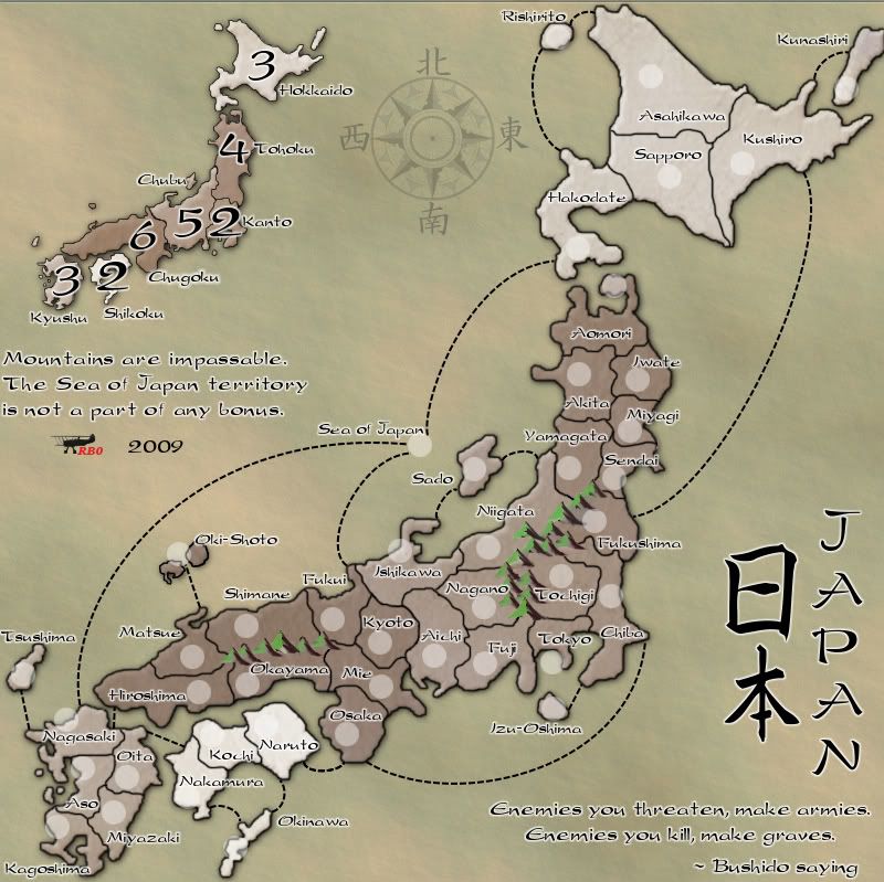
RedBaron0 wrote:
Here's what I've got so far. I know I'm missing a few things still. In particular some sort of color code for the bonuses. I figure I could color the inner edges of the territories, but that might be too much. I could also color along the edge of the the army circles. It is also an option to recolor the land very subtlety. At this point as I think about I've probably drained too much color out of the map and will have to add it back in some way.
I like it. The mountains need to overlay each other a bit more so there are not gaps in between them, but other than that, it is a very nice style for the map.
-

 The Neon Peon
- Posts: 2342
- Joined: Sat Jun 14, 2008 12:49 pm


Re: Japan - 日本 (D, Gp) V9.6 (Upd 11-14)pg29 Working on Graphics
You're going to need some more color to distinguish the bonus areas better. Kanto and Chubu are almost indistinguishable, for example.

-

 natty dread
- Posts: 12877
- Joined: Fri Feb 08, 2008 8:58 pm
- Location: just plain fucked


Re: Japan - 日本 (D, Gp) V9.6 (Upd 11-14)pg29 Working on Graphics
I think that the colors are beautiful. I would suggest leaving the land as is, and just color the text.natty_dread wrote:You're going to need some more color to distinguish the bonus areas better. Kanto and Chubu are almost indistinguishable, for example.

-

 porkenbeans
- Posts: 2546
- Joined: Mon Sep 10, 2007 4:06 pm


Re: Japan - 日本 (D, Gp) V9.6 (Upd 11-14)pg29 Working on Graphics
porkenbeans wrote:I think that the colors are beautiful. I would suggest leaving the land as is, and just color the text.natty_dread wrote:You're going to need some more color to distinguish the bonus areas better. Kanto and Chubu are almost indistinguishable, for example.
Allow me to quote the latest image here on the new page:
RedBaron0 wrote:
Here's what I've got so far. I know I'm missing a few things still. In particular some sort of color code for the bonuses. I figure I could color the inner edges of the territories, but that might be too much. I could also color along the edge of the the army circles. It is also an option to recolor the land very subtlety. At this point as I think about I've probably drained too much color out of the map and will have to add it back in some way.
I tend to agree with natty_dread here, and would further point out that Tohoku and Kanto are quite similar as well, at least when I look at the Fukushima-Chiba border. On the other hand, porkenbeans has a point, in that the nearly monochrome scheme is a nice change from many other maps. But I'm not sure that using coloured text could provide enough distinction without making the text jump off the page. Even if the colours are only a glow behind black text, there are seven zones, and that will pretty much eat up the rainbow, including indigo, which can be a bit of a stretch. Will these colours be clearly different only as a glow? I suppose one could use some white text and some black text, to further distinguish neighbouring regions.
(Man, it's too bad you lost that rising sun/red ball you had on the parchment way back when. It might suit this look very well.)
(Also, I miss the flag, but I have always been a keen vexillologist. Speaking of flags, if you're into them, check out this map I came across on Wikipedia. A clever concept, but a horrendous rendering of my beloved Maple Leaf banner. What the artist has done there is like dropping an actual star map into the canton of Old Glory. These things are stylized for a reason, dude.)
-

 ender516
- Posts: 4455
- Joined: Wed Dec 17, 2008 6:07 pm
- Location: Waterloo, Ontario


Re: Japan - 日本 (D, Gp) V9.6 (Upd 11-14)pg29 Working on Graphics
You're right, it's definitely oversaturated. You should get rid of the bevel and just have an outer glow. Also, for the text, the white stroke isn't necessary. Much better though.
-

 the.killing.44
- Posts: 4724
- Joined: Thu Oct 23, 2008 7:43 pm
- Location: now tell me what got two gums and knows how to spit rhymes


Re: Japan - 日本 (D, Gp) V9.6 (Upd 11-14)pg29 Working on Graphics
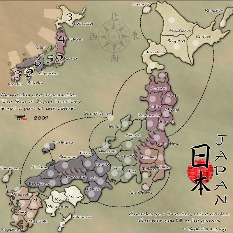
I didn't see 44's comments until too late. I kinda readded the color on a very subtle level. Again I'm just showing progress, adding little bits here and there... I may have come close to rediscovering the parchmenty red circle, its not quite there, but close. Added in a rising sun in the top corner, I'll have to work on that too. Changed the color of the green on the mountains to a brownish color.


-
 RedBaron0
- Posts: 2657
- Joined: Sun Aug 19, 2007 12:59 pm
- Location: Pennsylvania


Re: Japan - 日本 (D, Gp) V9.6 (Upd 11-14)pg29 Working on Graphics
Nice work on the colors.
One nagging detail... could you move Kunashiri to the left so the border doesn't run over?
The red dot looks real good in combination with the black text and glow.
The mountains look good graphically... though the color is somehow off in the mid region of the map. I really have no idea what it is. Maybe try saturating them a tad more or desaturating them slightly.
There's a slight color fudge up on the minimap by Kyushu.
I also like the rising sun, glad it made its return.
Now that you're a mod... can you stamp your own map?
Sketchblog [Update 07/25/11]: http://indyhelixsketch.blogspot.com/
Living in Japan [Update 07/17/11]: http://mirrorcountryih.blogspot.com/
Russian Revolution map for ConquerClub [07/20/11]: viewtopic.php?f=241&t=116575
Living in Japan [Update 07/17/11]: http://mirrorcountryih.blogspot.com/
Russian Revolution map for ConquerClub [07/20/11]: viewtopic.php?f=241&t=116575
-

 Industrial Helix
- Posts: 3462
- Joined: Mon Jul 14, 2008 6:49 pm
- Location: Ohio


Re: Japan - 日本 (D, Gp) V9.6 (Upd 11-14)pg29 Working on Graphics
This is rather picky, but I have an issue with the mountains. White they do look beautiful, the bottom of the mountain is very abrupt. I think a bit of a fade (just use eraser tool with 0 hardness and run it across so that the tip of the circle is barely over the bottom of the mountains).
But really, it's more opinion than anything that needs to be fixed.
But really, it's more opinion than anything that needs to be fixed.
-

 The Neon Peon
- Posts: 2342
- Joined: Sat Jun 14, 2008 12:49 pm


Re: Japan - 日本 (D, Gp) V9.6 (Upd 11-14)pg29 Working on Graphics
The latest version looks great Red...nice colours.
-

 keiths31
- Posts: 2202
- Joined: Fri Jan 26, 2007 6:41 pm
- Location: Thunder Bay, Ontario


Re: Japan - 日本 (D, Gp) V9.6 (Upd 11-14)pg29 Working on Graphics
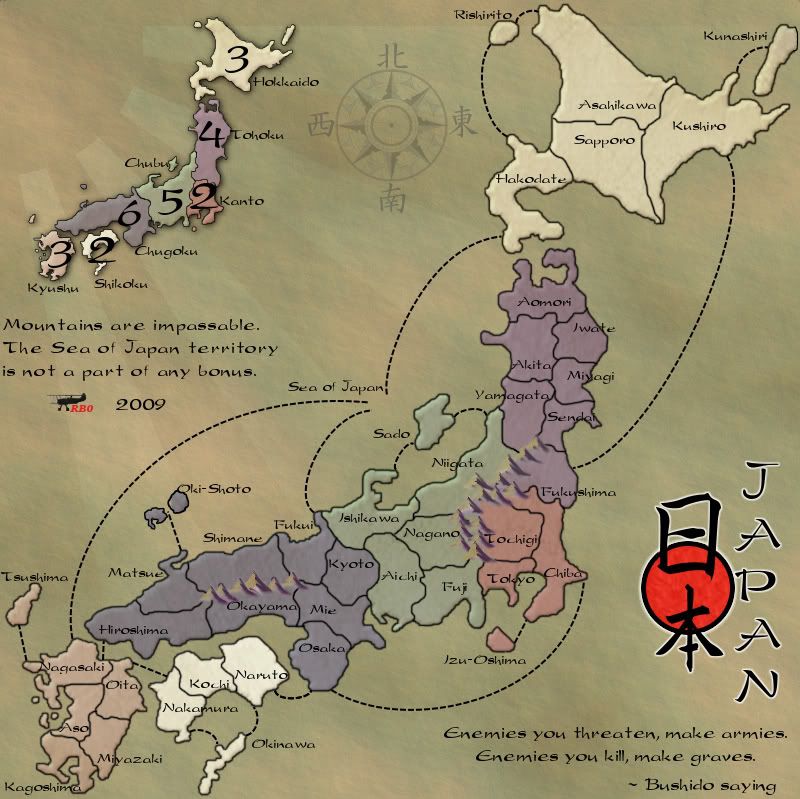
I like the colors, but you should colorblind check Kanto - Tohoka:
It's actually more of a Chubu - Kanto issue, as you can see. Fool around with the saturation levels there.
1. No offense, but I hate the cheesy texture filter on the dot under "Riben." Go for a wavier style, I suggest.
2. There's a little mess-up on the rising sun (which I love), where the red continues past the islands—this also applies to above Hokkaido, which I forgot to mark. Easy fix.
3. Nitpick: there's an odd line on the top of the image. If it's from a layer style (which it probably is), just create a layer at the very top of the psd and use the stamp clone tool to cover it up.
4. You can barely see it, but if you zoom in there is a discrepancy in the continents; a non-saturated overflow of color over the borders is shown.
Add on my older comments (which I know you've seen but here they are for more ease):
I applaud you for reworking the color scheme of the map; I ensure you it's a huge improvement and will be much better expected.
It's actually more of a Chubu - Kanto issue, as you can see. Fool around with the saturation levels there.
1. No offense, but I hate the cheesy texture filter on the dot under "Riben." Go for a wavier style, I suggest.
2. There's a little mess-up on the rising sun (which I love), where the red continues past the islands—this also applies to above Hokkaido, which I forgot to mark. Easy fix.
3. Nitpick: there's an odd line on the top of the image. If it's from a layer style (which it probably is), just create a layer at the very top of the psd and use the stamp clone tool to cover it up.
4. You can barely see it, but if you zoom in there is a discrepancy in the continents; a non-saturated overflow of color over the borders is shown.
Add on my older comments (which I know you've seen but here they are for more ease):
the.killing.44 wrote:You're right, it's definitely oversaturated. You should get rid of the bevel and just have an outer glow. Also, for the text, the white stroke isn't necessary. Much better though.
I applaud you for reworking the color scheme of the map; I ensure you it's a huge improvement and will be much better expected.
-

 the.killing.44
- Posts: 4724
- Joined: Thu Oct 23, 2008 7:43 pm
- Location: now tell me what got two gums and knows how to spit rhymes


Re: Japan - 日本 (D, Gp) V9.6 (Upd 11-14)pg29 Working on Graphics
Thanks guys I'll probably let this stew for a day or so more let a few more folks see it and comment as well. I think part of my problem early on was wanting to rush through and at the first suggestion I rework the image and post another update and so on and so on... Not that I don't totally agree with what has already been suggested, I just want to make sure there isn't anything else that even you guys possibly have missed.
I actually did the rising sun beam past the island on purpose... at first the beam went all the way across the map.(that might be why there's a line at the top of the map too ) I looked at as, hey the beams of sunlight can be a part of the map! Then hey... these look stupid.
  Then I was indecisive to where exactly to end the beams, especially by Kyushu since there is a larger gap there. Probably will us the top of the "K" as an ending point.
I can probably rectified the color blind issue be lightening up Kanto (reddish to more of a pink) and darkening Tohoku(fuchsia to more of a straight purple), at least so the color blind filter can distinguish the regional difference.
Maybe for the red circle I use something similar to aforementioned Okami. Simple red circle with a black ring with the glow around it, perhaps? Then I can fiddle with the red in the circle itself, grungy, blend, blur, something along those lines.
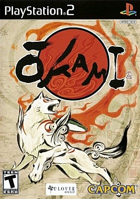
I actually did the rising sun beam past the island on purpose... at first the beam went all the way across the map.(that might be why there's a line at the top of the map too
I can probably rectified the color blind issue be lightening up Kanto (reddish to more of a pink) and darkening Tohoku(fuchsia to more of a straight purple), at least so the color blind filter can distinguish the regional difference.
Maybe for the red circle I use something similar to aforementioned Okami. Simple red circle with a black ring with the glow around it, perhaps? Then I can fiddle with the red in the circle itself, grungy, blend, blur, something along those lines.


-

 RedBaron0
- Posts: 2657
- Joined: Sun Aug 19, 2007 12:59 pm
- Location: Pennsylvania


Re: Japan - 日本 (D, Gp) V9.6 (Upd 11-14)pg29 Working on Graphics
This is a real nitpick... but now that the map looks old, your signature with that biplane really doesn't fit in at all... Could you possibly consider using just your name as a signature?

-

 natty dread
- Posts: 12877
- Joined: Fri Feb 08, 2008 8:58 pm
- Location: just plain fucked


Re: Japan - 日本 (D, Gp) V9.6 (Upd 11-14)pg29 Working on Graphics
natty_dread wrote:This is a real nitpick... but now that the map looks old, your signature with that biplane really doesn't fit in at all... Could you possibly consider using just your name as a signature?
Nah, there's a precedent of signatures just being uniform across all maps made by a maker. See oaktown: his Marcella script sig is on all his maps, from 1800's India to 1914 Europe to 1961 Berlin, etc. I love it, and think he should keep it.
-

 the.killing.44
- Posts: 4724
- Joined: Thu Oct 23, 2008 7:43 pm
- Location: now tell me what got two gums and knows how to spit rhymes


Re: Japan - 日本 (D, Gp) V9.6 (Upd 11-14)pg29 Working on Graphics
Going on Killing's suggestions about the extended sun rays... you could possibly extend them to the opposite corners and make a border out of it.
Sketchblog [Update 07/25/11]: http://indyhelixsketch.blogspot.com/
Living in Japan [Update 07/17/11]: http://mirrorcountryih.blogspot.com/
Russian Revolution map for ConquerClub [07/20/11]: viewtopic.php?f=241&t=116575
Living in Japan [Update 07/17/11]: http://mirrorcountryih.blogspot.com/
Russian Revolution map for ConquerClub [07/20/11]: viewtopic.php?f=241&t=116575
-

 Industrial Helix
- Posts: 3462
- Joined: Mon Jul 14, 2008 6:49 pm
- Location: Ohio


Re: Japan - 日本 (D, Gp) V9.6 (Upd 11-14)pg29 Working on Graphics
the.killing.44 wrote:natty_dread wrote:This is a real nitpick... but now that the map looks old, your signature with that biplane really doesn't fit in at all... Could you possibly consider using just your name as a signature?
Nah, there's a precedent of signatures just being uniform across all maps made by a maker. See oaktown: his Marcella script sig is on all his maps, from 1800's India to 1914 Europe to 1961 Berlin, etc. I love it, and think he should keep it.
Well, I guess it's fine then... It's a matter of personal preference, but I like the maps where even the signature is consistent with the theme of the map.
On another note... didn't the Red Baron fly a triplane (namely, Fokker Dr.I)?

-

 natty dread
- Posts: 12877
- Joined: Fri Feb 08, 2008 8:58 pm
- Location: just plain fucked


Re: Japan - 日本 (D, Gp) V9.6 (Upd 11-14)pg29 Working on Graphics
natty_dread wrote:On another note... didn't the Red Baron fly a triplane (namely, Fokker Dr.I)?
Yeah I know, I couldn't find a silhouette of a triplane I liked, so I just went with this. Manfred von Richthofen is best known for flying the Fokker Dr1, but did fly other planes during his career.
Industrial Helix wrote:Going on Killing's suggestions about the extended sun rays... you could possibly extend them to the opposite corners and make a border out of it.
I tried that, it looked horrid. That's why there's still a some extending past the mini-map, I wasn't sure where to erase the extensions too.


-

 RedBaron0
- Posts: 2657
- Joined: Sun Aug 19, 2007 12:59 pm
- Location: Pennsylvania


Re: Japan - 日本 (D, Gp) V9.6 (Upd 11-14)pg29 Working on Graphics
RedBaron0 wrote:[Industrial Helix wrote:Going on Killing's suggestions about the extended sun rays... you could possibly extend them to the opposite corners and make a border out of it.
I tried that, it looked horrid. That's why there's still a some extending past the mini-map, I wasn't sure where to erase the extensions too.
Hmm. Maybe you could fade it into the main canvas color then... I kind of think you can do it by progressively desaturating it as it passes the mini map.
Sketchblog [Update 07/25/11]: http://indyhelixsketch.blogspot.com/
Living in Japan [Update 07/17/11]: http://mirrorcountryih.blogspot.com/
Russian Revolution map for ConquerClub [07/20/11]: viewtopic.php?f=241&t=116575
Living in Japan [Update 07/17/11]: http://mirrorcountryih.blogspot.com/
Russian Revolution map for ConquerClub [07/20/11]: viewtopic.php?f=241&t=116575
-

 Industrial Helix
- Posts: 3462
- Joined: Mon Jul 14, 2008 6:49 pm
- Location: Ohio


Re: Japan - 日本 (D, Gp) V9.6 (Upd 11-14)pg29 Working on Graphics
Industrial Helix wrote:RedBaron0 wrote:[Industrial Helix wrote:Going on Killing's suggestions about the extended sun rays... you could possibly extend them to the opposite corners and make a border out of it.
I tried that, it looked horrid. That's why there's still a some extending past the mini-map, I wasn't sure where to erase the extensions too.
Hmm. Maybe you could fade it into the main canvas color then... I kind of think you can do it by progressively desaturating it as it passes the mini map.
Gradient mask on the layer. Go for it.
-

 the.killing.44
- Posts: 4724
- Joined: Thu Oct 23, 2008 7:43 pm
- Location: now tell me what got two gums and knows how to spit rhymes


Re: Japan - 日本 (D, Gp) V9.6 (Upd 11-14)pg29 Working on Graphics
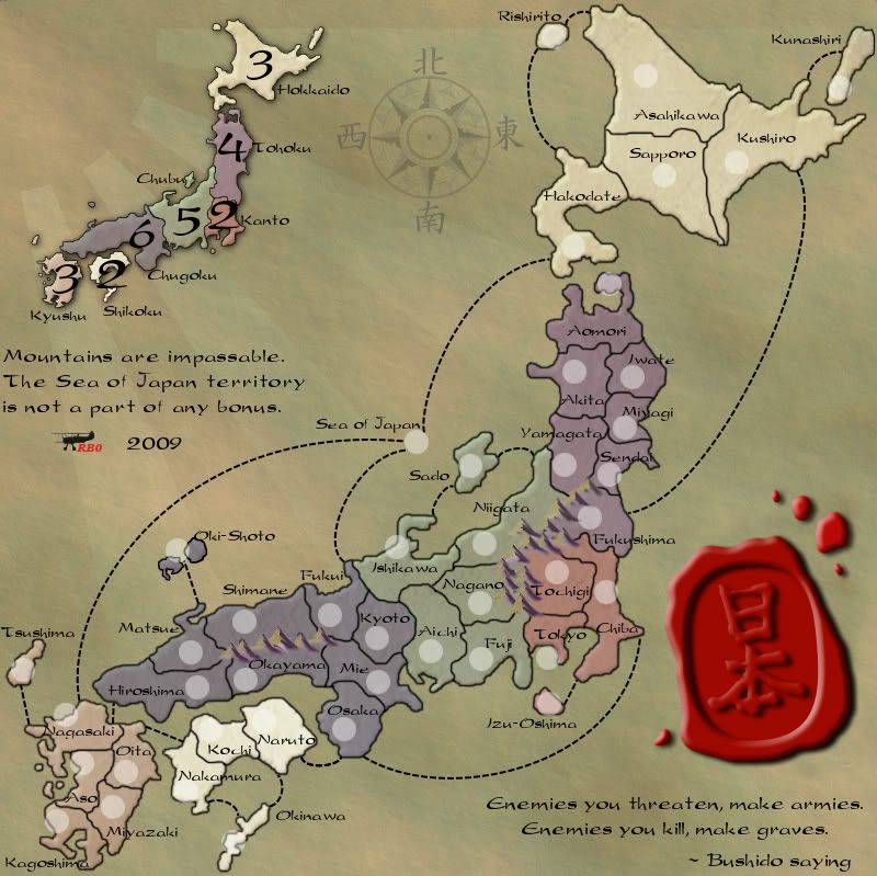
Alright with a bit of time today I've probably addressed all the concerns brought forth. There is still a little more to do. When I checked with vischeck I think I'll have to change the green color of Chubu to be lighter, it's blending with with Kanto for those with color blindness. I might just switch the color with Kyushu or Hokkaido. I show 2 versions with and without army circles, I'm figuring to move to a map without the circles, but the circles show where the values will go. I can get my XML up to speed and do a check to be sure the numbers look good on top of the image.
And I just noticed I erased a chunk of blue from the island in Oki-shoto... I'll get it.


-

 RedBaron0
- Posts: 2657
- Joined: Sun Aug 19, 2007 12:59 pm
- Location: Pennsylvania


Re: Japan - 日本 (D, Gp) V9.6 (Upd 11-14)pg29 Working on Graphics
Ooooh..... this feels a lot better.....
One thought I had about the title, was that you could use a red wax seal in place of the red circle, and have the Japanese symbols embossed on it (although it may look overworked)... Here's some examples for inspiration:

One thought I had about the title, was that you could use a red wax seal in place of the red circle, and have the Japanese symbols embossed on it (although it may look overworked)... Here's some examples for inspiration:


PB: 2661 | He's blue... If he were green he would die | No mod would be stupid enough to do that
-

 MrBenn
- Posts: 6880
- Joined: Wed Nov 21, 2007 9:32 am
- Location: Off Duty


Re: Japan - 日本 (D, Gp) V9.6 (Upd 11-14)pg29 Working on Graphics
Yes, yes, yes! This is waaaaaayyy better!! 

Can we please get this Gr'd. I'd do it but I think Mr.Benn wouldn't like it too much!
Can we please get this Gr'd. I'd do it but I think Mr.Benn wouldn't like it too much!
-
 isaiah40
- Posts: 3990
- Joined: Mon Aug 27, 2007 7:14 pm


Re: Japan - 日本 (D, Gp) V9.6 (Upd 11-14)pg29 Working on Graphics
I'm actually feeling a littel bit excited by the map now - previously it was a bit "meh"....
You've actually inspired me to waste a bit of time doing something
I took this image, and used it to make this:
http://www.fileden.com/files/2009/1/9/2259283/Japan_seal.psd
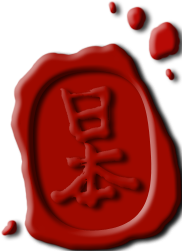
For some reason the cropping on it is a bit off ...
...
It could be a bit darker, but it looks alright I suppose?
You've actually inspired me to waste a bit of time doing something
I took this image, and used it to make this:
http://www.fileden.com/files/2009/1/9/2259283/Japan_seal.psd

For some reason the cropping on it is a bit off
 ...
...It could be a bit darker, but it looks alright I suppose?


PB: 2661 | He's blue... If he were green he would die | No mod would be stupid enough to do that
-

 MrBenn
- Posts: 6880
- Joined: Wed Nov 21, 2007 9:32 am
- Location: Off Duty


Who is online
Users browsing this forum: No registered users

