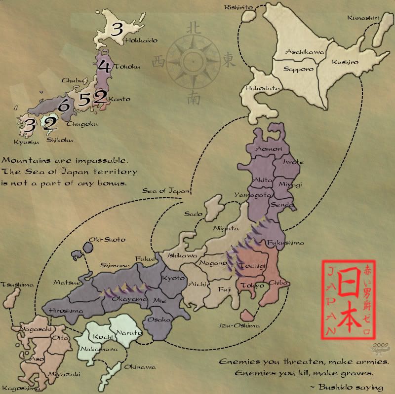
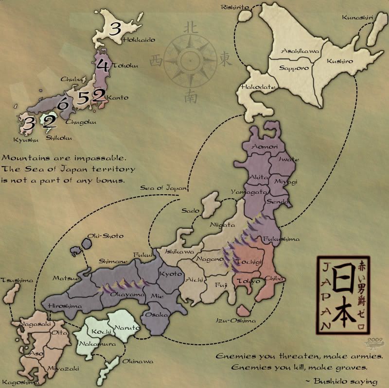
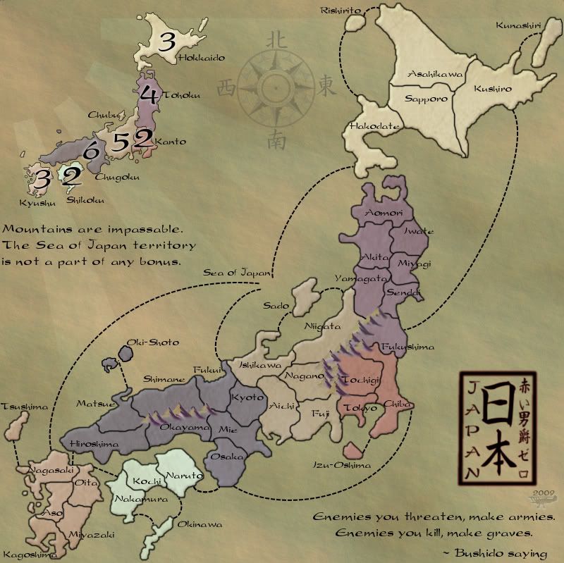
Congratulations, you've taken this map to a whole new level, much more like Japan, oriental style of olden days on scroll parchment.
i like MrBenn's offering of the seal, but think it is way too bright and could be given some "ancient" treatment ti style if in line with the map.
Very nice work indeed.
Two small things....
1. the black bonus 2 on Skikohu get losts...perhaps those numbers could have a slightly different tinge to them
2. your signature....with the 2009....seems out of place in consistent with the map design. Perhaps top left placement, with transparent treatment of say 50% and reduce the size of the 2009 to that of your signature....i think you'll understand what i mean....make it like a watermark perhaps.