Go here. Style and common coloring of ink stamps.
http://www.thejapaneseconnection.com/digital_hanko.htm
Japan - 日本 - Quenched
Moderator: Cartographers
Re: Japan - 日本 (D, Gp) V9.6 (Upd 11-14)pg29 Working on Graphics
![]() by jefjef on Fri Nov 27, 2009 10:02 am
by jefjef on Fri Nov 27, 2009 10:02 am
This post was made by jefjef who should be on your ignore list.

drunkmonkey wrote:I'm filing a C&A report right now. Its nice because they have a drop-down for "jefjef".
-

 jefjef
- Posts: 6026
- Joined: Mon Feb 23, 2009 8:41 pm
- Location: on my ass


Re: Japan - 日本 (D, Gp) V9.6 (Upd 11-14)pg29 Working on Graphics
![]() by isaiah40 on Fri Nov 27, 2009 10:47 am
by isaiah40 on Fri Nov 27, 2009 10:47 am
Without the drop shadow. I agree with Mr.Benn, make the stamp have little pits, chunks (small ones), not entirely perfectly stamped, like a rubber stamp.
-
isaiah40
- Posts: 3990
- Joined: Mon Aug 27, 2007 7:14 pm


Re: Japan - 日本 (D, Gp) V9.6 (Upd 11-14)pg29 Working on Graphics
![]() by RedBaron0 on Fri Nov 27, 2009 4:21 pm
by RedBaron0 on Fri Nov 27, 2009 4:21 pm
- Click image to enlarge.
I think I got the stamp now, what do you guys think?
I'll get something out by the Sea of Japan, I've got an junk I was using before that I can likely use in some way, at worst I can put an army circle out there if nothing can be found or agreed on.


-

RedBaron0
- Posts: 2657
- Joined: Sun Aug 19, 2007 12:59 pm
- Location: Pennsylvania


Re: Japan - 日本 (D, Gp) V9.6 (Upd 11-14)pg29 Working on Graphics
![]() by isaiah40 on Fri Nov 27, 2009 4:26 pm
by isaiah40 on Fri Nov 27, 2009 4:26 pm
Can you make the 2 symbols inside the stamp area more like the border of the stamp? It seems to stand out to much, as the border of the stamp looks like a rubber stamp.
-
isaiah40
- Posts: 3990
- Joined: Mon Aug 27, 2007 7:14 pm
Re: Japan - 日本 (D, Gp) V9.6 (Upd 11-14)pg29 Working on Graphics
![]() by RedBaron0 on Fri Nov 27, 2009 4:30 pm
by RedBaron0 on Fri Nov 27, 2009 4:30 pm
You mean put the 日本 off to the left say, smaller, with a larger "Japan" in the the center?
-
RedBaron0
- Posts: 2657
- Joined: Sun Aug 19, 2007 12:59 pm
- Location: Pennsylvania
Re: Japan - 日本 (D, Gp) V9.6 (Upd 11-14)pg29 Working on Graphics
![]() by the.killing.44 on Fri Nov 27, 2009 4:31 pm
by the.killing.44 on Fri Nov 27, 2009 4:31 pm
Still not a fan of the bevel or the lines—I think you should make them more brush-painted on. The bevel is off with the parchment feel, IMO.
For the title area, it's too "perfect." Take a natural brush at ~20px; Spacing: 50%; Scattering: scatter ~150%, count 2, count jitter 100%; Other Dynamics: opacity jitter 50% control off, flow jitter 57% control pen pressure. Duplicate all the layers in the title/sig block, merge them, and hide the originals. Then, on your merged layer, make a vector mask, select all and delete (so it's clear), and draw all around the area, making it look older and faded.
Hopefully that makes sense and looks good.
-

the.killing.44
- Posts: 4724
- Joined: Thu Oct 23, 2008 7:43 pm
- Location: now tell me what got two gums and knows how to spit rhymes


Re: Japan - 日本 (D, Gp) V9.6 (Upd 11-14)pg29 Working on Graphics
![]() by porkenbeans on Fri Nov 27, 2009 5:02 pm
by porkenbeans on Fri Nov 27, 2009 5:02 pm
44 is right. if you want to make this look just like an authentic old map, you need to loose all the bevel and shadow, so as to make it look as though it is painted on, without any illusion of relief.
But, if you just want to use the feel of an old map, and make a game, I think that it is perfectly OK to go ahead and use bevel and shadow. Aesthetically this looks very nice. And it does go towards the effect of bringing in a little 3-D. Personally I like the 3-D. It adds more interest. It does however detract from it looking like a painted on. old map. I would be happy with either way that you choose to go, as this is a very, very, beautiful work of art.
But, if you just want to use the feel of an old map, and make a game, I think that it is perfectly OK to go ahead and use bevel and shadow. Aesthetically this looks very nice. And it does go towards the effect of bringing in a little 3-D. Personally I like the 3-D. It adds more interest. It does however detract from it looking like a painted on. old map. I would be happy with either way that you choose to go, as this is a very, very, beautiful work of art.

-

porkenbeans
- Posts: 2546
- Joined: Mon Sep 10, 2007 4:06 pm


Re: Japan - 日本 (D, Gp) V9.6 (Upd 11-14)pg29 Working on Graphics
![]() by jefjef on Fri Nov 27, 2009 5:28 pm
by jefjef on Fri Nov 27, 2009 5:28 pm
Like the title/stamp. Like the sig.
Think the main map needs to look painted on. After all the mountains sure look painted.
The mini bonus map. I think looks great and works with the shadow as it is.
Nice one RB0
Think the main map needs to look painted on. After all the mountains sure look painted.
The mini bonus map. I think looks great and works with the shadow as it is.
Nice one RB0
This post was made by jefjef who should be on your ignore list.
drunkmonkey wrote:I'm filing a C&A report right now. Its nice because they have a drop-down for "jefjef".
-
jefjef
- Posts: 6026
- Joined: Mon Feb 23, 2009 8:41 pm
- Location: on my ass
Re: Japan - 日本 (D, Gp) V9.6 (Upd 11-14)pg29 Working on Graphics
![]() by ender516 on Fri Nov 27, 2009 7:39 pm
by ender516 on Fri Nov 27, 2009 7:39 pm
isaiah40 wrote:Can you make the 2 symbols inside the stamp area more like the border of the stamp? It seems to stand out to much, as the border of the stamp looks like a rubber stamp.
RedBaron0 wrote:You mean put the 日本 off to the left say, smaller, with a larger "Japan" in the the center?
If isaiah40 is saying what I think he is, the two large symbols (日本?, I can't tell, I don't have the Japanese fonts on this machine) are too solid, compared to the border of the stamp, which is a little less opaque, a little more diffuse.
-

ender516
- Posts: 4455
- Joined: Wed Dec 17, 2008 6:07 pm
- Location: Waterloo, Ontario


Re: Japan - 日本 (D, Gp) V9.6 (Upd 11-14)pg29 Working on Graphics
![]() by isaiah40 on Fri Nov 27, 2009 9:53 pm
by isaiah40 on Fri Nov 27, 2009 9:53 pm
ender516 wrote:isaiah40 wrote:Can you make the 2 symbols inside the stamp area more like the border of the stamp? It seems to stand out to much, as the border of the stamp looks like a rubber stamp.RedBaron0 wrote:You mean put the 日本 off to the left say, smaller, with a larger "Japan" in the the center?
If isaiah40 is saying what I think he is, the two large symbols (日本?, I can't tell, I don't have the Japanese fonts on this machine) are too solid, compared to the border of the stamp, which is a little less opaque, a little more diffuse.
Yes, thank you ender! That's what I meant. SO sorry I didn't make sure it was described clear enough
-
isaiah40
- Posts: 3990
- Joined: Mon Aug 27, 2007 7:14 pm
Re: Japan - 日本 (D, Gp) V9.6 (Upd 11-14)pg29 Working on Graphics
![]() by RedBaron0 on Sat Nov 28, 2009 4:02 am
by RedBaron0 on Sat Nov 28, 2009 4:02 am
the.killing.44 wrote:Still not a fan of the bevel or the lines—I think you should make them more brush-painted on. The bevel is off with the parchment feel, IMO.
Bevel is out, drop shadow is out. That's easy to fix. Just to be sure, the dashed sea connections you mean for "the lines" or is it the borders you mean?
the.killing.44 wrote:For the title area, it's too "perfect." Take a natural brush at ~20px; Spacing: 50%; Scattering: scatter ~150%, count 2, count jitter 100%; Other Dynamics: opacity jitter 50% control off, flow jitter 57% control pen pressure. Duplicate all the layers in the title/sig block, merge them, and hide the originals. Then, on your merged layer, make a vector mask, select all and delete (so it's clear), and draw all around the area, making it look older and faded.
Hopefully that makes sense and looks good.
I think I get it... (checks translator) Yeah I kinda do, Photoshop? I'll see what I can do. GIMP I'm using remember.
-
RedBaron0
- Posts: 2657
- Joined: Sun Aug 19, 2007 12:59 pm
- Location: Pennsylvania
Re: Japan - 日本 (D, Gp) V9.6 (Upd 11-14)pg29 Working on Graphics
![]() by the.killing.44 on Sat Nov 28, 2009 11:48 am
by the.killing.44 on Sat Nov 28, 2009 11:48 am
RedBaron0 wrote:the.killing.44 wrote:Still not a fan of the bevel or the lines—I think you should make them more brush-painted on. The bevel is off with the parchment feel, IMO.
Bevel is out, drop shadow is out. That's easy to fix. Just to be sure, the dashed sea connections you mean for "the lines" or is it the borders you mean?the.killing.44 wrote:For the title area, it's too "perfect." Take a natural brush at ~20px; Spacing: 50%; Scattering: scatter ~150%, count 2, count jitter 100%; Other Dynamics: opacity jitter 50% control off, flow jitter 57% control pen pressure. Duplicate all the layers in the title/sig block, merge them, and hide the originals. Then, on your merged layer, make a vector mask, select all and delete (so it's clear), and draw all around the area, making it look older and faded.
Hopefully that makes sense and looks good.
I think I get it... (checks translator) Yeah I kinda do, Photoshop? I'll see what I can do. GIMP I'm using remember.
Grr, damn GIMP. Does it have layer masks? That's the most important thing
-
the.killing.44
- Posts: 4724
- Joined: Thu Oct 23, 2008 7:43 pm
- Location: now tell me what got two gums and knows how to spit rhymes
Re: Japan - 日本 (D, Gp) V9.6 (Upd 11-14)pg29 Working on Graphics
![]() by captainwalrus on Sat Nov 28, 2009 11:53 am
by captainwalrus on Sat Nov 28, 2009 11:53 am
woah, I haven't stopped in here in a while, but it is really comming along nicely. 
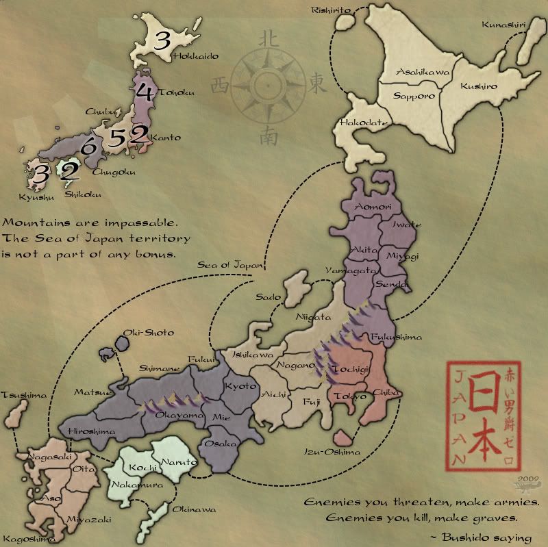
I find it odd that some of the short connections are straight, like Nakamura to Otia, but some are curved, like Nakamura to okinawa. I think that either one would be fine as long as it is consistant.
I find it odd that some of the short connections are straight, like Nakamura to Otia, but some are curved, like Nakamura to okinawa. I think that either one would be fine as long as it is consistant.
~ CaptainWalrus
-

captainwalrus
- Posts: 1018
- Joined: Sun Nov 11, 2007 3:19 pm
- Location: Finnmark


Re: Japan - 日本 (D, Gp) V9.6 (Upd 11-14)pg29 Working on Graphics
![]() by lt_oddball on Sat Nov 28, 2009 7:26 pm
by lt_oddball on Sat Nov 28, 2009 7:26 pm
dude ..wdf? 
I thought the colorful map with flag was ready to be launched ??? ..and now you revert to a bland map ?
Whatever happened to the "beware of/for colourblind people" criterium ?
I can imagine that you think of shogun times to implement in the map..but..you throw months of work away...
Who talked you into this change ??

You're like my brother , always after "perfection" , planning and changing things all the time but never finishing the product to release.
I thought the colorful map with flag was ready to be launched ??? ..and now you revert to a bland map ?
Whatever happened to the "beware of/for colourblind people" criterium ?
I can imagine that you think of shogun times to implement in the map..but..you throw months of work away...
Who talked you into this change ??
You're like my brother , always after "perfection" , planning and changing things all the time but never finishing the product to release.
Barbarus hic ego sum, quia non intellegor ulli.
-

lt_oddball
- Posts: 364
- Joined: Mon Mar 05, 2007 11:17 am
- Location: Fortress Europe
Re: Japan - 日本 (D, Gp) V9.6 (Upd 11-14)pg29 Working on Graphics
![]() by ender516 on Sun Nov 29, 2009 1:22 am
by ender516 on Sun Nov 29, 2009 1:22 am
lt_oddball wrote:dude ..wdf?
I thought the colorful map with flag was ready to be launched ??? ..and now you revert to a bland map ?
Whatever happened to the "beware of/for colourblind people" criterium ?
I can imagine that you think of shogun times to implement in the map..but..you throw months of work away...
Who talked you into this change ??
You're like my brother , always after "perfection" , planning and changing things all the time but never finishing the product to release.
I have been watching this map right through, and there were a number of comments about the map not quite capturing the Japanese feel, so rather than let the map stall, RedBaron0 gave it a fresh start. I too thought it was a shame to flush all that work for a reason like that when so many Japanese elements had been eliminated due to other objections, but I admire the Baron's ability to persevere.
-
ender516
- Posts: 4455
- Joined: Wed Dec 17, 2008 6:07 pm
- Location: Waterloo, Ontario
Re: Japan - 日本 (D, Gp) V9.6 (Upd 11-14)pg29 Working on Graphics
![]() by Raskholnikov on Sun Nov 29, 2009 2:50 am
by Raskholnikov on Sun Nov 29, 2009 2:50 am
I actually love this map. I think it is a really striking re-creation of modern Japan by means of a traditional artistic style. The deliberate understatement of color and contrast enhances the effect. Congrats for not giving up and taking this into a different direction, which ended up far better than the original attempt.
-

Raskholnikov
- Posts: 638
- Joined: Fri Sep 11, 2009 3:40 pm


Re: Japan - 日本 (D, Gp) V9.6 (Upd 11-14)pg29 Working on Graphics
![]() by ender516 on Sun Nov 29, 2009 3:11 am
by ender516 on Sun Nov 29, 2009 3:11 am
I find it interesting how this map is praised for depicting modern geographical divisions with an old style, while 150 A.H. is panned for depicting ancient localities with a modern look.
-
ender516
- Posts: 4455
- Joined: Wed Dec 17, 2008 6:07 pm
- Location: Waterloo, Ontario
Re: Japan - 日本 (D, Gp) V9.6 (Upd 11-14)pg29 Working on Graphics
![]() by Raskholnikov on Sun Nov 29, 2009 5:17 am
by Raskholnikov on Sun Nov 29, 2009 5:17 am
Hahaha... good point well made!! I think the Foundry views "theme" as a function of looking back to a historical "tradition". A Japan map based on robots, neon lights and electronics would probably receive little support.
That does not detract from the beauty of this map: a traditional re-presentation of modern Japan.
Why a modern re-presentation of the dynastic dynamics of Greater Mediterranean around 772 AD seems to generate resistance is, as you say, ironic. Probably because it does not meet our deeply internalised views about what a "Greater Middle-East-at-the-time-of-Islamic-Expansion" should look like. But this is a discussion for another thread. I still love this map!
-
Raskholnikov
- Posts: 638
- Joined: Fri Sep 11, 2009 3:40 pm
Re: Japan - 日本 (D, Gp) V9.6 (Upd 11-14)pg29 Working on Graphics
![]() by Evil DIMwit on Sun Nov 29, 2009 8:29 pm
by Evil DIMwit on Sun Nov 29, 2009 8:29 pm
Raskholnikov wrote:Hahaha... good point well made!! I think the Foundry views "theme" as a function of looking back to a historical "tradition". A Japan map based on robots, neon lights and electronics would probably receive little support.
That actually sounds kinda sweet, if it's done well. Too late for this map, though.


-

Evil DIMwit
- Posts: 1616
- Joined: Thu Mar 22, 2007 1:47 pm
- Location: Philadelphia, NJ


Re: Japan - 日本 (D, Gp) V9.6 (Upd 11-14)pg29 Working on Graphics
![]() by RedBaron0 on Mon Nov 30, 2009 4:14 am
by RedBaron0 on Mon Nov 30, 2009 4:14 am
the.killing.44 wrote:Grr, damn GIMP. Does it have layer masks? That's the most important thing
I've got some options and GIMP does have layer masks. You didn't answer my question about the lines though:
the.killing.44 wrote:Still not a fan of the bevel or the lines—I think you should make them more brush-painted on. The bevel is off with the parchment feel, IMO.RedBaron0 wrote:Bevel is out, drop shadow is out. That's easy to fix. Just to be sure, the dashed sea connections you mean for "the lines" or is it the borders you mean?
I just want to be sure.

Robots from Japan kick a$$!
I flow where the winds take me... and this where we're are. The map is essentially the same, but with with a more well defined theme as an older map than as a newer one. I did check the color blindness filters and it passes after some changes in the colors. Before the green color of Chubu merged with the red of Kanto now there's a clear differentiation.
-
RedBaron0
- Posts: 2657
- Joined: Sun Aug 19, 2007 12:59 pm
- Location: Pennsylvania
Re: Japan - 日本 (D, Gp) V9.6 (Upd 11-14)pg29 Working on Graphics
![]() by AndyDufresne on Mon Nov 30, 2009 11:20 am
by AndyDufresne on Mon Nov 30, 2009 11:20 am
Evil DIMwit wrote:Raskholnikov wrote:Hahaha... good point well made!! I think the Foundry views "theme" as a function of looking back to a historical "tradition". A Japan map based on robots, neon lights and electronics would probably receive little support.
That actually sounds kinda sweet, if it's done well. Too late for this map, though.
Agreed. Someone get on that.
Good work thus far, Redbaron.
--Andy
-

AndyDufresne
- Posts: 24935
- Joined: Fri Mar 03, 2006 8:22 pm
- Location: A Banana Palm in Zihuatanejo

Re: Japan - 日本 (D, Gp) V9.6 (Upd 11-14)pg29 Working on Graphics
![]() by jefjef on Mon Nov 30, 2009 11:42 am
by jefjef on Mon Nov 30, 2009 11:42 am
Hey RB0. Seeing how lower right has plenty of activity I wonder how your sig (plane) would look in the center of the sun. (That big empty corner)
This post was made by jefjef who should be on your ignore list.
drunkmonkey wrote:I'm filing a C&A report right now. Its nice because they have a drop-down for "jefjef".
-
jefjef
- Posts: 6026
- Joined: Mon Feb 23, 2009 8:41 pm
- Location: on my ass
Re: Japan - 日本 (D, Gp) V9.6 (Upd 11-14)pg29 Working on Graphics
![]() by RedBaron0 on Mon Nov 30, 2009 1:04 pm
by RedBaron0 on Mon Nov 30, 2009 1:04 pm
Well.... the corner isn't empty, it has the sun in it. I think it'll make the symbol of the "Rising Sun" (for lack of a better term) different, and not what it's intended to be.
-
RedBaron0
- Posts: 2657
- Joined: Sun Aug 19, 2007 12:59 pm
- Location: Pennsylvania
Re: Japan - 日本 (D, Gp) V9.6 (Upd 11-14)pg29 Working on Graphics
![]() by the.killing.44 on Mon Nov 30, 2009 5:35 pm
by the.killing.44 on Mon Nov 30, 2009 5:35 pm
Sea line connectors 
-
the.killing.44
- Posts: 4724
- Joined: Thu Oct 23, 2008 7:43 pm
- Location: now tell me what got two gums and knows how to spit rhymes
Re: Japan - 日本 (D, Gp) V9.6 (Upd 11-14)pg29 Working on Graphics
![]() by MrBenn on Mon Nov 30, 2009 6:28 pm
by MrBenn on Mon Nov 30, 2009 6:28 pm
Bumping the image to the latest page:
Technically it's a "falling sun" (as the lines come down instead of up), but I think we can let it pass...
I think the sun is a really nice touch - I love the subtlety of it - the fact it is barely there makes it a treat for the eyes when they finally notice it
The stamp-title looks pretty darn good - although I think it would be even better if the outer border was less blurry, and perhaps a little heavier (similar to the weight of the heavy stroke of the Japanese Symbols)
RedBaron0 wrote:Well.... the corner isn't empty, it has the sun in it. I think it'll make the symbol of the "Rising Sun" (for lack of a better term) different, and not what it's intended to be.
Technically it's a "falling sun" (as the lines come down instead of up), but I think we can let it pass...
I think the sun is a really nice touch - I love the subtlety of it - the fact it is barely there makes it a treat for the eyes when they finally notice it
The stamp-title looks pretty darn good - although I think it would be even better if the outer border was less blurry, and perhaps a little heavier (similar to the weight of the heavy stroke of the Japanese Symbols)

PB: 2661 | He's blue... If he were green he would die | No mod would be stupid enough to do that
-

MrBenn
- Posts: 6880
- Joined: Wed Nov 21, 2007 9:32 am
- Location: Off Duty


Who is online
Users browsing this forum: No registered users
|
|||||||
| Conquer Club is not associated with RISK online in any way. Copyright © 2006-2025 by Big Wham LLC | |||||||