Hi RED.
Like your boshido better enemies you "kill" make graves.
Think you need to have a less faded stamp.
Japan - 日本 - Quenched
Moderator: Cartographers
Re: Japan - 日本 (D, Gp) V11.2 (Upd 12-6)pg38 Working on Graphics
![]() by jefjef on Fri Dec 11, 2009 2:23 am
by jefjef on Fri Dec 11, 2009 2:23 am
This post was made by jefjef who should be on your ignore list.

drunkmonkey wrote:I'm filing a C&A report right now. Its nice because they have a drop-down for "jefjef".
-

 jefjef
- Posts: 6026
- Joined: Mon Feb 23, 2009 8:41 pm
- Location: on my ass


Re: Japan - 日本 (D, Gp) V11.2 (Upd 12-6)pg38 Working on Graphics
![]() by natty dread on Fri Dec 11, 2009 5:13 am
by natty dread on Fri Dec 11, 2009 5:13 am
Choose the font that was on chubu... at least everyone seems to like it.
And I like the Bushido saying better with "bury". It's fitting... what else would buried enemies make but graves?
And I like the Bushido saying better with "bury". It's fitting... what else would buried enemies make but graves?

-

natty dread
- Posts: 12877
- Joined: Fri Feb 08, 2008 8:58 pm
- Location: just plain fucked


Re: Japan - 日本 (D, Gp) V11.2 (Upd 12-6)pg38 Working on Graphics
![]() by ender516 on Fri Dec 11, 2009 9:31 am
by ender516 on Fri Dec 11, 2009 9:31 am
natty_dread wrote:Choose the font that was on chubu... at least everyone seems to like it.
Agreed. Apart from the fact that fumandomuerte played with it, I didn't see much support for it, and I find the lower-case "a" in that font to be a problem as well: not closed enough on top for my liking, too easily read as a "u". Chubu (Domo Aregato) seems to have two #1 picks, two #2 picks and my #3. Tohoku (Bonzai) just got two #1s. Of course, you may have a preference, which certainly should carry some weight.
-

ender516
- Posts: 4455
- Joined: Wed Dec 17, 2008 6:07 pm
- Location: Waterloo, Ontario


Re: Japan - 日本 (D, Gp) V11.2 (Upd 12-6)pg38 Working on Graphics
![]() by RedBaron0 on Fri Dec 11, 2009 4:11 pm
by RedBaron0 on Fri Dec 11, 2009 4:11 pm
Easy enough, I think I picked the wrong bonus region when I did it. If I can finish up the small map by tonight, maybe we might be good to go with the next update... but that's not up to me, is it? 


-

RedBaron0
- Posts: 2657
- Joined: Sun Aug 19, 2007 12:59 pm
- Location: Pennsylvania


Re: Japan - 日本 (D, Gp) V11.2 (Upd 12-6)pg38 Working on Graphics
![]() by RedBaron0 on Sat Dec 12, 2009 12:19 am
by RedBaron0 on Sat Dec 12, 2009 12:19 am
Domo Aregato it is 
Hopefully I've got the small image ready to go, tonight.... {keyboard faceplant}
Crap... I forgot to re-add the border around Rishirito. morning, will do..... couple little colors poking out here and there, erase to those little issues and is there anything else you guys see?
- Click image to enlarge.
Hopefully I've got the small image ready to go, tonight.... {keyboard faceplant}
- Click image to enlarge.

Crap... I forgot to re-add the border around Rishirito. morning, will do..... couple little colors poking out here and there, erase to those little issues and is there anything else you guys see?
-
RedBaron0
- Posts: 2657
- Joined: Sun Aug 19, 2007 12:59 pm
- Location: Pennsylvania
Re: Japan - 日本 (D, Gp) V11.2 (Upd 12-6)pg38 Working on Graphics
![]() by Bones2484 on Sat Dec 12, 2009 12:20 am
by Bones2484 on Sat Dec 12, 2009 12:20 am
I guess Im the only one that loved the old font and wasnt bothered by the weird o's and s's.
-

Bones2484
- Posts: 2307
- Joined: Mon Sep 17, 2007 11:24 am
- Location: Los Angeles, CA (G1)


Re: Japan - 日本 (D, Gp) V11.2 (Upd 12-6)pg38 Working on Graphics
![]() by RedBaron0 on Sat Dec 12, 2009 1:04 am
by RedBaron0 on Sat Dec 12, 2009 1:04 am
Bones2484 wrote:I guess I'm the only one that loved the old font and wasn't bothered by the weird o's and s's.
Course not...
-
RedBaron0
- Posts: 2657
- Joined: Sun Aug 19, 2007 12:59 pm
- Location: Pennsylvania
Re: Japan - 日本 (D, Gp) V11.2 (Upd 12-6)pg38 Working on Graphics
![]() by MrBenn on Sat Dec 12, 2009 5:24 am
by MrBenn on Sat Dec 12, 2009 5:24 am
Bones2484 wrote:I guess Im the only one that loved the old font and wasnt bothered by the weird o's and s's.
I didn't see anything really wrong with it either...

PB: 2661 | He's blue... If he were green he would die | No mod would be stupid enough to do that
-

MrBenn
- Posts: 6880
- Joined: Wed Nov 21, 2007 9:32 am
- Location: Off Duty


Re: Japan - 日本 (D, Gp) V11.8 (Upd 12-12)pg41 Time's almost up!
![]() by natty dread on Sat Dec 12, 2009 9:36 am
by natty dread on Sat Dec 12, 2009 9:36 am
Hmm, you guys are weird. You should start some kind of "weird o's and s's fanclub"...
-
natty dread
- Posts: 12877
- Joined: Fri Feb 08, 2008 8:58 pm
- Location: just plain fucked
Re: Japan - 日本 (D, Gp) V11.8 (Upd 12-12)pg41 Time's almost up!
![]() by RedBaron0 on Sat Dec 12, 2009 12:33 pm
by RedBaron0 on Sat Dec 12, 2009 12:33 pm
I guess the major question is, does it matter if the O's and S's look weird? Can you all tell they're O's and S's? (yes... otherwise they wouldn't be "weird O's and S's") In which case I am likely to go back to that font, kudasai
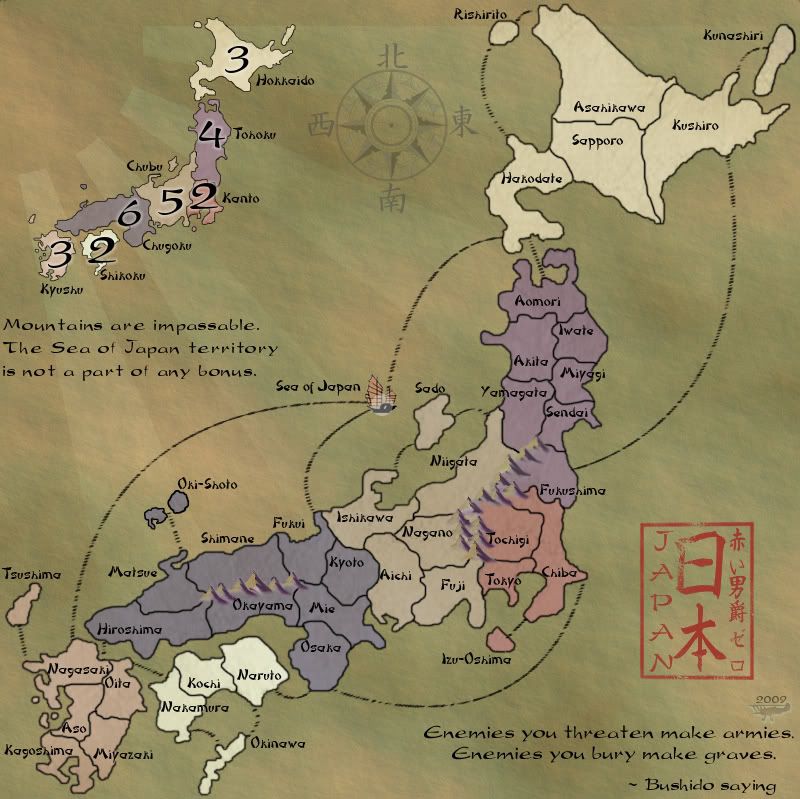
Bottom line, the font is extremely easy to change, AND the major thing here is whether or not you can read the names of the territories. Only thing would be to make adjustment where letters cross border lines. Is there any issue with the MAP? I've changed a couple of the things I was asked to, the stamp is stronger, the compass has been muted. The argument between "kill" and "bury" is arbitrary, with no impact on the map itself, a graphical addition to enhance the "feeling" of Japan, both words convey the same basic message. Honestly I like bury, since it implies you've already killed your enemies, and all that remains for the victor to do is a proper burial of ones enemy. Anything else I'm missing???
Version 11.9
Large:(no change from 11.8 )
Small:
Bottom line, the font is extremely easy to change, AND the major thing here is whether or not you can read the names of the territories. Only thing would be to make adjustment where letters cross border lines. Is there any issue with the MAP? I've changed a couple of the things I was asked to, the stamp is stronger, the compass has been muted. The argument between "kill" and "bury" is arbitrary, with no impact on the map itself, a graphical addition to enhance the "feeling" of Japan, both words convey the same basic message. Honestly I like bury, since it implies you've already killed your enemies, and all that remains for the victor to do is a proper burial of ones enemy. Anything else I'm missing???
Version 11.9
Large:(no change from 11.8 )
- Click image to enlarge.
Small:
- Click image to enlarge.

-
RedBaron0
- Posts: 2657
- Joined: Sun Aug 19, 2007 12:59 pm
- Location: Pennsylvania
Re: Japan - 日本 (D, Gp) V11.8 (Upd 12-12)pg41 Time's almost up!
![]() by Industrial Helix on Sat Dec 12, 2009 1:04 pm
by Industrial Helix on Sat Dec 12, 2009 1:04 pm
The only thing about the map that needs to be fixed is the quote... "Enemies you bury make graves" doesn't entirely make sense. Go back to "Enemies you kill make graves"
Sketchblog [Update 07/25/11]: http://indyhelixsketch.blogspot.com/
Living in Japan [Update 07/17/11]: http://mirrorcountryih.blogspot.com/
Russian Revolution map for ConquerClub [07/20/11]: viewtopic.php?f=241&t=116575
Living in Japan [Update 07/17/11]: http://mirrorcountryih.blogspot.com/
Russian Revolution map for ConquerClub [07/20/11]: viewtopic.php?f=241&t=116575
-

Industrial Helix
- Posts: 3462
- Joined: Mon Jul 14, 2008 6:49 pm
- Location: Ohio


Re: Japan - 日本 (D, Gp) V11.8 (Upd 12-12)pg41 Time's almost up!
![]() by RedBaron0 on Sat Dec 12, 2009 1:11 pm
by RedBaron0 on Sat Dec 12, 2009 1:11 pm
RedBaron0 wrote:The argument between "kill" and "bury" is arbitrary, with no impact on the map itself, a graphical addition to enhance the "feeling" of Japan, both words convey the same basic message. Honestly I like bury, since it implies you've already killed your enemies.
-
RedBaron0
- Posts: 2657
- Joined: Sun Aug 19, 2007 12:59 pm
- Location: Pennsylvania
Re: Japan - 日本 (D, Gp) V11.8 (Upd 12-12)pg41 Time's almost up!
![]() by the.killing.44 on Sat Dec 12, 2009 1:17 pm
by the.killing.44 on Sat Dec 12, 2009 1:17 pm
Two things:
I still think your sea lines need work. Less of the opacity jitter and more scattering of your brush settings. Try using natural brushes over the calligraphic.
The font you use for the saying and Mountain / S. of Japan bit is still kind of phony (not to mention it has the o / s problem).
http://www.dafont.com/brush-tipterrence.font
http://www.dafont.com/japanese-brush.font
Methinks you were looking under Asian-looking fonts rather than the Brush Calligraphy fonts. The latter are much more authentic and better-looking than the former, which tend to be fake, "fun"-looking fonts.
-

the.killing.44
- Posts: 4724
- Joined: Thu Oct 23, 2008 7:43 pm
- Location: now tell me what got two gums and knows how to spit rhymes


Re: Japan - 日本 (D, Gp) V11.8 (Upd 12-12)pg41 Time's almost up!
![]() by AndyDufresne on Sat Dec 12, 2009 9:52 pm
by AndyDufresne on Sat Dec 12, 2009 9:52 pm
RedBaron0 wrote:RedBaron0 wrote:The argument between "kill" and "bury" is arbitrary, with no impact on the map itself, a graphical addition to enhance the "feeling" of Japan, both words convey the same basic message. Honestly I like bury, since it implies you've already killed your enemies.
Fitting enough, good argument.
Great work on the map. Really looking forward to it.
Though only thing I'd like to maybe see an experimentation with is making the text...either all of the text, or at least the quote and below the legend text...look a little more like it is on the background, like the stamp.
But everything looks pretty superb to me.
--Andy
-

AndyDufresne
- Posts: 24935
- Joined: Fri Mar 03, 2006 8:22 pm
- Location: A Banana Palm in Zihuatanejo


Re: Japan - 日本 (D, Gp) V11.8 (Upd 12-12)pg41 Time's almost up!
![]() by ender516 on Sat Dec 12, 2009 10:00 pm
by ender516 on Sat Dec 12, 2009 10:00 pm
AndyDufresne wrote:RedBaron0 wrote:RedBaron0 wrote:The argument between "kill" and "bury" is arbitrary, with no impact on the map itself, a graphical addition to enhance the "feeling" of Japan, both words convey the same basic message. Honestly I like bury, since it implies you've already killed your enemies.
Fitting enough, good argument.
Great work on the map. Really looking forward to it.
Though only thing I'd like to maybe see an experimentation with is making the text...either all of the text, or at least the quote and below the legend text...look a little more like it is on the background, like the stamp.
But everything looks pretty superb to me.
--Andy
I sincerely doubt that fading the text will be a good idea. You would be trading legibility for some sort of artistic realism, which would not be a good deal.
-
ender516
- Posts: 4455
- Joined: Wed Dec 17, 2008 6:07 pm
- Location: Waterloo, Ontario
Re: Japan - 日本 (D, Gp) V11.8 (Upd 12-12)pg41 Time's almost up!
![]() by AndyDufresne on Sat Dec 12, 2009 10:02 pm
by AndyDufresne on Sat Dec 12, 2009 10:02 pm
I don't think a substantial fade would be needed. I sincerely doubt that a minor fade would increase legibility issues to the degree you are devising in your head.
--Andy
--Andy
-
AndyDufresne
- Posts: 24935
- Joined: Fri Mar 03, 2006 8:22 pm
- Location: A Banana Palm in Zihuatanejo
Re: Japan - 日本 (D, Gp) V12.0 (Upd 12-13)pg41 Time's almost up!
![]() by RedBaron0 on Sun Dec 13, 2009 9:46 am
by RedBaron0 on Sun Dec 13, 2009 9:46 am
Probably my last shot at punching through before the shut down, no worries if it doesn't.
Version 12.0
Large:
Small:
Version 12.0
Large:
- Click image to enlarge.
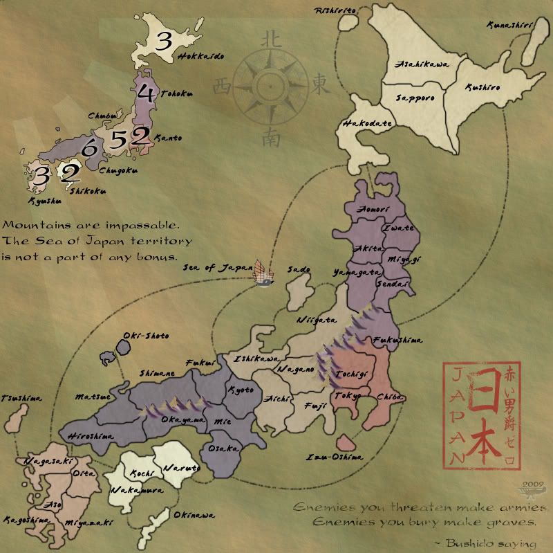
Small:
- Click image to enlarge.

-
RedBaron0
- Posts: 2657
- Joined: Sun Aug 19, 2007 12:59 pm
- Location: Pennsylvania
Re: Japan - 日本 (D, Gp) V12.0 (Upd 12-13)pg42 Time's almost up!
![]() by isaiah40 on Sun Dec 13, 2009 10:13 am
by isaiah40 on Sun Dec 13, 2009 10:13 am
Go back with the text on 11.8/11.9, this one is too hard to read. Especially on the small. That's my nitpick for today 
-
isaiah40
- Posts: 3990
- Joined: Mon Aug 27, 2007 7:14 pm

Re: Japan - 日本 (D, Gp) V12.0 (Upd 12-13)pg42 Time's almost up!
![]() by The Neon Peon on Sun Dec 13, 2009 10:18 am
by The Neon Peon on Sun Dec 13, 2009 10:18 am
isaiah40 wrote:Go back with the text on 11.8/11.9, this one is too hard to read. Especially on the small. That's my nitpick for today
Just stick with 11.9, that one was perfect. (I agree, hard to read)
And shouldn't the font be more of a FF thing?
-

The Neon Peon
- Posts: 2342
- Joined: Sat Jun 14, 2008 12:49 pm


Re: Japan - 日本 (D, Gp) V12.0 (Upd 12-13)pg42 Time's almost up!
![]() by RedBaron0 on Sun Dec 13, 2009 10:38 am
by RedBaron0 on Sun Dec 13, 2009 10:38 am
As long as the font is the ONLY real issue left I'd agree.
-
RedBaron0
- Posts: 2657
- Joined: Sun Aug 19, 2007 12:59 pm
- Location: Pennsylvania
Re: Japan - 日本 (D, Gp) V12.0 (Upd 12-13)pg42 Time's almost up!
![]() by isaiah40 on Sun Dec 13, 2009 10:42 am
by isaiah40 on Sun Dec 13, 2009 10:42 am
RedBaron0 wrote:As long as the font is the ONLY real issue left I'd agree.
That is the only issue I see right now!
-
isaiah40
- Posts: 3990
- Joined: Mon Aug 27, 2007 7:14 pm
Re: Japan - 日本 (D, Gp) V12.0 (Upd 12-13)pg42 Time's almost up!
![]() by natty dread on Sun Dec 13, 2009 11:17 am
by natty dread on Sun Dec 13, 2009 11:17 am
Yeah, stamp the map. And I agree with previous posters, go back to the previous font.
-
natty dread
- Posts: 12877
- Joined: Fri Feb 08, 2008 8:58 pm
- Location: just plain fucked
Re: Japan - 日本 (D, Gp) V12.0 (Upd 12-13)pg42 Time's almost up!
![]() by the.killing.44 on Sun Dec 13, 2009 11:19 am
by the.killing.44 on Sun Dec 13, 2009 11:19 am
I meant change the Bushido saying and legend font, not the terts, which were fine…
-
the.killing.44
- Posts: 4724
- Joined: Thu Oct 23, 2008 7:43 pm
- Location: now tell me what got two gums and knows how to spit rhymes
Re: Japan - 日本 (D, Gp) V12.0 (Upd 12-13)pg42 Time's almost up!
![]() by RedBaron0 on Sun Dec 13, 2009 11:20 am
by RedBaron0 on Sun Dec 13, 2009 11:20 am
Opps... ](./images/smilies/eusa_wall.gif "Brick wall")
-
RedBaron0
- Posts: 2657
- Joined: Sun Aug 19, 2007 12:59 pm
- Location: Pennsylvania
Re: Japan - 日本 (D, Gp) V12.0 (Upd 12-13)pg42 Time's almost up!
![]() by RedBaron0 on Sun Dec 13, 2009 11:49 am
by RedBaron0 on Sun Dec 13, 2009 11:49 am
Version 12.1
Large:
Small:
Fixed.
Large:
- Click image to enlarge.

Small:
- Click image to enlarge.
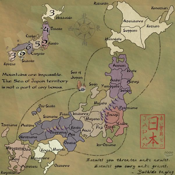
Fixed.
-
RedBaron0
- Posts: 2657
- Joined: Sun Aug 19, 2007 12:59 pm
- Location: Pennsylvania
Who is online
Users browsing this forum: No registered users
|
|||||||
| Conquer Club is not associated with RISK online in any way. Copyright © 2006-2025 by Big Wham LLC | |||||||