iancanton wrote:u need only 3 sets of starting positions; to make sense, each set must include one village and one french left flank division.
If you say so
Moderator: Cartographers
![]() by pamoa on Thu May 07, 2009 2:17 am
by pamoa on Thu May 07, 2009 2:17 am
iancanton wrote:u need only 3 sets of starting positions; to make sense, each set must include one village and one french left flank division.


![]() by Incandenza on Sun May 17, 2009 7:58 pm
by Incandenza on Sun May 17, 2009 7:58 pm
pamoa wrote:iancanton wrote:u need only 3 sets of starting positions; to make sense, each set must include one village and one french left flank division.
If you say so


![]() by pamoa on Mon May 18, 2009 2:43 am
by pamoa on Mon May 18, 2009 2:43 am
<positions>
   <position>
      <territory>Suchet</territory>
      <territory>Pratzen</territory>
   </position>

   <position>
      <territory>Kellerman</territory>
      <territory>Skolnitz</territory>
   </position>

   <position>
      <territory>Caffarelli</territory>
      <territory>Telnitz</territory>
   </position>
</positions>
![]() by Incandenza on Mon May 18, 2009 9:43 pm
by Incandenza on Mon May 18, 2009 9:43 pm

![]() by captainwalrus on Tue May 19, 2009 6:24 pm
by captainwalrus on Tue May 19, 2009 6:24 pm


![]() by pamoa on Wed May 20, 2009 2:50 am
by pamoa on Wed May 20, 2009 2:50 am
![]() by MrBenn on Wed May 20, 2009 10:07 am
by MrBenn on Wed May 20, 2009 10:07 am


![]() by pamoa on Thu May 21, 2009 11:44 am
by pamoa on Thu May 21, 2009 11:44 am
![]() by the.killing.44 on Thu May 21, 2009 11:47 am
by the.killing.44 on Thu May 21, 2009 11:47 am


![]() by pamoa on Thu May 21, 2009 11:55 am
by pamoa on Thu May 21, 2009 11:55 am
the.killing.44 wrote:Did you consider stroking the paths with a 1px black (possibly low-ish opacity) stroke? It might just improve the clarity.
![]() by pamoa on Wed May 27, 2009 1:04 pm
by pamoa on Wed May 27, 2009 1:04 pm

![]() by MrBenn on Wed May 27, 2009 4:40 pm
by MrBenn on Wed May 27, 2009 4:40 pm
![]() by pamoa on Fri May 29, 2009 4:11 am
by pamoa on Fri May 29, 2009 4:11 am
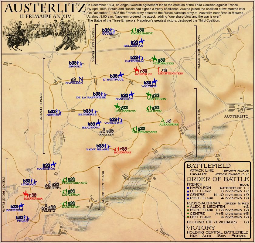
MrBenn wrote:The historical text at the top of the map is incredibly difficult to read on the small map. Legibility could be improved by making the title & drawing slightly smaller; width is more of an issue than height, but you could shuffle Suchet, Engelhardt and Kellerman down a bit if you need. The descriptive text can then be made slightly larger to fit the space.
MrBenn wrote:Both maps feels a bit too spaced out - there appears to be 40px of dead space at the bottom of the small map and around 60px on the large.. Is there any way you could move the bonus legend up a little bit, without losing the clarity of the Central Flank indicator? There looks to be enough room to move the Cetnral Flank indicator nearer to Alexandre, which would make it easier to move the legend up.
It may help space if you were to change Left-Central-Right Flanks to North-Central-South - that way you could have a single set of indicators on one side of the map, which would give you a bit more room to squeeze things in more comfortably; although you may not need to change it if you can fit everything in
MrBenn wrote:On the legend you have Alex. & Liechten. +1... It's not clear whether you need both of them for a +1 bonus, or whether they are +1 autodeploy each (like Napoleon)
MrBenn wrote:Just as an aside, have you experimented with any textures in the background? The map looks like it should be aged, but feels too clean and modern...
![]() by captainwalrus on Wed Jun 03, 2009 3:24 pm
by captainwalrus on Wed Jun 03, 2009 3:24 pm
![]() by pamoa on Thu Jun 04, 2009 12:31 am
by pamoa on Thu Jun 04, 2009 12:31 am
captainwalrus wrote:I wonder if this might get confusing if the blue player controlled a lot of red or Green territories. Perhaps you should show that, instead of what you have now, where the blue all have blue army numbers and the green all have green, ect.
captainwalrus wrote:I think not many people are commenting, because it is hard to find things to comment about.

![]() by TaCktiX on Thu Jun 04, 2009 11:40 am
by TaCktiX on Thu Jun 04, 2009 11:40 am


![]() by MrBenn on Thu Jun 04, 2009 3:40 pm
by MrBenn on Thu Jun 04, 2009 3:40 pm
![]() by Blitzaholic on Thu Jun 04, 2009 3:43 pm
by Blitzaholic on Thu Jun 04, 2009 3:43 pm


![]() by dolomite13 on Thu Jun 04, 2009 4:59 pm
by dolomite13 on Thu Jun 04, 2009 4:59 pm


![]() by LED ZEPPELINER on Thu Jun 04, 2009 5:02 pm
by LED ZEPPELINER on Thu Jun 04, 2009 5:02 pm
sailorseal wrote:My big boy banana was out the whole time
AndyDufresne wrote:Forever linked at the hip's-banana! (That sounds strange, don't quote me.)AndyDufresne wrote:Many Happy Bananas to everyone, lets party...with Bananas.
--Andy


![]() by MrBenn on Thu Jun 04, 2009 5:02 pm
by MrBenn on Thu Jun 04, 2009 5:02 pm
9. A map must work within the following map size restrictions:1. SMALL MAP: WIDTH up to 630 px; HEIGHT 600 px
2. LARGE MAP: WIDTH up to 840 px ; HEIGHT 800 px.
![]() by dolomite13 on Thu Jun 04, 2009 5:29 pm
by dolomite13 on Thu Jun 04, 2009 5:29 pm
![]() by Danyael on Fri Jun 05, 2009 3:42 pm
by Danyael on Fri Jun 05, 2009 3:42 pm
pamoa wrote:the.killing.44 wrote:Did you consider stroking the paths with a 1px black (possibly low-ish opacity) stroke? It might just improve the clarity.
yes I thought some solution like this but did decide to reserve it for the main road which didn't enter in gameplay
and keep a single line for the path which are attack route 2px wide and unused path 1px wide
the colour I choose is to blend in the map bg so as not to have a drawing for gameplay glued on a faded inutile bg
if you really think it is difficult to figure out the attack line I can try a darker shade (or maybe just you should increase your monitor contrast
)


![]() by pamoa on Sat Jun 06, 2009 10:53 am
by pamoa on Sat Jun 06, 2009 10:53 am
TaCktiX wrote:I think that instead of the bar look for the red/green alliance, why not have them diagonally? At first it's hard to tell that it is intentionally two colors. Diagonally could increase the relative visibility.
TaCktiX wrote:On the order of battle, at first I thought "oh, the 15th division", then realized there is no 15th division and you meant 15 DIVISIONS. Adding an S to the abbreviation should help.
TaCktiX wrote:There is no note of attack routes. It's been assumed that people will know that the brown lines are attacks. Please find some way to explicitly note this, as some moron will not figure it out.
MrBenn wrote:Pamoa, was that last image just to test the 888s in different colours?? Have you made any other adjustments?
Blitzaholic wrote:If you could only change the name please to AUSTERBLITZbe wonderful
dolomite13 wrote:AH i was sure I read 800x800 somewhere... thanx mrbenn... however I do believe you don't need to use all of that space =)
MrBenn wrote:Both maps feels a bit too spaced out - there appears to be 40px of dead space at the bottom of the small map and around 60px on the large.. Is there any way you could move the bonus legend up a little bit, without losing the clarity of the Central Flank indicator? There looks to be enough room to move the Cetnral Flank indicator nearer to Alexandre, which would make it easier to move the legend up.
It may help space if you were to change Left-Central-Right Flanks to North-Central-South - that way you could have a single set of indicators on one side of the map, which would give you a bit more room to squeeze things in more comfortably; although you may not need to change it if you can fit everything in
I can't see having space and air in a map as a problem
I did go until this point at the bottom of the map to have both lakes in
the.killing.44 wrote:Did you consider stroking the paths with a 1px black (possibly low-ish opacity) stroke? It might just improve the clarity.
pamoa wrote:yes I thought some solution like this but did decide to reserve it for the main road which didn't enter in gameplay
and keep a single line for the path which are attack route 2px wide and unused path 1px wide
the colour I choose is to blend in the map bg so as not to have a drawing for gameplay glued on a faded inutile bg
if you really think it is difficult to figure out the attack line I can try a darker shade (or maybe just you should increase your monitor contrast
Danyael wrote:i can follow the paths nicely but i think that a stroke is not necessarily the best way to way them pop out with keeping the clean look of everything
maybe try a black glow instead this will make it stick out a little better so you don't have to be inches from the screen
Danyael wrote:by the way Nice clean look i like it
![]() by Danyael on Sat Jun 06, 2009 11:09 am
by Danyael on Sat Jun 06, 2009 11:09 am
pamoa wrote:Danyael wrote:i can follow the paths nicely but i think that a stroke is not necessarily the best way to way them pop out with keeping the clean look of everything
maybe try a black glow instead this will make it stick out a little better so you don't have to be inches from the screen
sorry I'm not sure to understand what you mean by trying a black glow is it around the actual brown roads
if that's it sound good to try
Users browsing this forum: No registered users
|
|||||||
| Conquer Club is not associated with RISK online in any way. Copyright © 2006-2025 by Big Wham LLC | |||||||