I think there may be too much contrast with the unplayable part of the map and the sea. Maybe darken them both up, or just the land, I'm not sure, see what you can come up with.
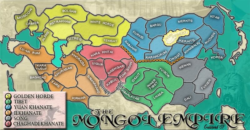
1. Make all water darker.
I'm a bit loathe to darken the water too much as I feel that the colour is quite appealing and that it makes this map stand out from other maps. If you look back a few pages Andy also commented that it was a good feature... Do other people think I should darken the seas?
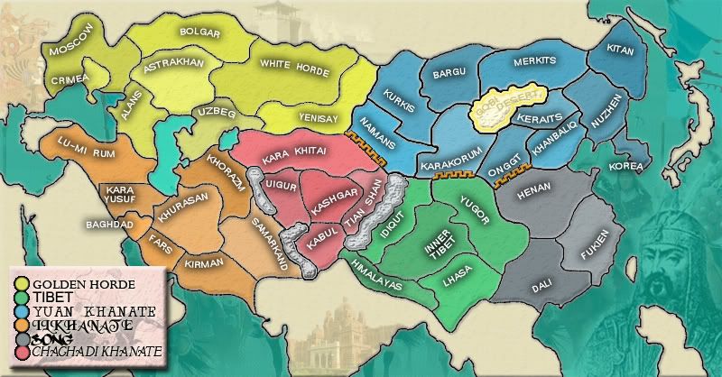
That wall is the Chinese Great Wall, I suppose. Is it in its real place? Can we change its position? I can think better about suggestions knowing the answer to this question...
It certainly is the great wall but its not 100% accurate in its placement. At this point the wall wasn't the continuous barrier we see today either so as long as it is in a generaly north-westerly area then its probably ok.
- A great problem: the southern area is incredibly strong with those 3 small continents. I strongly suggest you rethink your continents scheme. Maybe join Tibet and Song and split Khanate.
The continents are based on the historical areas so it would be a bit hard to break up their current structure. I'd rather explore the possibilities available through impassable borders before splitting/merging any continents. It would be easier to add territories to the existing continents as well than to change them altogether.
- A minor problem: red and blue areas have high bonuses.
Blues bonus seemed correct before the impaassable border streched so far accross and there were more border territories. I'll take it down to six and I think I should open up another border as well. As for red, I explained earlier in the thread that I thought it should be higher as it is much harder to expand from that position compared to green (which can expand into the grey continent without adding any extra borders) and it is also in the centre of the map and people are going to be powering through it to break continents.