- Click image to enlarge.

- Click image to enlarge.

Moderator: Cartographers
![]() by koontz1973 on Mon Apr 30, 2012 11:00 pm
by koontz1973 on Mon Apr 30, 2012 11:00 pm


![]() by RedBaron0 on Tue May 01, 2012 1:16 am
by RedBaron0 on Tue May 01, 2012 1:16 am


![]() by koontz1973 on Tue May 01, 2012 2:09 am
by koontz1973 on Tue May 01, 2012 2:09 am


![]() by Nola_Lifer on Tue May 01, 2012 7:35 pm
by Nola_Lifer on Tue May 01, 2012 7:35 pm


![]() by koontz1973 on Tue May 01, 2012 10:16 pm
by koontz1973 on Tue May 01, 2012 10:16 pm
Nola_Lifer wrote:I got to be honest here, don't like the texture at all
and the map just seems to be floating in the air can you make it blend in better with the background at all?
![]() by koontz1973 on Thu May 03, 2012 1:03 pm
by koontz1973 on Thu May 03, 2012 1:03 pm


![]() by isaiah40 on Thu May 03, 2012 8:19 pm
by isaiah40 on Thu May 03, 2012 8:19 pm
koontz1973 wrote:Anything else oh mighty mod gods in blue.


![]() by koontz1973 on Fri May 04, 2012 12:08 am
by koontz1973 on Fri May 04, 2012 12:08 am
Yes! Bring me the sacrificial virgin!


![]() by isaiah40 on Fri May 04, 2012 7:23 am
by isaiah40 on Fri May 04, 2012 7:23 am
![]() by AndyDufresne on Fri May 04, 2012 9:32 am
by AndyDufresne on Fri May 04, 2012 9:32 am


![]() by koontz1973 on Fri May 04, 2012 9:59 am
by koontz1973 on Fri May 04, 2012 9:59 am


![]() by y2manypbr on Fri May 04, 2012 11:16 am
by y2manypbr on Fri May 04, 2012 11:16 am


![]() by koontz1973 on Fri May 04, 2012 12:17 pm
by koontz1973 on Fri May 04, 2012 12:17 pm
![]() by isaiah40 on Sun May 06, 2012 8:11 am
by isaiah40 on Sun May 06, 2012 8:11 am

![]() by koontz1973 on Sun May 06, 2012 8:12 am
by koontz1973 on Sun May 06, 2012 8:12 am
![]() by natty dread on Mon May 14, 2012 2:21 am
by natty dread on Mon May 14, 2012 2:21 am


![]() by natty dread on Mon May 14, 2012 2:46 am
by natty dread on Mon May 14, 2012 2:46 am
![]() by AndyDufresne on Mon May 14, 2012 2:22 pm
by AndyDufresne on Mon May 14, 2012 2:22 pm
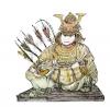
natty dread wrote:The issues I brought up last time I posted here have not been addressed at all. Frankly, it looks like another mediocre map with shitty graphics has slipped through because no one really gives a bleep about it. If I were in charge here, I'd strip the graphics stamp and put this thing back in the main foundry to be developed properly. I'm not, so I'm just going to enter some criticism.
Firstly, the map image is a bland, ambiguous blur of similar colours - there's no contrast. It's like someone poured a can of mushroom soup on the table and arranged it into a map... The playable area gets lost in the middle of that sea of bland, drab colours. The lack of any outline, any kind of visual clues where the playable area begins makes it horrible to watch - your eyes aren't drawn towards it, in fact it's completely opposite, it attempts to slip away from your gaze.
And the canvas texture is too strong
The title doesn't look like it belongs on. Why is the title more prominent than the playable area? It should be the other way around. Currently the only thing that draws my eye in this picture is the title. It shouldn't be like that.
![]() by koontz1973 on Mon May 14, 2012 11:13 pm
by koontz1973 on Mon May 14, 2012 11:13 pm
AndyDufresne wrote:I somewhat feel this way as well, and I think one or two others pointed this out as well previously.
I tend to agree.
I think the title looks fine.
--Andy
![]() by natty dread on Tue May 15, 2012 1:09 am
by natty dread on Tue May 15, 2012 1:09 am
koontz1973 wrote:Why should the map be made up of bright colours? We have other maps that are drab (as it has been said for this) with similar colours throughout. As for the playing area having a outline, it had one up to a couple of updates ago. Took it out to stop the floating map syndrome as pointed out by some. As for anyone mistaking the background for the playing area, I very much doubt any player will come in and say why the could not play the head of the statue. You go from a mass of colours to solid blocks of colour. They where a lot closer to the backgrounds colours in the past but with the CB test fails, brighter and different colours had to be found. These work.
koontz1973 wrote:The canvas texture may be a tad strong in some peoples opinion, and when this was pointed out by yourself and Nola_Lifer, it was made less so for the large (the small in peoples opinion was good). Right now, it is not bad and fits in with the maps style so it is going to stay.
![]() by AndyDufresne on Tue May 15, 2012 8:36 am
by AndyDufresne on Tue May 15, 2012 8:36 am
![]() by natty dread on Tue May 15, 2012 8:44 am
by natty dread on Tue May 15, 2012 8:44 am
AndyDufresne wrote:I don't think I'd say it is unacceptable
AndyDufresne wrote: I think there is still room for improvement, which is what Final Forge is all about!
![]() by koontz1973 on Tue May 15, 2012 10:53 am
by koontz1973 on Tue May 15, 2012 10:53 am
AndyDufresne wrote:I don't think I'd say it is unacceptable, but I think there is still room for improvement, which is what Final Forge is all about!
--Andy
![]() by natty dread on Tue May 15, 2012 11:04 am
by natty dread on Tue May 15, 2012 11:04 am
![]() by Nola_Lifer on Tue May 15, 2012 5:18 pm
by Nola_Lifer on Tue May 15, 2012 5:18 pm
Users browsing this forum: No registered users
|
|||||||
| Conquer Club is not associated with RISK online in any way. Copyright © 2006-2024 by Big Wham LLC | |||||||


