Conquer Club

Classic Cities Jakarta [Quenched]

Care to peruse completed maps? Take a stroll through the Atlas.

Moderator: Cartographers

Forum rules
Please read the Community Guidelines before posting.

Re: Classic Cities Jakarta [11/2] Page 10

Postby natty dread on Fri Feb 24, 2012 8:18 am

koontz1973 wrote:natty, all you have said about the background is that you do not think it is right and not done the way you would of done it.


Well then you have not been listening. What I've been saying is that the background does not look like an actual painting. You need to make it more authentic, give it some handmade feel, brush strokes, that sort of thing. I don't care how you accomplish it, as long as you do it.

koontz1973 wrote:I will address the background at some point but am not going to go through the normal argument we have in every thread.


Interesting, because the "normal argument" we've had in your other map threads has resulted in your maps getting better. Remember how reluctant you were to change anything in your Falkland map? And how it ultimately got ten times better when you did?

koontz1973 wrote:I will get it changed and changed it will be, but to my liking. You may disagree with this and I am sure you will but it will be done that way.


Like I said, I don't care how you do it, as long as it gets done. However, in the past you've been complaining to me that I don't give you specific enough instructions about the changes needed to your map. Now it seems you complain that you don't want to follow my instructions, you want to do things your way... which is fine, but the next time you ask for specific instructions to do something, just remember this conversation... ;)
Image
User avatar
Sergeant 1st Class natty dread
 
Posts: 12877
Joined: Fri Feb 08, 2008 8:58 pm
Location: just plain fucked

Re: Classic Cities Jakarta [11/2] Page 10

Postby koontz1973 on Fri Feb 24, 2012 12:29 pm

Been playing around with the background. These are the styles that I like so no problem with any of them. Choose one and the map can follow suit. Just remember that the map, mini map and title cover most of these images up and only really the figure in the left is seen.
1
Image
2
Image
3
Image
4
Image
5
Image
6
Image
7
Image
Last edited by koontz1973 on Fri Feb 24, 2012 11:59 pm, edited 1 time in total.
Image
User avatar
Lieutenant koontz1973
 
Posts: 6960
Joined: Thu Jan 01, 2009 10:57 am

Re: Classic Cities Jakarta [11/2] Page 10

Postby natty dread on Fri Feb 24, 2012 12:33 pm

Ok, take #3, then put #5 on top of it in 60% hard light mode. See what happens.
Image
User avatar
Sergeant 1st Class natty dread
 
Posts: 12877
Joined: Fri Feb 08, 2008 8:58 pm
Location: just plain fucked

Re: Classic Cities Jakarta[11/2]Background image-Choose one

Postby Flapcake on Fri Feb 24, 2012 2:27 pm

1, 3, 5 or 6, are good, 2 and 4 looks wierd :P 5 are my favorit
User avatar
Private 1st Class Flapcake
 
Posts: 756
Joined: Tue Jan 11, 2011 8:22 am
Location: beyond the unknown

Re: Classic Cities Jakarta [11/2] Page 10

Postby koontz1973 on Fri Feb 24, 2012 11:58 pm

natty dread wrote:Ok, take #3, then put #5 on top of it in 60% hard light mode. See what happens.

7
Image
Image
User avatar
Lieutenant koontz1973
 
Posts: 6960
Joined: Thu Jan 01, 2009 10:57 am

Re: Classic Cities Jakarta[11/2]Background image-Choose one

Postby natty dread on Sat Feb 25, 2012 12:30 am

Hm, that doesn't look too shabby, maybe the contrast could be slightly reduced but otherwise good.

Now if you could only overlay it with some kind of texture that would give it a feel of brush strokes... :-k
Image
User avatar
Sergeant 1st Class natty dread
 
Posts: 12877
Joined: Fri Feb 08, 2008 8:58 pm
Location: just plain fucked

Re: Classic Cities Jakarta[11/2]Background image-Choose one

Postby koontz1973 on Sat Feb 25, 2012 12:37 am

Let me put the map on it (as it is now) and lets see what needs to be done.
Image
User avatar
Lieutenant koontz1973
 
Posts: 6960
Joined: Thu Jan 01, 2009 10:57 am

Re: Classic Cities Jakarta[11/2]Background image-Choose one

Postby koontz1973 on Sat Feb 25, 2012 12:46 am

This is with the map/mini map etc. The map has the new colours because of the CB filters.
Click image to enlarge.
image
Last edited by koontz1973 on Sat Feb 25, 2012 1:43 am, edited 1 time in total.
Image
User avatar
Lieutenant koontz1973
 
Posts: 6960
Joined: Thu Jan 01, 2009 10:57 am

Re: Classic Cities Jakarta[11/2]Background image-Choose one

Postby natty dread on Sat Feb 25, 2012 1:34 am

Hm. The image looks a bit dark now...
Image
User avatar
Sergeant 1st Class natty dread
 
Posts: 12877
Joined: Fri Feb 08, 2008 8:58 pm
Location: just plain fucked

Re: Classic Cities Jakarta[11/2]Background image-Choose one

Postby koontz1973 on Sat Feb 25, 2012 1:43 am

Thats because of the grunge layers.
Image
User avatar
Lieutenant koontz1973
 
Posts: 6960
Joined: Thu Jan 01, 2009 10:57 am

Re: Classic Cities Jakarta[11/2]Background image-Choose one

Postby natty dread on Sat Feb 25, 2012 6:20 am

koontz1973 wrote:Thats because of the grunge layers.


Try lightening them? Or maybe try lightening the underlying layers, whatever works.
Image
User avatar
Sergeant 1st Class natty dread
 
Posts: 12877
Joined: Fri Feb 08, 2008 8:58 pm
Location: just plain fucked

Re: Classic Cities Jakarta[11/2]Background image-Choose one

Postby koontz1973 on Sat Feb 25, 2012 8:42 am

Thats the stray rubbish removed. Mini map brought up to date. Map lightened up. Sig added.
Click image to enlarge.
image
Image
User avatar
Lieutenant koontz1973
 
Posts: 6960
Joined: Thu Jan 01, 2009 10:57 am

Re: Classic Cities Jakarta[11/2]Background image-Choose one

Postby natty dread on Sat Feb 25, 2012 10:35 am

Ok, I'm sorry to be saying this, but... it still doesn't quite look right.

For one thing the entire image now looks like it has too much contrast... like when you turn the contrast knob of your tv/monitor all the way up?

Also, you should have some kind of contrast between the playable area and the non-playable area, to make the playable area stand out from the rest. Currently, all of your image is on the same level of lightness, the same level of saturation, same level of focus... it makes it all blend in and doesn't allow the playable area to "pop" sufficiently from the background. This is something you should fix.
Image
User avatar
Sergeant 1st Class natty dread
 
Posts: 12877
Joined: Fri Feb 08, 2008 8:58 pm
Location: just plain fucked

Re: Classic Cities Jakarta[11/2]Background image-Choose one

Postby koontz1973 on Sat Feb 25, 2012 10:48 am

natty dread wrote:Ok, I'm sorry to be saying this, but... it still doesn't quite look right.

For one thing the entire image now looks like it has too much contrast... like when you turn the contrast knob of your tv/monitor all the way up?

That I can fix. It is probably due to the texture layers being on burn mode.

Also, you should have some kind of contrast between the playable area and the non-playable area, to make the playable area stand out from the rest. Currently, all of your image is on the same level of lightness, the same level of saturation, same level of focus... it makes it all blend in and doesn't allow the playable area to "pop" sufficiently from the background. This is something you should fix.

This I do not see as a problem. Having the map blend into the background is OK considering you have a difference between the background image and playable area. I cannot imagine anyone getting confused between the map and background. Right now, the playable area has far less detail than the background. The colours are lighter and at no point on the map does the background colour match the playable area in the same region.

The two real problems I see now are the light blue rivers (territ lines) being to light and glowing and the names. They are nice and all but have a sharpness about them that just no longer fit the map. This might be solved easily or not but will have a play around later today with them.
Image
User avatar
Lieutenant koontz1973
 
Posts: 6960
Joined: Thu Jan 01, 2009 10:57 am

Re: Classic Cities Jakarta[11/2]Background image-Choose one

Postby natty dread on Sat Feb 25, 2012 11:32 am

koontz1973 wrote:That I can fix. It is probably due to the texture layers being on burn mode.


Oh yeah, burn mode is not really good for textures. In fact it's pretty much the worst mode to use... Burn and multiply modes always make the image darker.

Textures look best with grain merge or soft/hard light. Those modes all work with the basic principle that pixel values less than 128 make the image darker and values higher than 128 make the image lighter (although obviously they have some differences) which is optimal for most textures, since often on textures you have light and dark areas, and also because this way the overall lightness of the image changes less.

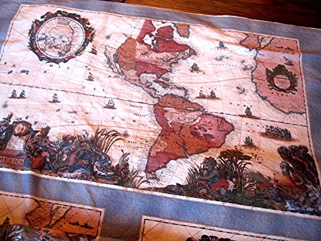
koontz1973 wrote:This I do not see as a problem. Having the map blend into the background is OK


Sorry, but it really isn't... this isn't really a matter of stylistic preference, or an issue of opinion - it's simply a matter of following the principles of good graphical design.

Look... I don't want to sound like I'm lecturing to you. The fact that I've made maps longer than you certainly does not mean that I'm always right and you're always wrong. But there are certain things you learn about graphics with experience, and if I sometimes come off as if I think I know better, it's only because I want to share that knowledge which I've learned.


In any graphical image, you can divide the image in parts: the background, the primary elements, and the secondary elements. The background is obvious... the primary element in this case would be the playable area, the map itself, and the secondary elements would be things like title, legend, etc. To achieve a clean and legible style that is easy to the eyes, the primary elements need to be distinct from the background - they need to be what "draws" your eyes in, in the image... the secondary elements should also stand out, but less than the primary ones.

Of course, you can tell what part of the map is playable area, that's not what I'm saying. The problem is, the playable area should "naturally" draw your eyes to it, and currently, it just gets lost in the background.

Now, there are lots of ways by which contrast can be achieved between two parts of an image. It doesn't have to be all that high, you can use several subtle things, which by themselves aren't noticeable but combined they give the playable area a good contrast with it's surroundings. I'm also not saying that the map can't have a uniform style, it can and should. But the style should be executed in a way that makes it easy on the eyes and readable.

Some ways of adding contrast:
- You could add a subtle drop shadow or glow to the playable area.
- You could create a contrast in focus: make the playable area sharper than it's surroundings.
- You could create a contrast in saturation: make the playable area more or less saturated colours than the background.
- or a contrast in lightness, making the playable area lighter than the background
- or some kind of subtle lighting effects, maybe like a spotlight (or several) on the playable area... or gradients or such...

You don't have to use all of them, of course, or you can figure out some other methods of achieving contrast, I'm just trying to say that there are options here, and no one is trying to force you on a certain path...
Image
User avatar
Sergeant 1st Class natty dread
 
Posts: 12877
Joined: Fri Feb 08, 2008 8:58 pm
Location: just plain fucked

Re: Classic Cities Jakarta[11/2]Background image-Choose one

Postby koontz1973 on Sun Feb 26, 2012 3:08 am

natty, when I said that I was happy, and I was, do not get me wrong but I will always play with the image. Even when I say I am happy and even after you say you are happy. I always try to improve it. And I think I have done that this time around. Also, the rivers have been brought up to date and the text has a slight blur to it.

Now, I always said that I wanted to distress the map as much as possible without compromising playability. This is just a test shot and not current image. The distress goes into the map itself but not over any names or where territ numbers would go.

Thoughts. Remember, this is just a mock up.
To much, not enough, background is standard GIMP and is not staying.
Click image to enlarge.
image
Image
User avatar
Lieutenant koontz1973
 
Posts: 6960
Joined: Thu Jan 01, 2009 10:57 am

Re: Classic Cities Jakarta [20/2] Vacation please.

Postby RedBaron0 on Tue Feb 28, 2012 8:23 pm

Well.... you asked for my thoughts, I still give them, I do need to get around to everybody again and I'm gathering up resources for everyone with green stamps currently, sorry it's taken a lil long. If you still want a vaca after this, just lemme know, I don't see an explanation post, just in the title.

The rips and tears are to sharp they should be blurred and made to look more ragged if possible.
A bit of tilt, just a tiny bit, to the map on top of whatever background you chose will be a great addition.
Additional subtle folds in the fabric of the map will add some sense of the material being used for the map. I don't mean paper angular folds, I mean like wavy crinkles in the fabric, see the 'bumps/waves" in the fabric below?
Click image to enlarge.
image


The title isn't in the image, its ON the image, the pattern in the fabric should go through onto the title.
The bridges are bothering me, it might be the color as well as orientation of the bridges, either vertical or horizontal, the best looking one is the bridge that's on an angle.
You may want to think about going for some more sepia type colors for the playable surface the greens may be just a tad bright and to good for what is an "old" map.
ImageImage
User avatar
Sergeant 1st Class RedBaron0
 
Posts: 2657
Joined: Sun Aug 19, 2007 12:59 pm
Location: Pennsylvania

Re: Classic Cities Jakarta [20/2] Vacation please.

Postby koontz1973 on Tue Feb 28, 2012 11:47 pm

Thanks RedBaron for you thoughts and one day I may get to use them. But I need this on vacation for now. Same with the other two in the drafting room. No time or energy to get them to the best graphically.
Image
User avatar
Lieutenant koontz1973
 
Posts: 6960
Joined: Thu Jan 01, 2009 10:57 am

Re: Classic Cities Jakarta [20/2] Vacation please.

Postby RedBaron0 on Wed Feb 29, 2012 2:56 am

okeydokeylokey [Moved]

This map will be put on vacation per mapmakers request. To return it from vacation, please make an update and contact any CA. Your map may be scrutinized a second time for gameplay standards upon returning from vacation, and if such action is deemed necessary stripped of its GP stamp if it is found to be deficient by current Foundry standards.
ImageImage
User avatar
Sergeant 1st Class RedBaron0
 
Posts: 2657
Joined: Sun Aug 19, 2007 12:59 pm
Location: Pennsylvania

Re: [Vacation valid until Sept. 2012] Classic Cities Jakarta

Postby koontz1973 on Mon Apr 09, 2012 11:05 am

RedBaron, said I would work on this and hope you like the changes. First of, the tilt, fraying of the texture, just could never get it looking right so have abandoned that idea.

Title look better now - yes or no?
Colours toned down but not in the serpia range as you wanted. Is this OK now or not?
Bridges have been fixed, all different shapes and at the angle of the river.
Added some subtle shading to the map so it looks rumpled, only a small amount down of this.
Text now has a brown glow and not white.

Hope you like it and I can get on with the small map now. ;)
Click image to enlarge.
image
Image
User avatar
Lieutenant koontz1973
 
Posts: 6960
Joined: Thu Jan 01, 2009 10:57 am

Re: Classic Cities Jakarta [9 April] Page 12.

Postby koontz1973 on Thu Apr 12, 2012 12:22 pm

Can I get this moved back to the main foundry please.
Image
User avatar
Lieutenant koontz1973
 
Posts: 6960
Joined: Thu Jan 01, 2009 10:57 am

Re: Classic Cities Jakarta [9 April] Page 12.

Postby isaiah40 on Thu Apr 12, 2012 8:48 pm

This just doesn't belong in the Recycling Box.
MOVED
Lieutenant isaiah40
 
Posts: 3990
Joined: Mon Aug 27, 2007 7:14 pm

Re: Classic Cities Jakarta [9 April] Page 12.

Postby koontz1973 on Thu Apr 12, 2012 10:27 pm

Thanks isaiah40. Brought the small up to date and updated first post. Let me know of any other changes any of you would like to see.
Click image to enlarge.
image

Click image to enlarge.
image
Image
User avatar
Lieutenant koontz1973
 
Posts: 6960
Joined: Thu Jan 01, 2009 10:57 am

Re: Classic Cities Jakarta [13 April] Page 12.

Postby RedBaron0 on Sun Apr 15, 2012 12:57 am

The title.... just doesn't mesh with the map. whatever mode or setting you have for it.... just no. What actually may be a happy mistake, the lowercase "J" on the small map instead of upper case I think works better. The letters I think need to be a solid color and then blended INTO the map. Perhaps more of a burned in flavor?

Colors are okay, I worry about the purple in the middle though :/

The shading looks more to me like the light being cast onto the map is being obstructed, it isn't bad but isn't "rumpled." It isn't bad though, kinda growing on me.

text is good, love the glow... it looks great on the large map, but no where near the same on the small though.

Bridges look better too!
ImageImage
User avatar
Sergeant 1st Class RedBaron0
 
Posts: 2657
Joined: Sun Aug 19, 2007 12:59 pm
Location: Pennsylvania

Re: Classic Cities Jakarta [13 April] Page 12.

Postby koontz1973 on Sun Apr 15, 2012 1:11 am

Thanks RB0. Will look into the large shading. And sort the title out. I know what you are after and it is polar to what I would want but will give it a go. You never know, it might grow on me also.
Can I ask what it is you dislike or worry with the purple?

In case you where wondering, this is the distorted version at the angle you asked for and the one I scrapped.
Click image to enlarge.
image
Image
User avatar
Lieutenant koontz1973
 
Posts: 6960
Joined: Thu Jan 01, 2009 10:57 am

PreviousNext

Return to The Atlas

Who is online

Users browsing this forum: No registered users