RAIL USA [Quenched]
Moderator: Cartographers
![]() by Keredrex on Tue Jul 31, 2007 1:48 pm
by Keredrex on Tue Jul 31, 2007 1:48 pm
Lookin Good... I also think the font on the Bonus board should change... Possibly use the same font as the 3 letter territory names and it is a bit dark for some of the colors used on it....... also the Small legend on the right ... the -3 letter names... Looks like it is saying MINUS 3... not a big deal though...
... I would lighten the Blue background a bit...
otherwise... its great
... I would lighten the Blue background a bit...
otherwise... its great
-

 Keredrex
- Posts: 400
- Joined: Sun Jan 14, 2007 1:41 am
- Location: New York


![]() by WidowMakers on Wed Aug 01, 2007 5:16 am
by WidowMakers on Wed Aug 01, 2007 5:16 am
I needed to use a font that had the same width for each letter. Since these arrival/departure signs use little individual letters, they all need to be the same. This was the best font I could find that would allow this. I f anyone has a better font please make sure each character is the same width.Keredrex wrote:Lookin Good... I also think the font on the Bonus board should change... Possibly use the same font as the 3 letter territory names and it is a bit dark for some of the colors used on it.......
I can fix that. They are * and just there to show that there is more than one instruction. I will remove it and see how it looks.Keredrex wrote:...... also the Small legend on the right ... the -3 letter names... Looks like it is saying MINUS 3...
otherwise... its great
I am going to incorporate the Title into the sign board, switch the railroad line names around as suggested by onbekende and look into making a different background.......cairnswk wrote:KEYOGI wrote:I like the new legend, but I feel it could perhaps still use some tweaking. How about using some different shades of blue so it doesn't contrast so much with the background? Also, perhaps a different font?
That sounds like a good idea, Keyogi.Let's see how that looks!
I also think the Station board doesn't fit with the mountains in the background....this is what I meant in previous post about its overall appeal.
onbekende wrote:perhaps the mountains are indeed a bit wierd, perhaps the inside of a railroad cathedral?
......probably something like this or inside a station.

-
WidowMakers
- Posts: 2774
- Joined: Mon Nov 20, 2006 9:25 am
- Location: Detroit, MI


![]() by onbekende on Wed Aug 01, 2007 5:25 am
by onbekende on Wed Aug 01, 2007 5:25 am
http://l2527.be/7SPECIAAL/Langs%20het%2 ... ntraal.jpg
thats our major railroad cathedral (bit under construction thou)
but you get the idea
thats our major railroad cathedral (bit under construction thou)
but you get the idea
Emperor of the Benelux
Founder of the Commonwealth of Planets
Founder and CEO of JF
Founder of the Commonwealth of Planets
Founder and CEO of JF
-

onbekende
- Posts: 1530
- Joined: Fri Apr 14, 2006 10:19 am
- Location: Belgium


![]() by WidowMakers on Thu Aug 02, 2007 7:16 pm
by WidowMakers on Thu Aug 02, 2007 7:16 pm
Well there is a feeling that the new legend board design does not flow well with the night train/mountain/moon scene. Based on some discussion the new legend lends itself to be more of an interior shot of a station.
Here are several pictures I found on Wikipedia. Does anyone have any opinion on which ones might look good.
Basically the actual map of the USA will cover most of the background. I am not sure if the background picture will look that well.
Grand Central

DC
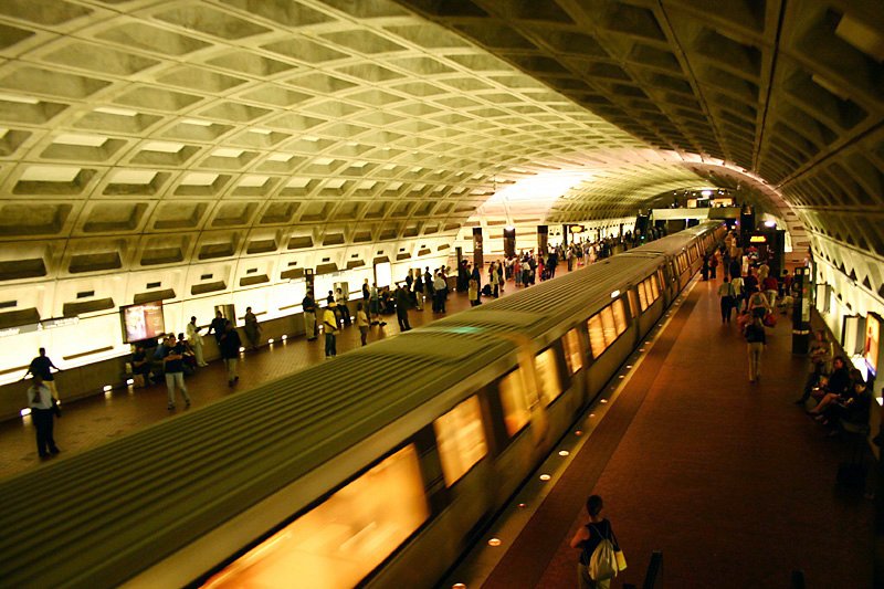
DC

I like the 2nd pic. What does everyone else think?
WM
Here are several pictures I found on Wikipedia. Does anyone have any opinion on which ones might look good.
Basically the actual map of the USA will cover most of the background. I am not sure if the background picture will look that well.
Grand Central
DC
DC
I like the 2nd pic. What does everyone else think?
WM
-
WidowMakers
- Posts: 2774
- Joined: Mon Nov 20, 2006 9:25 am
- Location: Detroit, MI
![]() by WidowMakers on Thu Aug 02, 2007 8:03 pm
by WidowMakers on Thu Aug 02, 2007 8:03 pm
Version 13
OK I used Pic #2 from the previous post and adjusted teh entire map.
What do you think?
The background is almost all gone and confusing. I do like the legend much better now.
I am still going to update the order of the rail lines and bonuses according to onbekende.

OK I used Pic #2 from the previous post and adjusted teh entire map.
What do you think?
The background is almost all gone and confusing. I do like the legend much better now.
I am still going to update the order of the rail lines and bonuses according to onbekende.
-
WidowMakers
- Posts: 2774
- Joined: Mon Nov 20, 2006 9:25 am
- Location: Detroit, MI
![]() by gimil on Thu Aug 02, 2007 8:06 pm
by gimil on Thu Aug 02, 2007 8:06 pm
i think the image could work but right now its TO subtle and soft compared the the rest of the map
ive also noticed that the pink and purple rail lines next to each other at the central station could cause some confusion.
EDIT: actually the image inst that bad. the problem i see is that the top right corner of the background image is lighter and seems to clash with the strong colors. the more midtone parts of the background are fine.
What do you know about map making, bitch?
Top Score:2403
natty_dread wrote:I was wrong
Top Score:2403
-

gimil
- Posts: 8599
- Joined: Sat Mar 03, 2007 12:42 pm
- Location: United Kingdom (Scotland)


![]() by DiM on Thu Aug 02, 2007 9:06 pm
by DiM on Thu Aug 02, 2007 9:06 pm
i liked the old background. especially the moon but i guess the train station image fits.
PS: what's up with cairnswk's sig in the butterfly?
PS: what's up with cairnswk's sig in the butterfly?
“In the beginning God said, the four-dimensional divergence of an antisymmetric, second rank tensor equals zero, and there was light, and it was good. And on the seventh day he rested.”- Michio Kaku
-

DiM
- Posts: 10415
- Joined: Wed Feb 14, 2007 6:20 pm
- Location: making maps for scooby snacks


![]() by cairnswk on Fri Aug 03, 2007 1:40 am
by cairnswk on Fri Aug 03, 2007 1:40 am
WM...I am in the same army as DiM on the old background. I think it was much better on the map....back then.
However, as I pointed out, the old image didn't fit well with the overall look and the new image as Keyogi touts is better for the design all around.
I don't think it is out of place; I really like the title incorporated into the flicker board....job well done there.
And moving the "destructions" and sigs is also a bonus that fits well.
Two suggestions:
* is it possible to dull the ceiling of the station background especially around the Chicago station area and also on the left side near SAC.
* as i mentioned before, the colours on the legend board perhaps just needs a little glow around them or something similar to make them appear like lights on the boards....perhaps even that dotted font previously suggested.
But very good work. I knew you could do it!

* Pearl Harbour * Waterloo * Forbidden City * Jamaica * Pot Mosbi
-

cairnswk
- Posts: 11510
- Joined: Sat Feb 03, 2007 8:32 pm
- Location: Australia


![]() by cairnswk on Fri Aug 03, 2007 1:45 am
by cairnswk on Fri Aug 03, 2007 1:45 am
DiM wrote:PS: what's up with cairnswk's sig in the butterfly?
Trying new sigature design DiM...it may work on some maps but perhaps a different version is required for others. I think WM has done a great job and the design psd will allow other colours to be incroporated.
* Pearl Harbour * Waterloo * Forbidden City * Jamaica * Pot Mosbi
-
cairnswk
- Posts: 11510
- Joined: Sat Feb 03, 2007 8:32 pm
- Location: Australia
![]() by WidowMakers on Fri Aug 03, 2007 4:47 am
by WidowMakers on Fri Aug 03, 2007 4:47 am
I have to agree with DiM, Keyogi and CairnsWK. I liked the old train background too. I was trying to figure out how to keep it but this seemed better (as everyone else has said) with the new legend.
I am going to rework the legend and try to make the board look better. But the title in the legend board really helps. Since I have a littel room on each side now I may make each section of the names the same size and the letter spacing a little wider. All of which will be based on teh order that onbekende pointed out a few posts ago. Just to explain, his order is more of an west to east, left to right layout. It seems to help read the map better.
The background image can be toned down easily but it hen starts to lose some of its purpose. I might just add a glow around the entire playable map are and see if that helps differentiate the map from the background pic.
OK Thanks for the comments
WM
Last edited by WidowMakers on Sat Aug 04, 2007 7:04 am, edited 1 time in total.
-
WidowMakers
- Posts: 2774
- Joined: Mon Nov 20, 2006 9:25 am
- Location: Detroit, MI
![]() by DiM on Fri Aug 03, 2007 7:05 am
by DiM on Fri Aug 03, 2007 7:05 am
cairnswk wrote:DiM wrote:PS: what's up with cairnswk's sig in the butterfly?
Trying new sigature design DiM...it may work on some maps but perhaps a different version is required for others. I think WM has done a great job and the design psd will allow other colours to be incroporated.
i understand but still, a butterfly?
that's kinda girlish
“In the beginning God said, the four-dimensional divergence of an antisymmetric, second rank tensor equals zero, and there was light, and it was good. And on the seventh day he rested.”- Michio Kaku
-
DiM
- Posts: 10415
- Joined: Wed Feb 14, 2007 6:20 pm
- Location: making maps for scooby snacks
![]() by DiM on Fri Aug 03, 2007 7:10 am
by DiM on Fri Aug 03, 2007 7:10 am
WidowMakers wrote:I have to agree with DiM, Jeyogi and CairnsWK. I liked the old train background too. I was trying to figure out how to keep it but this seemed better (as everyone else has said) with the new legend.
I am going to rework the legend and try to make the board look better. But the title in the legend board really helps. Since I have a littel room on each side now I may make each section of the names the same size and the letter spacing a little wider. All of which will be based on teh order that onbekende pointed out a few posts ago. Just to explain, his order is more of an west to east, left to right layout. It seems to help read the map better.
The background image can be toned down easily but it hen starts to lose some of its purpose. I might just add a glow around the entire playable map are and see if that helps differentiate the map from the background pic.
OK Thanks for the comments
WM
the old background had something poetic about it. a steam train through the mountains in the middle of the night with the moon watching over it.
it seemed like i could even feel it. the dum-dum noise of the traks some crickets in the background and some old gramophone music playing silently in the restaurant cart.
anyway back to the new image. i don't like the fact that it does not highlight the map at all. in fact it makes it kinda hard to see. especially in the north eastern corner.
“In the beginning God said, the four-dimensional divergence of an antisymmetric, second rank tensor equals zero, and there was light, and it was good. And on the seventh day he rested.”- Michio Kaku
-
DiM
- Posts: 10415
- Joined: Wed Feb 14, 2007 6:20 pm
- Location: making maps for scooby snacks
![]() by cairnswk on Fri Aug 03, 2007 7:17 am
by cairnswk on Fri Aug 03, 2007 7:17 am
DiM wrote:cairnswk wrote:DiM wrote:PS: what's up with cairnswk's sig in the butterfly?
Trying new sigature design DiM...it may work on some maps but perhaps a different version is required for others. I think WM has done a great job and the design psd will allow other colours to be incroporated.
i understand but still, a butterfly?
that's kinda girlish
Girlish eh? But is not my avatar a butterfly?
You can LOL with you third eye and darkened eyes....i prefer to pupate, crysalate, and spread wings....an ongoing cycle.
Thanks for the joke anyway.
* Pearl Harbour * Waterloo * Forbidden City * Jamaica * Pot Mosbi
-
cairnswk
- Posts: 11510
- Joined: Sat Feb 03, 2007 8:32 pm
- Location: Australia
![]() by DiM on Fri Aug 03, 2007 7:21 am
by DiM on Fri Aug 03, 2007 7:21 am
cairnswk wrote:DiM wrote:cairnswk wrote:DiM wrote:PS: what's up with cairnswk's sig in the butterfly?
Trying new sigature design DiM...it may work on some maps but perhaps a different version is required for others. I think WM has done a great job and the design psd will allow other colours to be incroporated.
i understand but still, a butterfly?
that's kinda girlish
Girlish eh? But is not my avatar a butterfly?
You can LOL with you third eye and darkened eyes....i prefer to pupate, crysalate, and spread wings....an ongoing cycle.
Thanks for the joke anyway.
yep your avvy is a butterfly but that one looks evil. look how he stretched his antennae and legs. he's ready to attack and devour anything in his path
“In the beginning God said, the four-dimensional divergence of an antisymmetric, second rank tensor equals zero, and there was light, and it was good. And on the seventh day he rested.”- Michio Kaku
-
DiM
- Posts: 10415
- Joined: Wed Feb 14, 2007 6:20 pm
- Location: making maps for scooby snacks
![]() by cairnswk on Fri Aug 03, 2007 7:35 am
by cairnswk on Fri Aug 03, 2007 7:35 am
DiM wrote:cairnswk wrote:DiM wrote:cairnswk wrote:DiM wrote:PS: what's up with cairnswk's sig in the butterfly?
Trying new sigature design DiM...it may work on some maps but perhaps a different version is required for others. I think WM has done a great job and the design psd will allow other colours to be incroporated.
i understand but still, a butterfly?
that's kinda girlish
Girlish eh? But is not my avatar a butterfly?
You can LOL with you third eye and darkened eyes....i prefer to pupate, crysalate, and spread wings....an ongoing cycle.
Thanks for the joke anyway.
yep your avvy is a butterfly but that one looks evil. look how he stretched his antennae and legs. he's ready to attack and devour anything in his path
i gotta use this -
"takes sherbet, i'm sure of it"
* Pearl Harbour * Waterloo * Forbidden City * Jamaica * Pot Mosbi
-
cairnswk
- Posts: 11510
- Joined: Sat Feb 03, 2007 8:32 pm
- Location: Australia
![]() by gimil on Fri Aug 03, 2007 9:36 pm
by gimil on Fri Aug 03, 2007 9:36 pm
cairnswk wrote:"takes sherbet, i'm sure of it"
Ruins it for yourself.
**takes sherbert**
if you remeber page 7 of this thread cairn . . .
gimil wrote:cairnswk wrote:gimil wrote:cairnswk wrote:I'm pumped!
*takes sherbert*
you ruined it for yourself
Nah Gimil...sherbert is full of "funny stuff"
I is high on the vibes of life...
you ruined it for yourself.
*takes vibes of life*

What do you know about map making, bitch?
Top Score:2403
natty_dread wrote:I was wrong
Top Score:2403
-
gimil
- Posts: 8599
- Joined: Sat Mar 03, 2007 12:42 pm
- Location: United Kingdom (Scotland)
![]() by DiM on Sat Aug 04, 2007 5:44 am
by DiM on Sat Aug 04, 2007 5:44 am
KEYOGI wrote:Alright guys, back on topic please.
**takes sherbet from Keyogi**
“In the beginning God said, the four-dimensional divergence of an antisymmetric, second rank tensor equals zero, and there was light, and it was good. And on the seventh day he rested.”- Michio Kaku
-
DiM
- Posts: 10415
- Joined: Wed Feb 14, 2007 6:20 pm
- Location: making maps for scooby snacks
![]() by gimil on Sat Aug 04, 2007 8:23 am
by gimil on Sat Aug 04, 2007 8:23 am
DiM wrote:KEYOGI wrote:Alright guys, back on topic please.
**takes sherbet from Keyogi**
ruined it for yourself
What do you know about map making, bitch?
Top Score:2403
natty_dread wrote:I was wrong
Top Score:2403
-
gimil
- Posts: 8599
- Joined: Sat Mar 03, 2007 12:42 pm
- Location: United Kingdom (Scotland)


![]() by cairnswk on Sat Aug 04, 2007 1:11 pm
by cairnswk on Sat Aug 04, 2007 1:11 pm
Gilligan wrote:The butterfly has no head, if you didn't know.
yeah its there gilligan, just blended into the darkness on the background.
EDIT\\ its on the version WM sent me, but not in the forum....Gilligan you're correct...apologies.
WM, can you amend this please.
* Pearl Harbour * Waterloo * Forbidden City * Jamaica * Pot Mosbi
-
cairnswk
- Posts: 11510
- Joined: Sat Feb 03, 2007 8:32 pm
- Location: Australia
Nice
![]() by Keredrex on Sat Aug 04, 2007 1:21 pm
by Keredrex on Sat Aug 04, 2007 1:21 pm
I Like Both Versions... The old Train Background and Moon... And The Tunnel... As for the tunnel version... Add a thin white outline to the border of USA....just enough so the country doen't bleed to nothing with the background
-
Keredrex
- Posts: 400
- Joined: Sun Jan 14, 2007 1:41 am
- Location: New York
![]() by WidowMakers on Tue Aug 07, 2007 5:56 am
by WidowMakers on Tue Aug 07, 2007 5:56 am
VERSION 14
Here are the updates.
1) I changed the order of the names in the legend to correspond to the layout of the map (thanks onbekende)
2) I made the text in the legend feel more like a LCD panel and LCD.
3) The underlined 3 letters of the service line was hard to make look good on the new legend so I edited the text to say "First three letters" Instead of "3 underlined letters"
4) Fixed CairnsWK sig so the butterfly has a head
NOTE: I know there are some stray blue glows behind the map. I will fix this next time.
-
WidowMakers
- Posts: 2774
- Joined: Mon Nov 20, 2006 9:25 am
- Location: Detroit, MI
Who is online
Users browsing this forum: No registered users
|
|||||||
| Conquer Club is not associated with RISK online in any way. Copyright © 2006-2024 by Big Wham LLC | |||||||