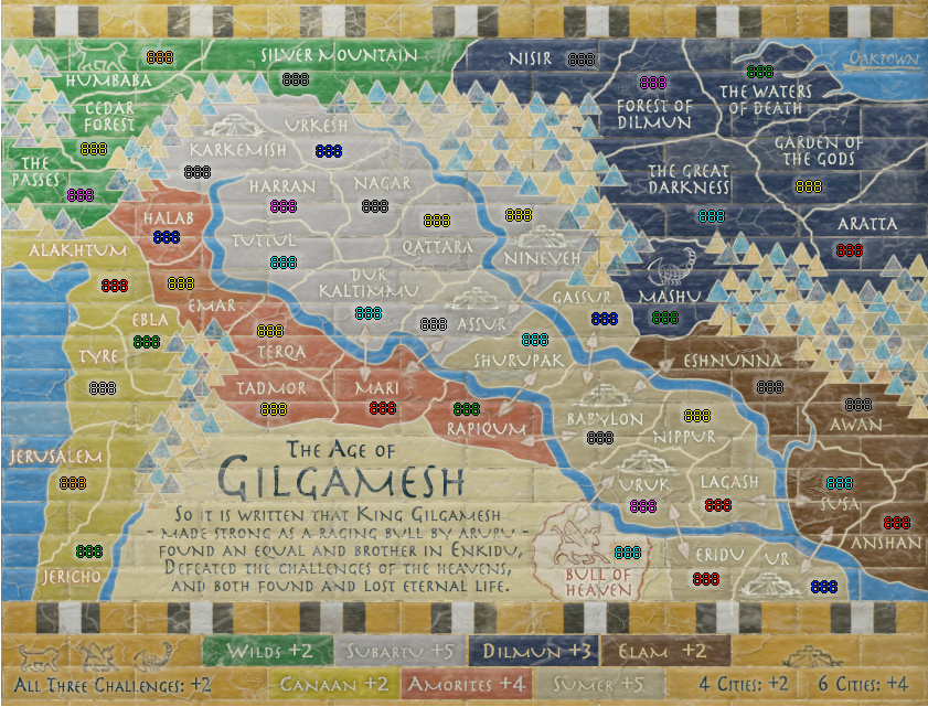
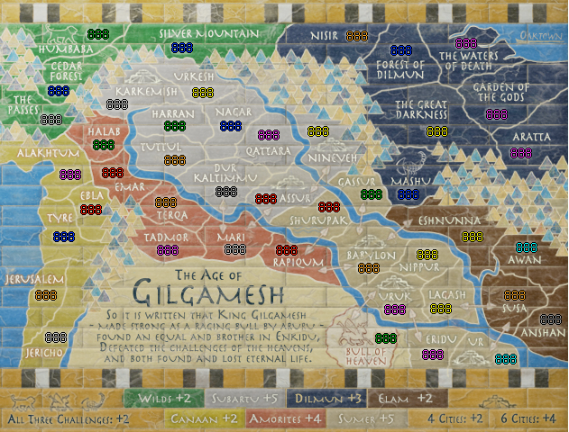
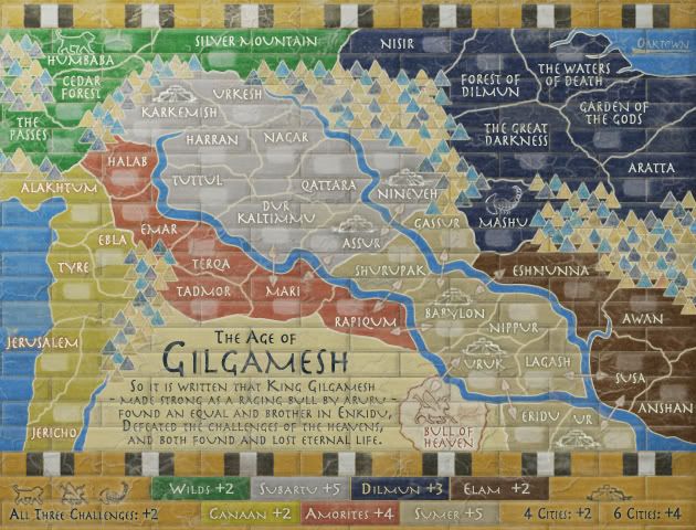
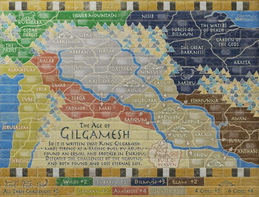
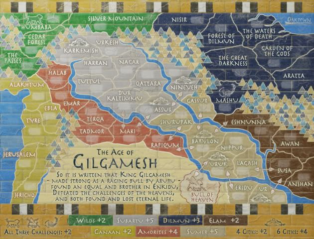
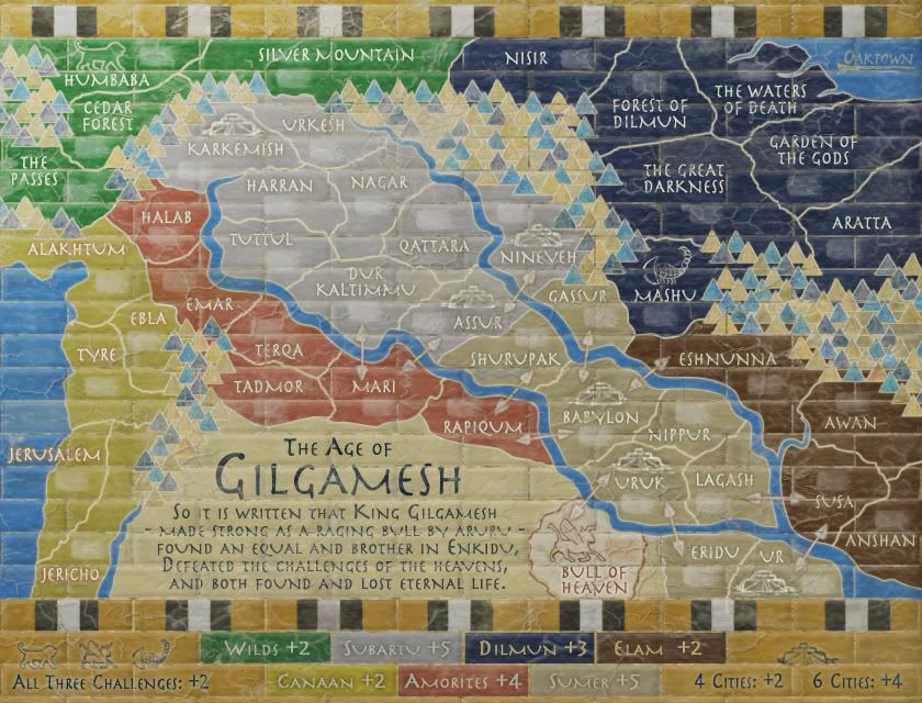
saaimen wrote:porkenbeans wrote:The only areas that are easy to read are the blue and brown areas. This is the only place where there is any kind of contrast.
The rest of the map is all the same, no contrast, no color, no way for me to clearly read it. I know that we have already had this conversation, and I realize that you are stuck on the faded, washed out look. But if you want this map to be popular, you may want to consider the older farts like me, that do not have perfect eyes anymore.

Anything that you could do to make the map easier to read, will be applauded by those like myself.

Just because you don't like the faded look doesn't give you the right to rant like that.
It's a very neat looking, original, concept-true map design and I like it very much.
Kudos to you oak. For making this map and for dealing with comments like the above.
You surely do not know me very well, or you would know that I can really put on a rant if I choose. lol.
I also like this map, it is very original and looks to be a map that I might enjoy playing, Its just that it is a bit hard for me to read. Maybe if the text were black, it would be more legible, and still be able to keep the washed out look. I don't know. Its just an idea.
And thanx Oak, for understanding that my comments are NOT meant as some kind of poke or jab at all of your work. You are one of my favorite mapmakers.


