grtz guys
in case you forgot my wonderful advice / feedback, here's what I got for you
F:
1. try to get the text to be uniform. it should all look like it was written by one guy. right now there looks to be two or three different types of handwriting and computerized text
2. the impassable likes are good but the faded areas could be mistaken for holes. perhaps find a different way for these lines to look hand drawn. maybe just sloppyness or something.
G:
1. the colours of the continents make the impassable lines look strange and different depending on where they are located. eg: yellow vs grey or light blue vs red. maybe have an outer shadow or stroke to make it uniform
H:
1. try to work on the whole old book vs photoshop made image.
2. play up the crease in the middle of the map. it's a fine line (ha ha) but I think slightly more there will go a long way
3. East and West are reversed!
good luck. And, I hope the two that don't win try and take the style they use here and apply it to a different map. Same with the other contestants.
Official Brazil REVAMP competition [Done! - RJbeals wins]
Moderator: Cartographers
Re: Official Brazil REVAMP competition [Pre Round 2]
![]() by edbeard on Sun Jul 27, 2008 8:32 pm
by edbeard on Sun Jul 27, 2008 8:32 pm
Last edited by edbeard on Sun Jul 27, 2008 9:14 pm, edited 1 time in total.
-

 edbeard
- Posts: 2501
- Joined: Thu Mar 29, 2007 12:41 am


Re: Official Brazil REVAMP competition [Pre Round 2]
![]() by RjBeals on Sun Jul 27, 2008 8:35 pm
by RjBeals on Sun Jul 27, 2008 8:35 pm
edbeard wrote:G:
1. the colours of the continents make the impassable lines look strange and different depending on where they are located. eg: yellow vs grey or light blue vs red. maybe have an outer shadow or stroke to make it uniform
Thanks ed - as always, your feedback is appreciated. I'm also taking out the double border line as someone said (i think oak) that it normally represents water.

-

RjBeals
- Posts: 2506
- Joined: Mon Nov 20, 2006 5:17 pm
- Location: South Carolina, USA


Re: Official Brazil REVAMP competition [Pre Round 2]
![]() by edbeard on Sun Jul 27, 2008 8:37 pm
by edbeard on Sun Jul 27, 2008 8:37 pm
RjBeals wrote:edbeard wrote:G:
1. the colours of the continents make the impassable lines look strange and different depending on where they are located. eg: yellow vs grey or light blue vs red. maybe have an outer shadow or stroke to make it uniform
Thanks ed - as always, your feedback is appreciated. I'm also taking out the double border line as someone said (i think oak) that it normally represents water.
you might want to see what you can do with the tilt since Marv mentioned he didn't like it. Though, if it's ok for the 'book' versions, it seems unfair that it's not ok for yours.
-
edbeard
- Posts: 2501
- Joined: Thu Mar 29, 2007 12:41 am
Re: Official Brazil REVAMP competition [Pre Round 2]
![]() by RjBeals on Sun Jul 27, 2008 8:40 pm
by RjBeals on Sun Jul 27, 2008 8:40 pm
I know - that surprised me that the tilt was the only comment Marv had about my map. I was really hoping he would like it more. But o well. I wonder why he doesn't want the tilt? The earth can be viewed from any angle. As long as a compass is added for north direction. I titled Italy in order to fit it. I'll PM Marv and see what he thinks.
-
RjBeals
- Posts: 2506
- Joined: Mon Nov 20, 2006 5:17 pm
- Location: South Carolina, USA
Re: Official Brazil REVAMP competition [Pre Round 2]
![]() by ZeakCytho on Sun Jul 27, 2008 9:01 pm
by ZeakCytho on Sun Jul 27, 2008 9:01 pm
I knew you were H, Oak!
Incidentally, I guessed Rj and WM correctly too.
I have to say, my favorite is Rj's. Just get rid of that weird water effect that goes around it all the way. I also don't love the title font.
Incidentally, I guessed Rj and WM correctly too.
I have to say, my favorite is Rj's. Just get rid of that weird water effect that goes around it all the way. I also don't love the title font.
-

ZeakCytho
- Posts: 1251
- Joined: Wed Sep 12, 2007 4:36 pm


Re: Official Brazil REVAMP competition [Pre Round 2]
![]() by Mjinga on Sun Jul 27, 2008 9:09 pm
by Mjinga on Sun Jul 27, 2008 9:09 pm
Congrats, RJ and all y'all others! I don't like the tilt on yours, RJ, or the waterlines, but that's about it. Oh, and I don't like that you call the blocked borders "non-crossing borders". Rename them to something else, maybe?
How did you get your patterns on the land?
For anyone that was curious, mine was D. I'm happy with how the voting turned out, 'cause I got marvaddin's vote, which was the one I most wanted. And everyone thought I was RJ.
How did you get your patterns on the land?
For anyone that was curious, mine was D. I'm happy with how the voting turned out, 'cause I got marvaddin's vote, which was the one I most wanted.
Reputation cleared. Never let it be said that Team CC don't investigate fairly.
Although they take bloody forever to do it...
Although they take bloody forever to do it...
-
Mjinga
- Posts: 251
- Joined: Fri Sep 14, 2007 2:36 pm


Re: Official Brazil REVAMP competition [Pre Round 2]
![]() by Kaplowitz on Sun Jul 27, 2008 9:10 pm
by Kaplowitz on Sun Jul 27, 2008 9:10 pm
I was A.
Congratz guys
Congratz guys

-

Kaplowitz
- Posts: 3088
- Joined: Tue May 01, 2007 5:11 pm

Re: Official Brazil REVAMP competition [Pre Round 2]
![]() by fireedud on Sun Jul 27, 2008 9:11 pm
by fireedud on Sun Jul 27, 2008 9:11 pm
Widow, can you please get your compass directions right?
me have no sig
-
fireedud
- Posts: 1704
- Joined: Fri Mar 02, 2007 10:06 pm


Re: Official Brazil REVAMP competition [Pre Round 2]
![]() by ZeakCytho on Sun Jul 27, 2008 9:13 pm
by ZeakCytho on Sun Jul 27, 2008 9:13 pm
Btw, here were my guesses:
A: wcaclimbing
B: Kaplowitz
C: No idea
D: Mjinga (course, I helped with this one)
E: Marvaddin, obviously
F: WM
G: Rj
H: Oak
I: No idea
So, who did C and I? Also, guess I was wrong about Kap and wca
A: wcaclimbing
B: Kaplowitz
C: No idea
D: Mjinga (course, I helped with this one)
E: Marvaddin, obviously
F: WM
G: Rj
H: Oak
I: No idea
So, who did C and I? Also, guess I was wrong about Kap and wca
-
ZeakCytho
- Posts: 1251
- Joined: Wed Sep 12, 2007 4:36 pm
Re: Official Brazil REVAMP competition [Pre Round 2]
![]() by RjBeals on Sun Jul 27, 2008 9:14 pm
by RjBeals on Sun Jul 27, 2008 9:14 pm
Kaplowitz wrote:I was A.
Congratz guys
I sooo knew that Kap. Nice job. It was a great looking map.
And Mjinga - I thought your map was Ruben Cesars. Nice work for you too.
-
RjBeals
- Posts: 2506
- Joined: Mon Nov 20, 2006 5:17 pm
- Location: South Carolina, USA
Re: Official Brazil REVAMP competition [Pre Round 2]
![]() by WidowMakers on Sun Jul 27, 2008 9:26 pm
by WidowMakers on Sun Jul 27, 2008 9:26 pm
What?fireedud wrote:Widow, can you please get your compass directions right?

-
WidowMakers
- Posts: 2774
- Joined: Mon Nov 20, 2006 9:25 am
- Location: Detroit, MI


Re: Official Brazil REVAMP competition [Pre Round 2]
![]() by RjBeals on Sun Jul 27, 2008 9:31 pm
by RjBeals on Sun Jul 27, 2008 9:31 pm
WidowMakers wrote:What?fireedud wrote:Widow, can you please get your compass directions right?
He probably meant me.
-
RjBeals
- Posts: 2506
- Joined: Mon Nov 20, 2006 5:17 pm
- Location: South Carolina, USA
Re: Official Brazil REVAMP competition [Pre Round 2]
![]() by whitestazn88 on Sun Jul 27, 2008 10:23 pm
by whitestazn88 on Sun Jul 27, 2008 10:23 pm
congrats to everyone
and by the way, i did predict that oak was h the whole time
and by the way, i did predict that oak was h the whole time
-
whitestazn88
- Posts: 3128
- Joined: Mon Feb 05, 2007 2:59 pm
- Location: behind you


Re: Official Brazil REVAMP competition [Pre Round 2]
![]() by WidowMakers on Sun Jul 27, 2008 11:13 pm
by WidowMakers on Sun Jul 27, 2008 11:13 pm
How is this?edbeard wrote:grtz guys
1. try to get the text to be uniform. it should all look like it was written by one guy. right now there looks to be two or three different types of handwriting and computerized text
2. the impassable likes are good but the faded areas could be mistaken for holes. perhaps find a different way for these lines to look hand drawn. maybe just sloppyness or something.
-Text is the same now.
-Impassable are more hand drawn and the holes from the previous version are less apparent. Still shows old book where.
-added more old dirty feeling.


-
WidowMakers
- Posts: 2774
- Joined: Mon Nov 20, 2006 9:25 am
- Location: Detroit, MI
Re: Official Brazil REVAMP competition [Pre Round 2]
![]() by Night Strike on Sun Jul 27, 2008 11:18 pm
by Night Strike on Sun Jul 27, 2008 11:18 pm
WM, the reason I voted for H over yours was because I liked the information in H, and it doesn't seem like there is enough area there to legibly fit the army numbers while still seeing all the borders and impassables. You'll have to show me those things in order to gain my vote.

-

Night Strike
- Posts: 8512
- Joined: Wed Apr 18, 2007 2:52 pm


Re: Official Brazil REVAMP competition [Pre Round 2]
![]() by edbeard on Sun Jul 27, 2008 11:21 pm
by edbeard on Sun Jul 27, 2008 11:21 pm
overall, it looks better but the text i's a LOT less readable.
problem is most of the text can't be made larger to solve that problem
I'd say just go back to the old text and keep these new borders.
And, I agree that showing a version with 888 can only help you.
problem is most of the text can't be made larger to solve that problem
I'd say just go back to the old text and keep these new borders.
And, I agree that showing a version with 888 can only help you.
-
edbeard
- Posts: 2501
- Joined: Thu Mar 29, 2007 12:41 am
Re: Official Brazil REVAMP competition [Pre Round 2]
![]() by ZeakCytho on Sun Jul 27, 2008 11:25 pm
by ZeakCytho on Sun Jul 27, 2008 11:25 pm
WM, my main problem with yours is size. I just don't see how you can fit armies on many of the territories. The angle the map is at, which is necessary in order to show the pages at the bottom, looks funny to me. But there isn't really a solution to these problems unless you totally scrap your theme. If yours goes on, I'd never play the small version on it. It's just too cramped.
On the upside, the colors are very nice, and I like the legend area a lot.
On the upside, the colors are very nice, and I like the legend area a lot.
-
ZeakCytho
- Posts: 1251
- Joined: Wed Sep 12, 2007 4:36 pm
Re: Official Brazil REVAMP competition [Pre Round 2]
![]() by WidowMakers on Sun Jul 27, 2008 11:26 pm
by WidowMakers on Sun Jul 27, 2008 11:26 pm
Night Strike wrote:WM, the reason I voted for H over yours was because I liked the information in H, and it doesn't seem like there is enough area there to legibly fit the army numbers while still seeing all the borders and impassables. You'll have to show me those things in order to gain my vote.
I will look into fixing that guys. This is the small map however. I understand that it still needs to be readable but it is the small map.edbeard wrote:overall, it looks better but the text i's a LOT less readable.
problem is most of the text can't be made larger to solve that problem
I'd say just go back to the old text and keep these new borders.
And, I agree that showing a version with 888 can only help you.
I might try to zoom more (make the map larger) and lose some of the book image. Does that make sense? Or would that hurt the theme?
-
WidowMakers
- Posts: 2774
- Joined: Mon Nov 20, 2006 9:25 am
- Location: Detroit, MI
Re: Official Brazil REVAMP competition [Pre Round 2]
![]() by edbeard on Sun Jul 27, 2008 11:29 pm
by edbeard on Sun Jul 27, 2008 11:29 pm
I'd say cut off half the text on the left and cut the bottom so that the S in South is at the bottom of the map. cutting off that L shape will help you zoom in a bit and get more space
-
edbeard
- Posts: 2501
- Joined: Thu Mar 29, 2007 12:41 am
Re: Official Brazil REVAMP competition [Pre Round 2]
![]() by Night Strike on Sun Jul 27, 2008 11:40 pm
by Night Strike on Sun Jul 27, 2008 11:40 pm
WM, I only play on small maps, so I would prefer if they are perfectly legible. 
I would prefer that you keep as much of the book theme as possible.
I would prefer that you keep as much of the book theme as possible.
-
Night Strike
- Posts: 8512
- Joined: Wed Apr 18, 2007 2:52 pm
Re: Official Brazil REVAMP competition [Pre Round 2]
![]() by oaktown on Mon Jul 28, 2008 12:27 am
by oaktown on Mon Jul 28, 2008 12:27 am
thanks for the votes everybody... for the record I was quite certain that wid did map F but I wasn't sure about G - I thought it could have been rj or benny, and it also looks a bit like the old mibi/coleman co-productions.
Round 2 - bring it on! I'm not sure what I'm going to do differently and I don't have much time for this over the next three days, but I'll try to pull something together.
Round 2 - bring it on! I'm not sure what I'm going to do differently and I don't have much time for this over the next three days, but I'll try to pull something together.

-

oaktown
- Posts: 4451
- Joined: Sun Dec 03, 2006 9:24 pm
- Location: majorcommand


Re: Official Brazil REVAMP competition [Pre Round 2]
![]() by pamoa on Mon Jul 28, 2008 2:32 am
by pamoa on Mon Jul 28, 2008 2:32 am
I'm so disapointed to recieve my only vote  and I still think it could have been great.
But hey that's competition, so congrats Widowmakers, RJbeals, Oaktown.
Here are my comments
First of all the old map approach in FH for a very young modern and dynamic country do bother me.
Did you guys ever see picture of Brailia, Sao Paulo or Rio recently?
Second in all 3 maps where is the rest of South America and where is the sea ?!?
I thought copacabana beach was one of the trademark of Brazil.
More in detail
Entry F-Widowmakers
Entry G-RJbeals
Entry H-Oaktown
Again congrats to all participant!
But hey that's competition, so congrats Widowmakers, RJbeals, Oaktown.
Here are my comments
First of all the old map approach in FH for a very young modern and dynamic country do bother me.
Did you guys ever see picture of Brailia, Sao Paulo or Rio recently?
Second in all 3 maps where is the rest of South America and where is the sea ?!?
I thought copacabana beach was one of the trademark of Brazil.
More in detail
Entry F-Widowmakers
- I'm not a huge fan of Hand made like stuff.
You will have some problems with armies in Triangulo, Belo Horizonte zone and in Northeast.
It's true you did wrote atlantic ocean in the downright corner but sea color is unvisible.
Impassable border is not clear in Xingu.
And I would made the all map more light.
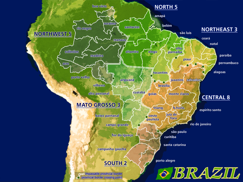
Entry G-RJbeals
- Definily my prefered.
The double yellow line around the country making it like an island is very odd, use it to make the ocean and the other South America country border.
For impassable borders you can maybe try to invert your scheme, double black line with yellow-brown inside.
And that title font, well... you surely can do better.
Entry H-Oaktown
- Well as allways clean and straight forward.
But as said above where is the sea and the rest of the continent?
Again congrats to all participant!
- Click image to enlarge.
De gueules à la tour d'argent ouverte, crénelée de trois pièces, sommée d'un donjon ajouré, crénelé de deux pièces
Gules an open tower silver, crenellated three parts, topped by a apertured turret, crenellated two parts
Gules an open tower silver, crenellated three parts, topped by a apertured turret, crenellated two parts
-

pamoa
- Posts: 1242
- Joined: Sat Sep 01, 2007 3:18 am
- Location: Confederatio Helvetica


Re: Official Brazil REVAMP competition [Pre Round 2]
![]() by RjBeals on Mon Jul 28, 2008 7:15 am
by RjBeals on Mon Jul 28, 2008 7:15 am
pamoa - i really liked your map. the only problem for me was the huge amount of wasted space on the map. You know you have some talent - don't let no votes get you. And thanks for the feedback.
-
RjBeals
- Posts: 2506
- Joined: Mon Nov 20, 2006 5:17 pm
- Location: South Carolina, USA
Re: Official Brazil REVAMP competition [Pre Round 2]
![]() by mibi on Mon Jul 28, 2008 8:59 am
by mibi on Mon Jul 28, 2008 8:59 am
wow... first time checking this thread. i don't check the stickies. anywasy, losts of great entries, its a shame we can't have more than one brazil map.
but i vote RJ hands down. the old book entries are great, but RJ's hass to much clarity and crispness to be passed over, i hope to play on it.
whats the deal with a round 2? whats that for?
but i vote RJ hands down. the old book entries are great, but RJ's hass to much clarity and crispness to be passed over, i hope to play on it.
whats the deal with a round 2? whats that for?
-

mibi
- Posts: 3350
- Joined: Thu Mar 01, 2007 8:19 pm
- Location: The Great State of Vermont
Re: Official Brazil REVAMP competition [Pre Round 2]
![]() by RjBeals on Mon Jul 28, 2008 10:10 am
by RjBeals on Mon Jul 28, 2008 10:10 am
mibi wrote:wow... first time checking this thread. i don't check the stickies. anywasy, losts of great entries, its a shame we can't have more than one brazil map.
but i vote RJ hands down. the old book entries are great, but RJ's hass to much clarity and crispness to be passed over, i hope to play on it.
whats the deal with a round 2? whats that for?
Too bad mibi. I was really hoping you would enter as well.
I guess round-2 is for last minute tweeks, and for all those who voted for the other 7 maps to cast a vote again.
-
RjBeals
- Posts: 2506
- Joined: Mon Nov 20, 2006 5:17 pm
- Location: South Carolina, USA
Who is online
Users browsing this forum: No registered users
|
|||||||
| Conquer Club is not associated with RISK online in any way. Copyright © 2006-2024 by Big Wham LLC | |||||||