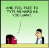
I'm not sure people would be too upset if you found them to be retarded.reverend_kyle wrote:May I stress the fact that using one of these banners in your CC sig does make you look retarded, because if someone is here obv they know about CC.
Use it as a sig at Landgrab.
Ultimate Conquer Club Sig Battle! -=mibi vs. RjBeals=- vote!
Moderator: Community Team
46 posts
• Page 2 of 2 • 1, 2
![]() by Coleman on Tue Nov 13, 2007 6:08 pm
by Coleman on Tue Nov 13, 2007 6:08 pm
Warning: You may be reading a really old topic.
-

 Coleman
- Posts: 5402
- Joined: Tue Jan 02, 2007 10:36 pm
- Location: Midwest


![]() by Twill on Tue Nov 13, 2007 6:27 pm
by Twill on Tue Nov 13, 2007 6:27 pm
Those are some fantastic sigs. Shame you guys didn't add them to the banner contest.
I'm going to say I LOVE number 5. It's so wonderfully ironic
7 and 9 also made me laugh
10 is easily the most slick of them all.
number 2 probably has the best caption: Are you dead yet? But i don't like the graphics - nuke war was never high on my list of likes.
I'm going to say I LOVE number 5. It's so wonderfully ironic
7 and 9 also made me laugh
10 is easily the most slick of them all.
number 2 probably has the best caption: Are you dead yet? But i don't like the graphics - nuke war was never high on my list of likes.
-
Twill
- Posts: 3630
- Joined: Fri Jan 20, 2006 10:54 pm


![]() by AndyDufresne on Tue Nov 13, 2007 10:07 pm
by AndyDufresne on Tue Nov 13, 2007 10:07 pm
These are all pretty fantastic...I don't even know if I can pick a favorite!
Well done guys...keep going! I'd like to see lots of these!
--Andy
- I really like: #4, #7, and #10
Though these follow close behind the above mentioned: #8 and #9
Well done guys...keep going! I'd like to see lots of these!
--Andy
-

AndyDufresne
- Posts: 24935
- Joined: Fri Mar 03, 2006 8:22 pm
- Location: A Banana Palm in Zihuatanejo


![]() by Aerial Attack on Wed Nov 14, 2007 12:52 am
by Aerial Attack on Wed Nov 14, 2007 12:52 am
If I had to rank them, I'd do it thusly:
1. #10 - just the slickest and most professional looking of the bunch
2. #5 - the sheer originality and comedic sense (from an outside perspective)
3. #9 - if the canon were a bit more clearly a canon, this would probably jump to first. The grainy look with the coffee stain, makes it seem like a road sign/billboard. But, even then the canon would much more clearly be a canon. As it is, one could almost confuse it for a gas pump.
4. #6 - this is a slick professional looking map with a haunting undertone
5. #7 - this is definitely the best purely CC/Risk signature
6. #8 - feels almost as if it was designed specifically for the banner contest. Nice, but a bit too much reading ! I just noticed the die border framing the picture. If you had made it 3 reds and 1 or 2 whites and had different numbers, this would have jumped to third.
7. #4 - Doesn't make enough sense/link to Conquer Club well. True #2 doesn't either, but that's basically so out there and it's not TRYING to tie in (too hard)
8. #3 - I would really like this one if the guy didn't look so much like Emperor Ming from the old Flash Gordon movies. Plus, it's a fantastic quote for the site. The red lines all around seem to take away from the desired effect.
9. #2 - Great Tag line. Too bad the art wasn't better
10. #1 - Interesting twist on Hope Springs Eternal, but it's a bit too crowded and the tag doesn't roll off the tongue like it should
To sum it all up - I'd give mibi a slight 51 to 49 advantage. If I were presenting to the Joint Chiefs of Staff - I'd use #10. Pretty much everywhere else, I'd go with #5. Unless my life depended on it (then #10 again).
-

Aerial Attack
- Posts: 1132
- Joined: Mon Jun 04, 2007 7:59 pm
- Location: Generation One: The Clan


![]() by Lanceyboyuk on Wed Nov 14, 2007 6:36 am
by Lanceyboyuk on Wed Nov 14, 2007 6:36 am
most of these are better than banner contest ones lol.
Last edited by Lanceyboyuk on Wed Nov 14, 2007 6:46 am, edited 1 time in total.

-
Lanceyboyuk
- Posts: 259
- Joined: Thu Nov 02, 2006 8:34 am
- Location: Cheshunt, Herts, UK


![]() by chessplaya on Wed Nov 14, 2007 6:45 am
by chessplaya on Wed Nov 14, 2007 6:45 am
I voted for Mibi because I extremely loved the sig number 3 :
the crying man with the for those who love the smell of napalm in the morning ... that was when i decided where my vote was going
RJbeals , although my vote went for Mibi .... U have done an extraordinary job as well.... only thing u werent original in 1 of those sigs .. the 1 with the cannon and the Site introduction next to it!
Veni...
Vidi...
Vici...
Vidi...
Vici...
-
chessplaya
- Posts: 1875
- Joined: Sat Jan 20, 2007 1:46 pm


![]() by RjBeals on Thu Nov 15, 2007 5:02 pm
by RjBeals on Thu Nov 15, 2007 5:02 pm
chessplaya wrote:RJbeals , although my vote went for Mibi .... U have done an extraordinary job as well.... only thing u werent original in 1 of those sigs .. the 1 with the cannon and the Site introduction next to it!
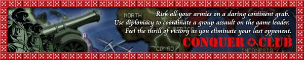
This one gave me the most trouble. I actually pulled out my risk game, took a digital picture of the canon, then brought it in photoshop & posterized it. I dislike the dice border - and I wish I didn't put it there, and although I like the line of army men, I don't like the way they blend with the canon.
Thanks for the votes guys. Even coming close to mibi is sweet. Remember he made the SEIGE map, the D-Day: Omaha Beach map, and the unfinished but very impressive The Trojan War map.

-

RjBeals
- Posts: 2506
- Joined: Mon Nov 20, 2006 5:17 pm
- Location: South Carolina, USA

![]() by wcaclimbing on Thu Nov 15, 2007 5:19 pm
by wcaclimbing on Thu Nov 15, 2007 5:19 pm
RJbeals all the way!
I like numbers 4 and 10 the most (both by RJ)
I like numbers 4 and 10 the most (both by RJ)

-

wcaclimbing
- Posts: 5598
- Joined: Fri May 12, 2006 10:09 pm
- Location: In your quantum box....Maybe.


![]() by cena-rules on Wed Nov 21, 2007 1:54 pm
by cena-rules on Wed Nov 21, 2007 1:54 pm
Can 1 of you do me a sig if I pm what I want please
19:41:22 ‹jakewilliams› I was a pedo
-

cena-rules
- Posts: 9740
- Joined: Sat Apr 28, 2007 2:27 am
- Location: Chat


Re: Ultimate Conquer Club Sig Battle! -=mibi vs. RjBeals=- vote!
![]() by Bruceswar on Tue Nov 03, 2009 5:35 pm
by Bruceswar on Tue Nov 03, 2009 5:35 pm
I forgot how great this was... these could be some killer ads. 
Highest Rank: 26 Highest Score: 3480

-

Bruceswar
- Posts: 9713
- Joined: Sun Dec 23, 2007 12:36 am
- Location: Cow Pastures


Re: Ultimate Conquer Club Sig Battle! -=mibi vs. RjBeals=- vote!
![]() by Foxglove on Tue Nov 03, 2009 5:54 pm
by Foxglove on Tue Nov 03, 2009 5:54 pm
These are very nice.  One of mibi's is missing though!
-
Foxglove
- Posts: 1308
- Joined: Sun Dec 16, 2007 1:05 pm


Re: Ultimate Conquer Club Sig Battle! -=mibi vs. RjBeals=- vote!
![]() by AndyDufresne on Tue Nov 03, 2009 5:58 pm
by AndyDufresne on Tue Nov 03, 2009 5:58 pm
These were indeed extremely fun to watch develop. I'd like to see something like this again...perhaps for a contest medal? Hm?
--Andy
--Andy
-
AndyDufresne
- Posts: 24935
- Joined: Fri Mar 03, 2006 8:22 pm
- Location: A Banana Palm in Zihuatanejo
Re: Ultimate Conquer Club Sig Battle! -=mibi vs. RjBeals=- vote!
![]() by Bruceswar on Tue Nov 03, 2009 6:09 pm
by Bruceswar on Tue Nov 03, 2009 6:09 pm
We had the layer battle arena for a bit, but not much was done there. This could be cool and some of these should be used as ads by lack...
Highest Rank: 26 Highest Score: 3480
-
Bruceswar
- Posts: 9713
- Joined: Sun Dec 23, 2007 12:36 am
- Location: Cow Pastures
Re: Ultimate Conquer Club Sig Battle! -=mibi vs. RjBeals=- vote!
![]() by mibi on Tue Nov 03, 2009 7:22 pm
by mibi on Tue Nov 03, 2009 7:22 pm
Bruceswar wrote:We had the layer battle arena for a bit, but not much was done there. This could be cool and some of these should be used as ads by lack...
I agree. I was always found of this one from another layer battle. I like how it turned out.

-

mibi
- Posts: 3350
- Joined: Thu Mar 01, 2007 8:19 pm
- Location: The Great State of Vermont


Re: Ultimate Conquer Club Sig Battle! -=mibi vs. RjBeals=- vote!
![]() by karelpietertje on Tue Nov 03, 2009 7:53 pm
by karelpietertje on Tue Nov 03, 2009 7:53 pm
Will there be anyone to challenge mibi ?

-

karelpietertje
- Posts: 801
- Joined: Mon Sep 03, 2007 1:43 pm


Re: Ultimate Conquer Club Sig Battle! -=mibi vs. RjBeals=- vote!
![]() by the.killing.44 on Tue Nov 03, 2009 7:56 pm
by the.killing.44 on Tue Nov 03, 2009 7:56 pm
karelpietertje wrote:Will there be anyone to challenge mibi
Only his clients
-

the.killing.44
- Posts: 4724
- Joined: Thu Oct 23, 2008 7:43 pm
- Location: now tell me what got two gums and knows how to spit rhymes


46 posts
• Page 2 of 2 • 1, 2
Return to Conquer Club Discussion
Who is online
Users browsing this forum: No registered users
|
|||||||
| Conquer Club is not associated with RISK online in any way. Copyright © 2006-2025 by Big Wham LLC | |||||||