Pangea | Pangaea etc.
Moderator: Cartographers
Re: PANGAEA!
![]() by captainwalrus on Tue Jan 12, 2010 4:06 pm
by captainwalrus on Tue Jan 12, 2010 4:06 pm
@poster unied- Proper grammar and spelling would be appreciated. It takes a little more effort, but it is very worth it for everyone. 
~ CaptainWalrus
-

 captainwalrus
- Posts: 1018
- Joined: Sun Nov 11, 2007 3:19 pm
- Location: Finnmark


Re: Pangea | Pangaea etc.
![]() by natty dread on Wed Jan 13, 2010 8:11 pm
by natty dread on Wed Jan 13, 2010 8:11 pm
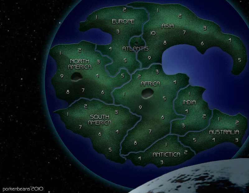
That looks really cool... but what's Antictica?

-

natty dread
- Posts: 12877
- Joined: Fri Feb 08, 2008 8:58 pm
- Location: just plain fucked


Re: Pangea | Pangaea etc.
![]() by porkenbeans on Wed Jan 13, 2010 8:13 pm
by porkenbeans on Wed Jan 13, 2010 8:13 pm
Yeah, I just noticed the typo. ...And thanks.natty_dread wrote:That looks really cool... but what's Antictica?

-

porkenbeans
- Posts: 2546
- Joined: Mon Sep 10, 2007 4:06 pm


Re: Pangea | Pangaea etc.
![]() by natty dread on Wed Jan 13, 2010 8:24 pm
by natty dread on Wed Jan 13, 2010 8:24 pm
porkenbeans wrote:Yeah, I just noticed the typo. ...And thanks.natty_dread wrote:That looks really cool... but what's Antictica?
So, now I know where you've been... you've probably been working on this baby day & night so you've had no time to stop by to the forums, eh?
So, as for the map... It looks like it could be a good map. It seems since the space-view in that other map of yours got shot down you needed another project to use it on... which is cool, now you can develop both maps in their own directions.
You'll probably need army circles, your land area is kinda dark. Personally... I'd maybe like to see it a bit lighter. You know, for clarity.
I really like the sparkly glitter texture on the land. You might get some
You're going to need to decide if you're going to use borders or connecting lines. Personally, I'd be ok with either, but since connecting lines seem to be decreasingly popular these days, borders might be the safer bet.
The numbers make me think of Feudal... Are you sure you'd not rather use actual country/region names for the territories? It's the one thing I kinda dislike in Feudal, the long list of similar looking territory names when you attack/deploy/reinforce...
Well, that's all I've got, looking forward to see where this goes.
-
natty dread
- Posts: 12877
- Joined: Fri Feb 08, 2008 8:58 pm
- Location: just plain fucked
Re: Pangea | Pangaea etc.
![]() by porkenbeans on Wed Jan 13, 2010 8:59 pm
by porkenbeans on Wed Jan 13, 2010 8:59 pm
I did the whole thing today, in about 4 hours. I am not too interested in actually doing the game play. I just threw up a bunch of numbers, so as to show how many territs, that I think would be proper. I did not draw in any borders for them yet, because I want to see if someone that has already been following, and/or working on the game play, would want to use my graphics. If someone steps up and wants to develop this map, I would be happy to provide the updates required.
Also, I have found that a dark background with a very small scale texture, does not need ANY circles.
Also, I have found that a dark background with a very small scale texture, does not need ANY circles.
-
porkenbeans
- Posts: 2546
- Joined: Mon Sep 10, 2007 4:06 pm
Re: Pangea | Pangaea etc.
![]() by captainwalrus on Wed Jan 13, 2010 9:03 pm
by captainwalrus on Wed Jan 13, 2010 9:03 pm
Do you know how accurate that is, or is it just rough estimations of how things would have been put together?
~ CaptainWalrus
-
captainwalrus
- Posts: 1018
- Joined: Sun Nov 11, 2007 3:19 pm
- Location: Finnmark
Re: Pangea | Pangaea etc.
![]() by porkenbeans on Wed Jan 13, 2010 10:35 pm
by porkenbeans on Wed Jan 13, 2010 10:35 pm
Well, nobody knows exactly what it looked like, but through the study of geology, and zoology, we do know where the continents matched up. Take a look at bizman's post, about 12 posts back. Click on the link, and you will see a pretty good example of what it may have looked like at some point in time.captainwalrus wrote:Do you know how accurate that is, or is it just rough estimations of how things would have been put together?
-
porkenbeans
- Posts: 2546
- Joined: Mon Sep 10, 2007 4:06 pm
Re: Pangea | Pangaea etc.
![]() by sully800 on Thu Jan 14, 2010 3:50 pm
by sully800 on Thu Jan 14, 2010 3:50 pm
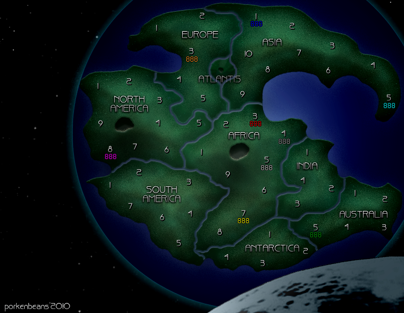
porkenbeans wrote:
- Click image to enlarge.
Sorry, but can you try putting blue where cyan or pink is? Dark backgrounds work well for most of the colors, but blue was always a problem (and the darker it is the worse it is).
The map is a pretty good start though - it's a commonly attempted idea so maybe someone will want to pursue it.
-

sully800
- Posts: 4978
- Joined: Wed Jun 14, 2006 5:45 pm
- Location: Bethlehem, Pennsylvania


Re: Pangea | Pangaea etc.
![]() by porkenbeans on Thu Jan 14, 2010 4:15 pm
by porkenbeans on Thu Jan 14, 2010 4:15 pm
- Click image to enlarge.
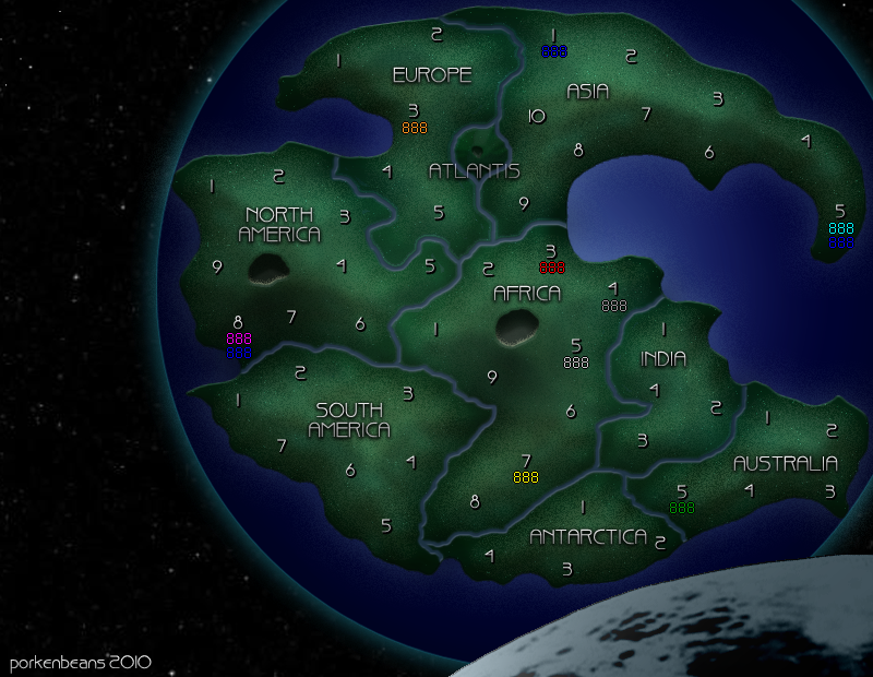
(and the darker it is the worse it is)
Gotta disagree with you here, The army colors are neon, and the darker the background, the BETTER they show up.
The reason that you may think this, is because most maps are NOT really dark enough to show the contrasting "neon" army numbers. And, if you have a large scale texture going on, it makes it even harder to read.
-
porkenbeans
- Posts: 2546
- Joined: Mon Sep 10, 2007 4:06 pm
Re: Pangea | Pangaea etc.
![]() by captainwalrus on Thu Jan 14, 2010 8:30 pm
by captainwalrus on Thu Jan 14, 2010 8:30 pm
I think he meant the darker the army color, like if it is head by a silver, red or blue player, it will be harder to read. With these colors though, I don't think it matters though. Green might be a problem in some areas, as the map is green.
~ CaptainWalrus
-
captainwalrus
- Posts: 1018
- Joined: Sun Nov 11, 2007 3:19 pm
- Location: Finnmark
Re: Pangea | Pangaea etc.
![]() by sully800 on Sat Jan 16, 2010 7:33 am
by sully800 on Sat Jan 16, 2010 7:33 am
The problem is that most of the numbers are light, and have a black outline - they show up well on light colors but also work fine on dark colors as shown above.
Blue however is a dark color with a black outline. It shows up well on light colors, but looks really bad on dark colors as shown above. The old classic (version 1) had dark army shadows, and the blue numbers were very hard to read for a lot of people. This prompted the first classic touch up, to make the blue numbers easier to read.
That should really just be a consideration for maps in general though. I don't believe this one is being developed.
-
sully800
- Posts: 4978
- Joined: Wed Jun 14, 2006 5:45 pm
- Location: Bethlehem, Pennsylvania
Re: Pangea | Pangaea etc.
![]() by porkenbeans on Sat Jan 16, 2010 12:35 pm
by porkenbeans on Sat Jan 16, 2010 12:35 pm
Do you think the blue numbers are hard to read on this map ?sully800 wrote:The problem is that most of the numbers are light, and have a black outline - they show up well on light colors but also work fine on dark colors as shown above.
Blue however is a dark color with a black outline. It shows up well on light colors, but looks really bad on dark colors as shown above. The old classic (version 1) had dark army shadows, and the blue numbers were very hard to read for a lot of people. This prompted the first classic touch up, to make the blue numbers easier to read.
That should really just be a consideration for maps in general though. I don't believe this one is being developed.
-
porkenbeans
- Posts: 2546
- Joined: Mon Sep 10, 2007 4:06 pm
Re: Pangea | Pangaea etc.
![]() by porkenbeans on Sat Jan 16, 2010 3:59 pm
by porkenbeans on Sat Jan 16, 2010 3:59 pm
I use glasses, and I can see the blue numbers crystal clear, with or without them on.sully800 wrote:yes
You gotta be kidding, ...right ?
-
porkenbeans
- Posts: 2546
- Joined: Mon Sep 10, 2007 4:06 pm
Re: Pangea | Pangaea etc.
![]() by sully800 on Sat Jan 16, 2010 4:35 pm
by sully800 on Sat Jan 16, 2010 4:35 pm
porkenbeans wrote:I use glasses, and I can see the blue numbers crystal clear, with or without them on.sully800 wrote:yes
You gotta be kidding, ...right ?
If you released a map like that I guarantee that people would complain. Yes I can figure out what the numbers say. No they are not easy to read, and it would not be fun to be a game with a background that dark.
-
sully800
- Posts: 4978
- Joined: Wed Jun 14, 2006 5:45 pm
- Location: Bethlehem, Pennsylvania
Re: Pangea | Pangaea etc.
![]() by AndyDufresne on Sat Jan 16, 2010 4:47 pm
by AndyDufresne on Sat Jan 16, 2010 4:47 pm
Agreed, blue looks bad on dark colors. There is enough Foundry history to suggest this.
--Andy
--Andy
-

AndyDufresne
- Posts: 24935
- Joined: Fri Mar 03, 2006 8:22 pm
- Location: A Banana Palm in Zihuatanejo


Re: Pangea | Pangaea etc.
![]() by porkenbeans on Sat Jan 16, 2010 7:44 pm
by porkenbeans on Sat Jan 16, 2010 7:44 pm
- Click image to enlarge.

This map has a black background.
Other very dark maps include, Omaha, and Space. Europe and Arms race use black circles. I have no problem reading any of these maps.
I have a feeling that its only the dark maps with large texture, that people have a hard time reading. Not all dark maps are hard to read. I believe that the texture has more to do with causing legibility problems, than the brightness does.
Some maps, because of the subject and/or style, need to be dark. A map depicting "Space", is certainly a prime example. I will show a version with a "brighter" Earth, and then tell me which is best.
- Click image to enlarge.
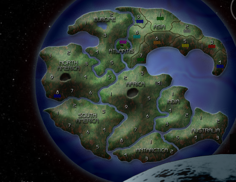
I think the numbers show up better over the dark areas, than the light areas.
-
porkenbeans
- Posts: 2546
- Joined: Mon Sep 10, 2007 4:06 pm
Re: Pangea | Pangaea etc.
![]() by AndyDufresne on Sat Jan 16, 2010 10:50 pm
by AndyDufresne on Sat Jan 16, 2010 10:50 pm
You're right, it is about balance. Which you should most definitely attempt, otherwise it just looks like junk.
--Andy
--Andy
-
AndyDufresne
- Posts: 24935
- Joined: Fri Mar 03, 2006 8:22 pm
- Location: A Banana Palm in Zihuatanejo
Re: Pangea | Pangaea etc.
![]() by alex951 on Sat Jan 16, 2010 10:57 pm
by alex951 on Sat Jan 16, 2010 10:57 pm
porkenbeans wrote:I think the numbers show up better over the dark areas, than the light areas.
this version is a bit brighter then the other one, but the blue 888 might still pose a problem to some probably more so if it was over the 7 area (i usually dont pay this part of the forum a visit so sorry if i'm wrong or sound dumb)
-

alex951
- Posts: 920
- Joined: Thu Aug 28, 2008 1:00 pm


Re: Pangea | Pangaea etc.
![]() by natty dread on Sun Jan 17, 2010 6:06 am
by natty dread on Sun Jan 17, 2010 6:06 am
Now that I look at it, the blue numbers are a bit hard to read at asia 4...
-
natty dread
- Posts: 12877
- Joined: Fri Feb 08, 2008 8:58 pm
- Location: just plain fucked
Re: Pangea | Pangaea etc.
![]() by alex951 on Sun Jan 17, 2010 1:36 pm
by alex951 on Sun Jan 17, 2010 1:36 pm
My first post I was using my pc right now I'm on my droid and the map looks fine. I guess the brightness also depends on peoples personal settings.
I would like to see less rivers and more mountain regions
I would like to see less rivers and more mountain regions
-
alex951
- Posts: 920
- Joined: Thu Aug 28, 2008 1:00 pm
Re: Pangea | Pangaea etc.
![]() by Neoteny on Mon Jan 18, 2010 4:30 pm
by Neoteny on Mon Jan 18, 2010 4:30 pm
But... it's Pangaea!
Napoleon Ier wrote:You people need to grow up to be honest.
-

Neoteny
- Posts: 3396
- Joined: Tue Sep 18, 2007 10:24 pm
- Location: Atlanta, Georgia


Re: Pangea | Pangaea etc.
![]() by captainwalrus on Mon Jan 18, 2010 6:18 pm
by captainwalrus on Mon Jan 18, 2010 6:18 pm
Try putting in a bunch of random numbers, not just 888's, and see if people can tell what they are. It is fine if you know it is 888, but maybe not if you can't tell if it is a 5 or 6 or something.
~ CaptainWalrus
-
captainwalrus
- Posts: 1018
- Joined: Sun Nov 11, 2007 3:19 pm
- Location: Finnmark
Return to Melting Pot: Map Ideas
Who is online
Users browsing this forum: No registered users
|
|||||||
| Conquer Club is not associated with RISK online in any way. Copyright © 2006-2025 by Big Wham LLC | |||||||