 by KLOBBER on Sat May 26, 2007 6:29 am
Dear Posters,
Thank you for all your kind and intelligent suggestions.
I have read all suggestions posted so far and taken them all under serious consideration. After carefully and thoughtfully delving deep into the wise words of the other posters, I have discovered that the same suggestions, numbering just four in total, keep coming up over and over again, with slightly different wording each time. This phenomenon continues even though I have already, in accordance with the Foundry’s guidelines, submitted appropriate rebuttals to each and every one of them.
I’m not as fond of repetition as the other posters here seem to be, but there is an old saying that goes, “When in Rome, do as the Romans,” and so I have decided to repeat my logical rebuttals as well. Please bear in mind that this type of repetition is somewhat of a departure for me, and although I personally find repetition to be annoying and possibly even a sign of compromised intelligence, still, I am compelled to do so by circumstances beyond my control.
I’ve carefully collected them and placed them together, here in this post, for your convenient, and possibly repetitive, perusal. The four suggestions follow, with their respective logical rebuttals attached, below:
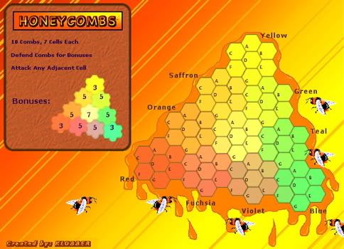
1. Map Size –
I was thinking about the size too, but I compared the size of the cells to the size of the circular shadow regions on the standard map, placing them right next to each other on the same computer screen, and I can understand that they will fit perfectly. Feel free to check it the same way, if you are equipped to do so, and when you’re finished, come back and tell me what you can understand from it, if anything.
In accordance with the Foundry’s guidelines, which state that the map should be no more than 350 pixels high so that players will not have to scroll down to play, I have limited it to 350. This map will avoid that scrolling annoyance.
2. Color Distinction –
This is an aspect of this map to which I have dedicated a great deal of valuable time, careful thought, and deep contemplation. There is a scaled-down guide to the left, in the exact shape of the playing board, in which the colors are extremely distinct, unique, and vibrantly contrasted to one another. This guide is one of the great features of this map not available on any others, and being an exact replica in shape, this will be an excellent guide to keep players well-informed of their options in regards to continents and bonuses.
The ten regions (combs) on the playing board, in and of themselves, are quite clear and easy to distinguish from one another. In addition to this, there is a unique and innovative continent guide just centimeters to the left of the playing board, and so even newcomers to the site will have no trouble at all playing this map in an efficient and well-organized manner – yes, even newcomers.
As if that were not enough, the shadow regions will cover the cells almost entirely, and when the cells of each comb are thus tinted a darker color, they will appear even yet more distinct from the cells of the other combs than they already do, which is saying a lot.
3. Impenetrable Borders –
I would like to point out that some maps on this site have impenetrable borders, and others do not. Actually, there is simply no such requirement. Also, I would like to point out that the Classic Map, which is the single most popularly played map on the site, does not include any impenetrable borders at all.
4. Legend Size –
The legend will not interfere with game play at its present size, nor would it interfere with game play if it were even larger. Also, the Foundry requires a legend to be part of the map.
Thank you very much,
Klobber
Last edited by
KLOBBER on Sat May 26, 2007 6:35 am, edited 3 times in total.


](./images/smilies/eusa_wall.gif "Brick wall")
