My suggestion is to scrap this version, get back to the roots, the real jamaca, that's not all beaches and rastas. Throw in some earthtones, some texture, some lions. This map is too club-med and not enough real jamaca.
sunrise in Paradise.
Moderator: Cartographers
Re: JAMAICAmon'
![]() by mibi on Tue Nov 03, 2009 5:01 pm
by mibi on Tue Nov 03, 2009 5:01 pm
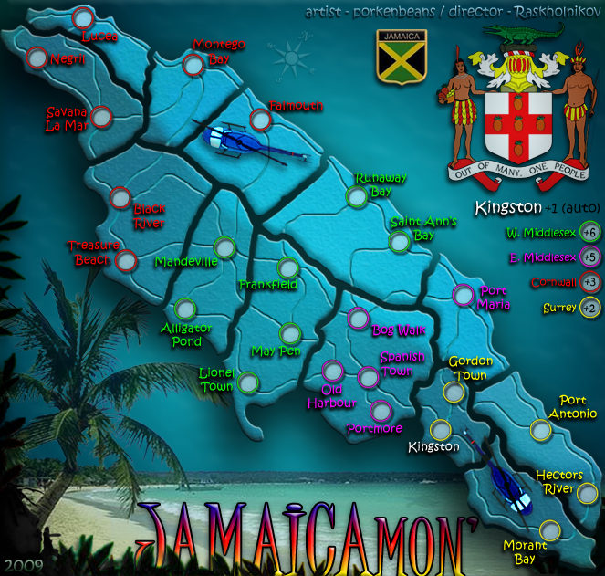
I don't know much about the gameplay, but the graphic doesn't work for me. Why is on an angle like that? It looks rather cramped, being all wedged up in there. It also looks like a fish, or a diving seaturtle. I don't thinkt the blue color works either. It doesn't really make sense for a landmass to be the color of the ocean and water. It has an Atlantis feel to it. The fragmentation of the country seems odd, and a bit arbitrary. It feels like earth quakes severed the country. Over all the map is way to big for such a few territories. And why do you have two seals in there? Isn't one enough? Might as well throw in the Jamacan flag, Jamacan national bird, and a picture of the president. The background image is not bad, and is workable, but the title text and the title itself feels a little Disney to me.
My suggestion is to scrap this version, get back to the roots, the real jamaca, that's not all beaches and rastas. Throw in some earthtones, some texture, some lions. This map is too club-med and not enough real jamaca.
My suggestion is to scrap this version, get back to the roots, the real jamaca, that's not all beaches and rastas. Throw in some earthtones, some texture, some lions. This map is too club-med and not enough real jamaca.
-

 mibi
mibi
- Posts: 3350
- Joined: Thu Mar 01, 2007 8:19 pm
- Location: The Great State of Vermont


Re: JAMAICAmon'
![]() by porkenbeans on Tue Nov 03, 2009 5:09 pm
by porkenbeans on Tue Nov 03, 2009 5:09 pm
mibi, I just gotta say "you are out of your mind".mibi wrote:I don't know much about the gameplay, but the graphic doesn't work for me. Why is on an angle like that? It looks rather cramped, being all wedged up in there. It also looks like a fish, or a diving seaturtle. I don't thinkt the blue color works either. It doesn't really make sense for a landmass to be the color of the ocean and water. It has an Atlantis feel to it. The fragmentation of the country seems odd, and a bit arbitrary. It feels like earth quakes severed the country. Over all the map is way to big for such a few territories. And why do you have two seals in there? Isn't one enough? Might as well throw in the Jamacan flag, Jamacan national bird, and a picture of the president. The background image is not bad, and is workable, but the title text and the title itself feels a little Disney to me.
My suggestion is to scrap this version, get back to the roots, the real jamaca, that's not all beaches and rastas. Throw in some earthtones, some texture, some lions. This map is too club-med and not enough real jamaca.
But I do not think that you are even here to offer any constructive criticism. If you can't even figure out why the island is tilted, Well, ... what can I say ?

-

porkenbeans
- Posts: 2546
- Joined: Mon Sep 10, 2007 4:06 pm


Re: JAMAICAmon'
![]() by the.killing.44 on Tue Nov 03, 2009 5:14 pm
by the.killing.44 on Tue Nov 03, 2009 5:14 pm
Dunno what you can say, but I say he's right.
-

the.killing.44
- Posts: 4724
- Joined: Thu Oct 23, 2008 7:43 pm
- Location: now tell me what got two gums and knows how to spit rhymes


Re: JAMAICAmon'
![]() by WidowMakers on Tue Nov 03, 2009 5:17 pm
by WidowMakers on Tue Nov 03, 2009 5:17 pm
constructive criticism http://dictionary.reference.com/browse/ ... +criticism
-criticism or advice that is useful and intended to help or improve something, often with an offer of possible solutions.
If all you want is for people to agree with you and say the map is great then you are not looking for criticism.
Pork just because it is your map, does not make it a good map.
Before ignoring everyone and blindly moving along, think about what people say and maybe the people who have made maps before have an idea on what to do.
agreed
-criticism or advice that is useful and intended to help or improve something, often with an offer of possible solutions.
- He thinks it is bad.
He has sighted things that others also think are bad.
He offers suggestions to make it better.
He has provided constructive criticism.
If all you want is for people to agree with you and say the map is great then you are not looking for criticism.
Pork just because it is your map, does not make it a good map.
Before ignoring everyone and blindly moving along, think about what people say and maybe the people who have made maps before have an idea on what to do.
the.killing.44 wrote:Dunno what you can say, but I say he's right.
agreed

-
WidowMakers
- Posts: 2774
- Joined: Mon Nov 20, 2006 9:25 am
- Location: Detroit, MI


Re: JAMAICAmon'
![]() by mibi on Tue Nov 03, 2009 5:24 pm
by mibi on Tue Nov 03, 2009 5:24 pm
porkenbeans wrote:mibi, I just gotta say "you are out of your mind".mibi wrote:I don't know much about the gameplay, but the graphic doesn't work for me. Why is on an angle like that? It looks rather cramped, being all wedged up in there. It also looks like a fish, or a diving seaturtle. I don't thinkt the blue color works either. It doesn't really make sense for a landmass to be the color of the ocean and water. It has an Atlantis feel to it. The fragmentation of the country seems odd, and a bit arbitrary. It feels like earth quakes severed the country. Over all the map is way to big for such a few territories. And why do you have two seals in there? Isn't one enough? Might as well throw in the Jamacan flag, Jamacan national bird, and a picture of the president. The background image is not bad, and is workable, but the title text and the title itself feels a little Disney to me.
My suggestion is to scrap this version, get back to the roots, the real jamaca, that's not all beaches and rastas. Throw in some earthtones, some texture, some lions. This map is too club-med and not enough real jamaca.
But I do not think that you are even here to offer any constructive criticism. If you can't even figure out why the island is tilted, Well, ... what can I say ?
Not sure why I would be out of my mind, but my ciritcisms are valid. Also please enlighten me as to why Jamaica is on an angle like that. I can't find another map of jamaica that displays it like that.
http://lmgtfy.com/?q=map+of+jamaica
-
mibi
- Posts: 3350
- Joined: Thu Mar 01, 2007 8:19 pm
- Location: The Great State of Vermont
Re: JAMAICAmon'
![]() by porkenbeans on Tue Nov 03, 2009 5:32 pm
by porkenbeans on Tue Nov 03, 2009 5:32 pm
Be happy tomibi wrote:porkenbeans wrote:mibi, I just gotta say "you are out of your mind".mibi wrote:I don't know much about the gameplay, but the graphic doesn't work for me. Why is on an angle like that? It looks rather cramped, being all wedged up in there. It also looks like a fish, or a diving seaturtle. I don't thinkt the blue color works either. It doesn't really make sense for a landmass to be the color of the ocean and water. It has an Atlantis feel to it. The fragmentation of the country seems odd, and a bit arbitrary. It feels like earth quakes severed the country. Over all the map is way to big for such a few territories. And why do you have two seals in there? Isn't one enough? Might as well throw in the Jamacan flag, Jamacan national bird, and a picture of the president. The background image is not bad, and is workable, but the title text and the title itself feels a little Disney to me.
My suggestion is to scrap this version, get back to the roots, the real jamaca, that's not all beaches and rastas. Throw in some earthtones, some texture, some lions. This map is too club-med and not enough real jamaca.
But I do not think that you are even here to offer any constructive criticism. If you can't even figure out why the island is tilted, Well, ... what can I say ?
Not sure why I would be out of my mind, but my ciritcisms are valid. Also please enlighten me as to why Jamaica is on an angle like that. I can't find another map of jamaica that displays it like that.
http://lmgtfy.com/?q=map+of+jamaica
. Right after you scroll back and take a moment or two to read the progress of this thread. Then I can try to have this conversation, without having to repeat myself so much.
-
porkenbeans
- Posts: 2546
- Joined: Mon Sep 10, 2007 4:06 pm
Re: JAMAICAmon'
![]() by WidowMakers on Tue Nov 03, 2009 5:48 pm
by WidowMakers on Tue Nov 03, 2009 5:48 pm
I believe he said so he can make the island bigger. However, I don't see why 630 pixels wide in the small map is not big enough.mibi wrote:Not sure why I would be out of my mind, but my ciritcisms are valid. Also please enlighten me as to why Jamaica is on an angle like that. I can't find another map of jamaica that displays it like that.
http://lmgtfy.com/?q=map+of+jamaica
-
WidowMakers
- Posts: 2774
- Joined: Mon Nov 20, 2006 9:25 am
- Location: Detroit, MI
Re: JAMAICAmon'
![]() by mibi on Tue Nov 03, 2009 6:02 pm
by mibi on Tue Nov 03, 2009 6:02 pm
porkenbeans wrote:Be happy tomibi wrote:porkenbeans wrote:mibi, I just gotta say "you are out of your mind".mibi wrote:I don't know much about the gameplay, but the graphic doesn't work for me. Why is on an angle like that? It looks rather cramped, being all wedged up in there. It also looks like a fish, or a diving seaturtle. I don't thinkt the blue color works either. It doesn't really make sense for a landmass to be the color of the ocean and water. It has an Atlantis feel to it. The fragmentation of the country seems odd, and a bit arbitrary. It feels like earth quakes severed the country. Over all the map is way to big for such a few territories. And why do you have two seals in there? Isn't one enough? Might as well throw in the Jamacan flag, Jamacan national bird, and a picture of the president. The background image is not bad, and is workable, but the title text and the title itself feels a little Disney to me.
My suggestion is to scrap this version, get back to the roots, the real jamaca, that's not all beaches and rastas. Throw in some earthtones, some texture, some lions. This map is too club-med and not enough real jamaca.
But I do not think that you are even here to offer any constructive criticism. If you can't even figure out why the island is tilted, Well, ... what can I say ?
Not sure why I would be out of my mind, but my ciritcisms are valid. Also please enlighten me as to why Jamaica is on an angle like that. I can't find another map of jamaica that displays it like that.
http://lmgtfy.com/?q=map+of+jamaica
. Right after you scroll back and take a moment or two to read the progress of this thread. Then I can try to have this conversation, without having to repeat myself so much.
ah ok, so is that what you are going to tell all the players who are like "wtf is jamaica on a 45 degree angle?" Might as well put "Read the thread" in the legend.
If you are going to start messing with the geography of something, it better be abundant clear why you are doing so. Here it is not clear, especially because it's essential a 'small map' that was turn on an angle to be made bigger, which doesn't make sense.
-
mibi
- Posts: 3350
- Joined: Thu Mar 01, 2007 8:19 pm
- Location: The Great State of Vermont
Re: JAMAICAmon'
![]() by AndyDufresne on Tue Nov 03, 2009 6:09 pm
by AndyDufresne on Tue Nov 03, 2009 6:09 pm
I think mibi (and others) are looking for a justification similar to that as to why RJbeal's Italy map is titled the way it is. When looking at RJ's map, it is pretty clear that the angle of Italy was altered from its traditional view to fit on the Conquer Club game board. Same goes for Tom's Madagascar slight orientation move, and Gimil's more major orientation move in Portugal.
--Andy
--Andy
-

AndyDufresne
- Posts: 24935
- Joined: Fri Mar 03, 2006 8:22 pm
- Location: A Banana Palm in Zihuatanejo


Re: JAMAICAmon'
![]() by porkenbeans on Tue Nov 03, 2009 7:33 pm
by porkenbeans on Tue Nov 03, 2009 7:33 pm
Actually, The island is NOT tilted at all. as the compass clearly denotes. It is a common procedure in cartography to arrange for the best and largest view. That is why they add the compass. Unlike times of very long ago, when the south pole was considered up. Modern cartography has chosen to flip it around and make all standard maps with the north pole oriented up. Starting from there, the subject of the map is rotated clockwise or counter clockwise, until it can best fit into the available space. When an image on a map has undergone this procedure, some sort of compass icon is always included.mibi wrote:porkenbeans wrote:Be happy tomibi wrote:porkenbeans wrote:mibi, I just gotta say "you are out of your mind".mibi wrote:I don't know much about the gameplay, but the graphic doesn't work for me. Why is on an angle like that? It looks rather cramped, being all wedged up in there. It also looks like a fish, or a diving seaturtle. I don't thinkt the blue color works either. It doesn't really make sense for a landmass to be the color of the ocean and water. It has an Atlantis feel to it. The fragmentation of the country seems odd, and a bit arbitrary. It feels like earth quakes severed the country. Over all the map is way to big for such a few territories. And why do you have two seals in there? Isn't one enough? Might as well throw in the Jamacan flag, Jamacan national bird, and a picture of the president. The background image is not bad, and is workable, but the title text and the title itself feels a little Disney to me.
My suggestion is to scrap this version, get back to the roots, the real jamaca, that's not all beaches and rastas. Throw in some earthtones, some texture, some lions. This map is too club-med and not enough real jamaca.
But I do not think that you are even here to offer any constructive criticism. If you can't even figure out why the island is tilted, Well, ... what can I say ?
Not sure why I would be out of my mind, but my ciritcisms are valid. Also please enlighten me as to why Jamaica is on an angle like that. I can't find another map of jamaica that displays it like that.
http://lmgtfy.com/?q=map+of+jamaica
. Right after you scroll back and take a moment or two to read the progress of this thread. Then I can try to have this conversation, without having to repeat myself so much.
ah ok, so is that what you are going to tell all the players who are like "wtf is jamaica on a 45 degree angle?" Might as well put "Read the thread" in the legend.
If you are going to start messing with the geography of something, it better be abundant clear why you are doing so. Here it is not clear, especially because it's essential a 'small map' that was turn on an angle to be made bigger, which doesn't make sense.
If you know how to read a map, this fact should NOT be anything new.
-
porkenbeans
- Posts: 2546
- Joined: Mon Sep 10, 2007 4:06 pm
Re: JAMAICAmon'
![]() by WidowMakers on Tue Nov 03, 2009 8:54 pm
by WidowMakers on Tue Nov 03, 2009 8:54 pm
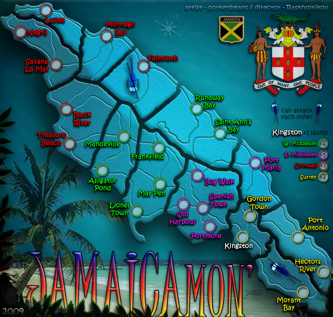
-More than enough room for not titled
-Easy to read
-Still need to add proper names
-Added parishes (3 colors) if GP desires
-Room at bottom or top for legend and names of developers
-Room for other GFX and text (motto, anthem, etc)

EDIT: Started around 6:00 pm. Ate dinner, played with kids and posted around 9:00 pm. Approx 2-2.25 hours of work
-Easy to read
-Still need to add proper names
-Added parishes (3 colors) if GP desires
-Room at bottom or top for legend and names of developers
-Room for other GFX and text (motto, anthem, etc)
EDIT: Started around 6:00 pm. Ate dinner, played with kids and posted around 9:00 pm. Approx 2-2.25 hours of work
Last edited by WidowMakers on Tue Nov 03, 2009 9:07 pm, edited 1 time in total.
-
WidowMakers
- Posts: 2774
- Joined: Mon Nov 20, 2006 9:25 am
- Location: Detroit, MI
-
the.killing.44
- Posts: 4724
- Joined: Thu Oct 23, 2008 7:43 pm
- Location: now tell me what got two gums and knows how to spit rhymes
Re: JAMAICAmon'
![]() by mibi on Tue Nov 03, 2009 9:44 pm
by mibi on Tue Nov 03, 2009 9:44 pm
yeah that looks good but Jamaica has a bit of a 'floating turd' issue. I would replace the water with a wood texture.
-
mibi
- Posts: 3350
- Joined: Thu Mar 01, 2007 8:19 pm
- Location: The Great State of Vermont
Re: JAMAICAmon'
![]() by Industrial Helix on Tue Nov 03, 2009 10:21 pm
by Industrial Helix on Tue Nov 03, 2009 10:21 pm
I like it!
The red lines in the west kind of contrast with the green lines a bit though. Maybe black lines?
The red lines in the west kind of contrast with the green lines a bit though. Maybe black lines?
Sketchblog [Update 07/25/11]: http://indyhelixsketch.blogspot.com/
Living in Japan [Update 07/17/11]: http://mirrorcountryih.blogspot.com/
Russian Revolution map for ConquerClub [07/20/11]: viewtopic.php?f=241&t=116575
Living in Japan [Update 07/17/11]: http://mirrorcountryih.blogspot.com/
Russian Revolution map for ConquerClub [07/20/11]: viewtopic.php?f=241&t=116575
-

Industrial Helix
- Posts: 3462
- Joined: Mon Jul 14, 2008 6:49 pm
- Location: Ohio


Re: JAMAICAmon'
![]() by WidowMakers on Tue Nov 03, 2009 10:27 pm
by WidowMakers on Tue Nov 03, 2009 10:27 pm
Industrial Helix wrote:I like it!
The red lines in the west kind of contrast with the green lines a bit though. Maybe black lines?
I don't plan on making any more changes. Afterall this is not my map.
I just did the map to show what could be done with a small map and not tilting the island. Just a fun quick exercise.
-
WidowMakers
- Posts: 2774
- Joined: Mon Nov 20, 2006 9:25 am
- Location: Detroit, MI
Re: JAMAICAmon'
![]() by neanderpaul14 on Tue Nov 03, 2009 10:34 pm
by neanderpaul14 on Tue Nov 03, 2009 10:34 pm
mibi wrote:yeah that looks good but Jamaica has a bit of a 'floating turd' issue. I would replace the water with a wood texture.
So you wanna put Jamaica in the forest instead of the ocean??

High score: 2724/#163 on scoreboard/COLONEL
-

neanderpaul14
- Posts: 1216
- Joined: Wed Aug 06, 2008 3:52 pm
- Location: "Always mystify, mislead and surprise the enemy if possible." - Thomas J. Jackson


Re: JAMAICAmon'
![]() by porkenbeans on Wed Nov 04, 2009 1:15 am
by porkenbeans on Wed Nov 04, 2009 1:15 am
@ W.M.,
I am trying to think of a nice way to say this.
I want to tell you first, that I do appreciate very much when people take an interest in my projects. I welcome constructive feedback, and suggestions. If there is something that you like about my map, and want to contribute what you can, to make it better. Please feel free to do just that.
I myself have taken an interest in a few maps that others are working on. I even illustrate some of my suggestions for them, so that it I do not come off like, all of the other self proclaimed critics out there, that between you and me, don't know jack about what they are flapping their gum's about.
But my friend, you have not come off to me, as someone that wants to help make "my" map better. You have NOT taken my map, and tweaked it to show a suggestion or two. You have basically said that my whole map is crap, and the only redeeming thing, is perhaps my army circles.
I could get behind the Jamaica map draft that you posted. I can even see some ways to make it better. All while trying to keep true to the style that you have put forth.
But, I am NOT here to help you with your Jamaica project. This thread is about my map. It is all about experimenting with new styles that are NOT cookie-cutter, straight off the CC Foundry assembly line. I have already stated before that my maps will always strive towards uniqueness. This means that you will always be able to point out the ways that my work does not conform to the way everybody else makes maps.
Like I said, your draft is fine, but to me it is NOT unique in any way from the rest.
If you want to take my art work into photoshop and tweak it here or there, I am not opposed to that at all. If you do please keep my uniqueness goal in mind, and do NOT, just go make it like all the others. You will be wasting your time, and mine as well.
-
porkenbeans
- Posts: 2546
- Joined: Mon Sep 10, 2007 4:06 pm
Re: JAMAICAmon'
![]() by jefjef on Wed Nov 04, 2009 1:42 am
by jefjef on Wed Nov 04, 2009 1:42 am
the.killing.24 wrote:That looks great
The coloring is crap. Back ground shit. Map boring as hell. = 2.25 hours wasted time.
Why on earth are you all hijacking PB's map? Don't seem to see this going on with anyone else's work. Real classy. Hang your heads.
And what is wrong with a non true north - south map? Nothing wrong with looking at things at non geographically correct directions. It's a flippin island.
As for jumps PB ya could easily just do ports. 3 looks like a workable number like Lucea - Port Antonio and Old Harbour.
This post was made by jefjef who should be on your ignore list.

drunkmonkey wrote:I'm filing a C&A report right now. Its nice because they have a drop-down for "jefjef".
-

jefjef
- Posts: 6026
- Joined: Mon Feb 23, 2009 8:41 pm
- Location: on my ass


Re: JAMAICAmon'
![]() by porkenbeans on Wed Nov 04, 2009 3:22 am
by porkenbeans on Wed Nov 04, 2009 3:22 am
- Click image to enlarge.
-
porkenbeans
- Posts: 2546
- Joined: Mon Sep 10, 2007 4:06 pm
Re: JAMAICAmon'
![]() by natty dread on Wed Nov 04, 2009 3:47 am
by natty dread on Wed Nov 04, 2009 3:47 am
That actually looks quite good as the small version.
Which brings me to point: I think your map is fine being tilted, and the parish puzzle pieces are fine as well, but I do think the large version is too large for a map this size. Maybe you could also scale down the large map. Not much, maybe 5%.
Which brings me to point: I think your map is fine being tilted, and the parish puzzle pieces are fine as well, but I do think the large version is too large for a map this size. Maybe you could also scale down the large map. Not much, maybe 5%.

-

natty dread
- Posts: 12877
- Joined: Fri Feb 08, 2008 8:58 pm
- Location: just plain fucked


Re: JAMAICAmon'
![]() by jefjef on Wed Nov 04, 2009 11:26 am
by jefjef on Wed Nov 04, 2009 11:26 am
Those copters are the size of terts..
Make em a farther jump. By another tert anyway.
Make em a farther jump. By another tert anyway.
This post was made by jefjef who should be on your ignore list.
drunkmonkey wrote:I'm filing a C&A report right now. Its nice because they have a drop-down for "jefjef".
-
jefjef
- Posts: 6026
- Joined: Mon Feb 23, 2009 8:41 pm
- Location: on my ass
Re: JAMAICAmon'
![]() by porkenbeans on Wed Nov 04, 2009 1:57 pm
by porkenbeans on Wed Nov 04, 2009 1:57 pm
I will try that, but remember that when you rescale your images, you should always use even numbers, as less distortion will take place.natty_dread wrote:That actually looks quite good as the small version.
Which brings me to point: I think your map is fine being tilted, and the parish puzzle pieces are fine as well, but I do think the large version is too large for a map this size. Maybe you could also scale down the large map. Not much, maybe 5%.
-
porkenbeans
- Posts: 2546
- Joined: Mon Sep 10, 2007 4:06 pm
Re: JAMAICAmon'
![]() by porkenbeans on Wed Nov 04, 2009 2:00 pm
by porkenbeans on Wed Nov 04, 2009 2:00 pm
I will try them a bit smaller, but the placement is perfect where they are, as the open spaces of the map seemed to be waiting for them.jefjef wrote:Those copters are the size of terts..
Make em a farther jump. By another tert anyway.
-
porkenbeans
- Posts: 2546
- Joined: Mon Sep 10, 2007 4:06 pm
Re: JAMAICAmon'
![]() by jefjef on Wed Nov 04, 2009 5:02 pm
by jefjef on Wed Nov 04, 2009 5:02 pm
porkenbeans wrote:I will try them a bit smaller, but the placement is perfect where they are, as the open spaces of the map seemed to be waiting for them.jefjef wrote:Those copters are the size of terts..
Make em a farther jump. By another tert anyway.
Well the idea of the jump is for flow & movement. Bypassing like just 3 terts is kinda pointless. But just an idea.
This post was made by jefjef who should be on your ignore list.
drunkmonkey wrote:I'm filing a C&A report right now. Its nice because they have a drop-down for "jefjef".
-
jefjef
- Posts: 6026
- Joined: Mon Feb 23, 2009 8:41 pm
- Location: on my ass
Re: JAMAICAmon'
![]() by porkenbeans on Wed Nov 04, 2009 5:20 pm
by porkenbeans on Wed Nov 04, 2009 5:20 pm
- Click image to enlarge.
Made the choppers smaller. re-sized and moved a few things.
Cleared up the text.
-
porkenbeans
- Posts: 2546
- Joined: Mon Sep 10, 2007 4:06 pm
Return to Melting Pot: Map Ideas
Who is online
Users browsing this forum: No registered users
|
|||||||
| Conquer Club is not associated with RISK online in any way. Copyright © 2006-2025 by Big Wham LLC | |||||||