there are a lot of territories that i did want to add but cut out...im testing playability now and ill have to see how it works
When you add new territories you have to reconsider the bonuses, borders, and a lot more than most think
I'm not saying that i dont like your idea cause i do its just that if there arent any visible problems with playability then im not going to change it
RuneScape Map [Abandoned]
Moderator: Cartographers


![]() by PimpCaneYoAss on Sat Apr 07, 2007 10:59 am
by PimpCaneYoAss on Sat Apr 07, 2007 10:59 am
Yea i do like that but 9 is obscene lol ill keep working and try to get more support about other things first...thanks though
-
 PimpCaneYoAss
- Posts: 185
- Joined: Fri Feb 16, 2007 3:04 pm
- Location: Connecticut


![]() by PimpCaneYoAss on Sun Apr 08, 2007 12:48 am
by PimpCaneYoAss on Sun Apr 08, 2007 12:48 am
mibi wrote:this map would look a lot better in CMYK. not that it matters being for CC and all, but that blue color is so far out of gamut its ruining my eyesight.
The blue is a little bright and ill take care of that
As for the CMYK, most of the maps do use the colors that i did. Unless you can specifically say how i can fix that...i can't
So i will fix the water and try to tone down the colors i guess so it looks like the mideast map
-
PimpCaneYoAss
- Posts: 185
- Joined: Fri Feb 16, 2007 3:04 pm
- Location: Connecticut


![]() by Coleman on Sun Apr 08, 2007 1:45 am
by Coleman on Sun Apr 08, 2007 1:45 am
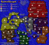
I think this looks tons better then what it started as. That said there are some issues that I think need to be addressed graphically.
Borders Some of the borders aren't consistant. A good example is the east/right side of Tree Gnome Stronghold versus the west/left side of it. I also feel the rivers look better with the thin black line around it (like the northern part of the river in Taverly/Falador) instead of no division between the water's edge and the landscape.
Title If you can provide an example of the actual Runescape title that looks exactly like the one you have here I'll be willing to accept the way it is and not complain about it, but right now it looks really bad.
Coloring COLOR INSIDE THE LINES!!! Check the east/right side of Red Dragon Isle, there should be no red on the east/right side of that border. This also happens in Dig Site and a few other places.
Ports This is kind of minor but I would like the message better if it says ports may attack other ports instead of can. It really doesn't make any difference but I personally would be happier with may.
Borders Some of the borders aren't consistant. A good example is the east/right side of Tree Gnome Stronghold versus the west/left side of it. I also feel the rivers look better with the thin black line around it (like the northern part of the river in Taverly/Falador) instead of no division between the water's edge and the landscape.
Title If you can provide an example of the actual Runescape title that looks exactly like the one you have here I'll be willing to accept the way it is and not complain about it, but right now it looks really bad.
Coloring COLOR INSIDE THE LINES!!!
Ports This is kind of minor but I would like the message better if it says ports may attack other ports instead of can. It really doesn't make any difference but I personally would be happier with may.
Warning: You may be reading a really old topic.
-

Coleman
- Posts: 5402
- Joined: Tue Jan 02, 2007 10:36 pm
- Location: Midwest


![]() by mibi on Sun Apr 08, 2007 9:53 am
by mibi on Sun Apr 08, 2007 9:53 am
PimpCaneYoAss wrote:mibi wrote:this map would look a lot better in CMYK. not that it matters being for CC and all, but that blue color is so far out of gamut its ruining my eyesight.
The blue is a little bright and ill take care of that
As for the CMYK, most of the maps do use the colors that i did. Unless you can specifically say how i can fix that...i can't
So i will fix the water and try to tone down the colors i guess so it looks like the mideast map
all back in gamut now
CMYK version, just a thought.

-

mibi
- Posts: 3350
- Joined: Thu Mar 01, 2007 8:19 pm
- Location: The Great State of Vermont


![]() by PimpCaneYoAss on Sun Apr 08, 2007 2:45 pm
by PimpCaneYoAss on Sun Apr 08, 2007 2:45 pm
Coleman wrote:I think this looks tons better then what it started as. That said there are some issues that I think need to be addressed graphically.
Borders Some of the borders aren't consistant. A good example is the east/right side of Tree Gnome Stronghold versus the west/left side of it. I also feel the rivers look better with the thin black line around it (like the northern part of the river in Taverly/Falador) instead of no division between the water's edge and the landscape.
Title If you can provide an example of the actual Runescape title that looks exactly like the one you have here I'll be willing to accept the way it is and not complain about it, but right now it looks really bad.
Coloring COLOR INSIDE THE LINES!!!
Ports This is kind of minor but I would like the message better if it says ports may attack other ports instead of can. It really doesn't make any difference but I personally would be happier with may.
Thanks for the help
Your right. I need to add borders to the rivers to help it look better.
The title is a little weak so ill try and fix that too.
The coloring is feathered around the edges...i guess i could try and take that feature away and see how it looks.
The port wording i will change.
-
PimpCaneYoAss
- Posts: 185
- Joined: Fri Feb 16, 2007 3:04 pm
- Location: Connecticut
![]() by freezie on Sun Apr 08, 2007 6:12 pm
by freezie on Sun Apr 08, 2007 6:12 pm
As a hardcore runescape player, I can affirm this is a real nice representation of the map. Real good, continue like that.
Hope Jagex gives their OK ( or they have already...)
You could always change the title to --- Run Escape-- like the comon runescape humour says. Would add a touch of humour, and actually goes by any copyright.
And for the elite wilderness, I would have actually named it mage arena, since it seems most of the fights actually happen there. Just a tought.. It's fine anyway
-
freezie
- Posts: 3901
- Joined: Fri Apr 06, 2007 12:18 pm
- Location: Somewhere between here and there.
![]() by PimpCaneYoAss on Sun Apr 08, 2007 9:13 pm
by PimpCaneYoAss on Sun Apr 08, 2007 9:13 pm
NEW UPDATE 4/8/07

Changes
-Lightened the colors
-Added borders to the rivers
-Changed color of title
-Port wording changed
-Changed feathered coloring to hard
Still a little bright ill try and darken it a little on next update. Keep the comments coming and thanks freezie for the suport. I agree...mage arena would be a better name. There isnt a line betwen Brimhaven and the Deep Jungle...i know lol. And the texture of the lake to the north western part is off texture which i can easily fix.
-
PimpCaneYoAss
- Posts: 185
- Joined: Fri Feb 16, 2007 3:04 pm
- Location: Connecticut


![]() by PimpCaneYoAss on Sun Apr 08, 2007 9:51 pm
by PimpCaneYoAss on Sun Apr 08, 2007 9:51 pm
If you think that isnt good then sure but i kinda like it...anyone else have any views on that
-
PimpCaneYoAss
- Posts: 185
- Joined: Fri Feb 16, 2007 3:04 pm
- Location: Connecticut
![]() by CaptainPlanet on Sun Apr 08, 2007 10:31 pm
by CaptainPlanet on Sun Apr 08, 2007 10:31 pm
freezie wrote:Hmmm...my memory might be flawed...but there is a port at the digsite..?
No, but it was added for playability
-
CaptainPlanet
- Posts: 132
- Joined: Wed Feb 14, 2007 6:21 pm
- Location: Bankhead
![]() by cowshrptrn on Sun Apr 08, 2007 11:15 pm
by cowshrptrn on Sun Apr 08, 2007 11:15 pm
Isn't the mining site near Al Karidh called the Scorpion mine?
Also, looks like you have some compression problems. What program are you making this with?
Also, looks like you have some compression problems. What program are you making this with?

-

cowshrptrn
- Posts: 838
- Joined: Thu Aug 17, 2006 1:15 pm
- Location: wouldn't YOU like to know....
![]() by PimpCaneYoAss on Sun Apr 08, 2007 11:16 pm
by PimpCaneYoAss on Sun Apr 08, 2007 11:16 pm
It might be but because of space issues i called it mining site
I dont no what you exactly mean by compression but im using fireworks
thanks for the help
I dont no what you exactly mean by compression but im using fireworks
thanks for the help
-
PimpCaneYoAss
- Posts: 185
- Joined: Fri Feb 16, 2007 3:04 pm
- Location: Connecticut
![]() by PimpCaneYoAss on Mon Apr 09, 2007 10:40 pm
by PimpCaneYoAss on Mon Apr 09, 2007 10:40 pm
NEW UPDATE 4/10/07

Changes
-Textures and colors
-Rivers/lakes got borders and same texture/color as ocean
-Title text and color
This is going either of two ways...people will love it or people will hate it. Leave me some feedback
Changes
-Textures and colors
-Rivers/lakes got borders and same texture/color as ocean
-Title text and color
This is going either of two ways...people will love it or people will hate it. Leave me some feedback
-
PimpCaneYoAss
- Posts: 185
- Joined: Fri Feb 16, 2007 3:04 pm
- Location: Connecticut
![]() by CaptainPlanet on Mon Apr 09, 2007 10:52 pm
by CaptainPlanet on Mon Apr 09, 2007 10:52 pm
The new colors are a little dark, but maybe its just me
-
CaptainPlanet
- Posts: 132
- Joined: Wed Feb 14, 2007 6:21 pm
- Location: Bankhead
![]() by Burning_Legion on Mon Apr 09, 2007 11:00 pm
by Burning_Legion on Mon Apr 09, 2007 11:00 pm
...O god...O god...OMG i should not know what this is but i do...o god
-
Burning_Legion
- Posts: 32
- Joined: Wed Mar 14, 2007 9:23 pm
![]() by PimpCaneYoAss on Tue Apr 10, 2007 1:34 pm
by PimpCaneYoAss on Tue Apr 10, 2007 1:34 pm
It does seem a little dark and maybe light army circles would look better too
-
PimpCaneYoAss
- Posts: 185
- Joined: Fri Feb 16, 2007 3:04 pm
- Location: Connecticut
![]() by freezie on Tue Apr 10, 2007 1:48 pm
by freezie on Tue Apr 10, 2007 1:48 pm
The new colors are nice, if you ask me. Though light armys circle wouldn't only look better...
IT'S A NEEDED CHANGE.
We can't see them at all on certain territories. Either change back to old graphics, or lgihten up the circles.
Otherwise, I have nothing to say.
IT'S A NEEDED CHANGE.
We can't see them at all on certain territories. Either change back to old graphics, or lgihten up the circles.
Otherwise, I have nothing to say.
-
freezie
- Posts: 3901
- Joined: Fri Apr 06, 2007 12:18 pm
- Location: Somewhere between here and there.
Return to Melting Pot: Map Ideas
Who is online
Users browsing this forum: No registered users
|
|||||||
| Conquer Club is not associated with RISK online in any way. Copyright © 2006-2025 by Big Wham LLC | |||||||