Conquer Club

France-Update 20=no texture

Have an idea for a map? Discuss ideas and concepts here.

Moderator: Cartographers

Forum rules
Please read the Community Guidelines before posting.

Postby spinwizard on Sat Mar 31, 2007 4:03 pm

boberz wrote:try taking the black outline off the text


u can't read it then!
User avatar
Private 1st Class spinwizard
 
Posts: 5016
Joined: Sun Dec 10, 2006 9:52 am

Postby lilwdlnddude on Sat Mar 31, 2007 4:47 pm

dude this france map is way better than reverend kyles. good job
Where's Waldo?!
User avatar
Captain lilwdlnddude
 
Posts: 302
Joined: Wed Feb 01, 2006 8:26 pm
Location: Earth

Postby Wisse on Sat Mar 31, 2007 4:51 pm

make the border of corse the same size as the other border and i liked thath red square around it
Image Image
User avatar
Sergeant Wisse
 
Posts: 4448
Joined: Fri Oct 13, 2006 2:59 pm
Location: The netherlands, gelderland, epe

Postby spinwizard on Sat Mar 31, 2007 4:53 pm

Wisse wrote:make the border of corse the same size as the other border and i liked thath red square around it


will do
User avatar
Private 1st Class spinwizard
 
Posts: 5016
Joined: Sun Dec 10, 2006 9:52 am

Postby spinwizard on Sat Mar 31, 2007 5:07 pm

Image

put box back in
made corse border better


any other improvements u want?
User avatar
Private 1st Class spinwizard
 
Posts: 5016
Joined: Sun Dec 10, 2006 9:52 am

Postby spinwizard on Sun Apr 01, 2007 5:42 am

should the alps bonus be rasied 2 +3

it can be attacked from 4 contenents and 7 terrortorys.
User avatar
Private 1st Class spinwizard
 
Posts: 5016
Joined: Sun Dec 10, 2006 9:52 am

Postby Skittles! on Sun Apr 01, 2007 6:16 am

Colours. Clean them up..

Texture of the sea. It reminds me of little bathroom tiles coloured blue and they're annoying to look at.

The brown table annoys me, it seems to plain. I dono what you can change it to.

The dead area texture. It looks like there's all these giant worms underneath the surface trying to get up to fresh air.
Or in other words, little squiggly lines.

Good luck
KraphtOne wrote:when you sign up a new account one of the check boxes should be "do you want to foe colton24 (it is highly recommended) "
User avatar
Private Skittles!
 
Posts: 14575
Joined: Wed Jan 03, 2007 2:18 am

Postby yeti_c on Sun Apr 01, 2007 7:16 am

Skittles! wrote:
Texture of the sea. It reminds me of little bathroom tiles coloured blue and they're annoying to look at.


My bathrooms are tiled like that... Nice to look at in a Bathroom when taking a dump!!

C.
Image
Highest score : 2297
User avatar
Lieutenant yeti_c
 
Posts: 9624
Joined: Thu Jan 04, 2007 9:02 am

Postby Skittles! on Sun Apr 01, 2007 7:36 am

yeti_c wrote:
Skittles! wrote:
Texture of the sea. It reminds me of little bathroom tiles coloured blue and they're annoying to look at.


My bathrooms are tiled like that... Nice to look at in a Bathroom when taking a dump!!

C.


How.. Unimportant?
KraphtOne wrote:when you sign up a new account one of the check boxes should be "do you want to foe colton24 (it is highly recommended) "
User avatar
Private Skittles!
 
Posts: 14575
Joined: Wed Jan 03, 2007 2:18 am

Postby AndyDufresne on Sun Apr 01, 2007 12:24 pm

Well the map is surely coming along:

Definitely clean up the borders, and make them clear (there are some parts where they seem to die out, Yonne, etc) and less pixely and more uniform (Orne).

I also can't stand the flesh tone color being used as continental color. Perhaps more of an orange color (but different the from yellow orange) would be more suitable? Or perhaps a dark red? But that wouldn't really fit with brightness of the map. But look into a different possibility.

I also think that the extra border around the Legend, seems sort of odd, and cramps the space a slightly. Maybe try it without that, and just the simple interior brown border. But maybe that would look bad just as that also!


--Andy
User avatar
Corporal 1st Class AndyDufresne
 
Posts: 24935
Joined: Fri Mar 03, 2006 8:22 pm
Location: A Banana Palm in Zihuatanejo

french map

Postby ganguscalm on Sun Apr 01, 2007 2:20 pm

how can you play a French map ??? every one will drop there guns and surrender !!!
User avatar
Private 1st Class ganguscalm
 
Posts: 824
Joined: Tue May 02, 2006 7:03 pm
Location: Mohave Desert Arizona

Postby sam_levi_11 on Sun Apr 01, 2007 3:06 pm

lol, u read my mind when i first saw it i thought, "isnt there a i surrender button", although you could just make alliances with everyone like they did
User avatar
Sergeant 1st Class sam_levi_11
 
Posts: 2872
Joined: Mon Dec 11, 2006 2:48 pm

Postby qeee1 on Sun Apr 01, 2007 4:30 pm

The colours... the colours... please experiment with different colours...
Frigidus wrote:but now that it's become relatively popular it's suffered the usual downturn in coolness.
User avatar
Colonel qeee1
 
Posts: 2904
Joined: Sun Feb 05, 2006 12:43 pm
Location: Ireland

Postby plysprtz on Sun Apr 01, 2007 5:26 pm

i like the colors maybe switch purple and yellow but thats about it

my only suggestion is that you change the region box take out that thick border and then make it bigger and make the back round a lighter color cant really cant really see MED. or Normandie for that matter

and maybe you could mess around with it but maybe put a border in between the different countries

i also thin Alsace should be worth 4 maybe, maybe not don't really matter
1546 - top score
User avatar
Cook plysprtz
 
Posts: 471
Joined: Fri Mar 02, 2007 2:43 pm
Location: chicago

Postby spinwizard on Mon Apr 02, 2007 3:28 am

ok, i will change the box and mess about with the colours
User avatar
Private 1st Class spinwizard
 
Posts: 5016
Joined: Sun Dec 10, 2006 9:52 am

Postby reverend_kyle on Mon Apr 02, 2007 3:42 am

I like this one better than mine, but the borders need cleaned.
DANCING MUSTARD FOR POOP IN '08!
User avatar
Sergeant reverend_kyle
 
Posts: 9250
Joined: Tue Mar 21, 2006 4:08 pm
Location: 1000 post club

Postby Zumo on Mon Apr 02, 2007 3:46 am

Wow what a huge Bretagne !

I live in Bretagne and I can assure you it's not THAT big ^^

But it's for gameplay purpose I guess :p
Private Zumo
 
Posts: 24
Joined: Thu Dec 14, 2006 7:37 am
Location: Rennes

Postby spinwizard on Mon Apr 02, 2007 4:07 am

reverend_kyle wrote:I like this one better than mine, but the borders need cleaned.


no sarcastic remark? :shock:
User avatar
Private 1st Class spinwizard
 
Posts: 5016
Joined: Sun Dec 10, 2006 9:52 am

Postby spinwizard on Mon Apr 02, 2007 4:07 am

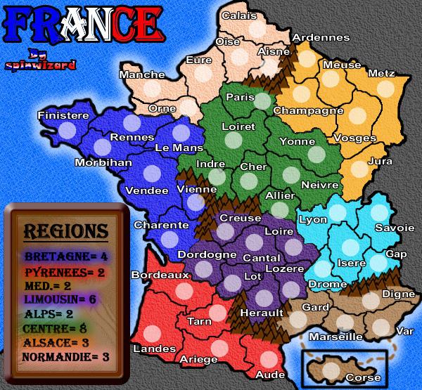
Zumo wrote:Wow what a huge Bretagne !

I live in Bretagne and I can assure you it's not THAT big ^^

But it's for gameplay purpose I guess :p


yes i combined it with aquentime i think 2 improve the gameplay...
User avatar
Private 1st Class spinwizard
 
Posts: 5016
Joined: Sun Dec 10, 2006 9:52 am

Postby spinwizard on Mon Apr 02, 2007 5:04 am

Image

box changed
colours changed
added mock numbers
cleared borders
new sea texture


what do u think?
User avatar
Private 1st Class spinwizard
 
Posts: 5016
Joined: Sun Dec 10, 2006 9:52 am

Postby steve monkey on Mon Apr 02, 2007 5:06 am

I think that these colours are much easier on the eye.
Image

May the dice gods shine favourably upon you.
User avatar
Private 1st Class steve monkey
 
Posts: 490
Joined: Sat May 13, 2006 5:25 pm
Location: London

Postby steve monkey on Mon Apr 02, 2007 5:08 am

The sea's a bit too 'busy' though, distracts a little from the map.
Image

May the dice gods shine favourably upon you.
User avatar
Private 1st Class steve monkey
 
Posts: 490
Joined: Sat May 13, 2006 5:25 pm
Location: London

Postby spinwizard on Mon Apr 02, 2007 5:10 am

yeah i was just messing about with different, more calm textures and i found the 'blue paint 1'
User avatar
Private 1st Class spinwizard
 
Posts: 5016
Joined: Sun Dec 10, 2006 9:52 am

Postby Skittles! on Mon Apr 02, 2007 5:11 am

I like the colours now..
The texture is abit.. dark and looks like smudged trees.
KraphtOne wrote:when you sign up a new account one of the check boxes should be "do you want to foe colton24 (it is highly recommended) "
User avatar
Private Skittles!
 
Posts: 14575
Joined: Wed Jan 03, 2007 2:18 am

Postby sam_levi_11 on Mon Apr 02, 2007 5:21 am

i dont like the sea.........too distracting
User avatar
Sergeant 1st Class sam_levi_11
 
Posts: 2872
Joined: Mon Dec 11, 2006 2:48 pm

PreviousNext

Return to Melting Pot: Map Ideas

Who is online

Users browsing this forum: No registered users