
Pangea new thread - Triassic New Version!
Moderator: Cartographers
![]() by lVlaniac on Sun Feb 11, 2007 3:08 pm
by lVlaniac on Sun Feb 11, 2007 3:08 pm
i like the one thats showed in the map( the latest one) but i think now that in the map i havent seen how are they conected i say you shold put a link between 2 continents by using some little fosils symbols i think that would be more appropiate for the map
I Could Eat A Bowl Of Alphabet Soup And Crap Out A Better Conversation Than Yours.
-
 lVlaniac
- Posts: 118
- Joined: Thu Dec 21, 2006 3:54 pm
- Location: santiago de chile
![]() by Sargentgeneral on Sun Feb 11, 2007 3:32 pm
by Sargentgeneral on Sun Feb 11, 2007 3:32 pm
south america definitely. I would like to see either #2 or 9 as the title one.
I think it is a little difficult to see whether some continents like have attack routes to them like india to antartica or where Africa and S. America connect. would there be some way to emphasize these so that is is more evident that they exists?
Map is coming along very nicely. Didnt care for this map much before but i am really becoming a fan. Good job Marvaddin and keep up the good work and this map will be done in no time.
Highest score: 1910
Highest rank: 188
Battle of the bands #1 champion: ACDC
Highest rank: 188
Battle of the bands #1 champion: ACDC
-

Sargentgeneral
- Posts: 379
- Joined: Thu Nov 16, 2006 11:55 pm
- Location: On Conquerclub, duh!


![]() by Marvaddin on Sun Feb 11, 2007 10:48 pm
by Marvaddin on Sun Feb 11, 2007 10:48 pm
Thanks all for the positive comments 
Here:
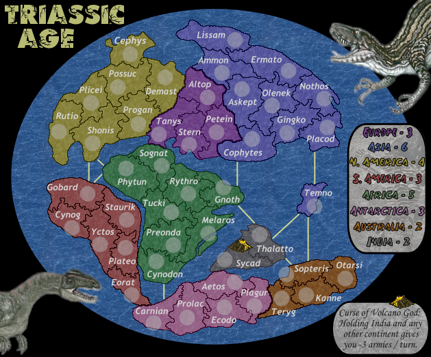
- Names of territories. I changed some since last time.
- Legend font that we have chosed.
- Sea routes. Have changed some too. Im thinking about possibly connect Cophytes and Temno.
- Army shadows.
- The curse of volcano god has returned. Its still not definitive. But I really would like to try this idea. And, I know the lava is much brighter than the rest of the map, but, I think would be good this way, so people would pay attention to it. Should I rename to Volcano God's Curse?
- Im keeping the title for a while but in near future, I will post images with other some other fonts from the previous options.
I didnt understand well the point... are you talking about the texture? I love the sea texture... If you are talking about the bad way continents border it, I will correct that (or at least try it) later.
Here:
- Names of territories. I changed some since last time.
- Legend font that we have chosed.
- Sea routes. Have changed some too. Im thinking about possibly connect Cophytes and Temno.
- Army shadows.
- The curse of volcano god has returned. Its still not definitive. But I really would like to try this idea. And, I know the lava is much brighter than the rest of the map, but, I think would be good this way, so people would pay attention to it. Should I rename to Volcano God's Curse?
- Im keeping the title for a while but in near future, I will post images with other some other fonts from the previous options.
AndyDufresne wrote:Marv, I remember there were some talks about the ocean being a little too busy. Have you tried blending it, or making it a little opaque, to cut down on that?
I didnt understand well the point... are you talking about the texture? I love the sea texture... If you are talking about the bad way continents border it, I will correct that (or at least try it) later.

-

Marvaddin
- Posts: 2545
- Joined: Thu Feb 09, 2006 5:06 pm
- Location: Belo Horizonte, Brazil


![]() by gavin_sidhu on Mon Feb 12, 2007 12:32 am
by gavin_sidhu on Mon Feb 12, 2007 12:32 am
Like your brazil map, i think you have gone into too much detail with the borders, theyre too bumpy. I suggest you clear them up abit.
Highest Score: 1843 Ranking (Australians): 3
-

gavin_sidhu
- Posts: 1428
- Joined: Mon May 22, 2006 6:16 am
- Location: Brisbane, Australia
![]() by Haydena on Mon Feb 12, 2007 5:14 am
by Haydena on Mon Feb 12, 2007 5:14 am
Right, it's looking really good now Marv. But I agree with the borders, have you gone through with a pixel tool and pixelled over the borders? You might want to make it less pixellated.
Also I'm not sure on the font for the country names. They just look too plain and boring. Try and spice them up a little. It just looks like they're not meant to be there and they just look so plain.
The sea routes look a bit boring too, it all just looks a bit too simple if you get what I mean.
Other than that I think this will be a great map, keep up the good work Marv!
-

Haydena
- Posts: 634
- Joined: Sun Mar 19, 2006 2:43 pm
- Location: Sussex, England
![]() by lVlaniac on Mon Feb 12, 2007 9:49 am
by lVlaniac on Mon Feb 12, 2007 9:49 am
i think your map i going really well by know and that curse of the volcano is cool too i stil think you should link some continents that arent conected by some fosil sign
I Could Eat A Bowl Of Alphabet Soup And Crap Out A Better Conversation Than Yours.
-
lVlaniac
- Posts: 118
- Joined: Thu Dec 21, 2006 3:54 pm
- Location: santiago de chile
![]() by reverend_kyle on Mon Feb 12, 2007 10:04 am
by reverend_kyle on Mon Feb 12, 2007 10:04 am
apply some sort of shadow or bevel to the text, it is boring unappealing and sticks out like a sore thumb. Much like qwerts eastern front map did before he finally caved.
DANCING MUSTARD FOR POOP IN '08!
-

reverend_kyle
- Posts: 9250
- Joined: Tue Mar 21, 2006 4:08 pm
- Location: 1000 post club


![]() by Guiscard on Mon Feb 12, 2007 4:37 pm
by Guiscard on Mon Feb 12, 2007 4:37 pm
Looking good but perhaps a bit dingy to me. maybe lightening up the continent colours ever so slightly would improve things.
qwert wrote:Can i ask you something?What is porpose for you to open these Political topic in ConquerClub? Why you mix politic with Risk? Why you not open topic like HOT AND SEXY,or something like that.
-

Guiscard
- Posts: 4103
- Joined: Fri Dec 08, 2006 7:27 pm
- Location: In the bar... With my head on the bar
![]() by Marvaddin on Mon Feb 12, 2007 5:37 pm
by Marvaddin on Mon Feb 12, 2007 5:37 pm
Thanks all for the comments. New version:

- New option for title, # 14. I like this one more. Also tested options 9 and 12, but they didnt fit well. Should I stay with the old one or use this?
- I have corrected the border with space problem, and also corrected the borders to ocean and between countries (as I promised I would do). Hope you all feel this better now.
- Improved the dinos a bit.
- Replaced some names and armies shadows, so they are nw in a better position, Im sure.
This is an eternal problem... The font must be readable, and occupy a small room... so fonts that are theme related usually are useless to countries names... I can check some more, but I dont know if I can find something thats not "plain" and will fit well. Does someone have a suggestion?
The sea routes are just sea routes, they arent usually very appealing... and I think this fossil sign idea cant be done. All I can do is make the sea routes curves and split them in minor portions... Would that be really important? Maybe I will try it anyway.
The continents were lighter some time ago, and someone asked for darker ones... change it again would be a step back. Maybe, if you get some support to this, maybe I will change them to lighter ones.
- New option for title, # 14. I like this one more. Also tested options 9 and 12, but they didnt fit well. Should I stay with the old one or use this?
- I have corrected the border with space problem, and also corrected the borders to ocean and between countries (as I promised I would do). Hope you all feel this better now.
- Improved the dinos a bit.
- Replaced some names and armies shadows, so they are nw in a better position, Im sure.
Haydena wrote:Also I'm not sure on the font for the country names. They just look too plain and boring. Try and spice them up a little. It just looks like they're not meant to be there and they just look so plain.
This is an eternal problem... The font must be readable, and occupy a small room... so fonts that are theme related usually are useless to countries names... I can check some more, but I dont know if I can find something thats not "plain" and will fit well. Does someone have a suggestion?
Haydena wrote:The sea routes look a bit boring too, it all just looks a bit too simple if you get what I mean.
lVlaniac wrote:i stil think you should link some continents that arent conected by some fosil sign
The sea routes are just sea routes, they arent usually very appealing... and I think this fossil sign idea cant be done. All I can do is make the sea routes curves and split them in minor portions... Would that be really important? Maybe I will try it anyway.
Guiscard wrote:Looking good but perhaps a bit dingy to me. maybe lightening up the continent colours ever so slightly would improve things.
The continents were lighter some time ago, and someone asked for darker ones... change it again would be a step back. Maybe, if you get some support to this, maybe I will change them to lighter ones.
-
Marvaddin
- Posts: 2545
- Joined: Thu Feb 09, 2006 5:06 pm
- Location: Belo Horizonte, Brazil
![]() by ericisshort on Mon Feb 12, 2007 10:05 pm
by ericisshort on Mon Feb 12, 2007 10:05 pm
1) the continent borders still seem a little too simple compared to the territory borders.
2) could you do an outer glow around the continents that goes into the ocean? I dont know how you have your layers set up but that would really be nice. It would just give them a bit more texture.
3) a small bevel around the territories if again, it is possible with the way you've set up the layers.
-

ericisshort
- Posts: 37
- Joined: Thu Nov 30, 2006 4:02 pm
- Location: oklahoma
![]() by reverend_kyle on Tue Feb 13, 2007 5:10 am
by reverend_kyle on Tue Feb 13, 2007 5:10 am
New title=no bueno
Also good to see some work done with the font. blends in better.
Also good to see some work done with the font. blends in better.
DANCING MUSTARD FOR POOP IN '08!
-
reverend_kyle
- Posts: 9250
- Joined: Tue Mar 21, 2006 4:08 pm
- Location: 1000 post club
![]() by KEYOGI on Tue Feb 13, 2007 6:20 am
by KEYOGI on Tue Feb 13, 2007 6:20 am
Ok, I've avoided paying this thread too much attention to date, but it seems all the bickering has finished so I'll have my say.
First thing is, I'm not sure the disc shape works, is it really needed? It might look better with a solid ocean background with longitude and latitude lines marking the background to give it that spherical perspective.
The ocean itself seems to clash with some of the continents, particularly Asia. Maybe just toning down the texture would help with this.
The territory names are good, but I'm not so sure about the continent names. I know why they're named as is, but the current names you have for continents didn't exist in that era. Might be a silly point, but it's something to consider.
You seem to have opposites for your continent borders and territory borders in that continents have quite a smooth shape to them, whereas territories have very jagged and variable shapes. If you could make one consistent with the other, I think it would look better.
Map looks good playability wise, the only thing I can think of is to add another border to Asia or North America.
-
KEYOGI
- Posts: 1632
- Joined: Tue Oct 10, 2006 6:09 am


![]() by Marvaddin on Wed Feb 14, 2007 10:01 pm
by Marvaddin on Wed Feb 14, 2007 10:01 pm
ericisshort wrote:1) the continent borders still seem a little too simple compared to the territory borders.
KEYOGI wrote:You seem to have opposites for your continent borders and territory borders in that continents have quite a smooth shape to them, whereas territories have very jagged and variable shapes. If you could make one consistent with the other, I think it would look better.
Great, now that I have worked on the borders there is something to talk about this. I like borders that way, I think much simpler borders seem stupid. I will think about change some little parts, or maybe try a new option, but I dont believe I would like it more... but I think I will try.
adam3b58 wrote:maybe some uncrossable borders in the north to break it up some? rivers or mountains?
Unnecessary, I think. Uncrossable are necessary between continents, not inside continents... and its not the case, because I think the continents are well constructed.
KEYOGI wrote:First thing is, I'm not sure the disc shape works, is it really needed? It might look better with a solid ocean background with longitude and latitude lines marking the background to give it that spherical perspective.
Not really necessary, but its something original and I hope its good enough when finished.
KEYOGI wrote:The ocean itself seems to clash with some of the continents, particularly Asia. Maybe just toning down the texture would help with this.
I really disagree. Its fine to me.
KEYOGI wrote:The territory names are good, but I'm not so sure about the continent names. I know why they're named as is, but the current names you have for continents didn't exist in that era. Might be a silly point, but it's something to consider.
Change continents names is something I really thought some time ago... It can be done, although I think its necessary, in this case, make them in reference to the original names. Would you like to place any suggestions?
KEYOGI wrote:Map looks good playability wise, the only thing I can think of is to add another border to Asia or North America.
Asia has already 4 (and 10 territories), and NA has 3 (and 7 territories). Are you talking about just add borders, or add new territories too? Where would you add the borders (to what continent)?
Beyond that... I will stay with this title font for now, but I will try improve the title a bit. I dislike the colour, I will maybe add a texture... lets see. And I will try another territories names font to next update.
-
Marvaddin
- Posts: 2545
- Joined: Thu Feb 09, 2006 5:06 pm
- Location: Belo Horizonte, Brazil
![]() by AndyDufresne on Wed Feb 14, 2007 10:09 pm
by AndyDufresne on Wed Feb 14, 2007 10:09 pm
KEYOGI wrote:...
First thing is, I'm not sure the disc shape works, is it really needed? It might look better with a solid ocean background with longitude and latitude lines marking the background to give it that spherical perspective.
The ocean itself seems to clash with some of the continents, particularly Asia. Maybe just toning down the texture would help with this
...
I agree with Keyogi on both points.
--Andy
-

AndyDufresne
- Posts: 24935
- Joined: Fri Mar 03, 2006 8:22 pm
- Location: A Banana Palm in Zihuatanejo


![]() by Marvaddin on Wed Feb 14, 2007 10:30 pm
by Marvaddin on Wed Feb 14, 2007 10:30 pm
I dont. And even if I did, I wouldnt do that... Each map I do I learn more about graphics... they are starting to be better each time. But at this point I still dont have enough knowledge, so, forget that
-
Marvaddin
- Posts: 2545
- Joined: Thu Feb 09, 2006 5:06 pm
- Location: Belo Horizonte, Brazil


![]() by killza666jrr on Wed Feb 14, 2007 11:40 pm
by killza666jrr on Wed Feb 14, 2007 11:40 pm
i like 11
Jamie wrote:Yeah, I hate my little 1 inch penis, but at least I'm not a Broncos fan, cause the Broncos really suck
(\__/)
(='.'=)
(")_(")
This is Bunny. Copy and paste him into your signature to help him gain world domination.
-

killza666jrr
- Posts: 338
- Joined: Sat Dec 16, 2006 6:12 pm
![]() by KEYOGI on Wed Feb 14, 2007 11:54 pm
by KEYOGI on Wed Feb 14, 2007 11:54 pm
If you're happy with the borders you have for territories, can I suggest doing something with the continent borders, the physical shape of the continents. I'm not sure if you've based them off a source image, but I think it might look better with some more variation. More of an eroded look, they look a bit too perfect to me at the moment. It's not really a problem though, just something I think could look better.
As for the ocean clashing with some continents, if you're fixed on keeping everything as is, some thicker continent lines might help create more contrast.
I'm sure I could come up with suggestions for continent names with research, but the majority of people will probably prefer the current names anyway.
-
KEYOGI
- Posts: 1632
- Joined: Tue Oct 10, 2006 6:09 am
![]() by Marvaddin on Sun Mar 04, 2007 7:54 pm
by Marvaddin on Sun Mar 04, 2007 7:54 pm
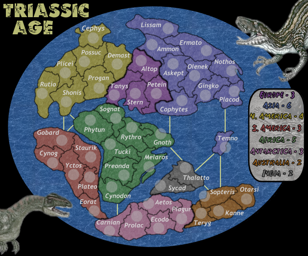
Ok, returning to activity on this project. I missed some elements, like the volcano, and the little legend refering to it, will adjust a bit the legend colours, etc...
Just checking: are the simpler territories frontiers better than the old ones?
-
Marvaddin
- Posts: 2545
- Joined: Thu Feb 09, 2006 5:06 pm
- Location: Belo Horizonte, Brazil
![]() by Skittles! on Sun Mar 04, 2007 11:41 pm
by Skittles! on Sun Mar 04, 2007 11:41 pm
I really don't like the colour of Asia and the colour of Europe close together. I think it conflicts too much to each other.
KraphtOne wrote:when you sign up a new account one of the check boxes should be "do you want to foe colton24 (it is highly recommended) "
-

Skittles!
- Posts: 14575
- Joined: Wed Jan 03, 2007 2:18 am


![]() by Marvaddin on Mon Mar 05, 2007 3:40 pm
by Marvaddin on Mon Mar 05, 2007 3:40 pm
^^ This is all the feedback I deserve, guys?? Please comment about the new borders, if its better or not.
About this question, I wouldnt like to have blue and purple together, but I was avoiding some other colours as neighbours, too... like red and purple, yellow and orange, yellow and pink... I can change that, but then say me what colours you would like to exchange.
About this question, I wouldnt like to have blue and purple together, but I was avoiding some other colours as neighbours, too... like red and purple, yellow and orange, yellow and pink... I can change that, but then say me what colours you would like to exchange.
-
Marvaddin
- Posts: 2545
- Joined: Thu Feb 09, 2006 5:06 pm
- Location: Belo Horizonte, Brazil
![]() by Wisse on Mon Mar 05, 2007 3:46 pm
by Wisse on Mon Mar 05, 2007 3:46 pm
don't make thick borders with the bonusses it looks ugly
why did you make the pictures gray again? i liked them colored
the water texture doesn't fit here, try not to use a real picture but use a texture
don't put a picture in the legend, its fine without it
make the universium not just black, try to make it looks like the real universium
why did you make the pictures gray again? i liked them colored
the water texture doesn't fit here, try not to use a real picture but use a texture
don't put a picture in the legend, its fine without it
make the universium not just black, try to make it looks like the real universium


-

Wisse
- Posts: 4448
- Joined: Fri Oct 13, 2006 2:59 pm
- Location: The netherlands, gelderland, epe

Return to Melting Pot: Map Ideas
Who is online
Users browsing this forum: No registered users
|
|||||||
| Conquer Club is not associated with RISK online in any way. Copyright © 2006-2025 by Big Wham LLC | |||||||