Japan Map [abandoned]
Moderator: Cartographers
Forum rules
Please read the Community Guidelines before posting.
Please read the Community Guidelines before posting.
Just one question, about the larger version of the map...
Obviously when it is resized it loses its quality big time... Do I have to completely rework the smaller map to the larger map or is there a way to resize it without it being too bad?
I think I realise now I shoulda worked on the larger version first lol
Obviously when it is resized it loses its quality big time... Do I have to completely rework the smaller map to the larger map or is there a way to resize it without it being too bad?
I think I realise now I shoulda worked on the larger version first lol

Haydena wrote:I think I realise now I shoulda worked on the larger version first lol
Positive: Great guy, will always play to his best. Honourable and fun to play with as well. You know you're in for a rough time playing mrdexter  Game 31384 Haydena
Positive: Mr D is the golden child of CC, if we had to elect a king he'd get my vote! Game 76700 silus
Positive: Mr D is the golden child of CC, if we had to elect a king he'd get my vote! Game 76700 silus

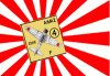
wow - what a great map this has become Haydena!
cannot wait to play it
graphics are just so stylish and well-crafted this map deserves a reward:
The Map of Japan is hereby awarded The Far East Mapping Award for best design! (u'll get the diploma on a later date...)
cannot wait to play it
graphics are just so stylish and well-crafted this map deserves a reward:
The Map of Japan is hereby awarded The Far East Mapping Award for best design! (u'll get the diploma on a later date...)
In Somnis Veritas -
In Dreams There Is Truth
Member of The Imperial Dragoons
In Dreams There Is Truth
Member of The Imperial Dragoons
If the general concesus is that people like this map as it is, I think it's time to work on making the large version. Are there any objections? Especially by Andy... The XML for the small version is done, and in a few minutes (I'm playing Civ 4 across a network at the moment) I'll post up the version with the numbers on it so they can be checked...
Augusta, is it really that good? I think it looks quite inadequate compared to some of the maps myself, but hey, I enjoyed making it (Exept the XML heh)
Augusta, is it really that good? I think it looks quite inadequate compared to some of the maps myself, but hey, I enjoyed making it (Exept the XML heh)
I think the design is great Haydena! (haven't studied the playability or anything... just how it looks)
I think it appears both stylish and very japanees (colors, texture etc.). It looks like a map someone has really made an effort with.
OK, so Europe and Africa both have great, bright colors (and design) - but the same colors would not suite Japan the same. Your choice of color is more delicate than bright - typical for Japan.
Only one suggestion:
Mount Fuji - why not make it stand out a bit? Its Japans holy mountain and important to almost all japanees. Its always snow on top of it so maybe it could be white at the top?
Or the mountain itself could be grey.
Just some thoughts - no big deal.
In Somnis Veritas -
In Dreams There Is Truth
Member of The Imperial Dragoons
In Dreams There Is Truth
Member of The Imperial Dragoons

Just on the resizing thing, I find when I'm resizing images, if I bump their colour level- ie. from 256 colours up to... um... whatever the next one is, then resize it and fix the level back down to save it, it comes out better than if I just resize it. That... may just be me/the programs I'm using though.
Frigidus wrote:but now that it's become relatively popular it's suffered the usual downturn in coolness.
-
AndyDufresne

- Posts: 24919
- Joined: Fri Mar 03, 2006 8:22 pm
- Location: A Banana Palm in Zihuatanejo
- Contact:
- Final Forge
Post questions and concerns if any.
--Andy
-
AndyDufresne
- Posts: 24919
- Joined: Fri Mar 03, 2006 8:22 pm
- Location: A Banana Palm in Zihuatanejo
- Contact:
Well lets see...
--And to start things off
--Andy
--And to start things off
Jota wrote: I think that the comment someone made about making the compass a little less sharp, so that it more closely resembled the style of the two drawn figures, has merit. But it's not hugely important or anything.
- I think I may have originally suggested that, and I agree it is a minor thing, though something I wouldn't mind being addressed, just to keep the same feel across the map, you know?
--Andy
Right, my list of things to do... I'll add to it and delete from it according to when they get completed/requested...
- Change the sharpness of the compass, should be able to do by playing with the transparency by very small amounts at a time.
- Change the labels of Wakayama and Tokoshima so that it is more obvious which is which.
- Change the spelling of Shizouka to Shizuoka.
- Change the spelling of Shikuko to Shikoku
- Take out larger mountain to make border between Yamanashi and Saitama clearer.
- I've decided that because I have a free day today, I'm going to make the large map from a blank canvas, I have the countries before the texture was added, a simple conversion to gif then a decrease in colouring should stop it from blurring, I'll then add in the borders and names and circles as they should be, the legend can just be copied from the smaller map, and I might have space for more artwork, who knows?
Last edited by Haydena on Mon Jun 12, 2006 12:39 pm, edited 2 times in total.
-
ZawBanjito

- Posts: 379
- Joined: Mon Jan 23, 2006 12:25 am
- Location: Somewhere


It looked to me like Yamanashi and Saitama weren't supposed to border (but if that's the case, I suppose the mountains should be extended to make that clearer). And re: Tohoku, see where he responded earlier.

-
AndyDufresne
- Posts: 24919
- Joined: Fri Mar 03, 2006 8:22 pm
- Location: A Banana Palm in Zihuatanejo
- Contact:
Hehe, well I'm glad I'm an effective bully. Sheesh, that's small? Yowza...
---The compass almost is too light now. The first color you tried didn't work either. Was the first the same 'ink' that is in the men?
---And whenever you get a chance, post an XML image with army values centralized in the circles.
Keep it up
--Andy
---The compass almost is too light now. The first color you tried didn't work either. Was the first the same 'ink' that is in the men?
---And whenever you get a chance, post an XML image with army values centralized in the circles.
Keep it up
--Andy