Hey Pork,
Happy to see your favorite project back up!
I like the title I think it's fun. I also agree that a few degrees less opacity will really help the map.
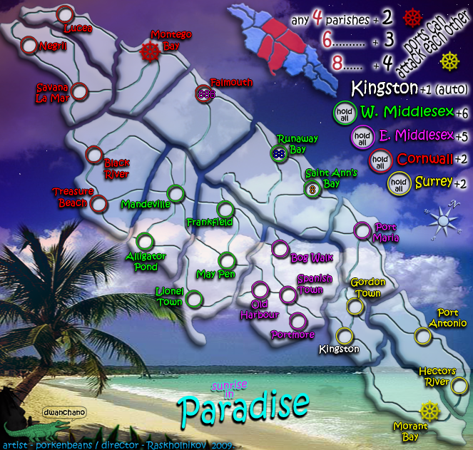
Why not replace the Montego Bay and Morant Bay city circles with the Ships' wheels colored in the respective colors? I think that would simplify and clarify the map and avoid using 2 symbols for the same city.
R
sunrise in Paradise.
Moderator: Cartographers
Re: sunrise in Paradise.
![]() by Raskholnikov on Wed Nov 18, 2009 5:28 am
by Raskholnikov on Wed Nov 18, 2009 5:28 am
-

 Raskholnikov
- Posts: 638
- Joined: Fri Sep 11, 2009 3:40 pm


Re: sunrise in Paradise.
![]() by jpcloet on Wed Nov 18, 2009 6:57 am
by jpcloet on Wed Nov 18, 2009 6:57 am
I think I'd still indicate somewhere on the map, that the map is Jamaica for the geographically challenged.
-

jpcloet
- Posts: 4317
- Joined: Sat Mar 17, 2007 9:18 am
- Location: Greater Toronto Area


Re: sunrise in Paradise.
![]() by Evil DIMwit on Wed Nov 18, 2009 7:43 am
by Evil DIMwit on Wed Nov 18, 2009 7:43 am
Your territory circles and names are clashing with the background big time -- it's terrific for visibility, but takes away from the image's coherence. Try making the colors more in line with your theme -- I recommend either blue/greens/yellow for the island, orange-yellow-blue for sunset, or black/green/yellow for Jamaica's flag. And whichever way you go, make those colors more a bit saturated than they are now -- not enough that they disappear but enough that they don't look like the MS Paint default pallet.
Gameplay-wise, I question the need for an auto-deploy on the capital. I know it's what all the "cool" kids are doing nowadays, but you've got enough going on in the map without making that one territory a strategic hotspot.
The bonuses also stick out at me as a little high for a map this small (compare Madagascar, Duck & Cover), but as they're uniformly high that may not be so awful.


-

Evil DIMwit
- Posts: 1616
- Joined: Thu Mar 22, 2007 1:47 pm
- Location: Philadelphia, NJ


Re: sunrise in Paradise.
![]() by porkenbeans on Wed Nov 18, 2009 2:37 pm
by porkenbeans on Wed Nov 18, 2009 2:37 pm
I think I hear a unanimous call for the sky island to be a little less transparent. ...check.
I also like the ideas of better colors for the circles, and incorporating the ships wheels into the territories circle.
About the island scene at the bottom of the map. I chose it because it was the best picture that I could find that fit the space. I am not opposed to changing it. I am open to look at any alternatives. I am not glued to the idea of it being a photograph. It could be an illustration of some kind. I would like to stick with the "beach" theme, but outside of that, I am very open to looking at any photographs, sketches or paintings that you artisans and photographers out there might want to offer up.

-

porkenbeans
- Posts: 2546
- Joined: Mon Sep 10, 2007 4:06 pm


Re: sunrise in Paradise.
![]() by porkenbeans on Mon Nov 23, 2009 8:28 pm
by porkenbeans on Mon Nov 23, 2009 8:28 pm
OK, here is a version with the sky island's opacity turned up more as requested. Also The port icons have been incorporated into the territs army circles.
- Click image to enlarge.
-
porkenbeans
- Posts: 2546
- Joined: Mon Sep 10, 2007 4:06 pm
Re: sunrise in Paradise.
![]() by Raskholnikov on Tue Nov 24, 2009 2:56 am
by Raskholnikov on Tue Nov 24, 2009 2:56 am
Love it! This totally works for me. Congrats on great work!
-
Raskholnikov
- Posts: 638
- Joined: Fri Sep 11, 2009 3:40 pm
Re: sunrise in Paradise.
![]() by ender516 on Wed Nov 25, 2009 2:00 pm
by ender516 on Wed Nov 25, 2009 2:00 pm
I like the idea of using the ship's wheel as the army circle, but I am concerned for the legibility of the numbers on top of the spokes. If you can show me an example which shows that it's not a problem, that would be fine. If legibility is a problem, I would suggest expanding the wheel so that the hub is the size of the other circles, with the spokes outside of that. Of course, depending on the length of the spokes, your wheels may then be getting too large, and you may have to move some text, but I think there is room in the ocean.
And if you continue to get objections to the parish puzzle pieces, you might consider reuniting the whole island while retaining the parish boundaries at their current width by making them appeared to be impressed or embossed or whatever word you want to use to say that they are pressed tight to the background image while the parishes themselves bulge toward the viewer.
I should say that when I jumped into this thread recently, and saw the mini-map, I was a bit confused, because at first I thought it was illustrating the four zones/XML continents/historical regions (Surrey, Cornwall, W. & E. Middlesex). And, apart from Falmouth (or whatever its parish is called), it does, especially if you note the slight difference in shading of Surrey (which may just be due to the background). Now that I have gone back and read the entire thread (let me just say ), and absorbed the legend next to the mini-map, I get it now. It might help others avoid my mistake if the sample red parishes were the ones surrounding the one containing Spanish Town, which come from three different zones. Or perhaps the red is unnecessary: a plain mini-map still serves as a visual definition of the term "parish" which I think is the point of it. The text beside it explains the bonus structure just fine once we know what a parish is.
For the sake of the XML coder on this map (volunteering if you need one), I hope you are not still thinking of giving the parish bonuses only for connected parishes. The XML can easily handle a bonus for having a minimum subset of the territories in a continent, but to enforce connectedness would entail, I think, a very large number of continents and some pretty hairy overrides.
Finally (for now), every time I see the text for Gordon Town, I think that Surrey has a fourth parish. I always have to look twice to see that Port Maria is the ruling settlement. Perhaps you could put "Gordon Town" in one line going due east just south of the middle of its army circle so that it does not touch the E. Middlesex area. This might force a move for "Port Antonio", but this could be, say, diametrically across its circle, which would then perhaps force Hectors River to move as well, perhaps being flattened to a single line of text too. I think names crossing parish borders are more acceptable if they remain within their historical region.
Glad to see this topic active again. I hope it regains its activity without regaining the rancour.
And if you continue to get objections to the parish puzzle pieces, you might consider reuniting the whole island while retaining the parish boundaries at their current width by making them appeared to be impressed or embossed or whatever word you want to use to say that they are pressed tight to the background image while the parishes themselves bulge toward the viewer.
I should say that when I jumped into this thread recently, and saw the mini-map, I was a bit confused, because at first I thought it was illustrating the four zones/XML continents/historical regions (Surrey, Cornwall, W. & E. Middlesex). And, apart from Falmouth (or whatever its parish is called), it does, especially if you note the slight difference in shading of Surrey (which may just be due to the background). Now that I have gone back and read the entire thread (let me just say
For the sake of the XML coder on this map (volunteering if you need one), I hope you are not still thinking of giving the parish bonuses only for connected parishes. The XML can easily handle a bonus for having a minimum subset of the territories in a continent, but to enforce connectedness would entail, I think, a very large number of continents and some pretty hairy overrides.
Finally (for now), every time I see the text for Gordon Town, I think that Surrey has a fourth parish. I always have to look twice to see that Port Maria is the ruling settlement. Perhaps you could put "Gordon Town" in one line going due east just south of the middle of its army circle so that it does not touch the E. Middlesex area. This might force a move for "Port Antonio", but this could be, say, diametrically across its circle, which would then perhaps force Hectors River to move as well, perhaps being flattened to a single line of text too. I think names crossing parish borders are more acceptable if they remain within their historical region.
Glad to see this topic active again. I hope it regains its activity without regaining the rancour.
-

ender516
- Posts: 4455
- Joined: Wed Dec 17, 2008 6:07 pm
- Location: Waterloo, Ontario


Re: sunrise in Paradise.
![]() by porkenbeans on Thu Nov 26, 2009 1:30 am
by porkenbeans on Thu Nov 26, 2009 1:30 am
Thanks partner. But I am afraid that I was right about the blacklist thing. I am sorry to say that your baby the God map, is meeting the same fate. They want you to change anything and everything that I did, because they are out to shut me down. And you along with me, if you do not bow to their edicts.Raskholnikov wrote:Love it! This totally works for me. Congrats on great work!
-
porkenbeans
- Posts: 2546
- Joined: Mon Sep 10, 2007 4:06 pm
Re: sunrise in Paradise.
![]() by Raskholnikov on Fri Nov 27, 2009 12:45 pm
by Raskholnikov on Fri Nov 27, 2009 12:45 pm
Pork, let's just stick to improving our maps and game-play. The Jamaica map is progressing very well, and so is Romania. Let's move these two along and do our best with 150 after Hijrah. Let's keep the rest of the discussion to a minumum because it's really not fun, not constructive and, frankly, I don't have the time (and I'm sure you don't either) to spend hours on useless arguments. So let's focus strictly on map issues on these threads and leave all extraneous stuff out. We can use other threads for changes we might want to see in the Foundry. Otherwise, we will end up with locked threads and maps in limbo. Many thanks, R
-
Raskholnikov
- Posts: 638
- Joined: Fri Sep 11, 2009 3:40 pm
Re: sunrise in Paradise.
![]() by RjBeals on Fri Nov 27, 2009 1:17 pm
by RjBeals on Fri Nov 27, 2009 1:17 pm
I'm still not feeling this map. It's got too much going on. Have you considered tilting the map so it's not diagonal, like wm and i did on these examples?
- Click image to enlarge.

- Click image to enlarge.

-

RjBeals
- Posts: 2506
- Joined: Mon Nov 20, 2006 5:17 pm
- Location: South Carolina, USA


Re: sunrise in Paradise.
![]() by jefjef on Fri Nov 27, 2009 1:50 pm
by jefjef on Fri Nov 27, 2009 1:50 pm
The ships wheel doesn't need to have the spokes. Done right you will still be able to tell what it is.
This post was made by jefjef who should be on your ignore list.

drunkmonkey wrote:I'm filing a C&A report right now. Its nice because they have a drop-down for "jefjef".
-

jefjef
- Posts: 6026
- Joined: Mon Feb 23, 2009 8:41 pm
- Location: on my ass


Return to Melting Pot: Map Ideas
Who is online
Users browsing this forum: No registered users
|
|||||||
| Conquer Club is not associated with RISK online in any way. Copyright © 2006-2025 by Big Wham LLC | |||||||