RuneScape Map [Abandoned]
Moderator: Cartographers

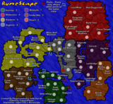
![]() by PimpCaneYoAss on Tue Apr 17, 2007 4:44 pm
by PimpCaneYoAss on Tue Apr 17, 2007 4:44 pm
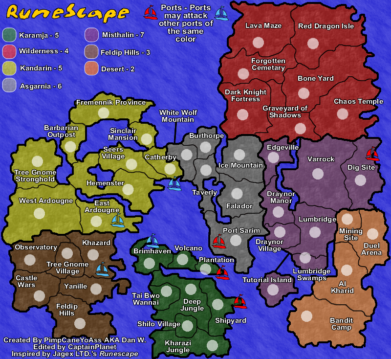
(Number of Territories x 1.5) + (Number of bordering territories within continent x 4) + (Number of neighboring territories outside of continent x 0.5) + (Number of neighboring continents x 1) / 6
For Misthalin
(8 X 1.5) + (6 x 4) + (9 x 0.5) + (4 x 1) / 6 = 7.4166666...
For Asgarnia
(6 x 1.5) + (4 x 4) + (9 x 0.5) + (4 x 1) / 6 = 5.5833333...
For Kandarin
(9 x 1.5) + (3 x 4) + (5 x 0.5) + (3 x 1) / 6 = 5.166666...
With my rounding i figure
-Misthalin 7
-Asgarnia 6
-Kandarin 5
For Misthalin
(8 X 1.5) + (6 x 4) + (9 x 0.5) + (4 x 1) / 6 = 7.4166666...
For Asgarnia
(6 x 1.5) + (4 x 4) + (9 x 0.5) + (4 x 1) / 6 = 5.5833333...
For Kandarin
(9 x 1.5) + (3 x 4) + (5 x 0.5) + (3 x 1) / 6 = 5.166666...
With my rounding i figure
-Misthalin 7
-Asgarnia 6
-Kandarin 5
-
 PimpCaneYoAss
- Posts: 185
- Joined: Fri Feb 16, 2007 3:04 pm
- Location: Connecticut


![]() by CaptainPlanet on Tue Apr 17, 2007 4:53 pm
by CaptainPlanet on Tue Apr 17, 2007 4:53 pm
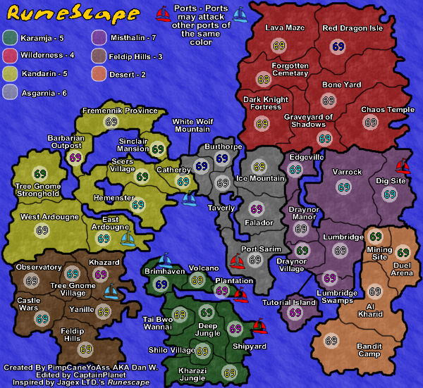
Lol @ the 69s
Anyway, looks good, except Desert and Wilderness have the same bonuses, but it's much easier to hold the desert
Anyway, looks good, except Desert and Wilderness have the same bonuses, but it's much easier to hold the desert
Stopper wrote:I voted Kid_A. I don't why they have the Ku Klux Klan in their avatar, but I like the name.
-
CaptainPlanet
- Posts: 132
- Joined: Wed Feb 14, 2007 6:21 pm
- Location: Bankhead
![]() by PimpCaneYoAss on Tue Apr 17, 2007 4:58 pm
by PimpCaneYoAss on Tue Apr 17, 2007 4:58 pm
Your right...
According to the formula its 4.66666...
I think this makes the bonuses too high tho so i think i will reduce the number of territories in the wilderness by cutting out the elite wilderness and one more bordering territory or something
According to the formula its 4.66666...
I think this makes the bonuses too high tho so i think i will reduce the number of territories in the wilderness by cutting out the elite wilderness and one more bordering territory or something
-
PimpCaneYoAss
- Posts: 185
- Joined: Fri Feb 16, 2007 3:04 pm
- Location: Connecticut
![]() by wrightfan123 on Tue Apr 17, 2007 6:52 pm
by wrightfan123 on Tue Apr 17, 2007 6:52 pm
well, apart from it being about RuneScape *shurders*, it's truning out to be a decent map. one thing, no 4 corner borders; those are crap
-

wrightfan123
- Posts: 601
- Joined: Sat Jan 06, 2007 2:58 pm
- Location: Looking over every baseball team's schedule to try to determine who will win the World Series.


![]() by PimpCaneYoAss on Tue Apr 17, 2007 7:17 pm
by PimpCaneYoAss on Tue Apr 17, 2007 7:17 pm
NEW UPDATE 4/17/07

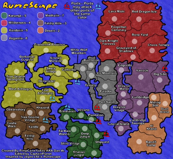
Changes
-Borders in Feldip Hills (Tree Gnome Village no longer borders Kandarin)
-Borders in Misthalin (No more four way border)
-Borders in Desert (Extended Al Kharid and removed the Desert Mining Camp)
-Borders in Wilderness (Removed Elite Wilderness)
Comments
No more four corner boreders. The bonuses are pretty accurate now too while providing a good range of them. Keep the comments coming please. Once again thanks to everyone for the feedback. There are 48 continents too so that is a good number for gameplay.
Problems to fix so far
-Lfd's should be LTD's in the lower left
-
PimpCaneYoAss
- Posts: 185
- Joined: Fri Feb 16, 2007 3:04 pm
- Location: Connecticut
![]() by PimpCaneYoAss on Tue Apr 17, 2007 10:19 pm
by PimpCaneYoAss on Tue Apr 17, 2007 10:19 pm
NEW UPDATE 4/18/07
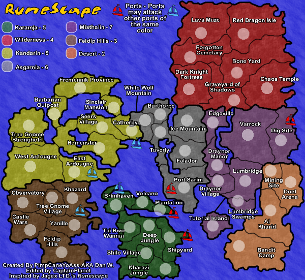
Changes
-Lfd.'s changed to LTD.'s in lower left
-Army circle locations
-Added Coordinates (neat and centered)
Comments
-Overall, I'm really happy with this. The coordinates are centered nicely and everything seems to be in place.
-Please keep the comments coming.
Problems to be addressed
-Make the title more appealing
-Blur the borders
-Make the signature smaller
-Address the issue of the textures representing the landscape (Help me with this)
-Add mountains and walls to add to the effect of the map (Help me with this too lol)
-Add images to help the RuneScape feel (Offer suggestions)
-Overall emotion (Major help needed)
Last edited by PimpCaneYoAss on Wed Apr 18, 2007 2:29 pm, edited 1 time in total.
-
PimpCaneYoAss
- Posts: 185
- Joined: Fri Feb 16, 2007 3:04 pm
- Location: Connecticut
![]() by PimpCaneYoAss on Wed Apr 18, 2007 12:06 am
by PimpCaneYoAss on Wed Apr 18, 2007 12:06 am
Let me know what you think about the map. Graphically, i think its ok. The port note i think might need to be moved down and the boat symbols could be put above it. Bonuses are correct i belive. keep the comments coming.
-
PimpCaneYoAss
- Posts: 185
- Joined: Fri Feb 16, 2007 3:04 pm
- Location: Connecticut
![]() by KEYOGI on Wed Apr 18, 2007 12:34 am
by KEYOGI on Wed Apr 18, 2007 12:34 am
The map has developed a great deal since I last had a good look at it. Some quick points to consider.
Title
Unless this is a specific style you are going for, I'd perhaps look into some different options. I don't feel it does the rest of your map justice.
Borders
At a quick glance your territory borders seem fine, but the continent borders could probably be thinned down some and blurred. They seem a bit thick and jagged at the moment.
Signature
It's rather large. Try and see if you can shrink it done some and maybe even reduce the transparency of it so it doesn't detract from the map.
That's about all for now. Your map is progressing nicely and I'll be back for a more detailed look in the future.
-
KEYOGI
- Posts: 1632
- Joined: Tue Oct 10, 2006 6:09 am


![]() by tanjyr on Wed Apr 18, 2007 8:54 am
by tanjyr on Wed Apr 18, 2007 8:54 am
i play runescape myself and was expecting this map to be much more impressive, but i guess this is good enough. i agree that the title should be made nicer.
Perhaps, just to fulfil my expectations, you could add pictures of runescape here and there?
Perhaps, just to fulfil my expectations, you could add pictures of runescape here and there?
-
tanjyr
- Posts: 17
- Joined: Sun Mar 04, 2007 7:39 am


![]() by DiM on Wed Apr 18, 2007 9:35 am
by DiM on Wed Apr 18, 2007 9:35 am
first it's really important to let you know i never played runescape before you read this post.
here goes:
i don't like this map. wait i'm wrong. i'm indifferent to this map. it has no emotion, no feeling, it lacks that certain "je ne sais quoi" that makes me drool and click the mouse frantically.
a map of runescape, should yell adventure, RPG, combat, mistery, fun, etc. at the moment it only whispers "boring".
from the start each map has 2 target users. the ones that relate to the theme and the others. a runescape addict will probably play this map even if it was the ugliest thing on earth. the problem is with the others.
so how can you convince the others to play?
1. gameplay.
2. graphics.
3. feeling.
1. i'm not a gameplay expert so i'll pass on this one.
2. graphics are bland on your map. you have only 2 textures. 1 for water and one for land. try various textures for the lands. i'm not familiar with the runescape universe but i see you have a continent named desert. well, make it look like a desert. at the moment kandarin looks more like a desert than the desert continent which is wrong. i'm sure the other continents have certain personalized traits like mountains plains forests snow, etc. make them represent those traits.
impassable borders. you have only rivers. add some mountains too. some walls would do well or even some impassable forests.
3. feeling. this is the really hard part. the feeling is usually inside the gfx section but i made it separate so i can better explain it. what do you need for the feeling? small things. like some sea dragons blending into the sea, some lava flows near the volcano, a sword compass, a parchment legend, a fancy font, etc.
hope this helps.
“In the beginning God said, the four-dimensional divergence of an antisymmetric, second rank tensor equals zero, and there was light, and it was good. And on the seventh day he rested.”- Michio Kaku
-

DiM
- Posts: 10415
- Joined: Wed Feb 14, 2007 6:20 pm
- Location: making maps for scooby snacks


![]() by DiM on Wed Apr 18, 2007 11:05 am
by DiM on Wed Apr 18, 2007 11:05 am
mibi wrote:what DiM said.
i agree with mibi
“In the beginning God said, the four-dimensional divergence of an antisymmetric, second rank tensor equals zero, and there was light, and it was good. And on the seventh day he rested.”- Michio Kaku
-
DiM
- Posts: 10415
- Joined: Wed Feb 14, 2007 6:20 pm
- Location: making maps for scooby snacks
![]() by PimpCaneYoAss on Wed Apr 18, 2007 2:16 pm
by PimpCaneYoAss on Wed Apr 18, 2007 2:16 pm
KEYOGI wrote:The map has developed a great deal since I last had a good look at it. Some quick points to consider.
Title
Unless this is a specific style you are going for, I'd perhaps look into some different options. I don't feel it does the rest of your map justice.
Borders
At a quick glance your territory borders seem fine, but the continent borders could probably be thinned down some and blurred. They seem a bit thick and jagged at the moment.
Signature
It's rather large. Try and see if you can shrink it done some and maybe even reduce the transparency of it so it doesn't detract from the map.
That's about all for now. Your map is progressing nicely and I'll be back for a more detailed look in the future.
I tried to pick a font that would be as close as possible to the actual RuneScape font. I could explore other options though.
I will blur the continent borders since they are a little jagged. I do however like the size so I won't slim them down too much.
The signature will be shrunken down and made more transparent. It is a bit too big.
Thanks KEYOGI. These probelms will be fixed in the next update.
-
PimpCaneYoAss
- Posts: 185
- Joined: Fri Feb 16, 2007 3:04 pm
- Location: Connecticut
![]() by PimpCaneYoAss on Wed Apr 18, 2007 2:17 pm
by PimpCaneYoAss on Wed Apr 18, 2007 2:17 pm
tanjyr wrote:i play runescape myself and was expecting this map to be much more impressive, but i guess this is good enough. i agree that the title should be made nicer.
Perhaps, just to fulfil my expectations, you could add pictures of runescape here and there?
I did think about this but then again I don't want to have to deal with copyright issues more than I already have too. Maybe some swords or other images that aren't necessarily from RuneScape but just reflect it would be good.
Thanks tanjyr.
-
PimpCaneYoAss
- Posts: 185
- Joined: Fri Feb 16, 2007 3:04 pm
- Location: Connecticut
![]() by PimpCaneYoAss on Wed Apr 18, 2007 2:24 pm
by PimpCaneYoAss on Wed Apr 18, 2007 2:24 pm
DiM wrote:first it's really important to let you know i never played runescape before you read this post.
here goes:
i don't like this map. wait i'm wrong. i'm indifferent to this map. it has no emotion, no feeling, it lacks that certain "je ne sais quoi" that makes me drool and click the mouse frantically.
a map of runescape, should yell adventure, RPG, combat, mistery, fun, etc. at the moment it only whispers "boring".
from the start each map has 2 target users. the ones that relate to the theme and the others. a runescape addict will probably play this map even if it was the ugliest thing on earth. the problem is with the others.
so how can you convince the others to play?
1. gameplay.
2. graphics.
3. feeling.
1. i'm not a gameplay expert so i'll pass on this one.
2. graphics are bland on your map. you have only 2 textures. 1 for water and one for land. try various textures for the lands. i'm not familiar with the runescape universe but i see you have a continent named desert. well, make it look like a desert. at the moment kandarin looks more like a desert than the desert continent which is wrong. i'm sure the other continents have certain personalized traits like mountains plains forests snow, etc. make them represent those traits.
impassable borders. you have only rivers. add some mountains too. some walls would do well or even some impassable forests.
3. feeling. this is the really hard part. the feeling is usually inside the gfx section but i made it separate so i can better explain it. what do you need for the feeling? small things. like some sea dragons blending into the sea, some lava flows near the volcano, a sword compass, a parchment legend, a fancy font, etc.
hope this helps.
I agree completely that the map does seem sort of "boring" at the moment. However, I would like to stick to one texture because when you introdcue too many I think it adds confusion. In my first draft (Pg. 1) you can see that I attempted this. The only thing is that only 3 out og the 7 continents in RuneScape have unique landscapes (Desert - Dry, Sand; Wilderness - Lava, rock; Karamja - Tropical forest). If I went with this, that woud mean te other 4 would be very similar in texture and color since they are your typical woodland kind of grassy regions.
I tried to capture this with the colors but then had to use purple, yellow, brown, and gray for the other continents to make thm unique.
I will try and add mountains and walls instead of just having rvers but I am, and I emphasize this next part, No expert with drawing them or inserting them in any way. I'm using fireworks so I don't no any special means to insert them except drawing with texture, which isnt the best of ways.
As far as the other images on the map such as the compass and monsters around it, I will try and work on that.
Thanks for everything DiM.
-
PimpCaneYoAss
- Posts: 185
- Joined: Fri Feb 16, 2007 3:04 pm
- Location: Connecticut
![]() by PimpCaneYoAss on Wed Apr 18, 2007 2:25 pm
by PimpCaneYoAss on Wed Apr 18, 2007 2:25 pm
The main thing I need help with everyone is ways to help enhance the emotion and overall appeal of this map. Please offer suggestions about things to add or various ways to help capture this effect. Thanks.
Refer to the most recent update (Pg. 13 2nd update) to see what I need help with.
Refer to the most recent update (Pg. 13 2nd update) to see what I need help with.
-
PimpCaneYoAss
- Posts: 185
- Joined: Fri Feb 16, 2007 3:04 pm
- Location: Connecticut
![]() by freezie on Wed Apr 18, 2007 3:23 pm
by freezie on Wed Apr 18, 2007 3:23 pm
Well for the texture, I think you can make them different wihile sticking to the theme of each regions. I'll post a few ideas for texture and images you could try.
For the desert, it's obvious. You could add some pyramids images, since they are important part of it. Especially the ancient pyramid that you could implement in the bottom of the continent. Can always make it a border. Sandy texture is up to it.
Asgarnia. Uniqueness of Fallador's walls. You could make the continent look a bit like it. Snow can obviously be used too, ice mountain beeing very close. A dwarf-style would also define is well, seeing that keldagrim isn't on the map.
Wilderness. I would see that continent more black than red. With skulls, rocks, lava. But black. Can even add dragons around, an important part of the member's PvE wilderness.
Karamja. Forest. Forest. Uhmmm..Maybe some forests too. Also a tribe-style or even tribal villages would also fit Karamja's theme.
Feldip hills. Not much to it now is it..Except ogres. You can work around that theme to do it. Mud, skulls on sticks, spit-rosts...the possibilities are limited..but there.
Kandarin. Not much to it now is there...I can see the wooden walls of the fremmenricks, their boats.. Gnome gliders for the gnome tree.
Misthalin...This is where I am stuck. Beside the important castle and knowledge that resides in varrock ( The museum, library..) I don't see anything for the texture. It's the market place for free players, but beside that...

-
freezie
- Posts: 3901
- Joined: Fri Apr 06, 2007 12:18 pm
- Location: Somewhere between here and there.

![]() by PimpCaneYoAss on Wed Apr 18, 2007 3:27 pm
by PimpCaneYoAss on Wed Apr 18, 2007 3:27 pm
Great ideas freezie
I would like to stick to the textures/colors i have now and just try to add some images like you had mentioned. This provides me with a great starting point. Thanks.
I would like to stick to the textures/colors i have now and just try to add some images like you had mentioned. This provides me with a great starting point. Thanks.
-
PimpCaneYoAss
- Posts: 185
- Joined: Fri Feb 16, 2007 3:04 pm
- Location: Connecticut
![]() by PimpCaneYoAss on Wed Apr 18, 2007 4:03 pm
by PimpCaneYoAss on Wed Apr 18, 2007 4:03 pm
NEW UPDATE 4/18/07
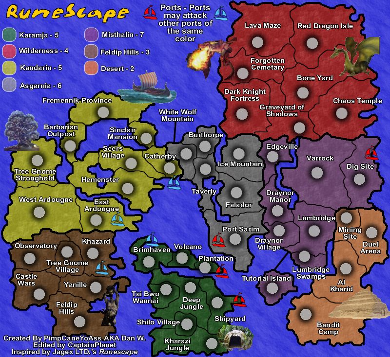
Changes
-Army Circle Shadows
-Added various pictures
Comments
-Still need to add walls to Falador and Mountains
Problems to be addressed
-Make the title more appealing
-Blur the borders
-Make the signature smaller
-Address the issue of the textures representing the landscape (Help me with this)
-Add mountains and walls to add to the effect of the map (Help me with this too lol)
-Make the images more transparent
-Overall emotion (Major help needed)
Last edited by PimpCaneYoAss on Wed Apr 18, 2007 4:11 pm, edited 1 time in total.
-
PimpCaneYoAss
- Posts: 185
- Joined: Fri Feb 16, 2007 3:04 pm
- Location: Connecticut


![]() by PimpCaneYoAss on Wed Apr 18, 2007 4:10 pm
by PimpCaneYoAss on Wed Apr 18, 2007 4:10 pm
fireedud wrote:OK, I like the fact that you have pictures, but they have to blend in with the map more.
I will increase the transparency of them. Thanks
-
PimpCaneYoAss
- Posts: 185
- Joined: Fri Feb 16, 2007 3:04 pm
- Location: Connecticut
![]() by PimpCaneYoAss on Wed Apr 18, 2007 4:24 pm
by PimpCaneYoAss on Wed Apr 18, 2007 4:24 pm
NEW UPDATE 4/18/07
Changes
-Images made more transparent
-Signature made smaller
-Title given bevel and shadow
-Borders blurred
Comments
-I still need to look into creating walls and mountains but Am not relly sure on how to go about doing this. Any help is apprecaited.
Prroblems to be addressed
-Textures to represent landscape
-Mountains and walls
-Overall emotion
-
PimpCaneYoAss
- Posts: 185
- Joined: Fri Feb 16, 2007 3:04 pm
- Location: Connecticut
![]() by freezie on Wed Apr 18, 2007 4:29 pm
by freezie on Wed Apr 18, 2007 4:29 pm
Hmmm...Ok..You do have pictures.
But it feels they are out of place. And they just seem some shadow of themself with that level of transparancy.
adding pictures that fast wasn't a very good idea. And the pyramid looks TOTALLY NOT like runescape.
The tree...erm?
The boat is ok..I would sea it in the see and not overgoing the continent though.
The dragons are..ok...But they overtake the continent once again. The green dragon looks really like runescape, though.
The ogre is totally ugly and out of place.
A cave? Errmmmm....
My idea is you go take screenies on runescape itself. Might be better..
-
freezie
- Posts: 3901
- Joined: Fri Apr 06, 2007 12:18 pm
- Location: Somewhere between here and there.
Return to Melting Pot: Map Ideas
Who is online
Users browsing this forum: No registered users
|
|||||||
| Conquer Club is not associated with RISK online in any way. Copyright © 2006-2025 by Big Wham LLC | |||||||