Why use a Dark colored Keyboard for the background???... I think it would be easier to use a White keyboard... it would be easier for the territ colors and fonts.
Also… I am glad you got creative with the bonuses but it seems like there is "TOO MUCH" ...Maybe not…
QWERTY Keyboard - Brand New Design [vacation]
Moderator: Cartographers

![]() by Tieryn on Mon Feb 25, 2008 7:36 pm
by Tieryn on Mon Feb 25, 2008 7:36 pm
Lightening the key tops is easily done, and I was planning it anyway. At least standardising the lightness (some keys are darker than others... some keys mothers are darker than other keys mothers?)
I'm using a dark keyboard because it was the best image I could find. The lighter keyboards were dingy and crap. I'd be careful of putting a glow behind the letters, as it's going to make the keys look LED lit (which is cool, but hey). If you can find me a decent, light coloured keyboard to use as a base image I'm willing to give it a shot tho.
*Posting from work* -oi you at home, look at these when you get back
-
 Tieryn
- Posts: 781
- Joined: Mon May 28, 2007 7:30 am
- Location: Generation One


![]() by Tieryn on Mon Feb 25, 2008 7:38 pm
by Tieryn on Mon Feb 25, 2008 7:38 pm
The split-natural style keyboard could make the hand definitions easier to see... and I can then use the pencil for a few connections perhaps...
Hmm.. I'll have a fiddle later tonight... See what comes up.
Hmm.. I'll have a fiddle later tonight... See what comes up.
-
Tieryn
- Posts: 781
- Joined: Mon May 28, 2007 7:30 am
- Location: Generation One
![]() by tenio on Mon Feb 25, 2008 8:09 pm
by tenio on Mon Feb 25, 2008 8:09 pm
ya that would be good
maybe could could you add a "sleep button"
and make it take 1 off from the territory it is on, but it can attack any territory
or make it become a neutral every turn
because i know (from experience) that the sleep button can destroy school projects (or if you are in the middle of a twl match!)
maybe could could you add a "sleep button"
and make it take 1 off from the territory it is on, but it can attack any territory
or make it become a neutral every turn
because i know (from experience) that the sleep button can destroy school projects (or if you are in the middle of a twl match!)
-
tenio
- Posts: 174
- Joined: Thu Apr 19, 2007 7:23 pm
- Location: The Moon

![]() by gangster2b on Tue Feb 26, 2008 7:15 am
by gangster2b on Tue Feb 26, 2008 7:15 am
tenio wrote:ya that would be good
maybe could could you add a "sleep button"
that's a good Idea!
-

gangster2b
- Posts: 36
- Joined: Fri Feb 08, 2008 2:18 pm
- Location: The Netherlands
![]() by Ogrecrusher on Tue Feb 26, 2008 10:18 am
by Ogrecrusher on Tue Feb 26, 2008 10:18 am
This is much improved. One thing though. The letters don't actually look like they are written on the keys. Looking at the key board I type this on, the letters look "sunken" into the surface of the key, while yours look like they hover above the key, if you get my meaning...
Oh also, I think the letters shouldn't be quite so in the corner of the keys, move them (very) slightly right and down. (Again I compare to the keyboard I type with)

Oh also, I think the letters shouldn't be quite so in the corner of the keys, move them (very) slightly right and down. (Again I compare to the keyboard I type with)
-
Ogrecrusher
- Posts: 250
- Joined: Thu Aug 16, 2007 2:55 pm


![]() by sam_levi_11 on Tue Feb 26, 2008 12:00 pm
by sam_levi_11 on Tue Feb 26, 2008 12:00 pm
if you use an english keyboard their are more keys, helping you make a larger map
-
sam_levi_11
- Posts: 2872
- Joined: Mon Dec 11, 2006 2:48 pm


![]() by fumandomuerte on Tue Feb 26, 2008 6:06 pm
by fumandomuerte on Tue Feb 26, 2008 6:06 pm
You need to work a lot with the graphics. For the actual standars of CC this would not pass to the next foundry stage.
Even though, I love the idea, but keep both eyes on the small details.
Vladi
Even though, I love the idea, but keep both eyes on the small details.
Vladi

-
fumandomuerte
- Posts: 620
- Joined: Sat Dec 29, 2007 1:27 am
- Location: The Cinderella of the Pacific


![]() by fromdahood on Tue Feb 26, 2008 9:19 pm
by fromdahood on Tue Feb 26, 2008 9:19 pm
i think the new look is a lot better, a lot easier to see.
-
fromdahood
- Posts: 31
- Joined: Sat Oct 27, 2007 10:47 am


![]() by oaktown on Tue Feb 26, 2008 10:22 pm
by oaktown on Tue Feb 26, 2008 10:22 pm
the new graphics are a change for the better... this map looks like something that should be taken more seriously now! I agree that the text on the keys needs some work, as well as either greater contrast from the background or a light stroke.
While I won't begin to try to wrap my head around the sheer volume of bonuses possible, something needs to be done with the legends to make everything easier to take in. There is information above, below, in the middle of, and running down the side of the actual playing area.
I'd say that if it is next to impossible to easily explain all that is going on, there may be too much going on to begin with.
-

oaktown
- Posts: 4451
- Joined: Sun Dec 03, 2006 9:24 pm
- Location: majorcommand


![]() by Tieryn on Wed Feb 27, 2008 2:45 am
by Tieryn on Wed Feb 27, 2008 2:45 am
The new graphics are at first stage... there's lots to be done I know.
The reason the letters are high is to make space for the armies to go under them. I can maybe move them down a pixel, but not much.
Yes, I will be re-doing the lettering, making them look part of the key (they have in previous versions, I need to work out what will do this best here)
I might look at using a white keyboard background, and will see what I can come up with, but I've always preferred black peripherals.
As far as making the map bigger goes, hell no, It started out full sized, but you just don't have the pixel space in 600 across to fit in more keys (and armies on them).
As far as cleaning up the instructions, I can work on that. I was aiming to have "Play instructions" up the top and "bonuses" down the bottom. Is this okay oak? or should I aim to consolidate both in one area?
-
Tieryn
- Posts: 781
- Joined: Mon May 28, 2007 7:30 am
- Location: Generation One
![]() by Tieryn on Thu Feb 28, 2008 10:14 am
by Tieryn on Thu Feb 28, 2008 10:14 am
Okay, so here's the start of my complete redesign white keyboard
please vote on it or the old black one
I must say I almost like this with armies on it... It is a little squished. and they are a bit bright, I think they need a 26x15 shaded box to darken the background perhaps? Positioning looks good and shouldn't clog up. Remember, this is the small map folks. Big map will have more room
So the age old gameplay question...
Do I make the pencils, and paperclips, territories? I have a feeling the answer is yes? and make them a standard continent bonus. Also making the left control keys and right conrtol keys each continents.
Last edited by Tieryn on Thu Feb 28, 2008 10:33 am, edited 1 time in total.
-
Tieryn
- Posts: 781
- Joined: Mon May 28, 2007 7:30 am
- Location: Generation One
![]() by FreeMan10 on Thu Feb 28, 2008 12:05 pm
by FreeMan10 on Thu Feb 28, 2008 12:05 pm
Wow. The upward curve of the keyboard (the very same model as the one I'm typing on right now!) and the downward curve of the wood grain does some weird things to the eyes...
This suggestion may seem counter-intuitive, but the keyboard looks very squished - I understand you probably had to do that to get it into the 600px width requirement. Maybe by shortening the image height (you've got a lot of dead space at the top of the image) will make the whole thing look wider and that may help with perspective a bit. With this keyboard, you'll still have space under the curved hand rest to put in a signature block. Also, shifting the keyboard left by a couple of pixels may help. It'll cut off the bottom corner of the hand rest, but let some of the right edge of the keyboard frame slide back into the picture (maybe bring it left just to the point where the left edge of the keyboard (CTRL key) just touches the edge of the image - like I said a couple of pixels).
I'm going to abstain from your poll for now, because I like the layout of the white keyboard, but I think I like the darker coloring of the black keyboard better.
I would not make the pencils & paper clips territs - I'd leave them simply as bridges, then be very, very careful about placement so there's no confusion on what they touch.
Might it be possible to split the space bar into two territs? I've seen ergo keyboards with two space keys, so there's real world precedence for it. Right now there's no indication of which 'hand' it falls into.
Keep up the great work, Tieryn, you'll have a winner on your hands soon enough!
-

FreeMan10
- Posts: 152
- Joined: Wed Jan 23, 2008 12:48 pm
- Location: On The Road


![]() by Tieryn on Fri Feb 29, 2008 2:06 am
by Tieryn on Fri Feb 29, 2008 2:06 am
Okay, early days yet, but it seems whitey has some support, so I'll oppress the black keyboard for now, and work on building up the white one...
The words are fuzzy, I haven't texted them yet, they are just from the original image. I've only done the coloured letters.
I'll try shortening the map and shifting the image a little to help with crampedness, you're right, it does look kinda squished, tho I think that's also just with 888 armies on, rather than the usual 8 or 88...
I've also removed the idea of "left control attacks right keys" because it doesn't really fit with the way I can describe this map.
The spacebar is one territory, that exists between both hands, and is in neither. It's connected only to those keys adjacent to it Alt, V, B, N, M, Alt Maybe C as well, not sure yet... If I do I'll need to widen the space bar a little to make it look more connected.
-
Tieryn
- Posts: 781
- Joined: Mon May 28, 2007 7:30 am
- Location: Generation One
![]() by Tieryn on Fri Feb 29, 2008 3:49 am
by Tieryn on Fri Feb 29, 2008 3:49 am
Okay, so I've finished off all the words on territs, also changed bonuses around a little. Rather than +1 to F keys, which was really for no other reason than I could, I've changed it to a requirements level bonus based on how many you have.
I've changed the right and left control keys into continents, standard style, to add a little bit of normality to the map.
I still like the combo's and words as bonus structures within the map (given the previous idea of "by finger" was shot down) unless someone can think of a better idea?
Will keep the pencils + paperclips as bridges not territs. Makes more sense anyway.
Also changed the grain of the wood to hopefully remove eye-soreness.
edit: added edge to table, changed colour of Combo's area to distinguish it from game area. Only bonuses on table area are continent style bonuses.
Added signature block from the black keyboard as a token of my appreciation for it. Added conquer club logo to conquer key in bonuses section to make it easier to notice that backspace is needed, and separate.
Can I get an idea on how far this is away from another stamp of anyones? Anything I need to particularly focus on or any still long-standing reservations about the whole thing?
Last edited by Tieryn on Fri Feb 29, 2008 11:20 am, edited 1 time in total.
-
Tieryn
- Posts: 781
- Joined: Mon May 28, 2007 7:30 am
- Location: Generation One
![]() by oaktown on Fri Feb 29, 2008 9:32 am
by oaktown on Fri Feb 29, 2008 9:32 am
hey tier, I'll take the time to pour over the gameplay next week. My immediate concern remains making the legend as clear and concise as possible - I think it is much improved from where it was, but maybe some of your fans can weigh in as to how to make this map simpler to understand. The line about "Hold3[+1]5[+3]9[+5]12[+7]" is especially in need of help, both to make it easier to understand and to look better.
Graphics aren't my department, but I'd say that its the visual elements that are going to hold you up longer than the play. A lot of things just look like they're thrown in and 'floating' over the rest of the image - the single keys below the keyboard, for example. And the little pencil. The new look definitely shows promise though - nice change.
Graphics aren't my department, but I'd say that its the visual elements that are going to hold you up longer than the play. A lot of things just look like they're thrown in and 'floating' over the rest of the image - the single keys below the keyboard, for example. And the little pencil. The new look definitely shows promise though - nice change.

-
oaktown
- Posts: 4451
- Joined: Sun Dec 03, 2006 9:24 pm
- Location: majorcommand
![]() by Tieryn on Fri Feb 29, 2008 9:59 am
by Tieryn on Fri Feb 29, 2008 9:59 am
So here's where I need some help from a real graphics artist rather than a simple photo editor like myself  How would I go about trying to make them less "floaty"?
Could I perhaps have the control keys broken and scattered on the table, but still in some sort of pattern?
On the pencils and paperclips note, I think things like these are needed instead of just dotted lines for connections. Sure they're arbitrary, but I think they can be done better... I've just had a great new idea i"m working on for this, will show you when it's done.
-
Tieryn
- Posts: 781
- Joined: Mon May 28, 2007 7:30 am
- Location: Generation One
![]() by Tieryn on Fri Feb 29, 2008 10:52 am
by Tieryn on Fri Feb 29, 2008 10:52 am
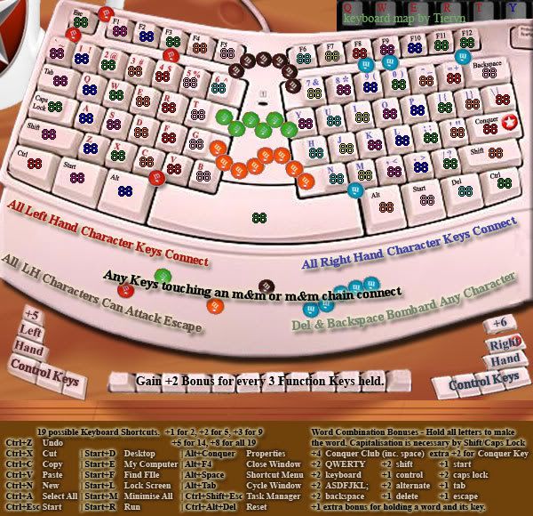
Well, I've implemented (basically, without touchup) my new idea for pathways without paperclips or pencils!
What does -every- geek always have somewhere, sometime, around his keyboard, and then feel the compulsive need to organise into single coloured groups of different pattern.... well.. I do sometimes... so here it is...
The QWERTY Candy Keyboard
I was thinking instead of m&m's, I could put a CC logo on the candy too? or some of them at least...
-
Tieryn
- Posts: 781
- Joined: Mon May 28, 2007 7:30 am
- Location: Generation One
![]() by FreeMan10 on Fri Feb 29, 2008 11:18 am
by FreeMan10 on Fri Feb 29, 2008 11:18 am
You're coming up with some really creative ideas, Tieryn. I'm liking them! A couple of tweaks that I think will help:
Get rid of the CC logo & the old keyboard - I understand why you've got 'em but they add too much clutter to an already busy map.
erase the PrtScr key from the top right of the keyboard - just cover it with white.
I like the m&ms - that's clever! You'd prolly have to remove the 'm' logo to avoid copyright issues (though m&ms are common enough you could probably leave 'em too, but you've got to keep Lak happy!). Be super careful with placement - does the red one in the top left corner touch `1Esc or just `Esc or... ? Also, the orange ones touch G & B, but they're connected for attack anyway. Are the red & blue m&ms necessary on the spacebar?
The woodgrain changes & the clipping of the top of the image seem to help.
What's the eye looking thing to the left of the keyboard cable?
Why are the control key bonuses different? I see some differences in the attack borders, but by my count the left has more borders than the right, so if anything it should be higher, not lower, than the right.
Some work with blending the image elements like oaktown mentioned would be really good. Unfortunately, I can tell you it's not good, but I've got no clue how to fix it. Me and graphics ability are really close - like oil and water.
-
FreeMan10
- Posts: 152
- Joined: Wed Jan 23, 2008 12:48 pm
- Location: On The Road
![]() by Tieryn on Fri Feb 29, 2008 11:25 am
by Tieryn on Fri Feb 29, 2008 11:25 am
Thanks for all the commentry freeman Here's a few responses tho I won't make any graphics changes just yet until I hear a few more voices over the weekend hopefully.
Old keyboard I can stand to lose, not a hassle, I just thought it would be a nice signature block... but you're right... it's not.
CC Logo I'd still like to have as it plays a small role in the gameplay, as well as helping identify its position in the control key map below.
The difference in bonuses is because the right hand keys is 7 territories, includes backspace - has 11 attackers. Left has 6 territs and 9 attackers. Left does not include escape.
The eye is just a random knot from the wood grain texturiser. It can be removed easily enough, but I like it there.. looking.... at you! and your strategy!
-
Tieryn
- Posts: 781
- Joined: Mon May 28, 2007 7:30 am
- Location: Generation One
Return to Melting Pot: Map Ideas
Who is online
Users browsing this forum: No registered users
|
|||||||
| Conquer Club is not associated with RISK online in any way. Copyright © 2006-2025 by Big Wham LLC | |||||||