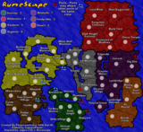
I've been really busy lately, but I added the Vvardenfell scroll, water and got rid of the Strongholds
Moderator: Cartographers
![]() by CaptainPlanet on Mon Apr 09, 2007 2:20 pm
by CaptainPlanet on Mon Apr 09, 2007 2:20 pm
![]() by Coleman on Mon Apr 09, 2007 2:55 pm
by Coleman on Mon Apr 09, 2007 2:55 pm


![]() by spiesr on Mon Apr 09, 2007 2:58 pm
by spiesr on Mon Apr 09, 2007 2:58 pm
alstergren wrote:Serbia wrote:CaptainPlanet wrote:qwert wrote:Show Copyright apply first
??? I don't know what you are saying
He's questioning what steps you've taken to check into the Copyrights of such a map.
It’s a made up, fictions map. Copyright apply per se (unless the author explicitly put it in the public domain). But it’s an old computer game, what are we talking about? 5 years by now. Don’t think they mind the free publicity for the series. Besides, I’m sure so much copyrighted material has been spread on fans’ forum by now they don’t bother. And computer software guys are pretty soft with these things.


![]() by alster on Mon Apr 09, 2007 3:40 pm
by alster on Mon Apr 09, 2007 3:40 pm
spiesr wrote:alstergren wrote:Serbia wrote:CaptainPlanet wrote:qwert wrote:Show Copyright apply first
??? I don't know what you are saying
He's questioning what steps you've taken to check into the Copyrights of such a map.
It’s a made up, fictions map. Copyright apply per se (unless the author explicitly put it in the public domain). But it’s an old computer game, what are we talking about? 5 years by now. Don’t think they mind the free publicity for the series. Besides, I’m sure so much copyrighted material has been spread on fans’ forum by now they don’t bother. And computer software guys are pretty soft with these things.
No, you need permission.
Gengoldy wrote:Of all the games I've played, and there have been some poor sports and cursing players out there, you are by far the lowest and with the least class.


![]() by alster on Mon Apr 09, 2007 3:42 pm
by alster on Mon Apr 09, 2007 3:42 pm
CaptainPlanet wrote:I've been really busy lately, but I added the Vvardenfell scroll, water and got rid of the Strongholds
Gengoldy wrote:Of all the games I've played, and there have been some poor sports and cursing players out there, you are by far the lowest and with the least class.
![]() by CaptainPlanet on Mon Apr 09, 2007 9:38 pm
by CaptainPlanet on Mon Apr 09, 2007 9:38 pm
spiesr wrote:What are the dots for? There is no way numbers will fit in them...
Coleman wrote:I think the mountains need to be a lot more clear. Maybe more colorful instead of black squiggles and directly on top of the borders they block.
Assuming I didn't get your impassible borders wrong this is what I think your bonuses should be:
Blue 2
Brown 2
Dark Gray 4
Light Green 6
Orange 3
Light Gray 6
Green 3
Yellow 2
Assuming you didn't have impassible borders then this is what I think you should make your bonuses be:
Blue 2
Brown 3
Dark Gray 5
Light Green 7
Orange 4
Light Gray 9
Green 4
Yellow 4
Also Marandus doesn't have an army circle.
![]() by wiggybowler on Tue Apr 10, 2007 12:12 am
by wiggybowler on Tue Apr 10, 2007 12:12 am


![]() by Telvannia on Wed Apr 11, 2007 4:34 am
by Telvannia on Wed Apr 11, 2007 4:34 am


![]() by CaptainPlanet on Thu Apr 12, 2007 7:30 pm
by CaptainPlanet on Thu Apr 12, 2007 7:30 pm

![]() by PimpCaneYoAss on Thu Apr 12, 2007 7:34 pm
by PimpCaneYoAss on Thu Apr 12, 2007 7:34 pm
![]() by Evil Pope on Thu Apr 12, 2007 8:42 pm
by Evil Pope on Thu Apr 12, 2007 8:42 pm

![]() by CaptainPlanet on Thu Apr 12, 2007 8:46 pm
by CaptainPlanet on Thu Apr 12, 2007 8:46 pm
![]() by Evil Pope on Thu Apr 12, 2007 9:14 pm
by Evil Pope on Thu Apr 12, 2007 9:14 pm
![]() by CaptainPlanet on Thu Apr 12, 2007 9:23 pm
by CaptainPlanet on Thu Apr 12, 2007 9:23 pm
![]() by CaptainPlanet on Fri Apr 13, 2007 10:45 am
by CaptainPlanet on Fri Apr 13, 2007 10:45 am

![]() by PimpCaneYoAss on Fri Apr 13, 2007 1:49 pm
by PimpCaneYoAss on Fri Apr 13, 2007 1:49 pm
![]() by assasinsensei on Fri Apr 13, 2007 1:54 pm
by assasinsensei on Fri Apr 13, 2007 1:54 pm

![]() by CaptainPlanet on Fri Apr 13, 2007 1:58 pm
by CaptainPlanet on Fri Apr 13, 2007 1:58 pm
![]() by CaptainPlanet on Sat Apr 14, 2007 2:01 pm
by CaptainPlanet on Sat Apr 14, 2007 2:01 pm

Return to Melting Pot: Map Ideas
Users browsing this forum: No registered users
|
|||||||
| Conquer Club is not associated with RISK online in any way. Copyright © 2006-2025 by Big Wham LLC | |||||||