Conquer Club

The Dungeon of Draknor [Vacation]

Have an idea for a map? Discuss ideas and concepts here.

Moderator: Cartographers

Forum rules
Please read the Community Guidelines before posting.

Postby Jota on Thu Jun 22, 2006 2:24 am

AndyDufresne wrote:---The walls...uh...don't really feel much more thicker...perhaps I missed something?


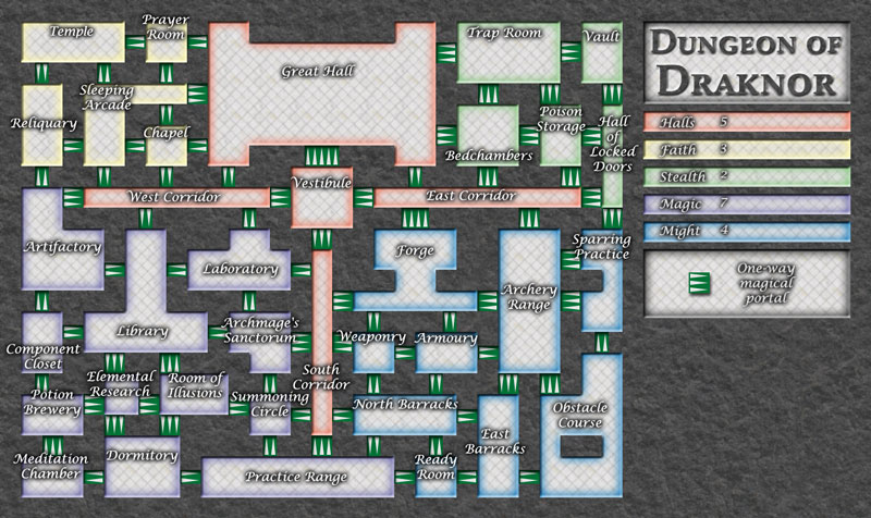
I tried to add more depth to the border between walls and floor. But it's possible that I misunderstood what sort of thickness is lacking.

And I see you used a few of my suggested names!


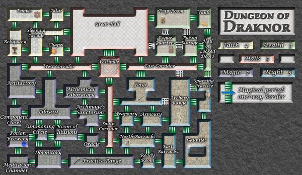
In CCU, I came up with the departments first, and drew the buildings afterward, so I was more attached to the names than the layout. Here, it was the other way around: I'll happily swap out individual room names (to a degree), but will probably refuse to redraw the rooms :)

Marvaddin wrote:The map really is better with different floors. You should use one to each continent, I believe.


That's an interesting idea, one I hadn't considered. Although I'm not sure if I could find five different stone floor textures that all look good enough.

What do you mean by Summoning Circle?


A summoning circle is a magic circle used to call up spirits or creatures. In this map, it happens to be an otherwise normal room that has four entrances but no exits.

Put the continents analysis and we can comment the bonuses better.


Hmm. With all the one-way exits, I'm not sure the continents can be summarized quite so simply as usual...
User avatar
Sergeant 1st Class Jota
 
Posts: 634
Joined: Wed Mar 29, 2006 7:38 pm

Postby gavin_sidhu on Thu Jun 22, 2006 2:41 am

Its alright, but i like ur usapocolyse one much much more.
User avatar
Lieutenant gavin_sidhu
 
Posts: 1428
Joined: Mon May 22, 2006 6:16 am
Location: Brisbane, Australia

Postby fluffybunnykins on Thu Jun 22, 2006 7:07 am

is there any way (in the xml) to have the exit from hall of illusions lead to a different, random location each time!
Superman wears 'Fluffybunnykins' pyjamas
User avatar
Corporal 1st Class fluffybunnykins
 
Posts: 385
Joined: Tue May 02, 2006 6:43 am
Location: Liverpool, UK

Postby AndyDufresne on Thu Jun 22, 2006 8:54 am

Hm, if such a thing was possible to do, there would have to be some coding in it to make sure you don't go to a place that you already own...which could be sticky.

---One question about playability...since these are all one way borders...you can't fortify back across ---> one like this, correct? If so...sheesh I'll hate this map for fortifying! :) You could always look into using a few regular two-way paths, though as internal areas in some continents, but then doing so sort of takes away from the whole maze dungeon feel.


--Andy
User avatar
Corporal 1st Class AndyDufresne
 
Posts: 24935
Joined: Fri Mar 03, 2006 8:22 pm
Location: A Banana Palm in Zihuatanejo

Postby spiesr on Thu Jun 22, 2006 9:47 am

If you can't fortify backwards that "summomning circle" will be a possible trap were one player could get stuck with olny it and not be able do anything.
User avatar
Captain spiesr
 
Posts: 2809
Joined: Mon May 08, 2006 10:52 am
Location: South Dakota

Postby Jota on Thu Jun 22, 2006 12:10 pm

fluffybunnykins wrote:is there any way (in the xml) to have the exit from hall of illusions lead to a different, random location each time!


Nope. And I'd rather not have any secret destinations that only people who look at the XML know about.

AndyDufresne wrote:One question about playability...since these are all one way borders...you can't fortify back across ---> one like this, correct?


If you only own those two countries, that's correct. On the other hand, if you own a few others nearby, you can often generate a path that leads back around to where you started. I'd definitely recommend using Unlimited Fortifications for this map.

spiesr wrote:If you can't fortify backwards that "summomning circle" will be a possible trap were one player could get stuck with olny it and not be able do anything.


Yup. Better watch out for that when you're playing :)

If enough people don't like having a "dead end" like that, I can take it back out. But I got enough comments in favor of it that it seemed worth doing.
User avatar
Sergeant 1st Class Jota
 
Posts: 634
Joined: Wed Mar 29, 2006 7:38 pm

Postby AndyDufresne on Thu Jun 22, 2006 1:24 pm

As for the dead end, it's a unique in idea, but I could see a lot of abuse.

Imagine being stuck in a game where everyone eliminates your countries except for that one. All you can do is deadbeat essentially, or continue building up armies for no reason. Also don't forget the people that like to make 'never-ending' games by not eliminating a player...again all you could do would be to deadbeat. I think such an idea, even though unique and amusing, brings too many bad aspects that over ride the good.


--Andy
User avatar
Corporal 1st Class AndyDufresne
 
Posts: 24935
Joined: Fri Mar 03, 2006 8:22 pm
Location: A Banana Palm in Zihuatanejo

Postby onbekende on Thu Jun 22, 2006 1:26 pm

or led it lead to the hall of illusions
Emperor of the Benelux
Founder of the Commonwealth of Planets
Founder and CEO of JF
User avatar
Lieutenant onbekende
 
Posts: 1530
Joined: Fri Apr 14, 2006 10:19 am
Location: Belgium

Postby rocksolid on Thu Jun 22, 2006 2:57 pm

Good solution^

For thickness, maybe by reversing the depth - sinking the rooms rather than raising them, as it looks like you did here. And if there's a way to steepen the angle of the bevelling involved in the depth illusion, that might help too.
User avatar
Lieutenant rocksolid
 
Posts: 625
Joined: Sat Mar 18, 2006 10:00 pm
Location: Mowwwnt Reeeal

Postby Jota on Thu Jun 22, 2006 4:55 pm

[url=http://grunk.org/risk/maze4c-large.jpg]Image
(Click for larger version.)[/url]

rock: This is the sunken version. I think it's one of those things where you can see it either way, depending on which way your brain happens to be oriented at the moment.

Changes include:

Adjusted the legend. How does this compare to the original legend layout? I'm also considering Halls on top, with the two side bits attached to the title "room".

Tried to make the wall thickness even more distinct.

Faith and Stealth now have lighter versions of the new floor textures. My two favorites are the original (still visible in Halls) and Faith.

Increased the font size in Magic. How is it, both for legibility and for not obscuring the portals?

A couple new options for portals, over around the Stealth/Might border. However, it occurred to me that if I just made the legend more explicit (as it is now), I could maybe get away with using the original style portals without modification. Opinions?

I'll wait to hear more feedback before doing anything with the Summoning Circle; the two options I'm looking at are "keep it as a dead end" or "put it back the way it was originally (with exits to the RoI and the Dormitory)".
User avatar
Sergeant 1st Class Jota
 
Posts: 634
Joined: Wed Mar 29, 2006 7:38 pm

Postby fluffybunnykins on Fri Jun 23, 2006 3:22 am

maybe they wouldn't look so raised, but more sunk, if the floor texture didn't carry on up the wall (reminds me of a curry house I know...) and if the shading was reversed, so that it was darker at the bottom and lighter at the top??? And, a steeper angle (ie lower bevel width) probably would help, as well... maybe it could just be the colour of the walls that determine the colour of the 'continent' (vvv and the texture of the floor of course! vvv)
also, consider reversing the direction of the doors from East Corridor to Poison & Locked doors, that way you keep the number of entries/exits for Stealth, Locked doors only has one way out... mwah ha ha
[picky]if the portal in the legend was slightly shorter, it might look like it was on the floor, rather than floating at ceiling height[/picky]
I know I pitched in with arrow alternatives an all, but I really prefer the originals.
I like the different floors for each area idea. looks good.
Font size is fine on larger version, bit tricky on the smaller one
Superman wears 'Fluffybunnykins' pyjamas
User avatar
Corporal 1st Class fluffybunnykins
 
Posts: 385
Joined: Tue May 02, 2006 6:43 am
Location: Liverpool, UK

Postby rocksolid on Fri Jun 23, 2006 5:17 pm

You could also make it so that only two walls/bevels of the room are visible at all - the way it would look if you were hovering at a height of 40 pixels above the top of the walls at the lower right of the dungeon. I keep trying to flip the raised/sunken thing in my mind, and it's just not convincing. I think steepening would help too, like fb said.
User avatar
Lieutenant rocksolid
 
Posts: 625
Joined: Sat Mar 18, 2006 10:00 pm
Location: Mowwwnt Reeeal

Postby Jota on Sat Jun 24, 2006 4:31 pm

fluffybunnykins wrote:maybe they wouldn't look so raised, but more sunk, if the floor texture didn't carry on up the wall


Interesting. If I try something like that, do you think it would be better to make the floors smaller, or the walls (i.e. the tops of the walls, not the angled bevel) narrower?

also, consider reversing the direction of the doors from East Corridor to Poison & Locked doors, that way you keep the number of entries/exits for Stealth, Locked doors only has one way out... mwah ha ha


Hmm. That would mean it would no longer be possible to get from the HoLD back to the rest of Stealth, which would affect the bonus (and I've already got a situation like that in Halls)... But maybe I can work around that. I'll look into it.

Font size is fine on larger version, bit tricky on the smaller one


Even in Magic, still? Darn.
User avatar
Sergeant 1st Class Jota
 
Posts: 634
Joined: Wed Mar 29, 2006 7:38 pm

Postby AndyDufresne on Sat Jun 24, 2006 4:42 pm

As for the font size, the larger version's originally font was fine. But when the smaller version came up, the original couldn't quite make the cut. But I think the increased size works on the smaller version. But increasing the size....does that effect how the numbers can fit? Seems some names might be too big and long then to fit the numbers in the small version.


--Andy
User avatar
Corporal 1st Class AndyDufresne
 
Posts: 24935
Joined: Fri Mar 03, 2006 8:22 pm
Location: A Banana Palm in Zihuatanejo

Postby Jota on Sat Jun 24, 2006 4:54 pm

That's hard to predict. But I'm actually more concerned with the names covering up the portals, at this point. Having the numbers stick out past the edge of a room slightly isn't as bad as not being able to tell which direction a one-way border leads.
User avatar
Sergeant 1st Class Jota
 
Posts: 634
Joined: Wed Mar 29, 2006 7:38 pm

Postby fluffybunnykins on Sat Jun 24, 2006 5:04 pm

I don't think the clarity of the portals is adversely affected by the names, and also, now I'm seeing it at home (and not on my horrible work monitor) I can read the names fine, too. I mean, it's a little hard work, but then I'll be looking at the large version, to play, eh?
Good news: I'm supposed to be getting two 19" panels, soon!
Superman wears 'Fluffybunnykins' pyjamas
User avatar
Corporal 1st Class fluffybunnykins
 
Posts: 385
Joined: Tue May 02, 2006 6:43 am
Location: Liverpool, UK

Postby Marvaddin on Sat Jun 24, 2006 7:15 pm

Nothing about change the continent names?
Or about remove the little confusing icons?
Image
User avatar
Major Marvaddin
 
Posts: 2545
Joined: Thu Feb 09, 2006 5:06 pm
Location: Belo Horizonte, Brazil

Postby Jota on Sat Jun 24, 2006 7:34 pm

I was waiting to hear if anyone else chimed in on either of those subjects, so that I could compare opinions. Also, I'm not really clear on what exactly you dislike about the continent names: I thought they summed up the main concepts behind the four D&D archetypes pretty well.
User avatar
Sergeant 1st Class Jota
 
Posts: 634
Joined: Wed Mar 29, 2006 7:38 pm

Postby Finsdale on Sun Jun 25, 2006 1:22 am

at first I was for a room with no exits but now I think that could be very bad, and wrong... because I have the feeling that I would get stuck in it... I have that kind of luck. I think the icons on the rooms are cool and all, but you would probably need a different one for each room, or you could place the same image in every room of the same continent. Even better, you could use silouettes of the objects as army shadows.
Just throwing out ideas anyways.
User avatar
Corporal 1st Class Finsdale
 
Posts: 36
Joined: Sun Apr 30, 2006 11:57 pm

Postby fluffybunnykins on Sun Jun 25, 2006 4:28 am

finsdale's idea, for army placement thingums, might be a goodun. but i don't mind the symbols as they are, either.
the continent names are fine by me
Superman wears 'Fluffybunnykins' pyjamas
User avatar
Corporal 1st Class fluffybunnykins
 
Posts: 385
Joined: Tue May 02, 2006 6:43 am
Location: Liverpool, UK

Postby Marvaddin on Sun Jun 25, 2006 7:59 am

About the icons, they are confusing... New players will go to them wanting any benefit. Or remove them, or add a ridiculous note like "icons are nothing in the gameplay" to warn all players.

And how about some continent names like temple, barracks, fortress, etc? A continent named "faith" is a bit ridiculous, but its just my opinion.
Image
User avatar
Major Marvaddin
 
Posts: 2545
Joined: Thu Feb 09, 2006 5:06 pm
Location: Belo Horizonte, Brazil

Postby AndyDufresne on Sun Jun 25, 2006 1:29 pm

I'm not sure Marv understands what this map really is, behind the image.

As for the images, I honestly can't see a new player thinking they are anything more than decorative items. Also if you add one to ever room....it would simply be cluttering the map.


--Andy
User avatar
Corporal 1st Class AndyDufresne
 
Posts: 24935
Joined: Fri Mar 03, 2006 8:22 pm
Location: A Banana Palm in Zihuatanejo

Postby fluffybunnykins on Sun Jun 25, 2006 1:37 pm

surely peeps would only think there was something special about the icons if there was a mention of them in the key?
Superman wears 'Fluffybunnykins' pyjamas
User avatar
Corporal 1st Class fluffybunnykins
 
Posts: 385
Joined: Tue May 02, 2006 6:43 am
Location: Liverpool, UK

Postby Jota on Sun Jun 25, 2006 3:35 pm

Since it sounds like the idea of having five different floor patterns is popular, which of the current ones do folks like best, and which should I replace? (Or if you think they're all great, feel free to say that too, of course.)
User avatar
Sergeant 1st Class Jota
 
Posts: 634
Joined: Wed Mar 29, 2006 7:38 pm

Postby AndyDufresne on Sun Jun 25, 2006 3:41 pm

Is it possible to post a good number of the floor patterns you have? Not on the whole map, but perhaps take like the great hall, and use that little area exclusively for patterns. Then post 'x' amount of small square images with the floor patterns, then you can see which ones people like the best. Then out of those, the few that people like, can be implemented.

Perhaps this is too much work :)


--Andy
User avatar
Corporal 1st Class AndyDufresne
 
Posts: 24935
Joined: Fri Mar 03, 2006 8:22 pm
Location: A Banana Palm in Zihuatanejo

PreviousNext

Return to Melting Pot: Map Ideas

Who is online

Users browsing this forum: No registered users