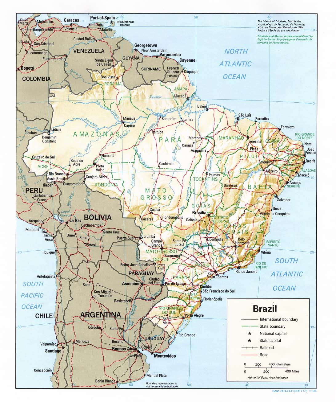
It looks good, and at the moment I prefer this map to the Fuzzy Penguin/Lone Prophet one.
That said, there is still quite a bit that I think needs tweaking.
1. I'm not keen on the font you've used for the Brazil title.
2. Do the territory names have to spelt in capitals? In areas where the territory name has to cross a border, it is quite hard to read... perhaps you could increase the glow slightly?
3. The Brazil flag looks a bit like an afterthought, and could probably be incorporated to look part of the design.
4. I like the Bonus legend style, but the opacity of it should probably be increased so that you can 'only just' see the background through it
5. I like the colours you've used, although I think I slightly prefer the more 'vibrant' ones.
6.The map texture looks very slightly 'dotty', and its probably just my eyes but I think it look a bit streaky' (a tiny bit like an inkjet printer that is about to start running out of ink).
That's it for now...


