Lovely and interesting map Ruben.
I truly do understand some of the reservation regarding the colour scheme... but i think this is totaly about our stereotype of what we associate with Cyprus:- Sun, sand and sea.
We can see from all of the comments that people have this idealised tourist version of island in mind - (ruins, pillars etc.)
With this 'bias' based largely upon climate (not political) in mind (a bias i have too) it is inevitable that we are more comfortable with warm hues and tones... people want browns and oranges and the odd palm tree i am sure

Your frustration at people not getting what you have in mind is tangible (with the odd silly statement about it being based on your mild colour-blindness for good measure)
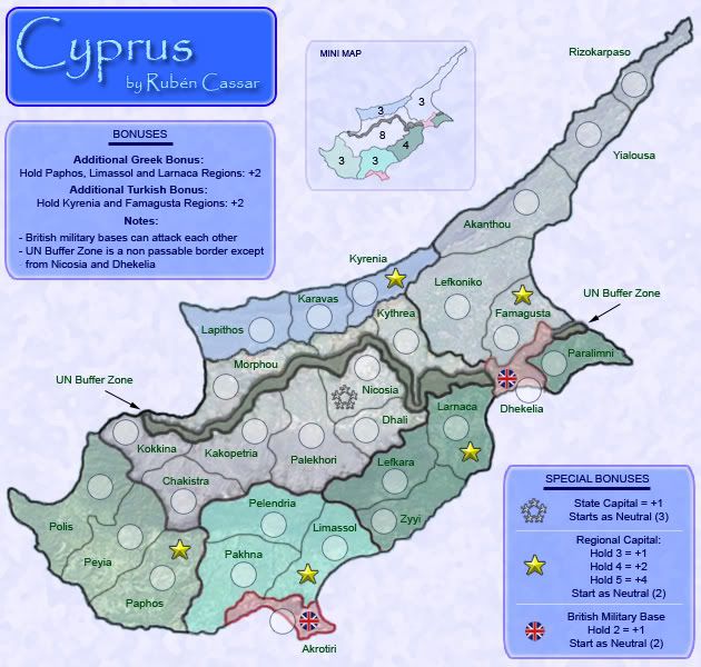
I confess that the colour scheme which you have chosen evokes more of a cold war Soviet Union feel.. it make me think more of post World War II Berlin than a Sunshine Island in the Mediterranean!
On reflection and based on my understanding of the acute divisions in the islands based on territory, religion and the historical enmity! .... I understand why you chose the colours.
As colour and graphics create the character and personality of the map, I think perhaps you need to explain it a little more so you can get people on-board.
i do think that perhaps a beautiful turquoise Ocean could give it a nice feeling of contrast for the senses (political unrest and complexity evoked by the territory colouring, juxtaposed against the beauty of the Mediterranean .. just a thought)
Actually I did not understand what you meant exactly by this comment.