Famine V.19.3 pg1+35 [I] [Reworking]
Moderator: Cartographers
Re: Famine V.17. pg1+26 [I] Name Change Poll! Vote Now!
![]() by InkL0sed on Mon Jun 16, 2008 5:11 pm
by InkL0sed on Mon Jun 16, 2008 5:11 pm
You seem to rely too much on the burn/dodge tool... maybe I'm wrong, but I think a little bevel here and there would do you wonders.
-

 InkL0sed
- Posts: 2370
- Joined: Sat Jun 23, 2007 4:06 pm
- Location: underwater


Re: Famine V.17. pg1+26 [I] Name Change Poll! Vote Now!
![]() by bryguy on Wed Jun 18, 2008 2:48 pm
by bryguy on Wed Jun 18, 2008 2:48 pm
InkL0sed wrote:You seem to rely too much on the burn/dodge tool... maybe I'm wrong, but I think a little bevel here and there would do you wonders.
ok I've been doing some googling, and come up with a way to do some bevel&emboss (i think), would something like this be good to help?
- Click image to enlarge.

-
bryguy
- Posts: 4381
- Joined: Tue Aug 07, 2007 8:50 am
- Location: Lost in a Jigsaw


Re: Famine V.17. pg1+26 [I] Name Change Poll! Vote Now!
![]() by t-o-m on Wed Jun 18, 2008 3:16 pm
by t-o-m on Wed Jun 18, 2008 3:16 pm
bryguy wrote:InkL0sed wrote:You seem to rely too much on the burn/dodge tool... maybe I'm wrong, but I think a little bevel here and there would do you wonders.
ok I've been doing some googling, and come up with a way to do some bevel&emboss (i think), would something like this be good to help?
- Click image to enlarge.
too soft for me
-

t-o-m
- Posts: 2918
- Joined: Sat Mar 22, 2008 2:22 pm


Re: Famine V.17. pg1+26 [I] Name Change Poll! Vote Now!
![]() by bryguy on Wed Jun 18, 2008 3:25 pm
by bryguy on Wed Jun 18, 2008 3:25 pm
t-o-m wrote:bryguy wrote:InkL0sed wrote:You seem to rely too much on the burn/dodge tool... maybe I'm wrong, but I think a little bevel here and there would do you wonders.
ok I've been doing some googling, and come up with a way to do some bevel&emboss (i think), would something like this be good to help?
- Click image to enlarge.
too soft for me
could u... uh... explain?
-
bryguy
- Posts: 4381
- Joined: Tue Aug 07, 2007 8:50 am
- Location: Lost in a Jigsaw
Re: Famine V.17. pg1+26 [I] Name Change Poll! Vote Now!
![]() by t-o-m on Wed Jun 18, 2008 3:49 pm
by t-o-m on Wed Jun 18, 2008 3:49 pm
bryguy wrote:
could u... uh... explain?
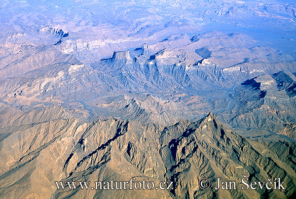
do you know any mountains that are blurrey, or soft?
-
t-o-m
- Posts: 2918
- Joined: Sat Mar 22, 2008 2:22 pm
Re: Famine V.17. pg1+26 [I] Name Change Poll! Vote Now!
![]() by InkL0sed on Wed Jun 18, 2008 3:58 pm
by InkL0sed on Wed Jun 18, 2008 3:58 pm
Have you seen the layered mountain approach in the TTT thread? That one is pretty cool. Also, you can add textures along with the bevel. If you just play around with it, you can definitely make a good mountain with a bevel.
Also, I wasn't just talking about mountains, but higher/lower elevation in general.
Also, I wasn't just talking about mountains, but higher/lower elevation in general.
-
InkL0sed
- Posts: 2370
- Joined: Sat Jun 23, 2007 4:06 pm
- Location: underwater
Re: Famine V.17. pg1+26 [I] Name Change Poll! Vote Now!
![]() by bryguy on Wed Jun 18, 2008 4:08 pm
by bryguy on Wed Jun 18, 2008 4:08 pm
t-o-m wrote:bryguy wrote:
could u... uh... explain?
do you know any mountains that are blurrey, or soft?
oh, mine arent mountains, those are just hills, just made larger.
InkL0sed wrote:Have you seen the layered mountain approach in the TTT thread? That one is pretty cool. Also, you can add textures along with the bevel. If you just play around with it, you can definitely make a good mountain with a bevel.
Also, I wasn't just talking about mountains, but higher/lower elevation in general.
Ive seen it, but i cant figure out how the heck they made it. Ill try different things for mountains tho. On another site i tried something for a mountain that i showed t-o-m and jako, but i havent shown it to you guys yet.
and yea i was thinking of mostly using the bevel/emboss for hills and higher areas and lower areas if i can (see the giant circle thing)
so yea mostly i was thinking of using the bevel and emboss for hills, and different methods for mountains, but yea i hate my current mountain so i keep working on it.
-
bryguy
- Posts: 4381
- Joined: Tue Aug 07, 2007 8:50 am
- Location: Lost in a Jigsaw
Famine V.18
![]() by bryguy on Thu Jun 19, 2008 4:53 pm
by bryguy on Thu Jun 19, 2008 4:53 pm
V.18
Changes:
Texture
Hills added (may be temporary hills for now)
Added some bevel down by the water
Beveled the castles
Tried to make the land seem more elevated
- Click image to enlarge.
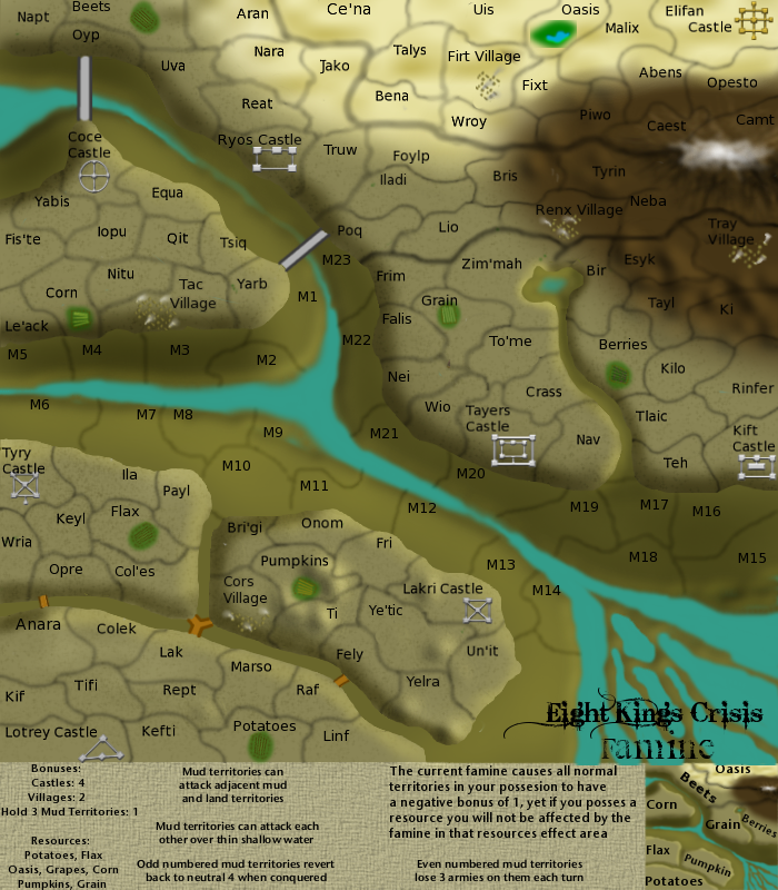
Changes:
Texture
Hills added (may be temporary hills for now)
Added some bevel down by the water
Beveled the castles
Tried to make the land seem more elevated
-
bryguy
- Posts: 4381
- Joined: Tue Aug 07, 2007 8:50 am
- Location: Lost in a Jigsaw
Re: Famine V.18. pg1+28 [I] Need comments on hills, last page
![]() by InkL0sed on Thu Jun 19, 2008 5:48 pm
by InkL0sed on Thu Jun 19, 2008 5:48 pm
Looking better. Try adding a layer between the light gray and dark gray levels, the transition between them is pretty choppy. Maybe a gradient.
-
InkL0sed
- Posts: 2370
- Joined: Sat Jun 23, 2007 4:06 pm
- Location: underwater
Re: Famine V.18. pg1+28 [I] Need comments on hills, last page
![]() by bryguy on Fri Jun 20, 2008 7:40 am
by bryguy on Fri Jun 20, 2008 7:40 am
InkL0sed wrote:Looking better. Try adding a layer between the light gray and dark gray levels, the transition between them is pretty choppy. Maybe a gradient.
ok sure. But between the light gray and dark gray on what?
-
bryguy
- Posts: 4381
- Joined: Tue Aug 07, 2007 8:50 am
- Location: Lost in a Jigsaw
Re: Famine V.18. pg1+28 [I] Need comments on hills, last page
![]() by wcaclimbing on Fri Jun 20, 2008 10:11 am
by wcaclimbing on Fri Jun 20, 2008 10:11 am
Could you please change the borders to something different?
At least make them solid lines. preferably not black, maybe dark brown.
Last time I suggested a change nothing happened.
Here's the easiest way to make new borders from what you have there. It might not look perfect, but its a start.
Take your layer with the border lines on it. Duplicate it 5 or 6 times. Then merge all those together. Then duplicate the new merged layer 5 or 6 times. then merge those together. That should give you a fairly thick border line. Then use Filter<Maximum to make the lines thinner and adjust it to what you like.
I'd prefer if those new borders would be on Overlay or Darken on the terrain behind, so they take on the color of the ground behind them.

-

wcaclimbing
- Posts: 5598
- Joined: Fri May 12, 2006 10:09 pm
- Location: In your quantum box....Maybe.


Re: Famine V.18. pg1+28 [I] Need comments on hills, last page
![]() by bryguy on Fri Jun 20, 2008 10:21 am
by bryguy on Fri Jun 20, 2008 10:21 am
wcaclimbing wrote:Could you please change the borders to something different?
At least make them solid lines. preferably not black, maybe dark brown.
Last time I suggested a change nothing happened.
Here's the easiest way to make new borders from what you have there. It might not look perfect, but its a start.
Take your layer with the border lines on it. Duplicate it 5 or 6 times. Then merge all those together. Then duplicate the new merged layer 5 or 6 times. then merge those together. That should give you a fairly thick border line. Then use Filter<Maximum to make the lines thinner and adjust it to what you like.
last I knew, GIMP didnt have a maximum filter, but I have downloaded a plug-in for GIMP that allows it to use photoshop filters, so now I only need to get that filter, and get the plug-in working (it might be working right now, but i dont know)
I'd prefer if those new borders would be on Overlay or Darken on the terrain behind, so they take on the color of the ground behind them.
ok sure ill do that
-
bryguy
- Posts: 4381
- Joined: Tue Aug 07, 2007 8:50 am
- Location: Lost in a Jigsaw
Re: Famine V.18. pg1+28 [I] Need comments on hills, last page
![]() by wcaclimbing on Fri Jun 20, 2008 10:24 am
by wcaclimbing on Fri Jun 20, 2008 10:24 am
Oh, its Gimp....
Can't help you much then. I don't know Gimp at all.
Can't help you much then. I don't know Gimp at all.
-
wcaclimbing
- Posts: 5598
- Joined: Fri May 12, 2006 10:09 pm
- Location: In your quantum box....Maybe.
Re: Famine V.18. pg1+28 [I] Need comments on hills, last page
![]() by bryguy on Fri Jun 20, 2008 10:40 am
by bryguy on Fri Jun 20, 2008 10:40 am
wcaclimbing wrote:Oh, its Gimp....
Can't help you much then. I don't know Gimp at all.
Its ok, if the graphix are so good looking that you couldnt tell its being made with GIMP, then i must be doing a pretty good job
anyways ill figure out a way to do it, some how, somewhere, over the rainbow
-
bryguy
- Posts: 4381
- Joined: Tue Aug 07, 2007 8:50 am
- Location: Lost in a Jigsaw
Re: Famine V.18. pg1+28 [I] Need comments on hills, last page
![]() by wcaclimbing on Fri Jun 20, 2008 10:52 am
by wcaclimbing on Fri Jun 20, 2008 10:52 am
bryguy wrote:Its ok, if the graphix are so good looking that you couldnt tell its being made with GIMP, then i must be doing a pretty good job

er... Its actually "I think the graphics need a lot of work, but I can't explain how to fix it cause I don't know what GIMP can do"
sorry to kill your excitement...
Just re-draw the borders, using a smaller harder brush. Don't do blurry borders.
-
wcaclimbing
- Posts: 5598
- Joined: Fri May 12, 2006 10:09 pm
- Location: In your quantum box....Maybe.
Re: Famine V.18. pg1+28 [I] Need comments on hills, last page
![]() by Kaplowitz on Fri Jun 20, 2008 10:54 am
by Kaplowitz on Fri Jun 20, 2008 10:54 am
The land looks like hills on top of hills. You need the make them look like one big hill.

-

Kaplowitz
- Posts: 3088
- Joined: Tue May 01, 2007 5:11 pm
Re: Famine V.18. pg1+28 [I] Need comments on hills, last page
![]() by bryguy on Fri Jun 20, 2008 10:58 am
by bryguy on Fri Jun 20, 2008 10:58 am
wcaclimbing wrote:bryguy wrote:Its ok, if the graphix are so good looking that you couldnt tell its being made with GIMP, then i must be doing a pretty good job
er... Its actually "I think the graphics need a lot of work, but I can't explain how to fix it cause I don't know what GIMP can do"
sorry to kill your excitement...
Just re-draw the borders, using a smaller harder brush. Don't do blurry borders.
Kaplowitz wrote:The land looks like hills on top of hills. You need the make them look like one big hill.
?????
do you mean that the main part of the land seems like a hill on top of the mud? or wat?
-
bryguy
- Posts: 4381
- Joined: Tue Aug 07, 2007 8:50 am
- Location: Lost in a Jigsaw
Re: Famine V.18. pg1+28 [I] Need comments on hills, last page
![]() by Kaplowitz on Fri Jun 20, 2008 11:02 am
by Kaplowitz on Fri Jun 20, 2008 11:02 am
bryguy wrote:Kaplowitz wrote:The land looks like hills on top of hills. You need the make them look like one big hill.
?????
do you mean that the main part of the land seems like a hill on top of the mud? or wat?
Yes..actually.
They need to blend together more. It looks like the main land is sitting on top of the mud land.
-
Kaplowitz
- Posts: 3088
- Joined: Tue May 01, 2007 5:11 pm
Re: Famine V.18. pg1+28 [I] Need comments on hills, last page
![]() by bryguy on Fri Jun 20, 2008 11:04 am
by bryguy on Fri Jun 20, 2008 11:04 am
Kaplowitz wrote:bryguy wrote:Kaplowitz wrote:The land looks like hills on top of hills. You need the make them look like one big hill.
?????
do you mean that the main part of the land seems like a hill on top of the mud? or wat?
Yes..actually.
They need to blend together more. It looks like the main land is sitting on top of the mud land.
cool, cause reading your post my mind immediately went to thinking about that. Ill see if using a fuzzy brush helps make it blend
-
bryguy
- Posts: 4381
- Joined: Tue Aug 07, 2007 8:50 am
- Location: Lost in a Jigsaw
Re: Famine V.18. pg1+28 [I] Need comments on hills, last page
![]() by seamusk on Sun Jun 22, 2008 10:56 pm
by seamusk on Sun Jun 22, 2008 10:56 pm
I don't know. I think it looks very much like mud flats look. You have a steep bank and then a floodplain of sorts which can be mud flats. This is a long thread and I need to catch up on it because I like the map idea and it seems to be coming along.
-
seamusk
- Posts: 722
- Joined: Thu Nov 22, 2007 6:23 pm


Re: Famine V.18. pg1+28 [I] Need comments on hills, last page
![]() by InkL0sed on Mon Jun 23, 2008 1:11 am
by InkL0sed on Mon Jun 23, 2008 1:11 am
bryguy wrote:InkL0sed wrote:Looking better. Try adding a layer between the light gray and dark gray levels, the transition between them is pretty choppy. Maybe a gradient.
ok sure. But between the light gray and dark gray on what?
Light areas = What used to be islands, land surrounding the castles
Dark areas = what used to be water, I believe you're calling it mud now
-
InkL0sed
- Posts: 2370
- Joined: Sat Jun 23, 2007 4:06 pm
- Location: underwater
Re: Famine V.18. pg1+28 [I] Need comments on hills, last page
![]() by wcaclimbing on Mon Jun 23, 2008 3:12 am
by wcaclimbing on Mon Jun 23, 2008 3:12 am
Here's just a few graphical suggestions from me:
Can you overlay a texture in gimp?
if so, put a texture on all the land, and it'll help a lot. some kind of sandstone (thats what it is on photoshop) texture, then adjust it till it looks good.
you should probably re-draw the water. Rivers(even dried up ones) don't have fuzzy edges. Make them sharp and flow with the shape of the mud flats. so it looks more like real water edges.
Also, just consider the size of the houses in the "villages". Its what, maybe 3 pixels gives you a 50 foot wide house?
Then that gives you bridges that are something like 500 feet wide....
the mud flats must be half a mile across in some places.
the scale of everything is just a bit strange for me.
Aim to make everything as realistic as possible if you are going to use this kind of graphics. If water isn't solid blue (its not, by the way) then don't draw it that way. give it more variation. Darker for deeper water, ripples round the edge.
Same problem with the land, to much solid color. You have many big areas of solid color, with abrupt changes to a different landscape. Let the color flow a bit, paint some variety in to break up the solid tan everywhere. Darker tan, lighter tan, maybe even a bit of green here and there. just take a really big, soft, light brush and throw a bit of variety across the whole thing. It won't be very noticeable that there is even any color there, but it'd make a huge difference.
Also, I'm curious about the reason behind the "odd number territories revert to 4 neutrals" and "even numbers lose 3 each turn". Those just don't make much sense to me, if you are going for realism. If its just to add more unnecessary rules to get me all confused, go ahead. I'm just wondering why those rules are in place.
-
wcaclimbing
- Posts: 5598
- Joined: Fri May 12, 2006 10:09 pm
- Location: In your quantum box....Maybe.
Re: Famine V.18. pg1+28 [I] Need comments on hills, last page
![]() by t-o-m on Mon Jun 23, 2008 1:27 pm
by t-o-m on Mon Jun 23, 2008 1:27 pm
im not too keen on the idea that you can go on the sea
maybe make that a big impassable?
maybe make that a big impassable?
-
t-o-m
- Posts: 2918
- Joined: Sat Mar 22, 2008 2:22 pm
Re: Famine V.18. pg1+28 [I] Need comments on hills, last page
![]() by bryguy on Mon Jun 23, 2008 3:47 pm
by bryguy on Mon Jun 23, 2008 3:47 pm
seamusk wrote:I don't know. I think it looks very much like mud flats look. You have a steep bank and then a floodplain of sorts which can be mud flats. This is a long thread and I need to catch up on it because I like the map idea and it seems to be coming along.
thanks
InkL0sed wrote:bryguy wrote:InkL0sed wrote:Looking better. Try adding a layer between the light gray and dark gray levels, the transition between them is pretty choppy. Maybe a gradient.
ok sure. But between the light gray and dark gray on what?
Light areas = What used to be islands, land surrounding the castles
Dark areas = what used to be water, I believe you're calling it mud now
im still confused.... so you want me to add a layer between the mud and dried up land? what do i put on it?
t-o-m wrote:im not too keen on the idea that you can go on the sea
maybe make that a big impassable?
you cant go on the sea, only the mud, but you can cross over the smaller parts of whats left of the water. Remember, I have to have something to make it so people can get around the map
wcaclimbing wrote:Here's just a few graphical suggestions from me:
Can you overlay a texture in gimp?
if so, put a texture on all the land, and it'll help a lot. some kind of sandstone (thats what it is on photoshop) texture, then adjust it till it looks good.
Yes you can do layer overlays, and patterns and such. Ill try that, thanks
you should probably re-draw the water. Rivers(even dried up ones) don't have fuzzy edges. Make them sharp and flow with the shape of the mud flats. so it looks more like real water edges.
ok sure, Ill redraw the water, cause also I recently added a bevel thing to the area around the water so that the water has a more "sunken into the ground slightly" feel
Also, just consider the size of the houses in the "villages". Its what, maybe 3 pixels gives you a 50 foot wide house?
Then that gives you bridges that are something like 500 feet wide....
the mud flats must be half a mile across in some places.
the scale of everything is just a bit strange for me.
hmm.... very true. Ill resize/redo the villages, cause last time i looked they also looked really blurry
Aim to make everything as realistic as possible if you are going to use this kind of graphics. If water isn't solid blue (its not, by the way) then don't draw it that way. give it more variation. Darker for deeper water, ripples round the edge.
Same problem with the land, to much solid color. You have many big areas of solid color, with abrupt changes to a different landscape. Let the color flow a bit, paint some variety in to break up the solid tan everywhere. Darker tan, lighter tan, maybe even a bit of green here and there. just take a really big, soft, light brush and throw a bit of variety across the whole thing. It won't be very noticeable that there is even any color there, but it'd make a huge difference.
ok ill do that. Also, for the water, ill try my best
Also, I'm curious about the reason behind the "odd number territories revert to 4 neutrals" and "even numbers lose 3 each turn". Those just don't make much sense to me, if you are going for realism. If its just to add more unnecessary rules to get me all confused, go ahead. I'm just wondering why those rules are in place.
Those rules are in place so that people cant go from lakri to tyry and then win the game. How about if i change it, so that all mud territories are killer neutral, but have some sunken boats or something like that (suggested earlier) that are not killer neutral, and are the only way that you can stay in the mud
Thanks for the suggestions and advice everyone
-
bryguy
- Posts: 4381
- Joined: Tue Aug 07, 2007 8:50 am
- Location: Lost in a Jigsaw
Re: Famine V.18. pg1+28 [I] Need comments on hills, last page
![]() by snapdoodle on Mon Jun 23, 2008 6:13 pm
by snapdoodle on Mon Jun 23, 2008 6:13 pm
Why does your mountain have blur?
-

snapdoodle
- Posts: 190
- Joined: Tue Jul 10, 2007 1:40 pm
Return to Melting Pot: Map Ideas
Who is online
Users browsing this forum: No registered users
|
|||||||
| Conquer Club is not associated with RISK online in any way. Copyright © 2006-2025 by Big Wham LLC | |||||||