Army Shadows?
Also I can't read it very well, but I don't know enough artistically to be able to point out what makes it hard to read.
High Seas Map [Abandoned - new project thread]
Moderator: Cartographers
98 posts
• Page 3 of 4 • 1, 2, 3, 4


![]() by Marvaddin on Tue Feb 06, 2007 6:05 pm
by Marvaddin on Tue Feb 06, 2007 6:05 pm
I hate the font! Hate the colour scheme with alike colours.
Plus, I hate how you have cut 2 portions of the map: the one where is that guy face, and Antarctic (how will it be Antarctic Ocean without Antarctic?)
Plus, I hate how you have cut 2 portions of the map: the one where is that guy face, and Antarctic (how will it be Antarctic Ocean without Antarctic?)

-

 Marvaddin
- Posts: 2545
- Joined: Thu Feb 09, 2006 5:06 pm
- Location: Belo Horizonte, Brazil


![]() by gavin_sidhu on Tue Feb 06, 2007 8:58 pm
by gavin_sidhu on Tue Feb 06, 2007 8:58 pm
Much better. I like the country lines seperation you used in the artic ocean, i think you should use that for all country borders, the black border lines of the atlantic are the worst.
Your font is not that bad, , but i think you need to move some words like Sierra Leone Rise (at first look i thought it was Sierra Rise), Bay of Bengal and especially Bermuda Triangle. Also think you should put a sea monster graphic in the Indian Ocean (maybe move one of the two that is in the pacific).
Your font is not that bad, , but i think you need to move some words like Sierra Leone Rise (at first look i thought it was Sierra Rise), Bay of Bengal and especially Bermuda Triangle. Also think you should put a sea monster graphic in the Indian Ocean (maybe move one of the two that is in the pacific).
-

gavin_sidhu
- Posts: 1428
- Joined: Mon May 22, 2006 6:16 am
- Location: Brisbane, Australia
![]() by ViscountGort on Wed Feb 07, 2007 10:48 am
by ViscountGort on Wed Feb 07, 2007 10:48 am
Version 2.2:
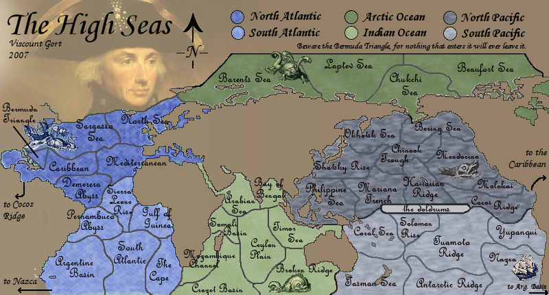
Thanks to everyone for the continued input. What do you make of the new version?
---
Marv I didn't entirely understand this I'm sorry. I assume you're unhappy with the cut in the north atlantic where nelson's face is. I personally like this layout. Extending the playable space up there would mean more territories in either the N. Atlantic or the Arctic Ocean, which I don't really want, and also possibly more borders for the Arctic Ocean, which I'm also not keen on as the artic's relative isolation means it can stay as a small, low-bonus continent. I also think ending the map here works nicely visually.
As for the antarctic, the 'antarctic ocean' doesn't feature in this map, so I don't understand your objection here. There is only one mention of the antarctic, which is the antarctic ridge, a territory in the south pacific. In reality this ridge does exist in the south pacific, so I think that's ok. I hoep tht addresses your comments to some extent.
- Background lightened.
Font changed. Some people liked it, some people hated it. Overall I think most people found it hard to read, so thought I'd try a change - what does everyone think?
Indian Ocean sea monster added.
Thanks to everyone for the continued input. What do you make of the new version?
---
Marv wrote:I hate how you have cut 2 portions of the map: the one where is that guy face, and Antarctic (how will it be Antarctic Ocean without Antarctic?)
Marv I didn't entirely understand this I'm sorry. I assume you're unhappy with the cut in the north atlantic where nelson's face is. I personally like this layout. Extending the playable space up there would mean more territories in either the N. Atlantic or the Arctic Ocean, which I don't really want, and also possibly more borders for the Arctic Ocean, which I'm also not keen on as the artic's relative isolation means it can stay as a small, low-bonus continent. I also think ending the map here works nicely visually.
As for the antarctic, the 'antarctic ocean' doesn't feature in this map, so I don't understand your objection here. There is only one mention of the antarctic, which is the antarctic ridge, a territory in the south pacific. In reality this ridge does exist in the south pacific, so I think that's ok. I hoep tht addresses your comments to some extent.
-

ViscountGort
- Posts: 35
- Joined: Mon Jan 22, 2007 7:21 am
- Location: University of Durham, England

![]() by Forza AZ on Wed Feb 07, 2007 11:42 am
by Forza AZ on Wed Feb 07, 2007 11:42 am
As I understand the Bermuda Triangle can't attack to the neigbouring seas. Is that correct? Then you should add arrows there to make it more clear I think, as people might overlook the line in the legend at first.
And I also think the font is still not very good te read. I would like a more standard font, so all names are easy to read.
And I also think the font is still not very good te read. I would like a more standard font, so all names are easy to read.
-

Forza AZ
- Posts: 4546
- Joined: Thu Oct 19, 2006 9:27 am
- Location: Alkmaar, Netherlands


![]() by Wisse on Wed Feb 07, 2007 11:48 am
by Wisse on Wed Feb 07, 2007 11:48 am
i don't think i am gonna play this map, because i don't like it physacily (srry for bad spelling) you can't do anything about it  but i'll help you to make it a good map
what i miss are the lines of north america (greenland etc.) in the west of the map
what i miss are the lines of north america (greenland etc.) in the west of the map


-

Wisse
- Posts: 4448
- Joined: Fri Oct 13, 2006 2:59 pm
- Location: The netherlands, gelderland, epe


![]() by sully800 on Wed Feb 07, 2007 1:00 pm
by sully800 on Wed Feb 07, 2007 1:00 pm
Forza AZ wrote:As I understand the Bermuda Triangle can't attack to the neigbouring seas. Is that correct? Then you should add arrows there to make it more clear I think, as people might overlook the line in the legend at first.
And I also think the font is still not very good te read. I would like a more standard font, so all names are easy to read.
I like the warning label- just a bit mysterious, like the actually bermuda triangle. Of course it will probably raise many bug reports from people who don't bother to look around, but I think it would be cool to have it be somewhat of a 'secret' feature. The font for everything still needs to be changed though I think, because its very hard to read. It looks kind of cool, but its illegible.
-

sully800
- Posts: 4978
- Joined: Wed Jun 14, 2006 5:45 pm
- Location: Bethlehem, Pennsylvania


![]() by Balsiefen on Wed Feb 07, 2007 3:50 pm
by Balsiefen on Wed Feb 07, 2007 3:50 pm
Both of the fonts are fine for me and most of the coulers are good
-the arctic is still a colour which, while it is a good sea colour it just doesn't seem right for the arctic
-the land also needs some texturing, i would use the texture you used for the south pacific in the last version
Apart from that looking good! definatly my favorate map in the foundry at the moment
-

Balsiefen
- Posts: 2299
- Joined: Wed Aug 30, 2006 6:15 am
- Location: The Ford of the Aldar in the East of the Kingdom of Lindissi


![]() by Marvaddin on Wed Feb 07, 2007 7:07 pm
by Marvaddin on Wed Feb 07, 2007 7:07 pm
ViscountGort wrote:Marv wrote:I hate how you have cut 2 portions of the map: the one where is that guy face, and Antarctic (how will it be Antarctic Ocean without Antarctic?)
Marv I didn't entirely understand this I'm sorry. I assume you're unhappy with the cut in the north atlantic where nelson's face is. I personally like this layout. Extending the playable space up there would mean more territories in either the N. Atlantic or the Arctic Ocean, which I don't really want, and also possibly more borders for the Arctic Ocean, which I'm also not keen on as the artic's relative isolation means it can stay as a small, low-bonus continent. I also think ending the map here works nicely visually.
As for the antarctic, the 'antarctic ocean' doesn't feature in this map, so I don't understand your objection here. There is only one mention of the antarctic, which is the antarctic ridge, a territory in the south pacific. In reality this ridge does exist in the south pacific, so I think that's ok. I hoep tht addresses your comments to some extent.
^^ Exactly what I dislike. I think the seas map should include all ocean portions around the globe, not excluding north atlantic or antarctic ocean.
Plus, you could increase the height of the map, so you would have room to bigger font. The font its still unreadable.
-
Marvaddin
- Posts: 2545
- Joined: Thu Feb 09, 2006 5:06 pm
- Location: Belo Horizonte, Brazil


![]() by gavin_sidhu on Thu Feb 08, 2007 1:08 am
by gavin_sidhu on Thu Feb 08, 2007 1:08 am
You need to do something about Mozambique Channel and Pennambuca Abyss. What i like about the border lines in the Artic ocean is that they are thin and nicely coloured, in other areas they are fat, which i find rather unsightly (especially north pacific). I like the idea of having only one ways into Bermuda Triangle, but i think you should write that closer to the actual territory, i can see people screaming about it already.
-
gavin_sidhu
- Posts: 1428
- Joined: Mon May 22, 2006 6:16 am
- Location: Brisbane, Australia
![]() by Fitz69 on Thu Feb 08, 2007 1:22 am
by Fitz69 on Thu Feb 08, 2007 1:22 am
The waters north of Iceland and around Greenland should be included. In reality these waters are even more open and accessable than the ones north of Siberia and Canada so leaving them out makes no sense.
Considering the global warming all of the arctic waters will be inccreasingly accessable anyway.
There's nothing keeping you from adding some unpassable borders up there though. Novaya Zemlya, north of Greenland or Baffin Island just to mention a few.
Considering the global warming all of the arctic waters will be inccreasingly accessable anyway.
There's nothing keeping you from adding some unpassable borders up there though. Novaya Zemlya, north of Greenland or Baffin Island just to mention a few.
-

Fitz69
- Posts: 196
- Joined: Wed Nov 29, 2006 8:46 am
- Location: Sweden

I love it
![]() by Jack0827 on Fri Feb 09, 2007 9:14 pm
by Jack0827 on Fri Feb 09, 2007 9:14 pm
I think that this is a great map! i didn't mind the brown but at this piont it looks great. the font was fine to begin with but what about using the font that you used for the title in the upper left corner, it is simple but still keeps with the thyme. I also wouldn't change the picture because I think that it just adds more wonder to the backround. I don't think that there need to be more than 3 small images( ships, see monsters, ect.) in the back round because if you look at some of the old maps there arn't very many of these small images. it dosn't realy matter but I just wouldn't add any more because then it just becomes to much. Overall my favorite map that I have seen. keep up the good work  !
!
-

Jack0827
- Posts: 101
- Joined: Sat Jan 06, 2007 5:54 pm
- Location: newport news va


![]() by adam3b58 on Mon Feb 12, 2007 3:01 pm
by adam3b58 on Mon Feb 12, 2007 3:01 pm
i didnt see any mention of this, so i'd like to throw the idea of bonuses for owning monsters up in the air. it would make them more integral to the map. maybe like +3 if you own them or something. just tossing it out there
-
adam3b58
- Posts: 157
- Joined: Sun Dec 24, 2006 11:05 pm
- Location: Montana


![]() by Guiscard on Thu Mar 01, 2007 9:59 am
by Guiscard on Thu Mar 01, 2007 9:59 am
Yeh, definitely crack on with this. if you need any help pm me.
qwert wrote:Can i ask you something?What is porpose for you to open these Political topic in ConquerClub? Why you mix politic with Risk? Why you not open topic like HOT AND SEXY,or something like that.
-

Guiscard
- Posts: 4103
- Joined: Fri Dec 08, 2006 7:27 pm
- Location: In the bar... With my head on the bar
![]() by Contrickster on Thu Mar 01, 2007 12:44 pm
by Contrickster on Thu Mar 01, 2007 12:44 pm
I like the idea for the map a lot!
How about 1 "port" land territory for each Ocean? The ships have got to come from somewhere, and it would make some of the "dead" land more appealing than all brown.
How about 1 "port" land territory for each Ocean? The ships have got to come from somewhere, and it would make some of the "dead" land more appealing than all brown.
-
Contrickster
- Posts: 261
- Joined: Tue Jan 23, 2007 7:24 pm
98 posts
• Page 3 of 4 • 1, 2, 3, 4
Return to Melting Pot: Map Ideas
Who is online
Users browsing this forum: No registered users
|
|||||||
| Conquer Club is not associated with RISK online in any way. Copyright © 2006-2025 by Big Wham LLC | |||||||