Conquer Club

Conquer Club Park [Abandoned]

Have an idea for a map? Discuss ideas and concepts here.

Moderator: Cartographers

Forum rules
Please read the Community Guidelines before posting.

Postby musicman_379 on Mon Jul 02, 2007 2:40 pm

thegeneralpublic wrote:Naw, make it the CC logo. We don't want to get into that whole Yankees / Red Sox thing.

I Agree.
Night Strike wrote:I think the continents would look better if they are blocked (like section A, B, C, etc) instead of rows (100, 200, 300). I'm not sure how that would work, but I think it would make the map better liked.

Actually, in most (probably all) Major Leage ballparks, seat sections are numerical, and usually 3-digits.
Image
User avatar
Corporal musicman_379
 
Posts: 141
Joined: Sat Apr 07, 2007 2:22 pm
Location: SW Kansas

Postby musicman_379 on Mon Jul 02, 2007 3:03 pm

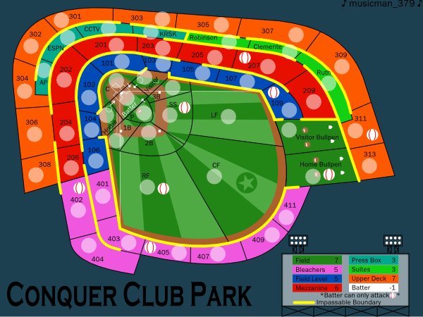
UPDATE!
Image
Image
This time, the changes are on the Field:
Mower stripe texture and CC logo on Field
"Chalk lines" for batter's box, coach's boxes, on-deck circles
Home plate, bases, and pitcher's base on Field and in the bullpens
Warning track added
Batter position color removed
Image
User avatar
Corporal musicman_379
 
Posts: 141
Joined: Sat Apr 07, 2007 2:22 pm
Location: SW Kansas

Postby Night Strike on Mon Jul 02, 2007 7:32 pm

I think the black lines throughout the infield make the map very cluttered. I don't know what could be done instead. The "mowed" lines make the field look much better.
Image
User avatar
Major Night Strike
 
Posts: 8512
Joined: Wed Apr 18, 2007 2:52 pm

Postby draglin3 on Mon Jul 02, 2007 11:02 pm

I like the additions...and I'll give on the sox logo :P
Words are, of course, the most potent drug used by mankind
User avatar
Cadet draglin3
 
Posts: 27
Joined: Wed Jun 13, 2007 7:02 pm
Location: d208, store 3736

Postby Unit_2 on Mon Jul 02, 2007 11:12 pm

that pic at the top woud look good for the map.
Image
User avatar
Cook Unit_2
 
Posts: 1834
Joined: Sun Jan 14, 2007 12:59 pm
Location: Pennsylvania, U.S.A, North America, Earth, Milky Way, Universe.

Postby musicman_379 on Tue Jul 03, 2007 4:28 pm

Unit_2 wrote:that pic at the top woud look good for the map.

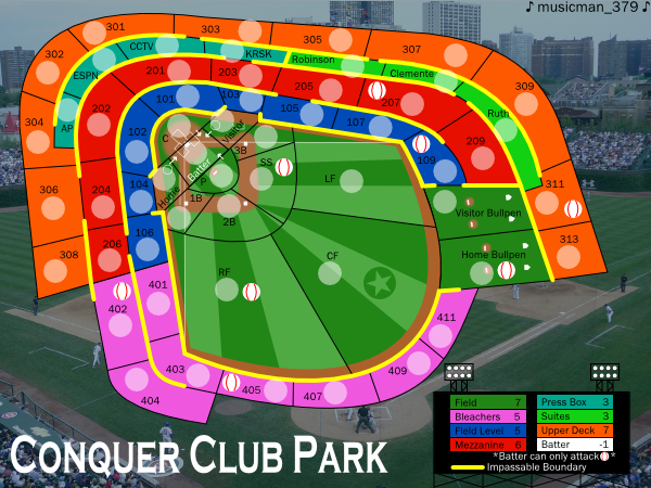
I tried this just to see (with a different picture, though), and putting a picture of a ballpark as the background really adds to the baseball theme. I'll go with it right now.
Image
User avatar
Corporal musicman_379
 
Posts: 141
Joined: Sat Apr 07, 2007 2:22 pm
Location: SW Kansas

Postby musicman_379 on Thu Jul 12, 2007 4:10 pm

Here it is. A new background is the change this time. Enjoy! Comment Too!
Image
Image
Image
User avatar
Corporal musicman_379
 
Posts: 141
Joined: Sat Apr 07, 2007 2:22 pm
Location: SW Kansas

Postby Kaplowitz on Thu Jul 12, 2007 4:53 pm

Looks good!

I would change "Batter" from white to brown on the key
Image
User avatar
Private 1st Class Kaplowitz
 
Posts: 3088
Joined: Tue May 01, 2007 5:11 pm

Postby Night Strike on Thu Jul 12, 2007 5:02 pm

Oh gosh.........don't like it!!! Having your field's orientation going against the orientation of the picture is just terrible!!! It makes the whole thing look like it's out of place.
Image
User avatar
Major Night Strike
 
Posts: 8512
Joined: Wed Apr 18, 2007 2:52 pm

Postby Kaplowitz on Thu Jul 12, 2007 7:42 pm

Night Strike wrote:Oh gosh.........don't like it!!! Having your field's orientation going against the orientation of the picture is just terrible!!! It makes the whole thing look like it's out of place.


I think that it looks fine. Acually, maybe it would look better if the outer border was darker.
Image
User avatar
Private 1st Class Kaplowitz
 
Posts: 3088
Joined: Tue May 01, 2007 5:11 pm

Postby thegeneralpublic on Thu Jul 12, 2007 8:51 pm

I concur; the background picture looks fine to me! This map is looking downright awesome!
User avatar
Cadet thegeneralpublic
 
Posts: 126
Joined: Fri Mar 09, 2007 9:49 pm
Location: In front of my computer screen.

Postby ParadiceCity9 on Fri Jul 13, 2007 1:00 pm

I think you should change the angle of the field. I mean make it so home plate as at the base of the page and center field is at the top of the page.
Corporal 1st Class ParadiceCity9
 
Posts: 4239
Joined: Thu Feb 15, 2007 4:10 pm

Postby Keredrex on Fri Jul 13, 2007 2:10 pm

Good Job Can't wait to Play.... I think It looks good this way....

ParadiceCity9 wrote:I think you should change the angle of the field. I mean make it so home plate as at the base of the page and center field is at the top of the page.


Placing the map with Batter on the bottom and Outfield towards the top would Illiminate the rest of the Stadium... which is always partially behind Home plate
User avatar
Sergeant 1st Class Keredrex
 
Posts: 400
Joined: Sun Jan 14, 2007 1:41 am
Location: New York

Postby musicman_379 on Fri Jul 13, 2007 5:45 pm

Kaplowitz wrote:
Night Strike wrote:Oh gosh.........don't like it!!! Having your field's orientation going against the orientation of the picture is just terrible!!! It makes the whole thing look like it's out of place.


I think that it looks fine. Acually, maybe it would look better if the outer border was darker.


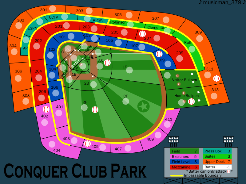
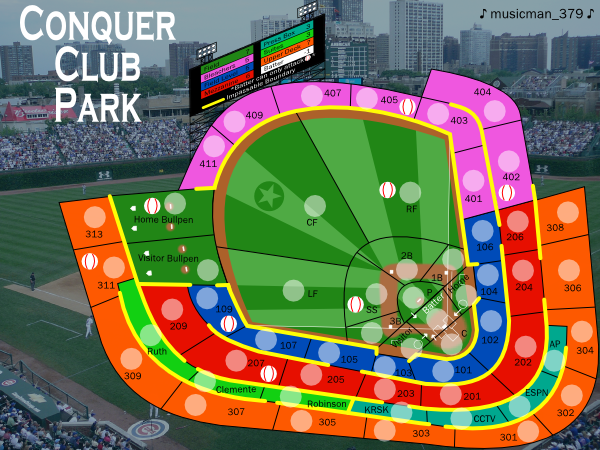
Since comments on this are about 50-50, I'm presenting two versions of the (small) map for a foundry decision.
Do you like version one, with the map's field orientation against the picture's field orientation?
Image
Or version two, with the map's field orientation with the picture's field orientation?
Image
(and, yes, I do know that the scoreboard legend is very hard to read--it can be redone if this version is preferred by the foundry)
Image
User avatar
Corporal musicman_379
 
Posts: 141
Joined: Sat Apr 07, 2007 2:22 pm
Location: SW Kansas

Postby Night Strike on Fri Jul 13, 2007 6:09 pm

Tough choice. I don't know if I like the bottom orientation, but I'm not convinced it fits properly on the top one. Maybe you could just do a background of various baseball items: bats, balls, hot dogs, etc.
Image
User avatar
Major Night Strike
 
Posts: 8512
Joined: Wed Apr 18, 2007 2:52 pm

Postby Kaplowitz on Fri Jul 13, 2007 8:09 pm

I think the top one is fine!
Image
User avatar
Private 1st Class Kaplowitz
 
Posts: 3088
Joined: Tue May 01, 2007 5:11 pm

Postby gimil on Fri Jul 13, 2007 8:16 pm

The origonal is fine but seriously you need to start putting some kind of texture into the contients. They just look flat and boaring
What do you know about map making, bitch?

natty_dread wrote:I was wrong


Top Score:2403
User avatar
Corporal 1st Class gimil
 
Posts: 8599
Joined: Sat Mar 03, 2007 12:42 pm
Location: United Kingdom (Scotland)

Postby edbeard on Fri Jul 13, 2007 8:30 pm

I'm totally against the background you currently have.

1. It's probably copyrighted so you'll have to deal with that and probably not worth the hassle.

2. More importantly it doesn't look right at all. The contrast between the gameplay area and this drawing as the background stands out too much.

I think you're missing an opportunity here. You can draw an actual background of the map outside. Parking lot. A river. Freeway. Possibly draw a pitcher or a batter or something.

To be Frank, what you have now looks bad. Shirley you can do quite a bit better.


As for other parts of the graphics. I think it'd be cool if you could actually draw in the seats on the bleachers. The boxes and sweets would obviously need a different look, but it could really add something if done subtley.
User avatar
Lieutenant edbeard
 
Posts: 2501
Joined: Thu Mar 29, 2007 12:41 am

Postby AndyDufresne on Fri Jul 13, 2007 10:12 pm

I agree with most everything edbeard has suggested, especially the background part.


--Andy
User avatar
Corporal 1st Class AndyDufresne
 
Posts: 24935
Joined: Fri Mar 03, 2006 8:22 pm
Location: A Banana Palm in Zihuatanejo

Postby Ronaldinho on Sat Jul 14, 2007 5:48 am

Omg please dont tell me andy, your going to let a baseball stadium on this site :evil: :evil: :evil: :evil: :evil:
Image
User avatar
Sergeant Ronaldinho
 
Posts: 3069
Joined: Sat May 27, 2006 5:35 pm
Location: Dorset, England.

Postby gimil on Sat Jul 14, 2007 7:33 am

Ronaldinho wrote:Omg please dont tell me andy, your going to let a baseball stadium on this site :evil: :evil: :evil: :evil: :evil:


who let you out of your flame war cage?
What do you know about map making, bitch?

natty_dread wrote:I was wrong


Top Score:2403
User avatar
Corporal 1st Class gimil
 
Posts: 8599
Joined: Sat Mar 03, 2007 12:42 pm
Location: United Kingdom (Scotland)

Good suggestiones

Postby Keredrex on Sat Jul 14, 2007 10:58 am

I agree with Some of edbeard's ideas... Yes the Map is a little flat but It reminds me of the kind of map that shows Seating arrangements... Maybe add textures to the territories BUT don't go for photo realism...THe background image is a bit off... definitely add more to it kinda like a google maps view... Highways .. A River .. Parking lot Etc.. as for orientation... either one works
User avatar
Sergeant 1st Class Keredrex
 
Posts: 400
Joined: Sun Jan 14, 2007 1:41 am
Location: New York

Postby ParadiceCity9 on Sat Jul 14, 2007 10:21 pm

the maps just really ghetto...kinda like it just came out of paint.

improve on colors def.
Corporal 1st Class ParadiceCity9
 
Posts: 4239
Joined: Thu Feb 15, 2007 4:10 pm

Postby thegeneralpublic on Sun Jul 15, 2007 7:26 am

I like the second image and what you were trying to do with the scoreboard, but I don't think that would work well for readability.
User avatar
Cadet thegeneralpublic
 
Posts: 126
Joined: Fri Mar 09, 2007 9:49 pm
Location: In front of my computer screen.

Postby khazalid on Sun Jul 15, 2007 7:40 am

i think its cool so many people are into making maps. makes cc a better place. the curret glut all suffer the same problem though, too novel and flashy and not playable enough. who still plays king of the mountains y'know?
Lieutenant khazalid
 
Posts: 3413
Joined: Thu Oct 26, 2006 5:39 am
Location: scotland

PreviousNext

Return to Melting Pot: Map Ideas

Who is online

Users browsing this forum: No registered users