Antartica Map [Vacation]
Moderator: Cartographers
![]() by gavin_sidhu on Fri Aug 18, 2006 2:23 am
by gavin_sidhu on Fri Aug 18, 2006 2:23 am
I like the smudge for the first map picture, gives a blizzardy feel. Make roosevelt island bigger so it touches Marie Byrd Land. You made up most of those names didnt u? High Low Land, Reverend Kyle Land, Reverend Drew Land.
Highest Score: 1843 Ranking (Australians): 3
-

 gavin_sidhu
- Posts: 1428
- Joined: Mon May 22, 2006 6:16 am
- Location: Brisbane, Australia
![]() by reverend_kyle on Fri Aug 18, 2006 3:04 am
by reverend_kyle on Fri Aug 18, 2006 3:04 am
gavin_sidhu wrote:I like the smudge for the first map picture, gives a blizzardy feel. Make roosevelt island bigger so it touches Marie Byrd Land. You made up most of those names didnt u? High Low Land, Reverend Kyle Land, Reverend Drew Land.
I didn't like the smudge of the first map until I combined it with the texture...
also.. I made up those 3 names.. none of the other ones.
speaking of which newest update

This was mostly as par marvaddins suggestion..
I added iceburgs for the non crossable.... I changed the font in russia's claim and part of australias(russias is different than australias) as the 2 fonts I think look best... thoughts?
DANCING MUSTARD FOR POOP IN '08!
-

reverend_kyle
- Posts: 9250
- Joined: Tue Mar 21, 2006 4:08 pm
- Location: 1000 post club


![]() by BD Juzza on Fri Aug 18, 2006 4:25 am
by BD Juzza on Fri Aug 18, 2006 4:25 am
Ok i have read all the post and i believe that you have showed the people that did not believe the map would be any good however i do believe you need to change the colour of the map where Australia's claim is it is to similar to New Zealand.
Maybe on the background instead of the one you have you could change it to pictures of animals which are common to antarctica.
Maybe on the background instead of the one you have you could change it to pictures of animals which are common to antarctica.
-

BD Juzza
- Posts: 26
- Joined: Tue Jul 04, 2006 9:37 pm
- Location: Australia, Brisbane
![]() by gavin_sidhu on Fri Aug 18, 2006 5:12 am
by gavin_sidhu on Fri Aug 18, 2006 5:12 am
Zhong Shan doesnt sound very australian.
You can hardly tell the smudge in this image.
You can hardly tell the smudge in this image.
Highest Score: 1843 Ranking (Australians): 3
-
gavin_sidhu
- Posts: 1428
- Joined: Mon May 22, 2006 6:16 am
- Location: Brisbane, Australia
![]() by happysadfun on Fri Aug 18, 2006 6:29 pm
by happysadfun on Fri Aug 18, 2006 6:29 pm
I agree with GavSid, plus the font on Concordia and Casey is better. argentina's too dark. nz and australia are too similar. if you want to keep the colors feel free to make the text white. hey wait that's a good idea? Icy-ish. But the colors are just too similar on Australia and NZ and South pole. The key has the same trouble that Ireland did. But too much blue.
 Children, this is what happens to hockey players, druggies, and Hillary Clinton.
Rope. Tree. Hillary. Some assembly required.
-

happysadfun
- Posts: 1251
- Joined: Mon Jul 10, 2006 9:06 pm
- Location: Haundin at DotSco, Being Sad that Mark Green Lost in Suburban Wisconsin
![]() by gavin_sidhu on Fri Aug 18, 2006 7:53 pm
by gavin_sidhu on Fri Aug 18, 2006 7:53 pm
The colours of Australia's Claim and New Zealand's Clame would be alright if the conginents were not right next to each other. Maybe you should switch the colours of Australia's and Britain's claim.
Highest Score: 1843 Ranking (Australians): 3
-
gavin_sidhu
- Posts: 1428
- Joined: Mon May 22, 2006 6:16 am
- Location: Brisbane, Australia
![]() by happysadfun on Fri Aug 18, 2006 7:56 pm
by happysadfun on Fri Aug 18, 2006 7:56 pm
I say it should be Norway. We can't have so many blues right next to each other.
Children, this is what happens to hockey players, druggies, and Hillary Clinton.
Rope. Tree. Hillary. Some assembly required.
-
happysadfun
- Posts: 1251
- Joined: Mon Jul 10, 2006 9:06 pm
- Location: Haundin at DotSco, Being Sad that Mark Green Lost in Suburban Wisconsin
![]() by reverend_kyle on Fri Aug 18, 2006 9:05 pm
by reverend_kyle on Fri Aug 18, 2006 9:05 pm
as of now I cant figure out how i'd do that because it'd take alot of backtracking... and I asked my friend and he could figure it out so I will see.
DANCING MUSTARD FOR POOP IN '08!
-
reverend_kyle
- Posts: 9250
- Joined: Tue Mar 21, 2006 4:08 pm
- Location: 1000 post club
![]() by gavin_sidhu on Fri Aug 18, 2006 9:37 pm
by gavin_sidhu on Fri Aug 18, 2006 9:37 pm
reverend_kyle wrote:as of now I cant figure out how i'd do that because it'd take alot of backtracking... and I asked my friend and he could figure it out so I will see.
U made it hard because your using textures. Its very hard to work with textures in GIMP, to change the colour u have to get rid of the texture and then add the texture a different colour (well thats how i do it) I think ud need to use the select by colour button, or u could just use the erasor.
Highest Score: 1843 Ranking (Australians): 3
-
gavin_sidhu
- Posts: 1428
- Joined: Mon May 22, 2006 6:16 am
- Location: Brisbane, Australia
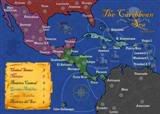 MIDDLE AMERICA MAP
![]() by happysadfun on Sat Aug 19, 2006 12:33 pm
by happysadfun on Sat Aug 19, 2006 12:33 pm
maritovw wrote:there are some countries with a different font... Concordia, Casey & Russia's countries
And it's better
Children, this is what happens to hockey players, druggies, and Hillary Clinton.
Rope. Tree. Hillary. Some assembly required.
-
happysadfun
- Posts: 1251
- Joined: Mon Jul 10, 2006 9:06 pm
- Location: Haundin at DotSco, Being Sad that Mark Green Lost in Suburban Wisconsin
![]() by reverend_kyle on Sat Aug 19, 2006 1:46 pm
by reverend_kyle on Sat Aug 19, 2006 1:46 pm
maritovw wrote:there are some countries with a different font... Concordia, Casey & Russia's countries
those are experimental fonts because no one liked my real fonts.
DANCING MUSTARD FOR POOP IN '08!
-
reverend_kyle
- Posts: 9250
- Joined: Tue Mar 21, 2006 4:08 pm
- Location: 1000 post club
![]() by reverend_kyle on Sat Aug 19, 2006 1:47 pm
by reverend_kyle on Sat Aug 19, 2006 1:47 pm
gavin_sidhu wrote:reverend_kyle wrote:as of now I cant figure out how i'd do that because it'd take alot of backtracking... and I asked my friend and he could figure it out so I will see.
U made it hard because your using textures. Its very hard to work with textures in GIMP, to change the colour u have to get rid of the texture and then add the texture a different colour (well thats how i do it) I think ud need to use the select by colour button, or u could just use the erasor.
how do I remove texture.
DANCING MUSTARD FOR POOP IN '08!
-
reverend_kyle
- Posts: 9250
- Joined: Tue Mar 21, 2006 4:08 pm
- Location: 1000 post club
![]() by lilwdlnddude on Sat Aug 19, 2006 4:58 pm
by lilwdlnddude on Sat Aug 19, 2006 4:58 pm
Just wondering, what program do you use to make your maps?
-
lilwdlnddude
- Posts: 302
- Joined: Wed Feb 01, 2006 8:26 pm
- Location: Earth


![]() by lilwdlnddude on Sat Aug 19, 2006 11:34 pm
by lilwdlnddude on Sat Aug 19, 2006 11:34 pm
whoa, I've never heard of this before. I was just looking at it and so pretty much its like adobe photoshop right? and is it free?
-
lilwdlnddude
- Posts: 302
- Joined: Wed Feb 01, 2006 8:26 pm
- Location: Earth
![]() by reverend_kyle on Sun Aug 20, 2006 8:25 pm
by reverend_kyle on Sun Aug 20, 2006 8:25 pm
yeah its free.. i am very good on photoshop but It costs money so I changed to this..
DANCING MUSTARD FOR POOP IN '08!
-
reverend_kyle
- Posts: 9250
- Joined: Tue Mar 21, 2006 4:08 pm
- Location: 1000 post club
![]() by Enigma on Sun Aug 20, 2006 10:49 pm
by Enigma on Sun Aug 20, 2006 10:49 pm
nice map, i luv the names. high low land. *laughs*
i think it really would b better if u switched out the colour 4 nz- maybe just replace it instead of switching it w/ another. another shade of green might balance the map out better.
the font 4 concordia and casey in australia is the best- most readable.
w/e u did to seperate the territories in australia is really cool- makes it look like 3d ice shelves. would a lighter colour btwn the double lines that seperate them wrk? i know its a small detail but it might b cool to make them look like chunks of ice shoved 2gether.
oh- and changing the font 2 white is prob a bad idea- it would be unreadable on chile.
its looking gr8, cant wait to play it
Do you need an excuse to have a war? I mean, who for? Can't you just say "You got lots of cash and land, but I've got a big sword, so divy up right now, chop chop."
Terry Pratchet
Terry Pratchet
-
Enigma
- Posts: 367
- Joined: Mon Jul 03, 2006 10:23 pm
- Location: Classified


![]() by lilwdlnddude on Mon Aug 21, 2006 2:04 pm
by lilwdlnddude on Mon Aug 21, 2006 2:04 pm
Tho only thing that I have to suggest about this map is:
1. Make the water not so crazy. All the white just messes with my eyes, I think it makes the map look sloppy.
2. Make the mountains more real. You used the exact same looking mountain shape.... and it dosnt really look like a moutain to me.
3. Make everything clearer. It seems like someone just took an eraser and just went over the whole picture, sorta smearing things.
I'm sure that some of things things will make the map look more playable. I hope you consider some of these suggestions.
Kyle
Where's Waldo?!
-
lilwdlnddude
- Posts: 302
- Joined: Wed Feb 01, 2006 8:26 pm
- Location: Earth
![]() by reverend_kyle on Mon Aug 21, 2006 6:53 pm
by reverend_kyle on Mon Aug 21, 2006 6:53 pm
lilwdlnddude wrote:Tho only thing that I have to suggest about this map is:
1. Make the water not so crazy. All the white just messes with my eyes, I think it makes the map look sloppy.
2. Make the mountains more real. You used the exact same looking mountain shape.... and it dosnt really look like a moutain to me.
3. Make everything clearer. It seems like someone just took an eraser and just went over the whole picture, sorta smearing things.
I'm sure that some of things things will make the map look more playable. I hope you consider some of these suggestions.
Kyle
1.working on changes to the water..
2. they arent mountains necessarily more like giant ice burgs.. and I like the graphic I have..
3. that was sort of the effect I was going for.. I feel it makes it look more blizzardly.
DANCING MUSTARD FOR POOP IN '08!
-
reverend_kyle
- Posts: 9250
- Joined: Tue Mar 21, 2006 4:08 pm
- Location: 1000 post club
![]() by gavin_sidhu on Tue Aug 22, 2006 2:19 am
by gavin_sidhu on Tue Aug 22, 2006 2:19 am
Get ur map and use gaussian blur, it may end up looking better (then again it may not)
To get Guassian blur, click Filters>Blur>Gaussian blur. I think it might give a blizzardy feel to the map.
To get Guassian blur, click Filters>Blur>Gaussian blur. I think it might give a blizzardy feel to the map.
Highest Score: 1843 Ranking (Australians): 3
-
gavin_sidhu
- Posts: 1428
- Joined: Mon May 22, 2006 6:16 am
- Location: Brisbane, Australia
![]() by cramill on Tue Aug 22, 2006 8:44 pm
by cramill on Tue Aug 22, 2006 8:44 pm
lilwdlnddude wrote:Just wondering, what program do you use to make your maps?
revrend_kyle wrote:gimp.
Hey, how would one go about getting GIMP on windows? I was looking a little bit and I didn't take the time to figure it out myself, so can anyone tell me how?
-

cramill
- Posts: 611
- Joined: Sun Jun 18, 2006 8:13 pm
- Location: Phoenix, AZ


![]() by reverend_kyle on Wed Aug 23, 2006 2:22 am
by reverend_kyle on Wed Aug 23, 2006 2:22 am
cramill wrote:lilwdlnddude wrote:Just wondering, what program do you use to make your maps?revrend_kyle wrote:gimp.
Hey, how would one go about getting GIMP on windows? I was looking a little bit and I didn't take the time to figure it out myself, so can anyone tell me how?
desau explains it in landgrabs map factory.
DANCING MUSTARD FOR POOP IN '08!
-
reverend_kyle
- Posts: 9250
- Joined: Tue Mar 21, 2006 4:08 pm
- Location: 1000 post club
![]() by gavin_sidhu on Wed Aug 23, 2006 2:25 am
by gavin_sidhu on Wed Aug 23, 2006 2:25 am
cramill wrote:lilwdlnddude wrote:Just wondering, what program do you use to make your maps?revrend_kyle wrote:gimp.
Hey, how would one go about getting GIMP on windows? I was looking a little bit and I didn't take the time to figure it out myself, so can anyone tell me how?
type in download Gimp into google and it will come up. Alternatively u could just click the link in the map making thread. Also when you download it, one version crashes when you create a text box, so use have to make sure u download the latest one.
Highest Score: 1843 Ranking (Australians): 3
-
gavin_sidhu
- Posts: 1428
- Joined: Mon May 22, 2006 6:16 am
- Location: Brisbane, Australia
Return to Melting Pot: Map Ideas
Who is online
Users browsing this forum: No registered users
|
|||||||
| Conquer Club is not associated with RISK online in any way. Copyright © 2006-2025 by Big Wham LLC | |||||||