Terra Luna: Abbandoned - free to a good home
Moderator: Cartographers

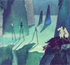
![]() by hecter on Wed May 09, 2007 3:26 pm
by hecter on Wed May 09, 2007 3:26 pm
Change the territory name font. It's hard to read.
In heaven... Everything is fine, in heaven... Everything is fine, in heaven... Everything is fine... You got your things, and I've got mine.

-

 hecter
- Posts: 14632
- Joined: Tue Jan 09, 2007 6:27 pm
- Location: Tying somebody up on the third floor


![]() by wcaclimbing on Wed May 09, 2007 3:30 pm
by wcaclimbing on Wed May 09, 2007 3:30 pm
You should change the borders within each continent to something more visible. Grey borders on a grey background is kinda hard to see.
How about a grey-tinted version of the continent color?
How about a grey-tinted version of the continent color?

-

wcaclimbing
- Posts: 5598
- Joined: Fri May 12, 2006 10:09 pm
- Location: In your quantum box....Maybe.


![]() by Bodmanbod on Wed May 09, 2007 4:56 pm
by Bodmanbod on Wed May 09, 2007 4:56 pm
Maybe for the continents you could extand the colored 'haze' over the entire continent and make it more transparent. That would give us color blocks and make them easier to see.
Also the territory borders should be darkened or even broken into dashes to help clarify them.
JK
well actually they are coloured. i will not change the continents colour for the following reasons:
1. They already are coloured.
2. The continents are already easy to make out because some are dark and some are light.
3. people originally told me to make them less colourful. i will not keep changing how colourful the continents are because some people prefer them more colourful and some don't. doing this will generally get the map nowhere! although if someone can tell me how to change the poll then i will change it to find out properly.
Gameplay wise, I think zupus (the large territory) is too crucial. It can attack too many places, making yellow have to defend from countless places. I say you should make the one way borders attack zupus, rather than attack from zupus.
And i suppose you would like me to remove all other tactical elements of the map too?
I see no reason to change this, some territories are stronger than others, deal with it. This makes the map more interesting. If you look on classical map then you will see china borders many countries, but do people ask the makers of risk to change china? NO. All of the territories on this map are carefully considered and their shape, size, no of borders etc are all for a reason. I will not change the direction of the one way borders on any of the one way borders because it would be illogical, the borders go in the direction they do for a reason. There are a lot of maps about atm which are very much made to be equal. These maps are boring. Why should the yellow continent be as easy to defend as the red one? some continents should be easier to take/hold than others.
please...make changes to the first page
WTF? why? The topic's title tells you which page has the latest update. just go straight to that page. if i change the first topic then people are unable to see the true progression of the map. why when i am the one putting effort into making a map spend time editing posts so that you can be lazy and click on the big link instead of the little link?
Change the territory name font. It's hard to read.
well that is not really possible. the text needs to be small so that i don't cover most of the map with labels (particularly on the small version). The font used is what's called a pixel font, it is pretty much the smallest font possible on the screen. Any other font would have to be bigger and cover up territories or spill into the wrong territories.
You should change the borders within each continent to something more visible. Grey borders on a grey background is kinda hard to see.
How about a grey-tinted version of the continent color?
again, no. sorry but the territory borders are easy enough to see. there are enough maps around with big horrible lines all over them marking territories but with no real subtlety. They way they are is subtly but visible. making them the continent colour has been tried earlier on in development and using a greyed version would make them harder to see if anything.
-
Bodmanbod
- Posts: 96
- Joined: Wed May 02, 2007 9:24 am
![]() by mibi on Wed May 09, 2007 5:05 pm
by mibi on Wed May 09, 2007 5:05 pm
you wont get far with that attitude partna'.
That being said, I think this map is way to confusing. The one way is done in the same way as the continent bonuses, so its hard to get a grasp just where the continent edges are. Sure I could study it and figure it out, but do i want to ? no.
also,
The army circles are too dark, in fact you might not even need them at all.
-

mibi
- Posts: 3350
- Joined: Thu Mar 01, 2007 8:19 pm
- Location: The Great State of Vermont


![]() by mibi on Wed May 09, 2007 5:16 pm
by mibi on Wed May 09, 2007 5:16 pm
Bodmanbod wrote:well it was a bit of a rant i know.... sorry.
but in my defense i keep getting conflicting comments about the continent colours, and i fail to see why people are finding the map confusing.
because at this point... it looks more like a petri dish than a moon.
-
mibi
- Posts: 3350
- Joined: Thu Mar 01, 2007 8:19 pm
- Location: The Great State of Vermont
![]() by Bodmanbod on Wed May 09, 2007 5:19 pm
by Bodmanbod on Wed May 09, 2007 5:19 pm

well i added more colour to the whole continent and expanded the haze around the edge of each continent.
also i lightened the army circles.
a petri dish eh? well i think the more colourful i make it the less like the moon it will look, and the darker i make the lines all over it the less like the moon it will look.
-
Bodmanbod
- Posts: 96
- Joined: Wed May 02, 2007 9:24 am
![]() by mibi on Wed May 09, 2007 5:23 pm
by mibi on Wed May 09, 2007 5:23 pm
Bodmanbod wrote:
well i added more colour to the whole continent and expanded the haze around the edge of each continent.
also i lightened the army circles.
a petri dish eh? well i think the more colourful i make it the less like the moon it will look, and the darker i make the lines all over it the less like the moon it will look.
get rid of the army circles all together, and the Terra and Mare thing is silly, once a player is able to hold an area with 22 territories the game is over anyways.
And the yellow area is the one i have the most problem defining, its got one ways running through it and it seems like much of its border isnt even yellow, or just barely.
-
mibi
- Posts: 3350
- Joined: Thu Mar 01, 2007 8:19 pm
- Location: The Great State of Vermont
![]() by RobinJ on Wed May 09, 2007 5:46 pm
by RobinJ on Wed May 09, 2007 5:46 pm
Agree with Mibi on the Terra and Mare issue - you will never have a situation with 2 players holding one each so no real point in having extra bonuses. Also, I would like to know how this will look as the small map (the text could become near impossible to read).
One other thing, please never be quite as scathing about ideas as you were a few posts up - you need our backing remember.

One other thing, please never be quite as scathing about ideas as you were a few posts up - you need our backing remember.
nmhunate wrote:Speak English... It is the language that God wrote the bible in.
Highest Score: 2437
Highest Place: 84
-

RobinJ
- Posts: 1901
- Joined: Mon Aug 21, 2006 1:56 pm
- Location: Northern Ireland


![]() by Ruben Cassar on Wed May 09, 2007 6:46 pm
by Ruben Cassar on Wed May 09, 2007 6:46 pm
I just cannot see where a continent ends and another begins. You must do something to differentiate them more from each other...try using more varied colours perhaps?


-

Ruben Cassar
- Posts: 2160
- Joined: Thu Nov 16, 2006 6:04 am
- Location: Civitas Invicta, Melita, Evropa


![]() by Risktaker17 on Wed May 09, 2007 9:22 pm
by Risktaker17 on Wed May 09, 2007 9:22 pm
I think it looks great I'll definitely use it but the borders of all countries have to be more defined. Other than that looks real good.
-

Risktaker17
- Posts: 1495
- Joined: Sun Apr 01, 2007 8:09 am


![]() by Bodmanbod on Thu May 10, 2007 11:54 am
by Bodmanbod on Thu May 10, 2007 11:54 am
ok well i probably wont post an update until saturday, maybe monday.
but i can tell you when it comes it will most likely have the following changes:
+ the colour of the purple continent and the green continent will be swapped around to help define where the yellow continent is.
+ the yellow continent will be made more yellow
+ all of the borders will be made more visible
+ i may make the borders of continents more different to normal borders.
+ i will remove the army circles and the terra, mare thing (i was very unsure about that anyway and you guys just confirmed it for me)
I know it will be difficult to maybe think of other comments until i post the update but please keep them coming! i will try to make changes tonight but most likely wont have time.
-
Bodmanbod
- Posts: 96
- Joined: Wed May 02, 2007 9:24 am


![]() by snufkin on Thu May 10, 2007 3:48 pm
by snufkin on Thu May 10, 2007 3:48 pm
looking good
also.. making the continents in the legend have the same colour (imbrium and maybe siccitatis) and tilting (vitae, serenitatis) as in the map might minimise confusion further.
though I dont know whether it´s necessary or not since I can´t understand the reason ppl got confused in the first place?
whatever you do - don´t let anyone talk you into replacing the colours with something ugly and more "functional".
-
snufkin
- Posts: 206
- Joined: Sun Apr 22, 2007 7:40 am
- Location: borderland of Ranrike

![]() by Lone.prophet on Thu May 10, 2007 4:37 pm
by Lone.prophet on Thu May 10, 2007 4:37 pm
edbeard wrote:Lone.prophet wrote:to which side is the one way border?
I believe the direction the triangle point is the way that can attack
if this is true than the brown area should be +8 or something like that.
I do think they need to be made MUCH more clear though.
/signed

-
Lone.prophet
- Posts: 1467
- Joined: Thu Oct 12, 2006 4:37 pm
- Location: Your basement Muahaha

Return to Melting Pot: Map Ideas
Who is online
Users browsing this forum: No registered users
|
|||||||
| Conquer Club is not associated with RISK online in any way. Copyright © 2006-2025 by Big Wham LLC | |||||||