Before I say anything, bear with me for this post, as I am extremely tired and have just watched the most booooooring thing ever (presidential debates

), so my brains being a bit sluggish (im amazed i found the post button)
yeti_c wrote:I have to say your decication to purpose on this map is admirable.
Keep on plowing Bryguy.
C.
Thanks yeti

RjBeals wrote:bry - too many pages for me to sort though - so sorry if some of these have been addressed..
I dont mind, even if it has been addressed, its possible that I have forgotten it before...
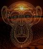
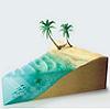
I'm not a fan of the black borders. since this is desert, why not try a shade of brown?
sure (although I prefer called it "barren land" rather than "dessert"

), Ill try that, since Im messing around with the borders already (trying different layer modes first (overlay, color, value, soft light, hard light, the works
) to see what looks best) so I might as well try seeing what they look like brown
You've got good lighting on the general map itself - however the huge black mountain needs some work. For a map like this, I would try keeping 1 general light source (the sun) and keep shadows falling all the same way. Shadows on the land look like they fall south west (sort of) so I would suggest a hard shadow on the mountain on that side, with a brighter spot on the other side. I would also really draw back some of that brownish blackish shadow from around the bottom of the mountain.
Yea thats what I have been trying to do, have them fall south west, yet for some reason the mountain wouldnt fall south west, just south

I can try doing it again, it was fairly simple to do the first time
Oh, and the bolded part is something I dont understand what your saying exactly...
only thing is that i have to figure out which layers i used to make it in the first place, I have like 5-50 layers that are backups just in case i need them or files that im keeping around just in case i need themYou're font is fine. Nice and clear. But is has no pizazz. Maybe search for a different font, that is still legible, but ties in with the desert theme. Some of your areas names look bold also (Yarb), while others look thin (To'me). I don't think thats intentional.
no it wasnt. I just hadnt really bothered to mess with them for a while, so after a little bit they ended up suddenly looking all different. Im currently trying the Booter font that kap found to redo the names (thanks kap! so far its lookin' great!)
The sandy beach areas look good.
uh.... not sure where your talkin' about, but thanks!
I think the water is too bright. It's almost glowing on my monitor. Like pool water. Have you tried a darker blue? with more ripples in it maybe.
I think this has been mentioned before, but idk. Recently I tried making it more blue, so that helped a bit, but yea ill add more ripples and make it more see through, because as you said, its to bright, and in my opinion it doesnt really fit being so bright.
I also don't care for the brown glow around the plain black title. The grungy text looks good.
Yea after a couple of days I decided I hated the glow. Ill move the title over to the legend area as well as getting rid of the glow, and Ill decide on Famine or Eight Kings Crisis (probably famine, it fits better)
So - keep on keeping on. You've come this far - don't stop now. My Italy map took almost 1 year exactly to quench.
Thanks
This is the only project that Ive ever started that I have really stuck to. Its become a hobby for me to be working on this
ZeakCytho wrote:The transition between mud and regular land really needs work. The land looks like it's plopped on top of the mud right now, rather than having them be two parts of the same whole. You need a gentler and more subtle transition.
yea thats the one thing that needs a lot of work in my opinion. Ive tried alot of things, even redoing the mud, just onto the land instead of onto a new layer, but no mater what it always ends up weird

So that took that way out of the question. Ive tried blurring, gaussian blurring, both, lots of both to make it a soft transition to solid, and countless other things, but i just had an idea on how i might do it, so ill try that
But that doesnt mean that any suggestions (highly detailed steps included would be nice

) will still be taken into account until I can get it nice
The water should look muddier, I think. Darken it up, like RJ said, but try decreasing the opacity so some of the mud color shows though.
Easy enought to do
The bridges also really need work - maybe just ditch them in the first place, if you can't make better looking ones, and only have connections via mud/shallow water.
I dont like the idea of ditching them, since they connect over some thick water in places, and connect areas in the lower left corner. I will still work on them tho, but any help would be accepted gratefully
I agree with what RJ said about the mountain. Also, the white thing on it - is that supposed to be snow? It kind of looks like a cloud. Not sure how you can effectively show snow from that angle, so maybe just have a rocky peak.
yea its supposed to be snow, but i think i might of accidentally slipped with the brush at one point, cause on part of it got more snow on it than the other parts, making it look like a cloud (which I completely agree with you on that!)
Ill try fixing it, if now, Ill see about getting rid of it
Overall, I'm still underwhelmed by the graphics on this. It feels like a lot of different styles thrown together.
Has there been any significant discussion of how the gameplay will work?
Yea you could probably say that it kinda is, as I am always trying to learn what I can for map making, so I have learned about 1-10 different styles (alot from different places on the web), and mine is always evolving.
I dont really know what you mean by this last sentence

Thank you for all the comments everybody!


 ) could work pretty well IMO.