really? well then im goodcairnswk wrote:I'm sorry you don't like the name because that is exactly what was there and it is staying. :)Herakilla wrote:i dont really like the name of War Dept. maybe Arsenal?
Prohibition Chicago [Quenched]
Moderator: Cartographers
Forum rules
Please read the Community Guidelines before posting.
Please read the Community Guidelines before posting.
-
Herakilla
- Posts: 4283
- Joined: Fri Jun 09, 2006 8:33 pm
- Location: Wandering the world, spreading Conquerism
Come join us in Live Chat!

Night Strike...all those issues should be corrected now in Version 13 below.Night Strike wrote:I don't think the Hymie Weiss line was fixed. Perhaps move the text and box up and move the connection down to the bottom of the territory to take the yellow dots down the street.
I think switching the yellow attack dots and Alfonso Capone positions would clear that area up.
You have a random gray dot on the Belle's Driveway next to the red light.


* Pearl Harbour * Waterloo * Forbidden City * Jamaica * Pot Mosbi

-
Risktaker17

- Posts: 1495
- Joined: Sun Apr 01, 2007 8:09 am

-
Herakilla
- Posts: 4283
- Joined: Fri Jun 09, 2006 8:33 pm
- Location: Wandering the world, spreading Conquerism
i know you explained that roads are impassable in the legend but just for safety could you put another one with the impassables in the lower right corner? some people are going to come wondering is the street impassable?
Come join us in Live Chat!

CairnsWK,
I've had a brief look at this map, and have the following observations:
1. The colour of the Ch. Outfit West is a bit too similar to the grey of the Public Utilities.
2. The Canadian Specials is blue on the legend, but looks a lot greener on the map.
3. There seem to be quite a few 'bottlenecks' to get territories (ie Frank Nitti > Belle's > Giggle Juice Warehouse > Sam Giancano). I know that it isn't a true bottleneck, but there's quite a few bits like this, and I'm not sure that the distribution is the same for each gang area - which might contribute to unbalanced play...
4. Is the river impassable? I expect it is, but there's nothing to say that anywhere. You could try embossing/indenting/sinking the water so that it looks more impassable, or put some shadow around the land like you've doone on the actual coastline...
That's it for now.
Thanks Mr Benn...i'll look into these and post something later this week.MrBenn wrote:CairnsWK,
I've had a brief look at this map, and have the following observations:
1. The colour of the Ch. Outfit West is a bit too similar to the grey of the Public Utilities.
2. The Canadian Specials is blue on the legend, but looks a lot greener on the map.
3. There seem to be quite a few 'bottlenecks' to get territories (ie Frank Nitti > Belle's > Giggle Juice Warehouse > Sam Giancano). I know that it isn't a true bottleneck, but there's quite a few bits like this, and I'm not sure that the distribution is the same for each gang area - which might contribute to unbalanced play...
4. Is the river impassable? I expect it is, but there's nothing to say that anywhere. You could try embossing/indenting/sinking the water so that it looks more impassable, or put some shadow around the land like you've doone on the actual coastline...
That's it for now.
* Pearl Harbour * Waterloo * Forbidden City * Jamaica * Pot Mosbi
I think those two colours are quite distinct, and all the colours are designed to fit within an art deco colour scheme.MrBenn wrote:CairnsWK,
I've had a brief look at this map, and have the following observations:
1. The colour of the Ch. Outfit West is a bit too similar to the grey of the Public Utilities.
Hope this version 25 fixes that2. The Canadian Specials is blue on the legend, but looks a lot greener on the map.
Yes, it could do, but i don't think it does....there is no difference between this and another map like Cairns Coral Coast where two islands Low is and Snapper islands hang off Port douglas, but there are no such other combinations of this confirguration on that map.3. There seem to be quite a few 'bottlenecks' to get territories (ie Frank Nitti > Belle's > Giggle Juice Warehouse > Sam Giancano). I know that it isn't a true bottleneck, but there's quite a few bits like this, and I'm not sure that the distribution is the same for each gang area - which might contribute to unbalanced play...
Inverted,,,done.4. Is the river impassable? I expect it is, but there's nothing to say that anywhere. You could try embossing/indenting/sinking the water so that it looks more impassable, or put some shadow around the land like you've doone on the actual coastline...
Version 14.


* Pearl Harbour * Waterloo * Forbidden City * Jamaica * Pot Mosbi
-
snapdoodle

- Posts: 190
- Joined: Tue Jul 10, 2007 1:40 pm
Hey Cairns,
I'm just going to get into it.
Hope it's helpful.
-The park land in the middle of the block of the Chi. Outfit West... doesn't make sense to me. One would think they wouldn't build park land in the center of a block like that.
-Some of the outlines of surrounding the terits are different colors than others. Is there a reason for it? ex. around Joey Aiello, or the way the sidewalk from breweries changes colors when it gets to War Dept.
-The mobster's face needs some polish I think... it's his eyes i think and maybe the pale skin.
-What's been bugging me why you chose to color the territories rather than the great graphic you've got within the territories. I know that's how you've done it before, like with waterloo, but waterloo had good textures.
-Part of me wants to have the image of the mobster you have on the left, actually appear on the map. Maybe have likenesses of the mobsters present in the territories.
-The blue drop shadow in the title and where it says "Bonuses" hurts my eyes a little. It's getting a "double" effect that I don't think you're intending.
-Some of the dots on the street, like from Joey Aiello to Little Italy, seem to have dots that clash. Also, maybe have a trail of blood to indicate routes since it's a bloody mess in the streets?
-The street that runs from the Breweries to the War Dept. ends abruptly. Could it just go all the way to the end?
-The line in the legend that reads "All Public Utilities attack each other including City Hall: Any 4" feels redundant. Couldn't you just say all government buildings and have City Hall image and the other image next to each other?
That's all for now. Let me know what you think.
-snap
-
Incandenza

- Posts: 4949
- Joined: Thu Oct 19, 2006 5:34 pm
- Gender: Male
- Location: Playing Eschaton with a bucket of old tennis balls
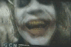
So, will you totally hate me if I say that the face of the gangster leaves a lot to be desired? 
(honestly, I'm not a fan of the sidebar graphic... that seems like space that could be dedicated to the map. But since I seem to be the only one that's commented about it, I'll shut up now)
(honestly, I'm not a fan of the sidebar graphic... that seems like space that could be dedicated to the map. But since I seem to be the only one that's commented about it, I'll shut up now)
THOTA: dingdingdingdingdingdingBOOM
Te Occidere Possunt Sed Te Edere Non Possunt Nefas Est
Te Occidere Possunt Sed Te Edere Non Possunt Nefas Est
No don't hate you, but agree with you.Incandenza wrote:So, will you totally hate me if I say that the face of the gangster leaves a lot to be desired?
Yes i no it is real estate for the map, but there's a lot of commentors who like that like bit, so i have to stay it is going to stay, but I will make some face adjustments.(honestly, I'm not a fan of the sidebar graphic... that seems like space that could be dedicated to the map. But since I seem to be the only one that's commented about it, I'll shut up now)
* Pearl Harbour * Waterloo * Forbidden City * Jamaica * Pot Mosbi
-
Incandenza
- Posts: 4949
- Joined: Thu Oct 19, 2006 5:34 pm
- Gender: Male
- Location: Playing Eschaton with a bucket of old tennis balls
cairnswk wrote:No don't hate you, but agree with you.Incandenza wrote:So, will you totally hate me if I say that the face of the gangster leaves a lot to be desired?
Yes i know it is real estate for the map, but there's a lot of commentors who like that bit, so i have to say it is going to stay, but I will make some face adjustments.(honestly, I'm not a fan of the sidebar graphic... that seems like space that could be dedicated to the map. But since I seem to be the only one that's commented about it, I'll shut up now)
* Pearl Harbour * Waterloo * Forbidden City * Jamaica * Pot Mosbi

Snap, thanks for your comments.snapdoodle wrote:Hey Cairns,
I'm just going to get into it.
Hope it's helpful.
-The park land in the middle of the block of the Chi. Outfit West... doesn't make sense to me. One would think they wouldn't build park land in the center of a block like that.
These blocks are only representations of the city layout in some form. If we got down and put all the blocks in they would be so minute at this scale. As for the parkland, that park is actally Garfield Park, but on this map it is used to separate those terts. So i guess it really doesn't matter if it is real or not.
Yes this is the layering effect on the sidewalk trims. Since sidewalks are not all made the same, they will come out in different shades of gray. Also there si stlight difference between the large and small map, when they are split in two maps (rather than be propogated up) then there will have to be adjustments made for the larger map.-Some of the outlines of surrounding the terits are different colors than others. Is there a reason for it? ex. around Joey Aiello, or the way the sidewalk from breweries changes colors when it gets to War Dept.
Can do something.-The mobster's face needs some polish I think... it's his eyes i think and maybe the pale skin.
Since some terts have a similar graphic, it would hard. Also the continents in play are resperesented by the different colours.-What's been bugging me why you chose to color the territories rather than the great graphic you've got within the territories. I know that's how you've done it before, like with waterloo, but waterloo had good textures.
No that would only more clutter an already cluttered map.-Part of me wants to have the image of the mobster you have on the left, actually appear on the map. Maybe have likenesses of the mobsters present in the territories.
Oh yes, that is quite intentional and not up for grabs.-The blue drop shadow in the title and where it says "Bonuses" hurts my eyes a little. It's getting a "double" effect that I don't think you're intending.
The blood would only confuse people between what was tert connection and blood trails.-Some of the dots on the street, like from Joey Aiello to Little Italy, seem to have dots that clash. Also, maybe have a trail of blood to indicate routes since it's a bloody mess in the streets?
Since the streets are only a representation of city blocks, does it really matter? I think not.-The street that runs from the Breweries to the War Dept. ends abruptly. Could it just go all the way to the end?
Yes yo-u probably could, but i prefer to show it this way, it is then consistent with the rest of the legend.-The line in the legend that reads "All Public Utilities attack each other including City Hall: Any 4" feels redundant. Couldn't you just say all government buildings and have City Hall image and the other image next to each other?
* Pearl Harbour * Waterloo * Forbidden City * Jamaica * Pot Mosbi


Alright, I can't really see anything major that needs to be changed in the gameplay department. I know you've said it elsewhere, but it couldn't hurt to add "roads" under the inpassables legend.
Just throwing some ideas around for discussioon...
racketeers bonus seems a bit too high... +2 maybe?
And I'd say whoever nabs the boats has a quick advantage in this one, because it'll be the only region that can't be hit via guns. What do people say about making it a +1?
The 'hold any four' public utilities - does that include City Hall?