The Citadel [Quenched]
Moderator: Cartographers
Forum rules
Please read the Community Guidelines before posting.
Please read the Community Guidelines before posting.

Re: The Citadel Map V2.1 (Pg1+3) Now with Fresh Readability
...so the map is perfect now? Not to troll my own thread, but I'd like to move this map forward.
-
wcaclimbing

- Posts: 5598
- Joined: Fri May 12, 2006 10:09 pm
- Location: In your quantum box....Maybe.
- Contact:
Re: The Citadel Map V2.1 (Pg1+2) Now with Fresh Readability
Have you tried putting a bit of color onto each country?
cause right now, all of the countries are solid grey.
I think a bit of color, or at least some light texture, might help it look better.
Nothing major, just something to put in place to get rid of the solid grey.
EDIT: and maybe some grass-like texture to put over the green in the middle. this map just has a few too many solid color areas for me to like visually.
Like I said before, don't do anything too extreme. Keep it simple, but add a bit of detail. Give the solid areas a bit of life and this will look a lot better.

Re: The Citadel Map V2.1 (Pg1+2) Now with Fresh Readability
All the gray territories are buildings, and that's exactly what their roofs look like. Due to the fact that I am taking my college campus and turning it into a map, I'd like to keep that as close to "the real thing" as possible. I think putting some glow around the territory names is sufficient for adding some sprucing.wcaclimbing wrote:Have you tried putting a bit of color onto each country?
cause right now, all of the countries are solid grey.
I think a bit of color, or at least some light texture, might help it look better.
Nothing major, just something to put in place to get rid of the solid grey.
I do want to add some grass texture. When I first started the map my artistic drive was rather low. Then I figured out an easy way to make Shadows for the buildings (notice how the sun is coming from the right side of campus?). Adding in some grassiness, and maybe even an asphalt/sidewalk texture is definitely within my range of do-ability, ESPECIALLY because of the solid color nature of major portions of the map. I'll add that.wcaclimbing wrote:EDIT: and maybe some grass-like texture to put over the green in the middle. this map just has a few too many solid color areas for me to like visually.
Like I said before, don't do anything too extreme. Keep it simple, but add a bit of detail. Give the solid areas a bit of life and this will look a lot better.
Current Discussion Points:
- Should the Parade Deck be split up, or is its heavy connections an attraction for the map?
- Are the Attack Routes nice and apparent?
- Are the bonus colors too bright for the map and need to be toned down a little?
- Are bonus numbers good right now?
- Is the hefty amount of interconnection, especially in the Battalion area, a good thing for the map?
-
wcaclimbing
- Posts: 5598
- Joined: Fri May 12, 2006 10:09 pm
- Location: In your quantum box....Maybe.
- Contact:
Re: The Citadel Map V2.1 (Pg1+2) Now with Fresh Readability
This map is really interesting. The attack routes are a bit confusing at first, but after a minute or two they are easy to understand.TaCktiX wrote: Current Discussion Points:
- Should the Parade Deck be split up, or is its heavy connections an attraction for the map? I think maybe splitting it into East Parade Deck and West Parade Deck would work better. Having the big center space is nice, but i think it is a bit too connected. splitting it into East and West might help some.
- Are the Attack Routes nice and apparent?
1.I don't understand how to get to and from the Locker Room. The dotted lines cross over it, but don't really show being able to attack there.
2. Maybe you could extend the dots into the parade deck and put something at the end of them. right now they just sort of go...go...go... stop. with nothing at the end, except for a big space of green. you might be able to make that connection a bit more obvious.
3. other than those two things, i think the connections will be good.
- Are the bonus colors too bright for the map and need to be toned down a little? NO. leave the colors exactly as they are. I like them a lot like this, and I doubt they could be improved.
- Are bonus numbers good right now?
1. I think 1st and 3rd should decrease to 4 bonus each. They are too easy to hold for that big of bonuses.
2. Jenkins, remembrance, and Lee should have bigger bonuses. they all have a lot of territories, they should be worth a bit more.
- Is the hefty amount of interconnection, especially in the Battalion area, a good thing for the map? I think it will work. It will make for some very interesting strategy, because everything can attack so many other places. It will be a fun place to play
Two more things:
The text where it lists the bonuses is tiny. It will be difficult for some people to read. I suggest making it bigger.
I dont understand the part about Batillions and the bombardments. You need to give a clearer explanation of what attacks what, and what each symbol means. the explanation on the map is confusing me

Re: The Citadel Map V2.1 (Pg1+2) Now with Fresh Readability
I think the coloured glows on the territory labels are too large. tone down the size a notch or two.
I agree about the legend. Perhaps look into adding a section on the top or bottom of the map since you have a bit of extra space in height.
clarity is still a big issue on this map. It can be difficult to know what attacks what especially where territory labels hide borders. this happens mostly on the left and right of the map.
I like the Parade Deck being one territory. It'll be a significant territory.
Re: The Citadel Map V2.1 (Pg1+2) Now with Fresh Readability
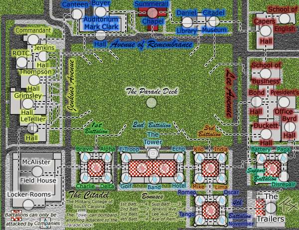
Version 3

I haven't added the grass textures yet, but every single border is now explicit. I personally don't like the Parade Deck attack routes, but I decided to overdo it rather than underdo it. Erasing is rather fast.
Updated:
- All borders have attack lines
- Adjusted bonuses for those mentioned
- Tried to clear up the Battalion/Company difference and the Tower's bombardment range
- Added Support Battalion's bonus color (forgot it in v2 and v2.1)
- Muted the outer glow
To Do:
- Grass, Asphalt, Sidewalk textures
Discussion Points:
- Are the unique elements finally clear?
- Is the Parade Deck now overcluttered, and I can cut back on how long the lines are? Or are they fine?
- Are the bonuses now more in line with what one would expect?
- Any other lingering concerns with graphics?
Re: The Citadel Map V2.1 (Pg1+2) Now with Fresh Readability
TaCktiX wrote:Version 3
I haven't added the grass textures yet, but every single border is now explicit. I personally don't like the Parade Deck attack routes, but I decided to overdo it rather than underdo it. Erasing is rather fast.
Updated:
- All borders have attack lines
- Adjusted bonuses for those mentioned
- Tried to clear up the Battalion/Company difference and the Tower's bombardment range
- Added Support Battalion's bonus color (forgot it in v2 and v2.1)
- Muted the outer glow
To Do:
- Grass, Asphalt, Sidewalk textures
Discussion Points:
- Are the unique elements finally clear? no
- Is the Parade Deck now overcluttered, and I can cut back on how long the lines are? Or are they fine? overcluttered
- Are the bonuses now more in line with what one would expect? no
- Any other lingering concerns with graphics? i cant read a thing on it
-
pepperonibread

- Posts: 954
- Joined: Sun Jan 28, 2007 4:33 pm
- Location: The Former Confederacy
Re: The Citadel Map V2.1 (Pg1+2) Now with Fresh Readability
Come on, the words aren't that bad. Granted, they could be cleared up a bit, but I can read everything on itbryguy wrote:TaCktiX wrote:Discussion Points:
- Are the unique elements finally clear? no
- Is the Parade Deck now overcluttered, and I can cut back on how long the lines are? Or are they fine? overcluttered
- Are the bonuses now more in line with what one would expect? no
- Any other lingering concerns with graphics? i cant read a thing on it
To Tacktix: With army numbers over top of them, the flags under the army circles may be hard to see.

Re: The Citadel Map V3 (Pg1+3) Explicit Material
It's why I set the flags on the background they're on too. The Large map won't have this clarification problem because I'll have the space for the text to say Quad. As it is, Small doesn't have that space, so I have to go off of context cues.pepperonibread wrote:Come on, the words aren't that bad. Granted, they could be cleared up a bit, but I can read everything on itbryguy wrote:TaCktiX wrote:Discussion Points:
- Are the unique elements finally clear? no
- Is the Parade Deck now overcluttered, and I can cut back on how long the lines are? Or are they fine? overcluttered
- Are the bonuses now more in line with what one would expect? no
- Any other lingering concerns with graphics? i cant read a thing on it
To Tacktix: With army numbers over top of them, the flags under the army circles may be hard to see.
As for the Deck, I'll shorten up the attack lines a little bit, more in keeping with what I want.
And please, if you're going to comment, don't give unconstructive one-liners.
-
wcaclimbing
- Posts: 5598
- Joined: Fri May 12, 2006 10:09 pm
- Location: In your quantum box....Maybe.
- Contact:
Re: The Citadel Map V3 (Pg1+3) Explicit Material
i take back my earlier comment. Having Parade deck as one big territory is better than splitting it up.
In the:
"batillions can only be attacked by Companies Parade deck" and it was
"whats a companies parade deck?.... oh"
Just move it to the right a bit so it isn't so close to the batillions/companies text.
Good job with the new dotted borders. everything is a lot clearer now.
In the:
section in the map, can you move the "parade deck" part of that text to the right some? right now it kinda merges with the text to the left of it, so the first time I read it asTower can bombard anything adjacent to the parade deck.
"batillions can only be attacked by Companies Parade deck" and it was
"whats a companies parade deck?.... oh"
Just move it to the right a bit so it isn't so close to the batillions/companies text.
Good job with the new dotted borders. everything is a lot clearer now.
-
Ditocoaf
- Posts: 1054
- Joined: Wed Feb 27, 2008 9:17 pm
- Location: Being eaten by the worms and weird fishes
Re: The Citadel Map V3 (Pg1+3) Explicit Material
WAaaay too many dotted borders. I think it would be clearer if you made everything simpler. Looking at the map, I have some ideas, but I can't really describe them, so all I'll say is to unclutter it a bit. Some borders should be made clear without dotted lines weaving around everywhere.
-
CatfishJohnson

- Posts: 137
- Joined: Tue Feb 19, 2008 3:47 pm
- Location: Michigan
- Contact:
Re: The Citadel Map V3 (Pg1+3) Explicit Material
the dotted make it look easier beilive it or not, it seperates and stops confusion fo sho, looking good tacktix btw
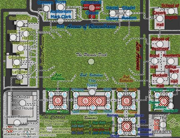
Re: The Citadel Map V4 (Pg1+3) Texturized
Version 4
Updates:
- Textured grass, asphalt, and sidewalk
- Edited the text effects on the bonuses to make them clearer with the new textures
- Trimmed back the attack lines to the Parade Deck
To Do:
- Add a connection from Duckett Hall to Byrd Hall. Having a territory in a continent not connect to any other territories in the continent is made of fail.
- Cut 2nd Battalion down to +6 bonus. +7 just isn't deserved.
Discussion Points:
- Good cutback on the attack lines?
- Any adjustments need to be made to the textures? Do they look good?
- Does the map suffer from any crippling illegibility due to the textures?
- Any non-texture legibility issues?
- Did I separate the Company/Battalion text from the Tower/Parade Deck text well enough?
- Is the Company/Battalion difference FINALLY clear?
-
shadowsteel9
- Posts: 145
- Joined: Sat Feb 16, 2008 6:33 pm
- Location: the moment
Re: The Citadel Map V4 (Pg1+3) Texturized
i like the texture
-
CatfishJohnson
- Posts: 137
- Joined: Tue Feb 19, 2008 3:47 pm
- Location: Michigan
- Contact:
Re: The Citadel Map V4 (Pg1+3) Texturized
everything looks good, but the explanation can be lighter color i think
-
gimil

- Posts: 8599
- Joined: Sat Mar 03, 2007 12:42 pm
- Gender: Male
- Location: United Kingdom (Scotland)
Re: The Citadel Map V4 (Pg1+3) Texturized
[ADV. IDEA]
What do you know about map making, bitch?
Top Score:2403natty_dread wrote:I was wrong
-
CatfishJohnson
- Posts: 137
- Joined: Tue Feb 19, 2008 3:47 pm
- Location: Michigan
- Contact:
Re: The Citadel Map V4 (Pg1+3) Texturized
COngrats mi friend

Re: The Citadel Map V4 (Pg1+3) Texturized
I'm having trouble with the hall names... Is it "Jenkins Hall" "thompson Hall" as I assume, or "Hall Thompson", "Hall Grimsley" "Hall LeTellier" as I first read them... make the font a little bit smaller, and put some space between the hall and the word below it... also perhaps dull the glow a little. My first feeling looking at this map is "WHOA COLOURS OW"... and that turns me off right away... I like the concept, but the naming of territs needs to be done better.
Same up at "Auditorium Mark Clark" or "School of Capers English"... heh :p
Keep up the good work tho.. I'd suggest having a different texture for grass/road.. it looks like the same at the moment, and looks awkward.
Edit: looking further... the smaller font down the bottom looks okay, I'd still experiment with different coloured fonts, rather than glowing everything... maybe a coloured font with a dark glow? and make the glow smaller, or more opacity or something? *Shrug* play, see
pps: perhaps make the dotted lines "inside" building different.. turn them into some sort of long, dark, hallway? This will unclutter the buildings a bit and make them look -perhaps- more realistic? Also distinguishes easily between intra-continent connections and inter-continent ones.
Same up at "Auditorium Mark Clark"
Keep up the good work tho.. I'd suggest having a different texture for grass/road.. it looks like the same at the moment, and looks awkward.
Edit: looking further... the smaller font down the bottom looks okay, I'd still experiment with different coloured fonts, rather than glowing everything... maybe a coloured font with a dark glow? and make the glow smaller, or more opacity or something? *Shrug* play, see
pps: perhaps make the dotted lines "inside" building different.. turn them into some sort of long, dark, hallway? This will unclutter the buildings a bit and make them look -perhaps- more realistic? Also distinguishes easily between intra-continent connections and inter-continent ones.
Re: The Citadel Map V4 (Pg1+3) Texturized
I'll tone down the outer glow more. The reason why I'm sticking with it is because the text alone mixes with building outlines and Stroking it with another color is too stark for the look I want. Outer Glow is a good middle ground for me. I'll narrow up the text so it's not so squished (this is a problem the Large version will not have in any way, shape, or form), for certain.Tieryn wrote:I'm having trouble with the hall names... Is it "Jenkins Hall" "thompson Hall" as I assume, or "Hall Thompson", "Hall Grimsley" "Hall LeTellier" as I first read them... make the font a little bit smaller, and put some space between the hall and the word below it... also perhaps dull the glow a little. My first feeling looking at this map is "WHOA COLOURS OW"... and that turns me off right away... I like the concept, but the naming of territs needs to be done better.
Same up at "Auditorium Mark Clark"
Looking at it, the grass and sidewalk textures are good. The road needs to go back to solid to act as a more effective barrier. I'll change this next version.Tieryn wrote:Keep up the good work tho.. I'd suggest having a different texture for grass/road.. it looks like the same at the moment, and looks awkward.
With the additional text on bottom, I'll mess around with colors and find a good mix. The black+effect isn't really working especially with that texture there.Tieryn wrote:Edit: looking further... the smaller font down the bottom looks okay, I'd still experiment with different coloured fonts, rather than glowing everything... maybe a coloured font with a dark glow? and make the glow smaller, or more opacity or something? *Shrug* play, see
I'm not changing the attack lines again. I got stuck with the 22px Army Circle limit and that makes borders that are there almost invisible behind all the text. With the continent glow it's apparent what goes out of continent and what's still in-continent (pun unintended, bladder-freaks), and the attack lines are simple to understand. Making a "hallway" look would disrupt the simplicity of "this is an attack line, this attacks this."Tieryn wrote:pps: perhaps make the dotted lines "inside" building different.. turn them into some sort of long, dark, hallway? This will unclutter the buildings a bit and make them look -perhaps- more realistic? Also distinguishes easily between intra-continent connections and inter-continent ones.
In general, I think it's a good thing I started with the Small version. So many problems with the pixel limit...being allowed to upscale to 800px will fix so many things.
-
CatfishJohnson
- Posts: 137
- Joined: Tue Feb 19, 2008 3:47 pm
- Location: Michigan
- Contact:
Re: The Citadel Map V4 (Pg1+3) Texturized
why would it be hall anderson......where the hell is it called that heh
-
whitestazn88
- Posts: 3128
- Joined: Mon Feb 05, 2007 2:59 pm
- Gender: Male
- Location: behind you
- Contact:
Re: The Citadel Map V4 (Pg1+3) Texturized
i like the textures and stuff, and i'm glad you shortened those dotted attack lines, they were a little too much. I think you should remove the names of the continents off the map though, and instead put them in the legend in a color coded manner.
Re: The Citadel Map V4 (Pg1+3) Texturized
I'd like to keep the continent names on the map. As it is I'm pressed for space in the bonus area, and if I tried to move continent names there and color-code, it would look like a smooshy mess, and we don't want that.
Re: The Citadel Map V4 (Pg1+3) Texturized
Version 5
Updates:
- Torched the asphalt texture, bringing it back to solid
- Lowered the glow effect around 90% of the map
- Added the Byrd-Duckett connection
- Made it so that the Tower, Kilo, and India don't look directly connected (attack line change)
- Edited 2nd Battalion Bonus down to the more proper 6
- Changed the Bonuses section to include the continent color
- Made Bonuses text bigger and more readable
- Moved Tango to make space for the bonuses
- Moved "Halls" around to make what territory is what more clear
- Changed the colors of Avenue of Remembrance and Lee Avenue so they are more readable with the lessened glow effect
Things that are NOT changing, so don't ask:
- Attack line look (simple, easy to understand as is)
- The continent names being on the map instead of in a secluded section
Discussion Points:
- Aren't the bonuses nice and easy to understand now? Are the values good?
- Are territory names now clear?
- Good color changes to Avenue of Remembrance and Lee Avenue?
-
CatfishJohnson
- Posts: 137
- Joined: Tue Feb 19, 2008 3:47 pm
- Location: Michigan
- Contact:
Re: The Citadel Map V5 (Pg1+4) Gameplay Discussion
im liking it broski
Re: The Citadel Map V5 (Pg1+4) Gameplay Discussion
The question is, does anyone else?