first off, this is looking much better than before. good job.
but....
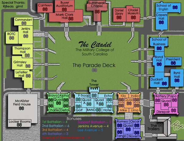
I'm not a fan of the diagonal border between canteen and mark clark hall. All the others are straight lines, could you do the same for that border?
I still don't like the grass texture either. Have you tried overlaying the sandstone filter on top of it to give it a kind of rough look? (like the grass in oasis, if you need an example).
Just make a new layer over your grass, make it solid grey, set it to overlay, and use filter-texturizer-sandstone and adjust it to your liking. then mess with brightness/contrast of that layer, as well as the opacity. you might find something you like. Right now the noise filter is showing through way too much.
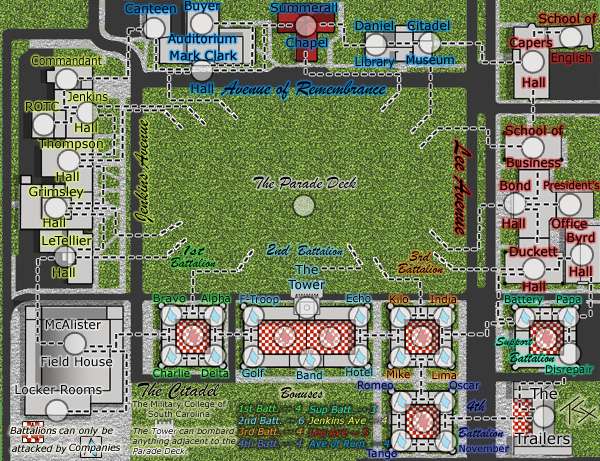
The Citadel [Quenched]
Moderator: Cartographers
Forum rules
Please read the Community Guidelines before posting.
Please read the Community Guidelines before posting.
-
wcaclimbing

- Posts: 5598
- Joined: Fri May 12, 2006 10:09 pm
- Location: In your quantum box....Maybe.
- Contact:

Re: The Citadel V10 (Pg1+10) [I]
I personally like the slightly-noisy grass. It's not getting in the way with map comprehension, and it matches with the sidewalk very well. I tried putting a poll up about it, but the board kept giving me back an error of "cannot determine the dimensions of the image" or something like that. Since all my images are externally linked, I don't know what that is about.

Re: The Citadel V10 (Pg1+10) [I]
While you're correct in saying the current grass doesn't get in the way of comprehension, I feel that it could still be improved and made to look better. The noise is not too bad now, and I could live with this map as is, but I do think what wcaclimbing suggested is at least worth a try.
Unrelated: since the light source is at the top right, shouldn't the shadows on the south side of the buildings be angled inward at their east ends? It seems to me they should have like a 50 or 60 degree angle where they now have a 90 degree one.
Unrelated: since the light source is at the top right, shouldn't the shadows on the south side of the buildings be angled inward at their east ends? It seems to me they should have like a 50 or 60 degree angle where they now have a 90 degree one.
Re: The Citadel V10 (Pg1+10) [I]
Alrighty, I'll put it on Version 11.ZeakCytho wrote:While you're correct in saying the current grass doesn't get in the way of comprehension, I feel that it could still be improved and made to look better. The noise is not too bad now, and I could live with this map as is, but I do think what wcaclimbing suggested is at least worth a try.
It's an ideal shadow, assuming a perfect universal light source that's somewhat in the top right of the map, when really it's at the top right of each building individually. I'm not that good at shadows, though I may end up putting a Drop Shadow and let PhotoShop do the work. What you see there is hand-drawn using marquees, another layer, and some opacity changes. Each building is a separate layer, so it shouldn't be that hard to do, woot.ZeakCytho wrote:Unrelated: since the light source is at the top right, shouldn't the shadows on the south side of the buildings be angled inward at their east ends? It seems to me they should have like a 50 or 60 degree angle where they now have a 90 degree one.
Re: The Citadel V10 (Pg1+10) [I]
Okay then. I know almost nothing about lighting, so I'm probably wrong.TaCktiX wrote:It's an ideal shadow, assuming a perfect universal light source that's somewhat in the top right of the map, when really it's at the top right of each building individually. I'm not that good at shadows, though I may end up putting a Drop Shadow and let PhotoShop do the work. What you see there is hand-drawn using marquees, another layer, and some opacity changes. Each building is a separate layer, so it shouldn't be that hard to do, woot.


Re: The Citadel V10 (Pg1+10) [I]
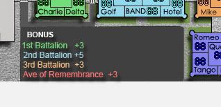
- I'm still not 100% satisfied with the font. It looks okay, but blurry in places. I think it can be improved.
- I'm still not 100% satisfied with the legend either. The dark blue & purple are very hard to read on top of that dark green background.
- I think the 2 green buildings are too close in color. Not all monitors have great chrominance.
- I don't like the 3D roofing on the red center building "Summerall Chapel". It looks out of place to me compared to the flat roofs on the other buildings. The trailers looks okay because there is no territ name on the roof, so it's different already.
- Are there any trees or bushes you could add around some of the building fronts? Like architecture style "circle" bushes? Not exactly like CCU did, but similar.
- What about cracks in the pavement, or some parked cars in the lot? or some tiny people walking on the sidewalks?
- How about take the crest (pictured below) and layer it on top of the parade deck? Keep it really subtle, like it was a pattern cut into the grass field.


Re: The Citadel V10 (Pg1+10) [I]
I tried posting this earlier, but my internet connection up and died right as I was posting. Good game...
Bizarre PhotoShop anti-aliasing. I'll fix it somehow. The font proper shows up just fine, just look at Mark Clark HALL, Jenkins HALL, and Bond HALL for examples of where it goes right. Duckett and Capers decided to arbitrarily misbehave.RjBeals wrote:# I'm still not 100% satisfied with the font. It looks okay, but blurry in places. I think it can be improved.
See below.# I'm still not 100% satisfied with the legend either. The dark blue & purple are very hard to read on top of that dark green background.
Oh c'mon, everyone's got 47" 1080p plasma hooked up to their home rig by now, right? No? Okay, I'll stick pink in for one of the battalions, even though I think it completely and utterly inappropriate for a military college, but I've run out of contrast colors.# I think the 2 green buildings are too close in color. Not all monitors have great chrominance.
Only three of the buildings I portray on that map DON'T have flat roofs. Summerall Chapel, The Trailers, and McAlister Field House. Due to readability concerns, I've dropped McAlister's parabolic dome. All other buildings genuinely have flat roofs with exception of air conditioning units and some cornicework that coincides with borders for the most part. If it's truly detracting from the consistency on the map, I'll remove the roof and make it flat, but I currently consider it an asset.# I don't like the 3D roofing on the red center building "Summerall Chapel". It looks out of place to me compared to the flat roofs on the other buildings. The trailers looks okay because there is no territ name on the roof, so it's different already.
There is a metric ton of trees and shrubbery on campus, particularly along the Avenue of Remembrance (all trees were planted in memory of war fallen). Bummer is, I don't know how to render a top-down tree or shrub, much less the oak and palm varieties found on campus. Any tips/help/detailed suggestions appreciated.# Are there any trees or bushes you could add around some of the building fronts? Like architecture style "circle" bushes? Not exactly like CCU did, but similar.
Cracks in the pavement would be completely out of scale with the map. I'll add subdivisions in the concrete instead. Parked cars and tiny people walking do not match with the image I want to portray on this map. This is the campus as it is without any human interaction. A still life if you will. Adding such obvious "signs of life" would violate that, and omitting them I don't think is hurting the map at all, as I can think of at least 2 maps off the top of my head that don't have tiny people walking that COULD have them.# What about cracks in the pavement, or some parked cars in the lot? or some tiny people walking on the sidewalks?
Behold the new legend background. Not that color combination, but there will not be grass in that part of the map when Version 11 releases. Thanks for making up my mind for what form of paraphernalia I wanted to stick there.# How about take the crest (pictured below) and layer it on top of the parade deck? Keep it really subtle, like it was a pattern cut into the grass field.
-
AndyDufresne

- Posts: 24932
- Joined: Fri Mar 03, 2006 8:22 pm
- Location: A Banana Palm in Zihuatanejo
- Contact:
Re: The Citadel V10 (Pg1+10) [I]
I think adding some "signs of life" could do a wonder in adding some depth to the map. Right now all it is...is just some random buildings to me. There's a little bit of a hook...but I think my mind is thinking..."This map seems oddly quite and devoid of life."Cracks in the pavement would be completely out of scale with the map. I'll add subdivisions in the concrete instead. Parked cars and tiny people walking do not match with the image I want to portray on this map. This is the campus as it is without any human interaction. A still life if you will. Adding such obvious "signs of life" would violate that, and omitting them I don't think is hurting the map at all, as I can think of at least 2 maps off the top of my head that don't have tiny people walking that COULD have them.
--Andy

Re: The Citadel V10 (Pg1+10) [I]
I agree -- the roads need a little sum'in sum'in, ya heard? 

-
wcaclimbing
- Posts: 5598
- Joined: Fri May 12, 2006 10:09 pm
- Location: In your quantum box....Maybe.
- Contact:
Re: The Citadel V10 (Pg1+10) [I]
lol.TaCktiX wrote: There is a metric ton of trees and shrubbery on campus, particularly along the Avenue of Remembrance (all trees were planted in memory of war fallen). Bummer is, I don't know how to render a top-down tree or shrub, much less the oak and palm varieties found on campus. Any tips/help/detailed suggestions appreciated.
Trees are very confusing to do....
Thats why I didn't put any in Oasis. I wish I could have, though.
If you figure out how to make a believable tree, PM me about it. I would be very interested in seeing how....

Re: The Citadel V10 (Pg1+10) [I]
I'm starting to feel like I'm the Foundry's new idea punching bag, taking each one for the team because I'm more interested in getting my map quenched than being able to stick with my original vision for the map. [/angst]AndyDufresne wrote:I think adding some "signs of life" could do a wonder in adding some depth to the map. Right now all it is...is just some random buildings to me. There's a little bit of a hook...but I think my mind is thinking..."This map seems oddly quite and devoid of life."Cracks in the pavement would be completely out of scale with the map. I'll add subdivisions in the concrete instead. Parked cars and tiny people walking do not match with the image I want to portray on this map. This is the campus as it is without any human interaction. A still life if you will. Adding such obvious "signs of life" would violate that, and omitting them I don't think is hurting the map at all, as I can think of at least 2 maps off the top of my head that don't have tiny people walking that COULD have them.
--Andy
That aside, if anyone is willing to help me figure out how to create parked cars and people, or close enough facsimiles to pass for them, I'll be happy to add them. As it stands, it will take me a mountain of effort and creativity just to create some dang trees, much less people from a few hundred feet up in the air (approximate "drawing height").
Now if anyone helps me with this, I have the PERFECT set piece to throw at it: Friday afternoon parade. There are roughly 2,000 bodies in the middle of the Parade Deck, with 1/10 of that watching on the edges. Cars are parked all over campus, especially on the Avenues.
Re: The Citadel V10 (Pg1+10) [I]
I think adding signs of life wouldn't really change the map that much. Given that it would be hard to make these signs of life look really good, I'm inclined to say leave the map as it is now - a still life of the campus.
I think the parade idea is bad. It would make the map way too busy and cluttered.
I think the parade idea is bad. It would make the map way too busy and cluttered.
Re: The Citadel V10 (Pg1+10) [I]
I agree with andy, add some signs of life, here are some ideas
1) a trailer or 2 at The Trailers
2) Some cars parked/driving on the concrete in some areas
dont know if those have been suggested or not
edit: ok it looks like tack suggested the cars, and tac im gonna have to say no parade. And look at operation drug war for an idea on cars
1) a trailer or 2 at The Trailers
2) Some cars parked/driving on the concrete in some areas
dont know if those have been suggested or not
edit: ok it looks like tack suggested the cars, and tac im gonna have to say no parade. And look at operation drug war for an idea on cars
Re: The Citadel V10 (Pg1+10) [I]
First of all - thanks for the special thanks in the top left of the map. I just noticed. Not necessary - but much appreciated.TaCktiX wrote: I'm starting to feel like I'm the Foundry's new idea punching bag, taking each one for the team because I'm more interested in getting my map quenched than being able to stick with my original vision for the map.
You wanna feel like a punching bag - go ask Tisha, or read through some of the later Puget Sound thread. That girl took a beating. You're map is moving along nicely TaC. A specialty map is going to be a lot harder to win people over than a geographical map. Besides me, is there really anyone else who's that familiar with the Citadel? Like I said before - I started a map of Charleston, SC (City where Citadel is located, and TaC's hometown) - but abandoned it because there was almost NO posts (which means NO interest). At least you've generated interest. It's good that you're interested in getting your map quenched more than your original map vision. That's the way it should be. Unless you're a super badasss who can graphically get peoples attention, and convince them that your original concept is the best. That doesn't really happen around here.
The cartos / foundry (which includes you) are representing the entire conquer club community. That's thousands of people, most of which don't comment on maps - but are quick to complain when it's released into live play. If you can satisfy us, you're home free. You've got great potential - and have really thrown yourself into cartography and foundry projects. Don't get discouraged. You'll find that you learn a ton just tweaking your maps and trying different things. My Italy map took like 10 months to quench. There were plenty of times I felt like abandoning the thing (especially when Lupo would tear it apart), but it eventually was quenched - and now my daughter wears the Italy map t-shirt as a night-gown to bed.
Anyway - we're just trying to offer suggestions & different viewpoints. Just because we suggest cracks / cars or whatever, you don't have to implement them. Just tell us no. If we want to argue - believe me we will.
Re: The Citadel V10 (Pg1+10) [I]
just got an idea for cracks, assuming that the concrete is 1 layer, copy it and paste the copy directly above the original, and then fill the copy with whatever you have for the sidewalks, and put the copy layer mode to overlay
Re: The Citadel V10 (Pg1+10) [I]
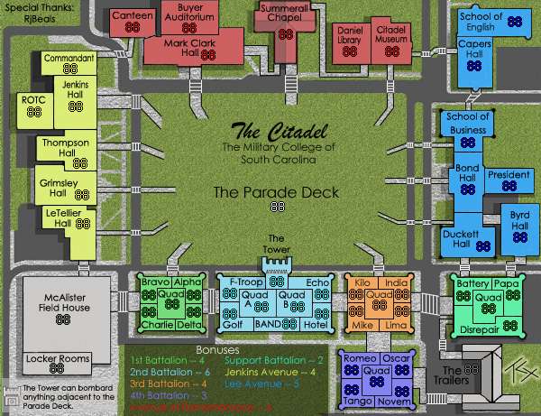
Version 11
Updates:
- Changed shadows to correspond to a mid-morning sun
- Made paths that connect territories stand out more than paths that don't
- Tweaked the Mark Clark Hall/Canteen border to be straight
- Changed the grass (again)
- Recolored Support Battalion to a hot pink
- Dropped all grass from the legend area to make it uber-readable
- Removed the Tower bombardment privilege (a gameplay problem waiting to happen)
Small map (600x461)
To Do:
Add Trees
Segment the Sidewalk
Change the Sidewalk texture to something less noisy
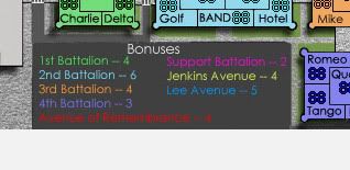
Discussion Points:
- Is the grass sufficiently grassy without being too noisy?
- Is the darkening of unusable paths enough to make that obvious?
- Are all continent colors different enough not to cause confusion?
- Is the legend completely readable now?
Updates:
- Changed shadows to correspond to a mid-morning sun
- Made paths that connect territories stand out more than paths that don't
- Tweaked the Mark Clark Hall/Canteen border to be straight
- Changed the grass (again)
- Recolored Support Battalion to a hot pink
- Dropped all grass from the legend area to make it uber-readable
- Removed the Tower bombardment privilege (a gameplay problem waiting to happen)
Small map (600x461)
To Do:
Add Trees
Segment the Sidewalk
Change the Sidewalk texture to something less noisy
Discussion Points:
- Is the grass sufficiently grassy without being too noisy?
- Is the darkening of unusable paths enough to make that obvious?
- Are all continent colors different enough not to cause confusion?
- Is the legend completely readable now?
-
AndyDufresne
- Posts: 24932
- Joined: Fri Mar 03, 2006 8:22 pm
- Location: A Banana Palm in Zihuatanejo
- Contact:
Re: The Citadel V11 (Pg1+12) [I]
I'd say the legend is more readable.
I'm still not sold on the still life. Everything looks a little too perfect and dull...
--Andy
I'm still not sold on the still life.
--Andy
Re: The Citadel V11 (Pg1+12) [I]
Discussion Points:
- Is the grass sufficiently grassy without being too noisy? Yes.
But I prefer the older noise to this one.
- Is the darkening of unusable paths enough to make that obvious? Yes.
It was fine before - it doesn't make or break the map.
- Are all continent colors different enough not to cause confusion? Yes.
But I wouldn't have picked hot pink for a military college.
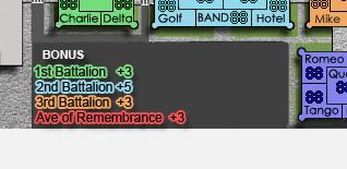
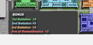
- Is the legend completely readable now? Yes/No
I can read it now - but you really need to ajust the settings on your font. your anti-aliasing too much - so it looks blurry.
Here's yours..
And here are some alternatives which look less blurry. Some have stroke / drop shadow to help them stand out.

- Is the grass sufficiently grassy without being too noisy? Yes.
But I prefer the older noise to this one.
- Is the darkening of unusable paths enough to make that obvious? Yes.
It was fine before - it doesn't make or break the map.
- Are all continent colors different enough not to cause confusion? Yes.
But I wouldn't have picked hot pink for a military college.
- Is the legend completely readable now? Yes/No
I can read it now - but you really need to ajust the settings on your font. your anti-aliasing too much - so it looks blurry.
Here's yours..
And here are some alternatives which look less blurry. Some have stroke / drop shadow to help them stand out.
Re: The Citadel V11 (Pg1+12) [I]
What if you made all of the buildings the same, buildingish color, but make the color of the text different to differentiate between continents? I think it would still be easy to tell what goes where, but it would look much more realistic, and therefore better.

Re: The Citadel V11 (Pg1+12) [I]
The second legend suggestion that Rj posted is lovely
I agree with the hot pink being an awkward choice, but I don't really see what else can be done. Maybe try a bright green?
I disagree with Kalpowitz' suggestion of making the buildings all the same color. The continents are easily distinguishable now and should remain that way; I feel that making text-color the only difference would make them too confusing for colorblind people.
I don't love this grass, but then again, I didn't love the old one better. I suppose you could try for a new grass style, but if I had to choose between this version and the last one, I'd go with this one.
Re: The Citadel V11 (Pg1+12) [I]
Version 5. Been done before, people didn't like it that way.Kaplowitz wrote:What if you made all of the buildings the same, buildingish color, but make the color of the text different to differentiate between continents? I think it would still be easy to tell what goes where, but it would look much more realistic, and therefore better.
Re: The Citadel V11 (Pg1+12) [I]
uh i dont like the look like that, it makes the look POP! and in a bad way.....
Re: The Citadel V11 (Pg1+12) [I]
I think thats just because so much was going on. Maybe now with the simpler map it would look nice.TaCktiX wrote:Version 5. Been done before, people didn't like it that way.Kaplowitz wrote:What if you made all of the buildings the same, buildingish color, but make the color of the text different to differentiate between continents? I think it would still be easy to tell what goes where, but it would look much more realistic, and therefore better.