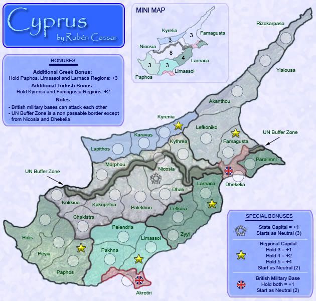
Cyprus - map on page 1 & 5 [I]
Moderator: Cartographers
Forum rules
Please read the Community Guidelines before posting.
Please read the Community Guidelines before posting.
-
gimil

- Posts: 8599
- Joined: Sat Mar 03, 2007 12:42 pm
- Gender: Male
- Location: United Kingdom (Scotland)
Re: Cyprus - map on page 1 & 5 [I]
Currently the colour scheme on this reminds me of a cold place like the artic rather than a mediterraian island. Could we beef it up with some warmer colours without making it look to much like malta?
What do you know about map making, bitch?
Top Score:2403natty_dread wrote:I was wrong

Re: Cyprus - map on page 1 & 5 [I]
hmmm... yeah, the naming could be problematic. I think the XML will handle it just fine, but players may not especially with the layered bonuses. Are the regions named after their capitals? If so maybe the territories could have names like "Paphos Town" or "Larnaca Village."
"U.N. buffer zone is unpassable except between Nikosia and Dhekelia" - call me nuts but i can't find Dhekelia on the map.
Bonuses: there are a lot of them, and they are high. I'm never a fan of 3 territory +3 regions, because in every game somebody should be able to control one by round 2, but I guess if there are three of them everybody should be able to control one by round 2. Then it comes down to who got to go first.
If you're going to give +3 for three territories with three borders, why not give +3 for holding three capitals? It's actually easier to hold the region because they are clumped together, and the capitals have more attackers to fear. When you look at it this way, +3 seems high.
It's not bad, but unnecessary to mention in the legend what starts as a neutral... by the time the game starts everybody will realize it's neutral.
And if you're going to give a bonus for holding them, I think you may as well start the british neutrals at 3... make a player earn that bonus, and don't give up any cheap cards.
OK, that was a lot... overall I like the map. Gimil is right about the color scheme, as it looks more like the Iceland map than a rocky eastern med island. My visit to the south coast of Turkey took me to brown landscapes lined by incredibly blue waters, which would be a fun challenge to reproduce.
-
rocky mountain
- Posts: 415
- Joined: Thu Jul 12, 2007 7:08 pm
Re: Cyprus - map on page 1 & 5 [I]
its between larnaca and paralimnioaktown wrote:call me nuts but i can't find Dhekelia on the map.
i also agree with the bonuses being too high. the 3 territ regions should be 1 or 2, and the larnaca region 2 or 3.
however, the greek region bonus should be like 4 or something, and the turkish be 3.
i agree that the colour scheme should be changed as i've said before. sadly, there was a poll, and the public wanted to keep this colour scheme. the background should be changed to a more Mediterranean ocean colour.
there's only been one update, and it's made it to the main foundry? so seeing as there's been only one update, all the 5-6 pages of posts were either about the same thing, or the suggestions weren't really taken into account? i dunno, i just think there should be more updates.
good luck. its coming along nicely though

best: place 2349; points 1617; GP 216; GW 102(47%); Lieutenant
Re: Cyprus - map on page 1 & 5 [I]
Oh, right! I thought the legend meant that Nikosia to Dhekelia were bordering territories between which you could attack.rocky mountain wrote:its between larnaca and paralimnioaktown wrote:call me nuts but i can't find Dhekelia on the map.
That said, having a territory span the DMZ seems a little weird. At least on the large version this is indicated by the army circle on the no-go zone, which is also kinda weird.
-
Hatchman

- Posts: 792
- Joined: Sat Jan 13, 2007 6:05 am
- Gender: Male
- Location: The charming village of Emery
Re: Cyprus - map on page 1 & 5 [I]
Very nice map Ruben!

Re: Cyprus - map on page 1 & 5 [I]
It is a bit tricky to spot that the territory is on both sides - a bit like Cairnswrks dows on upper egypt.oaktown wrote: That said, having a territory span the DMZ seems a little weird. At least on the large version this is indicated by the army circle on the no-go zone, which is also kinda weird.
Not sure how to suggest changing it - but perhaps a border crossing somewhere in the DMZ and a bit of colour continuation through to the other side of the territory.
C.

Highest score : 2297
-
Ruben Cassar

- Posts: 2160
- Joined: Thu Nov 16, 2006 6:04 am
- Gender: Male
- Location: Civitas Invicta, Melita, Evropa
Re: Cyprus - map on page 1 & 5 [I]
The problem is that those are the actual region names. I could rename them to North West, North East, etc if it is more clear or perhaps to something like Kyrelia Region to distinguish it from the territory Kyrelia?pamoa wrote:AHit's only now that I understand your special bonus and I lokked at your map about 10 times. You really have to find a way to be more clear about that. I think having a territory and a region sharing the same name is big problem, specially if you are combining different bonus type Regions group and special territorries. Name regions like turkish north/east, center, greek south,east,west.
About the Nicosia problem, I would say it's a quick and cheap way to solve it (don't take offense). You can do much better.
And last it's not clear if one have to hold Akrotiri britsh base to get the Limassol region bonus, same for Larnaca region with Dhekelia britsh base. And if not you would have a non continuity problem for the last one.
Hope it helps, go on, I still like it very much!
About Nicosia...I think I'm going to remove part of the buffer zone to show that it connects.
The British bases have different colours so I don't think anyone will think it's part of the region. In the legend it specifies that they are stand alone territories.
Is this better?gimil wrote:Currently the colour scheme on this reminds me of a cold place like the artic rather than a mediterraian island. Could we beef it up with some warmer colours without making it look to much like malta?
- Click image to enlarge.

Oaktown I will be commenting about the bonuses later on after we settle this colour issue thing.


-
rocky mountain
- Posts: 415
- Joined: Thu Jul 12, 2007 7:08 pm
Re: Cyprus - new colour scheme on page 6 [I]
i think a more orangy colour scheme, because the red and yellow looks way out of place amongst the blue. i think the whole island should be different, not just the bottom. the top turkish part still looks cold... the military bases don't look good against the red.
the top looks cold, the bottom weird. i just can't seem to get satsified can I? other than the coulours, it looks great!

the top looks cold, the bottom weird. i just can't seem to get satsified can I?
Ruben Cassar wrote:About Nicosia...I think I'm going to remove part of the buffer zone to show that it connects.
both goodRuben Cassar wrote:perhaps to something like Kyrelia Region to distinguish it from the territory Kyrelia?
best: place 2349; points 1617; GP 216; GW 102(47%); Lieutenant
-
rocky mountain
- Posts: 415
- Joined: Thu Jul 12, 2007 7:08 pm
Re: Cyprus - map on page 1 & 5 [I]
i think this is a valid question, because there was only the rough draft when it was idea passed, and:rocky mountain wrote:there's only been one update, and it's made it to the main foundry?
[quote="Ideas Stamp in "How to make a map handbook""]Two quality updates must be provided.[/quote]
not that i don't like this map, i was just curious, and there are maps that have been around longer than this one that haven't made it to the main foundry yet.
best: place 2349; points 1617; GP 216; GW 102(47%); Lieutenant
-
Ruben Cassar
- Posts: 2160
- Joined: Thu Nov 16, 2006 6:04 am
- Gender: Male
- Location: Civitas Invicta, Melita, Evropa
Re: Cyprus - map on page 1 & 5 [I]
not that i don't like this map, i was just curious, and there are maps that have been around longer than this one that haven't made it to the main foundry yet.[/quote]rocky mountain wrote:i think this is a valid question, because there was only the rough draft when it was idea passed, and:rocky mountain wrote:there's only been one update, and it's made it to the main foundry?
[quote="Ideas Stamp in "How to make a map handbook""]Two quality updates must be provided.
***takes a deep breath and tries to remember what the psychologist told him...ah yes..count from 1 to 10 before replying***
There were two drafts when the idea was passed. I just removed one of them from the main page. Besides the draft was far from rough. My maps are much more developed when I post them for the first time than others. If you check the version number that's how many I have at home on my PC. I just put them online when I think they are an advanced draft.
Honestly, I don't think a you should be questioning how the mods stamp maps. Mods devote a lot of their spare time looking at maps and giving us all feedback. However if you had a query you could have sent a pm to Gimil privately and not posted here in this thread. Sometimes I think some of you guys don't realise the time and effort a map maker devotes to a map while trying to please everyone...

Re: Cyprus - new colour scheme on page 6 [I]
no offence or anything about this particular map, but i really hate the GFX on this. it doesnt resemble cyprus at all, the colours are disgusting, i really dis-like that texture thing, i dont even know whats that blob of brown stuff in the middle with an army circle in the middle is, the title would say that this counrty is sitting in a freezer as gimil said something like arctic, can hardly read the terit names at the top. really dis-like these GFX.
thats all for now...
EDIT:
fixed a few typ-os
thats all for now...
EDIT:
fixed a few typ-os
-
Ruben Cassar
- Posts: 2160
- Joined: Thu Nov 16, 2006 6:04 am
- Gender: Male
- Location: Civitas Invicta, Melita, Evropa
Re: Cyprus - new colour scheme on page 6 [I]
Thanks for your most constructive comments Tom. The thing I like most of your posts are your suggestions, always so clear about how to address the criticisms you raise. I will definitely be working on your suggestions and guidelines.t-o-m wrote:no offence or anything about this particular map, but i really hate the GFX on this. it doesnt resemble cyprus at all, the colours are disgusting, i really dis-like that texture thing, i dont even know whats that blob of brown stuff in the middle with an army circle in the middle is, the title would say that this counrty is sitting in a freezer as gimil said something like arctic, can hardly read the terit names at the top. really dis-like these GFX.
thats all for now...
EDIT:
fixed a few typ-os
Btw there was a poll about the colour scheme and even though most of the people liked the colour scheme (60%) as it was I am changing it since there was a good number that wanted it changed. Did you see the new colour scheme? Did you comment on it. No.
You don't know what the blob of brown stuff is? Do you read the legend? Do you look at the arrow which says UN Buffer Zone? Do you know the current political situation of Cyprus? Have you looked at a Cyprus map on the internet? No.
Gimil said nothing about the title. He commented on the colour scheme. Did you read Gimil's comment properly? Did you see the new colour scheme or comment on it? Again no.
You can't read the territory names? They are legible enough for me and I am colour blind. However did you know that there is a large version of maps which you can play on if you can't read? Probably not.
P.S. Thank God you fixed the typos. The substance of your post was astounding. I did not want to miss a thing.
Phew...two in a row...better check my blood pressure...
-
rocky mountain
- Posts: 415
- Joined: Thu Jul 12, 2007 7:08 pm
Re: Cyprus - new colour scheme on page 6 [I]
i never said i disliked the map! i was just curious of how it got in the foundry so quick, thats all. i like the map. I've lived in cyprus, so i'm glad its coming up as a map.
best: place 2349; points 1617; GP 216; GW 102(47%); Lieutenant

Re: Cyprus - new colour scheme on page 6 [I]
Well, I like this map a lot. Here are some thoughts, arranged in a totally random order.
Though the color scheme could still use some work. The yellow and red seem almost too strong. As someone before mentioned, perhaps a more orangey/brown color scheme would work best.
I think the army circle solution for Nicosia is still a bit unclear. Is it possible to have a gap in the UN buffer zone? Or is that too much against reality for your liking? What if you split Nicosia into two territories - Greek Nicosia and Turkish Nicosia? That takes care of the problem altogether, though it still goes against reality.
I still think the ocean color should be a darker blue. You could switch the background color of the main map and of the minimap and things would be fine, I think. Or just make the current background darker/more blue and leave the minimap as is.
Maybe you should draw in an attack line between the two British military bases?
I'd change the legend text to read "The UN buffer zone is an impassable border. The UN Buffer Zone can be crossed in Nicosia and Dhekelia" or something like that. It's kind of confusing as it is now.
The text and arrows to the UNBZ on both sides of the map look too simple. Maybe put them in little boxes, or change the arrow style?
Cold you move some army circles so they're fully on/off the territory? I think Akrotiri and Dhekelia are the only ones with this problem.
Colors need to be changed on the minimap once the final color scheme is decided - not sure if you put off doing that until colors are decided, or you forgot.
Is there a bonus for British MBs? Are they part of the regions they're within? I assume not right now, since they're different colors, but if they are, that needs to be made more clear.
Keep up the good work!

Re: Cyprus - map on page 1 & 5 [I]
The problem is that those are the actual region names. I could rename them to North West, North East, etc if it is more clear or perhaps to something like Kyrelia Region to distinguish it from the territory Kyrelia?
- it is important to do it in your bonus legend the problem is there
About Nicosia...I think I'm going to remove part of the buffer zone to show that it connects.
-sure much better
- you still have a territorial continuty problem with Larnaca region
Main color theme is still not convincing. I think if you want a more mediternean feeling you should try more dark contrasting zone watch out not becoming too flashy!
- it is important to do it in your bonus legend the problem is there
About Nicosia...I think I'm going to remove part of the buffer zone to show that it connects.
-sure much better
The British bases have different colours so I don't think anyone will think it's part of the region. In the legend it specifies that they are stand alone territories.pamoa wrote:... it's not clear if one have to hold Akrotiri britsh base to get the Limassol region bonus, same for Larnaca region with Dhekelia britsh base. And if not you would have a non continuity problem for the last one.
- you still have a territorial continuty problem with Larnaca region
Main color theme is still not convincing. I think if you want a more mediternean feeling you should try more dark contrasting zone watch out not becoming too flashy!
De gueules à la tour d'argent ouverte, crénelée de trois pièces, sommée d'un donjon ajouré, crénelé de deux pièces
Gules an open tower silver, crenellated three parts, topped by a apertured turret, crenellated two parts
Gules an open tower silver, crenellated three parts, topped by a apertured turret, crenellated two parts
-
Ruben Cassar
- Posts: 2160
- Joined: Thu Nov 16, 2006 6:04 am
- Gender: Male
- Location: Civitas Invicta, Melita, Evropa
Re: Cyprus - new colour scheme on page 6 [I]
Guys I'm reading what you're saying and taking note of it.
I will focus again on this map in around 2 weeks time when I will be a free man again. If you have any further input just keep on posting and rest assured that I will consider every suggestion.
I will focus again on this map in around 2 weeks time when I will be a free man again. If you have any further input just keep on posting and rest assured that I will consider every suggestion.
Re: Cyprus - new colour scheme on page 6 [I]
thanks for the much appreciated sarcasmRuben Cassar wrote:Thanks for your most constructive comments Tom. The thing I like most of your posts are your suggestions, always so clear about how to address the criticisms you raise. I will definitely be working on your suggestions and guidelines.t-o-m wrote:no offence or anything about this particular map, but i really hate the GFX on this. it doesnt resemble cyprus at all, the colours are disgusting, i really dis-like that texture thing, i dont even know whats that blob of brown stuff in the middle with an army circle in the middle is, the title would say that this counrty is sitting in a freezer as gimil said something like arctic, can hardly read the terit names at the top. really dis-like these GFX.
thats all for now...
EDIT:
fixed a few typ-os
Btw there was a poll about the colour scheme and even though most of the people liked the colour scheme (60%) as it was I am changing it since there was a good number that wanted it changed. Did you see the new colour scheme? Did you comment on it. No.
You don't know what the blob of brown stuff is? Do you read the legend? Do you look at the arrow which says UN Buffer Zone? Do you know the current political situation of Cyprus? Have you looked at a Cyprus map on the internet? No.
You can't read the territory names? They are legible enough for me and I am colour blind. However did you know that there is a large version of maps which you can play on if you can't read? Probably not.
what happened to the days where you could just say what you thought?
what would you prefer,
- me saying "oh its great, quench it now" but me lieing
- or me just saying what i thought
and as for the colour scheme and you saying that you put up a poll, did you ever think that they might want a different colour scheme and they just picked the one that suited cyprus the best, but still not very well?
-
Ruben Cassar
- Posts: 2160
- Joined: Thu Nov 16, 2006 6:04 am
- Gender: Male
- Location: Civitas Invicta, Melita, Evropa
Re: Cyprus - new colour scheme on page 6 [I]
The problem is that you just complain and spam without giving any solutions on how to address the issues you raise. Your last post just said that everything was disgusting and nothing more. In fact throughout this thread you reiterated a lot of what you had already said in other posts before, when once would have been enough.t-o-m wrote:thanks for the much appreciated sarcasm
what happened to the days where you could just say what you thought?
what would you prefer,you cant honestly say that that map represents cyprus well can you?
- me saying "oh its great, quench it now" but me lieing
- or me just saying what i thought
and as for the colour scheme and you saying that you put up a poll, did you ever think that they might want a different colour scheme and they just picked the one that suited cyprus the best, but still not very well?
And on top of that from your replies I realise you don't bother reading what I post before. Anyway let's not start this all over again. As I said I will look into this map in a couple of weeks' time and I will be posting new colour schemes and other changes which I have not had time to implement so far.
-
The Viking

- Posts: 148
- Joined: Fri Feb 15, 2008 10:58 am
Re: Cyprus - new colour scheme on page 6 [I]
I would prefer some sort of warm yellow-orange-red color scheme, blue is too cold for Cyprus.
-
Ruben Cassar
- Posts: 2160
- Joined: Thu Nov 16, 2006 6:04 am
- Gender: Male
- Location: Civitas Invicta, Melita, Evropa
Re: Cyprus - new colour scheme on page 6 [I]
Yes I am going for those three and brown perhaps. However blue can symbolise the blue skies and sea as well...anyway the sea will be a darker blue in the next update so perhaps better not use blue for the regions as well.The Viking wrote:I would prefer some sort of warm yellow-orange-red color scheme, blue is too cold for Cyprus.

Re: Cyprus - new colour scheme on page 6 [I]
Im not a huge fan of the color scheme either, but i think that if you just took your original one, and just tweaked the hue-- it would look fine.
Yours
Horrible Amateur Hue Change

Yours
Horrible Amateur Hue Change


Re: Cyprus - new colour scheme on page 6 [I]
I think what ruben is trying to portray is that "cold war" is still ongoing in Cyprus. Its one of the only military standoffs between two First Class countries in the whole world. This is very specail and unique. So let him try and portray that.
i love teh grey military clour scheme for the buffer zones, it reminds me of the drab boring UN military dress.
FACTS:
Cyprus is rocky.
Cyprus has alot of greeny.
cyprus also has snow in the mountains and ive skiied there many a times.
So in someways any colour scheme would suit cyprus, not just rocky as mentioned by oaktown.
[img]http://img801.imageshack.us/img801/9761/41922610151374166770386.jpg[/mg]
-
Ruben Cassar
- Posts: 2160
- Joined: Thu Nov 16, 2006 6:04 am
- Gender: Male
- Location: Civitas Invicta, Melita, Evropa
Re: Cyprus - new colour scheme on page 6 [I]
You know I'm colour blind?Kaplowitz wrote:Im not a huge fan of the color scheme either, but i think that if you just took your original one, and just tweaked the hue-- it would look fine.
-
Ruben Cassar
- Posts: 2160
- Joined: Thu Nov 16, 2006 6:04 am
- Gender: Male
- Location: Civitas Invicta, Melita, Evropa
Re: Cyprus - new colour scheme on page 6 [I]
Actually the poll had 60% approval for the current colour scheme, but some people continued to insist that they did not like the colours. You remember I had the same problem with Malta? You know how hard it is to please everyone.hulmey wrote:I think what ruben is trying to portray is that "cold war" is still ongoing in Cyprus. Its one of the only military standoffs between two First Class countries in the whole world. This is very specail and unique. So let him try and portray that.
i love teh grey military clour scheme for the buffer zones, it reminds me of the drab boring UN military dress.
FACTS:
Cyprus is rocky.
Cyprus has alot of greeny.
cyprus also has snow in the mountains and ive skiied there many a times.
So in someways any colour scheme would suit cyprus, not just rocky as mentioned by oaktown.
I don't know hulmey...I like the current colour scheme and the majority of people who voted in the poll liked it as well but perhaps those who don't like the current scheme are more vocal.
However the reasons you stated for keeping the current colour scheme make sense. I guess most of the people who did not like the colour scheme don't even know that Cyprus has mountains, rivers and lots of green unlike Malta.
-
The Viking
- Posts: 148
- Joined: Fri Feb 15, 2008 10:58 am
Re: Cyprus - new colour scheme on page 6 [I]
I think the results of the vote might have been different if there had been 2 different versions to actually see and evaluate before voting, without having to imagine what it might look like.Ruben Cassar wrote:Actually the poll had 60% approval for the current colour scheme, but some people continued to insist that they did not like the colours. You remember I had the same problem with Malta? You know how hard it is to please everyone.
I don't know hulmey...I like the current colour scheme and the majority of people who voted in the poll liked it as well but perhaps those who don't like the current scheme are more vocal.