
Poll results:
How should the Parade Deck be?
Starts neutral (6-10)
3
27%
Killer neutral (starts and resets to 3)
8
72%
Never neutral
0
No votes
Total votes : 11
The Citadel [Quenched]
Moderator: Cartographers
Forum rules
Please read the Community Guidelines before posting.
Please read the Community Guidelines before posting.
Re: The Citadel V12 (Pg1+13) [I] Parade Deck Poll 5/22/08 End
New attack routes are thinner than the rest and easy to miss.TaCktiX wrote:- Added attack routes from Business to President, Canteen to Buyer, and ROTC to Commandant (forgot to add Byrd to President, on the To Do)
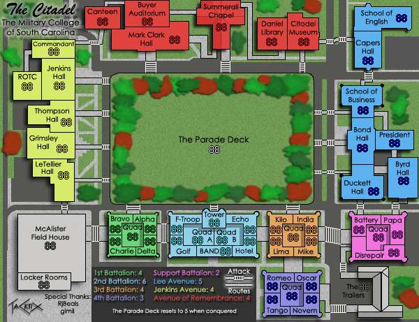
I'm still saying 'hmm' every time I look at the tower... it just doesn't seem right visually, and while it seems to border the Parade Deck it doesn't make sense why it would. The tower may require a rethink.

Re: The Citadel V12 (Pg1+13) [I] Parade Deck Poll 5/22/08 End
Maybe it's the perspective?oaktown wrote:... I'm still saying 'hmm' every time I look at the tower... it just doesn't seem right visually, ...
Perhaps a "from-above" view rather than the current "side-on" view would better fit the map's visual style?

Re: The Citadel V13 (Pg1+14) [I] 21-May-08 Update
I also got bit pretty hard making it wider to fit The Tower's text in (which is still smaller than every other territory). I can do a "from above" perspective, and add in the appropriate attack route in front of the battalion. That said, I will have to drop having the text on the territory directly, as the Tower is most certainly square, and not some bizarre rectangle.
-
gimil

- Posts: 8599
- Joined: Sat Mar 03, 2007 12:42 pm
- Gender: Male
- Location: United Kingdom (Scotland)
Re: The Citadel V13 (Pg1+14) [I]
gimil wrote:Trees need a drop shadow.
What do you know about map making, bitch?
Top Score:2403natty_dread wrote:I was wrong
Re: The Citadel V13 (Pg1+14) [I] 21-May-08 Update
Maybe it might help if the text was just "Tower"?TaCktiX wrote:I also got bit pretty hard making it wider to fit The Tower's text in (which is still smaller than every other territory). I can do a "from above" perspective, and add in the appropriate attack route in front of the battalion. That said, I will have to drop having the text on the territory directly, as the Tower is most certainly square, and not some bizarre rectangle.

Re: The Citadel V13 (Pg1+14) [I]
When i said they didnt fit the theme, i meant the gfx theme. Everything is so straight, and one color. The trees are blobs, and each tree has many colors. They look good, but i think they look out of place. I think you should have trees, just they should look different.TaCktiX wrote:The trees fill up a lot of empty space. Now that I look at them post-update, they look awful. I'll go back to the drawing board on creating them, but they're staying. And they DO fit the theme, as there are trees in virtually the same locations in reality (I took artistic liberty with how many trees, and what color, but they really do encircle the Deck).
.
Plus gimil is right, they need shadows.

Re: The Citadel V13 (Pg1+14) [I]
I am going to disagree with you here. This map has been, from the start, an attempt to get the campus exactly "as it is". If there's a sidewalk somewhere and it looks like that on the map, you can guarantee that there is a sidewalk identical to it in reality. If a building has a parking lot next to it, there really is a parking lot there. I've had to take a little artistic license to make it look cleaner, but of late I have been adding things that are on campus that I didn't have the technical capability to do before. There are multi-colored trees around the Deck, and all over campus. They're all relatively old (50+ years) and very large. I've said before their size, number, and actual color may be inaccurate strictly speaking, but that's artistic license to keep the map fairly simple to edit (relatively). So no, they do not look out of place, they are fully in keeping with the theme I have been working on from the start.Kaplowitz wrote:When i said they didnt fit the theme, i meant the gfx theme. Everything is so straight, and one color. The trees are blobs, and each tree has many colors. They look good, but i think they look out of place. I think you should have trees, just they should look different.
I recraft them, they'll get drop shadows, don't worry.Plus gimil is right, they need shadows.
Yeah, I'll do that. We refer to it on campus as "The Tower", but for readability reasons I can trim it up.grayhawke wrote:Maybe it might help if the text was just "Tower"?
I was burned out from doing all the other updates, so I didn't look at the size of the attack routes much. This will be fixed (I've got the space, easily).oaktown wrote:New attack routes are thinner than the rest and easy to miss.

Re: The Citadel V13 (Pg1+14) [I] 21-May-08 Update
Just a quick drop-in -- I really like the trees (and the look of the map in general).
I may actually start contributing... I've been kinda lurking this thread...
I may actually start contributing... I've been kinda lurking this thread...
Re: The Citadel V13 (Pg1+14) [I]
wait, there are new attack routes? cause i cant find any.....TaCktiX wrote:I was burned out from doing all the other updates, so I didn't look at the size of the attack routes much. This will be fixed (I've got the space, easily).oaktown wrote:New attack routes are thinner than the rest and easy to miss.
Re: The Citadel V13 (Pg1+14) [I] 21-May-08 Update
Can you at least remove the texture of the trees...just to see how they look? I think that would make me happy. 
I fully believe that the trees are there in real life, exactly how you drew them-- and i like the trees there. Its just they look out of place compared to the rest of the map. I want trees, but i want them to look simpler.
I fully believe that the trees are there in real life, exactly how you drew them-- and i like the trees there. Its just they look out of place compared to the rest of the map. I want trees, but i want them to look simpler.

Re: The Citadel V13 (Pg1+14) [I]
TaCktix...on assignment here to assist with graphics comments:TaCktiX wrote:The trees fill up a lot of empty space. Now that I look at them post-update, they look awful. I'll go back to the drawing board on creating them, but they're staying. And they DO fit the theme, as there are trees in virtually the same locations in reality (I took artistic liberty with how many trees, and what color, but they really do encircle the Deck).
EDIT: Forgot the army placement notes. Here's the image:
I'll be editing 2nd battalion to have better-spaced borders, but I'm pretty sure if I notched an 888 test on everything, they'd be fine.
I think the trees are a great addition and yes they fill up real estate on the map. They could do with a little improvement with some additions of light and shade being the main points i would add.
This is looking very clean and clear, although i am a little confused in front of Jenkins Ave with the white paths all over the place there. It seems excessive and sometimes as you know less is more. I understand what you are trying to do there, but players might ask what do they mean or what are they there for.
The same with the path from President to School of Business, is that a legit attack path of just there for decoration, because it doesn't correspond to the Attack Route in the legend.
Also, is there an attack route between Kilo/Lima and Echo/Hotel, and from Romeo/Oscar to LIma/Mike, also Bryd Hall to Ducket Hall.
I think the legend could do with something special, not too much, perhaps a nice simple thin border, and is it possible to place the Avenue of Remembrance under Jenkins Ave, and re-position that instruction on the Parade Deck across the bottom of the legend in one sentence ??!
The rounded corners near McAlister Field House are a little jagged, is it possible to smooth that.
Overall though, shaping up nicely.

* Pearl Harbour * Waterloo * Forbidden City * Jamaica * Pot Mosbi
Re: The Citadel V13 (Pg1+14) [I]
I think they look awful at the present time, I will be redoing them, and including shadow.cairnswk wrote:I think the trees are a great addition and yes they fill up real estate on the map. They could do with a little improvement with some additions of light and shade being the main points i would add.
Note also that there are clear paths exiting buildings and going to the Parade Deck. The sidewalks on that side of campus are relatively intricate, and each building has a different style in front of it for whatever reason. It follows my theme and since it isn't messing up map clarity, I don't think it needs changing.This is looking very clean and clear, although i am a little confused in front of Jenkins Ave with the white paths all over the place there. It seems excessive and sometimes as you know less is more. I understand what you are trying to do there, but players might ask what do they mean or what are they there for.
I need to widen those attack routes (President to Business), and I will add a note of black-outlined routes also being attack routes.The same with the path from President to School of Business, is that a legit attack path of just there for decoration, because it doesn't correspond to the Attack Route in the legend.
Also, is there an attack route between Kilo/Lima and Echo/Hotel, and from Romeo/Oscar to LIma/Mike, also Bryd Hall to Ducket Hall.
I like that idea, so I will certainly do it.I think the legend could do with something special, not too much, perhaps a nice simple thin border, and is it possible to place the Avenue of Remembrance under Jenkins Ave, and re-position that instruction on the Parade Deck across the bottom of the legend in one sentence ??!
On the To Do.The rounded corners near McAlister Field House are a little jagged, is it possible to smooth that.
With a few more adjustments I think this map will be ready for the one-two punch of Gp and Gr.Overall though, shaping up nicely.
Re: The Citadel V13 (Pg1+14) [I]
Mmmmm it is a little confusing as i have said. Perhaps lower the opacity or lessen the colour so that don't show up so much. If they are not important to gameplay, it is more important to have the attack routes most visible to avoid confusing players.TaCktiX wrote: Note also that there are clear paths exiting buildings and going to the Parade Deck. The sidewalks on that side of campus are relatively intricate, and each building has a different style in front of it for whatever reason. It follows my theme and since it isn't messing up map clarity, I don't think it needs changing.
* Pearl Harbour * Waterloo * Forbidden City * Jamaica * Pot Mosbi

Re: The Citadel V13 (Pg1+14) [I] 21-May-08 Update
I don't like the map title up in the corner. I didn't even see it the first half dozen times I looked at this version. I liked it emphasized in the middle. If you're scratching that for gameplay reasons (or whatever), it needs some emphasis like increasing the yellow glow.
The quads all seem to be sinking. I guess it would make sense that these are outdoor areas in real life. Nonetheless, the shadows are sort of confusing because until you added them I was just thinking of them as another room.
LMR
The quads all seem to be sinking. I guess it would make sense that these are outdoor areas in real life. Nonetheless, the shadows are sort of confusing because until you added them I was just thinking of them as another room.
LMR
Last edited by laci_mae on Thu May 29, 2008 1:51 am, edited 1 time in total.
Re: The Citadel V13 (Pg1+14) [I] 21-May-08 Update
The crosswalks look like ladders. It took me a long time to realize what they were.
Maybe you should reduce their opacity or something. I'm not quite sure, but I think it's because they stick out too much.
Maybe you should reduce their opacity or something. I'm not quite sure, but I think it's because they stick out too much.
Re: The Citadel V13 (Pg1+14) [I] 21-May-08 Update
Since the crosswalks are critical attack routes, I think it would be best to have them stand out too much.
Re: The Citadel V13 (Pg1+14) [I] 21-May-08 Update
But, but... ladders! Can't you just reduce the opacity a little bit? They'd be just as visible.
It's the only graphical issue I have.
It's the only graphical issue I have.
Re: The Citadel V13 (Pg1+14) [I] 21-May-08 Update
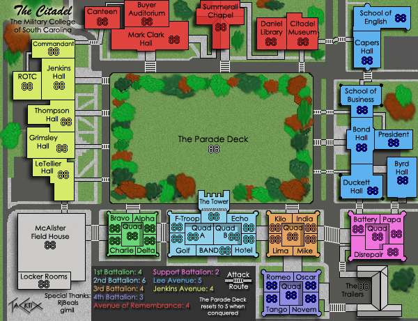
Version 14
Updates:
- Smoothed up the edges of the Parade Deck
- Corrected 2nd Battalion to look the same numbers-wise as the other battalions
- Made the title bigger and more visible
- Added the 2nd Attack Route to explain things
- Made the Parade Deck note one line (leaves me space for more explanation if I need it, too!)
- Redid the trees
- Crafted a different Tower, now showing the pillars "below" the tower section
- Created some more inter-continent attack routes
- Made previously extant attack routes more obvious
- Smoothed the curving roads
Small Version (600x461)
Large Version (700x538)
On the large, I'm going to have to do a Cairns-style split. All the single-pixel stuff I did (borders, attack routes) gets messed up badly by the upsize. It's posted to show that it does look fine at a larger size without any hefty optimizing. I'll wait to rightfully split the map when graphics on the Small have been cleared through.
To Do:
- Make the crosswalks a little more washed out so we don't have InkL0sed's ladder problem
Updates:
- Smoothed up the edges of the Parade Deck
- Corrected 2nd Battalion to look the same numbers-wise as the other battalions
- Made the title bigger and more visible
- Added the 2nd Attack Route to explain things
- Made the Parade Deck note one line (leaves me space for more explanation if I need it, too!)
- Redid the trees
- Crafted a different Tower, now showing the pillars "below" the tower section
- Created some more inter-continent attack routes
- Made previously extant attack routes more obvious
- Smoothed the curving roads
Small Version (600x461)
Large Version (700x538)
- Click image to enlarge.

To Do:
- Make the crosswalks a little more washed out so we don't have InkL0sed's ladder problem

Re: The Citadel V14 (Pg1+15) [I] 6/2/08 Small + Large
Two issues;
1. The parade deck doesn't actually reset when conquered... it is reset at the beginning of your following turn. It's a subtle nuance of language that I think needs to be changed, although I cannot think of anyhting at the moment.
2. The 'ladders'. Reducing the opacity will help. Could you just clarify whether they're steps or paths? If they're steps, then they need to be slightly tapered, staggered. If they're paths, you could change the style of them - maybe extend the paler pathway texture (like the one you've used outside Jenkins)?
On another note, I like your choice of colours, and the parade deck looks great - just add the couple of tweaks that Cairns suggested.

Re: The Citadel V14 (Pg1+15) [I] 6/2/08 Small + Large
Ohhh.. I think it looks bad upsized. Could you post the real size of the most recent update?

-
gimil
- Posts: 8599
- Joined: Sat Mar 03, 2007 12:42 pm
- Gender: Male
- Location: United Kingdom (Scotland)
Re: The Citadel V14 (Pg1+15) [I] 6/2/08 Small + Large
I like the trees there well made, but I still don't feel they fit the theme of this map. However Ill wait and see what others feel about them.
What do you know about map making, bitch?
Top Score:2403natty_dread wrote:I was wrong
Re: The Citadel V14 (Pg1+15) [I] 6/2/08 Small + Large
Rj, refresh your browser. Sometimes the Small doesn't render (it's there).
Re: The Citadel V14 (Pg1+15) [I] 6/2/08 Small + Large
1. Parade Deck text could be larger.
2. i think you've gone the wrong way with the bushes...IMHO they are far too blurry now, i preferred them with some detail, the total blurry thing on the bushes doesn't fit with the rest of the map.
3. Drop "special thanks" text down a fraction.
4. and perhaps drop the continents in the legend down a bit so they are all squashing Attack Routes, the legend just needs re-spacing a bit, but it looks good now IMHO.
Great work.
* Pearl Harbour * Waterloo * Forbidden City * Jamaica * Pot Mosbi
Re: The Citadel V14 (Pg1+15) [I] 6/2/08 Small + Large
alright, I think I'm fine with the attack routes and the use of the quad. The comment (above) about the language of the attack routes is valid.
My only issue now is with the colors... as the Foundry's foremost authority in colorblindness some of the colors are a bit close, and while this doesn't affect my ability to tell the regions apart, I do have trouble telling the labels apart in the legend. Lee Avenue and 4th battalion are too similar, as are 2nd and Support, as are Jenkins and 3rd. Again, I can tell the actual regions apart, I just can't be sure of which region is which. This will require one of the following: 1) some kind of identification on the map itself (which is unwieldy I know); 2) changes to the color, or; 3) alterations to how you've laid out the legend. Since the legend is less than visually stunning to begin with I would suggest going with the third solution.
I haven't really examined the bonuses too very closely... I was about to when I noticed the color concern.