The Citadel [Quenched]
Moderator: Cartographers
Forum rules
Please read the Community Guidelines before posting.
Please read the Community Guidelines before posting.

Re: The Citadel V14 (Pg1+15) [I] 6/2/08 Small + Large
Oaktown, I just thought of the cutest solution to your noted problem. Expect a fairly quick update tomorrow.

Re: The Citadel V13 (Pg1+14) [I] 21-May-08 Update
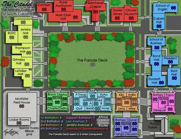
I'm still not totally satisfied with the bushes. They need a little more texture added to them, like more noise or speckles. And maybe remove the red ones?
The legend sentence "The Parade Deck resets....." is very small and blurry on monitor. It's really bad.
What are those black dots around the school of business? columns? If so, they should be adjusted to look like columns. It looks like a pixel smudge now.
Could you move the Capers Hall pathway down a bit so it lines up with the Citadel Museum? That way you wouldn't need to do that curved connector between them. It looks awkward now. I know it's not how a satellite would show it, but sometimes for the good of the map, changes need to be made (as you are aware).
The red armies on the red roofs look very similar. I think it will work since the roof has no texture, but you may want to check with others with different monitors and make sure they can distinguish the armies okay.
The Battalions look like the center areas are sunken in. Like it's a concave roof - Does that make sense? Is that the way it's suppose to look?
Overall, It's okay. I wish there was a little more style to some of the buildings, maybe more of an angle or something. They are really just colored blocks in a sense. Like the Summerall Chapel really looks better than the other buildings because of the sloped roof, and the slight shading on the one side. It gives it some depth. But I think overall it's good.

Re: The Citadel V13 (Pg1+14) [I] 21-May-08 Update
I didn't like the red ones that much anyway. The drop shadow is doing wonders for the trees, really, you should see the raw source without that effect on them. I'll add a smidge of noise to them all to see if that alleviates things. I like the mod-ability of the new trees a great deal better, so making edits won't be that hard.RjBeals wrote:I'm still not totally satisfied with the bushes. They need a little more texture added to them, like more noise or speckles. And maybe remove the red ones?
Just wait for the cutesy solution to Oaktown's continent differentiation issue.The legend sentence "The Parade Deck resets....." is very small and blurry on monitor. It's really bad.
They're little minarets that extend about 3-6 feet above the corners of the building, but from the sky view they don't look that great. I'll just drop them, as they add confusion and not character.What are those black dots around the school of business? columns? If so, they should be adjusted to look like columns. It looks like a pixel smudge now.
Reality invades again! Actually, my sidewalk in the middle is inaccurate, it's just a straight at an angle in reality. But to keep the Harbingers of Unclearness from signaling the Apocalypse of the Foundry, I'll straighten it.Could you move the Capers Hall pathway down a bit so it lines up with the Citadel Museum? That way you wouldn't need to do that curved connector between them. It looks awkward now. I know it's not how a satellite would show it, but sometimes for the good of the map, changes need to be made (as you are aware).
Simple desaturation of the red color should do the trick. Gogo color overlay!The red armies on the red roofs look very similar. I think it will work since the roof has no texture, but you may want to check with others with different monitors and make sure they can distinguish the armies okay.
Yup, those are the quads, a flat center section that's 4 stories below the top of the barracks. They're red and white checker pattern in reality, but yes, that IS the look I'm going for.The Battalions look like the center areas are sunken in. Like it's a concave roof - Does that make sense? Is that the way it's suppose to look?
I've made several comments about the sheer flatness of campus. Places where there are height differences I could make use of end up muddying the clean text (see Version 7 for examples of plenty of this), or just plain look bad, so inner shadowing won't work. I'll see if there's something else that can be done.Overall, It's okay. I wish there was a little more style to some of the buildings, maybe more of an angle or something. They are really just colored blocks in a sense. Like the Summerall Chapel really looks better than the other buildings because of the sloped roof, and the slight shading on the one side. It gives it some depth. But I think overall it's good.

Re: The Citadel V14 (Pg1+15) [I] 6/2/08 Small + Large
We like cute in the foundry. And cuddly. Like blinking rabbits that we get to shoot.TaCktiX wrote:Oaktown, I just thought of the cutest solution to your noted problem. Expect a fairly quick update tomorrow.
A stripped-down inset map would do the trick, but I look forward to what you have planned.

Re: The Citadel V14 (Pg1+15) [I] 6/2/08 Small + Large
I like the look at the moment because (don't take this the wrong way) it looks like the overhead of a school project someone made and brought in for a competition or something.
So in that sense, I think the trees fit, but probably showing a bit more depth would help.
So in that sense, I think the trees fit, but probably showing a bit more depth would help.
Re: The Citadel V14 (Pg1+15) [I] 6/2/08 Small + Large
Sorry about the delay. I would've released a version two days ago, but certain people *coughfoundrynewslettereditingstaffcough* have sat back and let me do the long and arduous task of writing up all the maps currently in progress in the Foundry. I really need to get this cough checked out.
Re: The Citadel V14 (Pg1+15) [I] 6/2/08 Small + Large
Hi Tac -
When I was talking about adding some depth to your buildings the other day, this is an example of what I was speaking of. I also changed the tree/bush look, and reduced the font to give more room for the armies. what do ya think? The buildings don't look so flat with that gradient applied.
When I was talking about adding some depth to your buildings the other day, this is an example of what I was speaking of. I also changed the tree/bush look, and reduced the font to give more room for the armies. what do ya think? The buildings don't look so flat with that gradient applied.

Re: The Citadel V14 (Pg1+15) [I] 6/2/08 Small + Large
I likey!RjBeals wrote:Hi Tac -
When I was talking about adding some depth to your buildings the other day, this is an example of what I was speaking of. I also changed the tree/bush look, and reduced the font to give more room for the armies. what do ya think? The buildings don't look so flat with that gradient applied.
LMR

Re: The Citadel V14 (Pg1+15) [I] 6/2/08 Small + Large
Yes, bevels are always great.
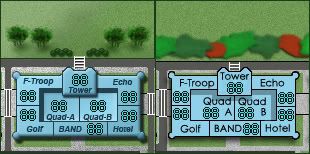
I think maybe another reason the crosswalks look like ladders is that they seem to fit outside of the paths by they connect by about a pixel, if you see what I mean. I think maybe if you narrowed them by two pixels on either side, it might help how they look. Not sure about this though.
I think maybe another reason the crosswalks look like ladders is that they seem to fit outside of the paths by they connect by about a pixel, if you see what I mean. I think maybe if you narrowed them by two pixels on either side, it might help how they look. Not sure about this though.
-
AndyDufresne

- Posts: 24932
- Joined: Fri Mar 03, 2006 8:22 pm
- Location: A Banana Palm in Zihuatanejo
- Contact:
Re: The Citadel V14 (Pg1+15) [I] 6/2/08 Small + Large
I think RJ may be on to something...
--Andy
--Andy
Re: The Citadel V14 (Pg1+15) [I] 6/2/08 Small + Large
Version 15
Updates:
- Washed out the sidewalks so they're a little more sidewalk-y and less ladder
- Removed the red trees (found out it looks fine without them entirely)
- Reordered the legend to make it colorblind understandable
- Added gradient and bevel to all the buildings to add a depth to them
- Increased the size of the Parade Deck text
- Moved signature and attack routes
- Removed the really bad turrets from Bond Hall
- Altered the color of Jenkins Avenue to look good with the gradient
- Straightened the attack route between Capers Hall and the Citadel Museum
Small version (600x461)
Large version (700x538)
Points of DIscussion:
- Colorblindness, is it good? I noticed that 1st/3rd and 4th/Support look the most similar, and the way I've got it organized should make it easier, but I need a checkoff from Oaktown or somebody.
- Are the attack routes in the legend clear? Are the ones on the map less ladder and more crosswalk?
- Did the gradient and bevel make the buildings more "real" as it were? (Thanks for the suggestion Rj, I really like it)
- I'm at my technical limit when it comes to the trees. I don't know how to "unblur" them, or make them any more finely detailed right now. If someone would like to make the trees and let me import, I'll give proper credit, but I can't do any more than what you see.
To Do:
- Completely and totally forgot to rephrase the killer neutral notification in the legend. It will read "The Parade Deck resets to 5 at the start of the holding player's turn". D'oh!
Updates:
- Washed out the sidewalks so they're a little more sidewalk-y and less ladder
- Removed the red trees (found out it looks fine without them entirely)
- Reordered the legend to make it colorblind understandable
- Added gradient and bevel to all the buildings to add a depth to them
- Increased the size of the Parade Deck text
- Moved signature and attack routes
- Removed the really bad turrets from Bond Hall
- Altered the color of Jenkins Avenue to look good with the gradient
- Straightened the attack route between Capers Hall and the Citadel Museum
Small version (600x461)
Large version (700x538)
- Click image to enlarge.

- Colorblindness, is it good? I noticed that 1st/3rd and 4th/Support look the most similar, and the way I've got it organized should make it easier, but I need a checkoff from Oaktown or somebody.
- Are the attack routes in the legend clear? Are the ones on the map less ladder and more crosswalk?
- Did the gradient and bevel make the buildings more "real" as it were? (Thanks for the suggestion Rj, I really like it)
- I'm at my technical limit when it comes to the trees. I don't know how to "unblur" them, or make them any more finely detailed right now. If someone would like to make the trees and let me import, I'll give proper credit, but I can't do any more than what you see.
To Do:
- Completely and totally forgot to rephrase the killer neutral notification in the legend. It will read "The Parade Deck resets to 5 at the start of the holding player's turn". D'oh!
Re: The Citadel V15 (Pg1+16) [I] 6/10/08 Small + Large
I don't think resizing the map for the large version is going to pass. It's way too blurry/pixelly; makes me go all cross-eyed.
This is why the large should be done first...
This is why the large should be done first...
Re: The Citadel V15 (Pg1+16) [I] 6/10/08 Small + Large
I noted before for Version 14 (first with a large) that all of my one-pixel manipulations (borders, attack routes) get completely screwed up by the straight resize. I will split the map to fix the issues, but only once the Small is satisfactory. As for the "do the large first", this map would not have been very good if I had started with the large, for if I had I would've tried to stick more of campus into the map, creating major readability issues in the small.
Re: The Citadel V15 (Pg1+16) [I] 6/10/08 Small + Large
Sadly, I agree... are you resizing it by saving it as a larger jpeg with new dimensions? because it would look better if you resized it first and then saved it, but depending on how you created your individual elements you might be screwed.InkL0sed wrote:I don't think resizing the map for the large version is going to pass. It's way too blurry/pixelly; makes me go all cross-eyed.
This is why the large should be done first...
You've got the right idea in running the legend date around the quad. Any chance you can somehow find enough room to fit each title in the correct spot? It took me a minute to figure out what you were doing, since 2nd battalion is next to 4th battalion in the legend but not on the map. Abbreviate battalion maybe? Ideally it would be:
1st ........... 2nd .......... 3rd Batt. +4
Batt. ......... Batt.
+4 ........... +6 ........... 4th Batt. +3
Re: The Citadel V15 (Pg1+16) [I] 6/10/08 Small + Large
I did resize in PSD first. As I said, all the hand-done one-pixel elements got broken by the upsize because PhotoShop almost universally decided to make them 2 pixels. I would like to minimize the amount of time I have to edit two maps, version wise. I can easily make the necessary edits to make the large not look so "wrong", but considering that I'm making a dozen sizable edits per version of the Small, replicating them on the large does not work for my time schedule (consider that I was a week late on releasing this version).
I'll do those abbreviations, and we both know that's a minor change. Are the bonuses fine, is everything clear and readable, any other hoops I need to jump through?
I'll do those abbreviations, and we both know that's a minor change. Are the bonuses fine, is everything clear and readable, any other hoops I need to jump through?
Re: The Citadel V15 (Pg1+16) [I] 6/10/08 Small + Large
Much better without the red bushes.
I think you've added too much gradient - it doesn't look right, although it's better imo.
or maybe try adding some gradient to the field also.
I'm not a fan of the bushes.
If you want the psd of the tree's i used in that small example, let me know. You could use those trees.
For your font, try arial / sharp / 7 pt. See if that helps.
Re: The Citadel V15 (Pg1+16) [I] 6/10/08 Small + Large
Hi Tack,
Nice update. Possibly you could make the Parade Deck green in the legend. Move it a little further toward being a "mini-map" style legend.
As for the trees, I don't see any reason for them to look realistic while the buildings do not. So long as the buildings remain many fabulous colors, they won't appear real, and it seems that real trees would look out of place. IMO of course!
Best,
LMR
-
gimil

- Posts: 8599
- Joined: Sat Mar 03, 2007 12:42 pm
- Gender: Male
- Location: United Kingdom (Scotland)
Re: The Citadel V15 (Pg1+16) [I] 6/10/08 Small + Large
I dont have time to look over this but that was a fantastic update tack. My hat off to you. 
What do you know about map making, bitch?
Top Score:2403natty_dread wrote:I was wrong
Re: The Citadel V15 (Pg1+16) [I] 6/10/08 Small + Large
Many thanks to RjBeals for the entire source for the new trees in this version.
Version 16
Updates:
- Changed out the trees
- Edited the text map so it mirrors the actual map
- Lessened the gradient's strength
- Put the text map's Parade Deck on its own layer (it was on the color overlay layer)
- Changed the killer neutral explanation to be more accurate
Small version (600x461)
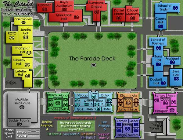
Large Version (700x538)
Discussion points:
- Bonuses, good?
- The new trees, good/bad/ugly?
- Map 100% understandable?
- Anything I'm missing?
Version 16
Updates:
- Changed out the trees
- Edited the text map so it mirrors the actual map
- Lessened the gradient's strength
- Put the text map's Parade Deck on its own layer (it was on the color overlay layer)
- Changed the killer neutral explanation to be more accurate
Small version (600x461)
Large Version (700x538)
- Click image to enlarge.

- Bonuses, good?
- The new trees, good/bad/ugly?
- Map 100% understandable?
- Anything I'm missing?
Re: The Citadel V16 (Pg1+17) [I] 6/12/08 Small + Large
Holy Crap!
Great Update!
That looks waaayyy better than the previous update. Those bushes you had before just didn't look right. I think you're pretty damn close to FF now. In fact, there's not much else I can comment on. Some of the text still looks a little blurry, but not bad. Have you tried to bring anyone in for comments from the live chat area? Of solicited feedback from some of the other players in your games? Recently, It feel like the same 8-10 people are doing all the commenting in the foundry (including on my map). I would be nice to have some fresh eyes give some feedback.
Nice job though Tac. You've taken and used all the feedback we've given you and applied it well. This map has gone through some serious visual upgrades since it's start.
Edit: My only regret is that I don't have a territory in my Charleston map simply called "The Citadel"
Re: The Citadel V16 (Pg1+17) [I] 6/12/08 Small + Large
I think I'm going to do a quick comparison to shock and awe people.
Version 1

Version 16
That said, I'll hit some people up in games I'm enjoying right now and see if they do anything (honestly haven't thought of advertising it much).
Version 1
Version 16
That said, I'll hit some people up in games I'm enjoying right now and see if they do anything (honestly haven't thought of advertising it much).

Re: The Citadel V16 (Pg1+17) [I] 6/12/08 Small + Large
map is looking very good. i look forward to playing you on it.
Re: The Citadel V16 (Pg1+17) [I] 6/12/08 Small + Large
cheers for the link, this map looks awesome!
i'd definatly play it, not too comlicated which puts me off a map .
.
like the idea of the +5 on conquer its very original
i'd definatly play it, not too comlicated which puts me off a map
like the idea of the +5 on conquer its very original
Re: The Citadel V16 (Pg1+17) [I] 6/12/08 Small + Large
So any other comments for this map? For the first time people aren't coming up with a laundry list for me to fix.
Re: The Citadel V16 (Pg1+17) [I] 6/12/08 Small + Large
maybe group your tree's a little different, so they are not directly in front of some of the walkways leading into the parade deck. I dunno - that's about all I can offer right now. The map looks complete to me.