
well i'm gunna sleep now cuz i have to work very early tomorrow, so i have no time to do fix it now.
i hope i can fix it in the evenening or something tomorrow, can you please be more specific about which territories should be moved? that helps a lot.
Oasis [Quenched]
Moderator: Cartographers
Forum rules
Please read the Community Guidelines before posting.
Please read the Community Guidelines before posting.
Re: Oasis -- XML & 88 tests: Pg 43 [Final Forge]
- Click image to enlarge.


Re: Oasis -- XML & 88 tests: Pg 43 [Final Forge]
Congrats on FF all. Well Done. 

* Pearl Harbour * Waterloo * Forbidden City * Jamaica * Pot Mosbi
-
snapdoodle

- Posts: 190
- Joined: Tue Jul 10, 2007 1:40 pm
Re: Oasis -- XML & 88 tests: Pg 43 [Final Forge]
congratulations!
almost there.
I think you will have a tough time fixing the overlap however without doing some redesign.
Desert 2 and Nezrah look like they need their borders redrawn... less Nezrah but more Desert 2.
almost there.
I think you will have a tough time fixing the overlap however without doing some redesign.
Desert 2 and Nezrah look like they need their borders redrawn... less Nezrah but more Desert 2.

Re: Oasis -- XML & 88 tests: Pg 43 [Final Forge]
Desert 57 definitely needs its army numbers slightly lower...
-
wcaclimbing

- Posts: 5598
- Joined: Fri May 12, 2006 10:09 pm
- Location: In your quantum box....Maybe.
- Contact:
Re: Oasis -- XML & 88 tests: Pg 43 [Final Forge]
I'm going to change the desert on slall version to a more simple font. And ill move the teritory names closer to the top edge of each area so there is more space for numbers on small. The large can stay like it is now, because it is good like it is now.
Ill do that if you guys want me to. Image will be up in a few days.
*waits to see if people agree*
Ill do that if you guys want me to. Image will be up in a few days.
*waits to see if people agree*

Re: Oasis -- XML & 88 tests: Pg 43 [Final Forge]
wcaclimbing wrote:I'm going to change the desert on slall version to a more simple font. And ill move the teritory names closer to the top edge of each area so there is more space for numbers on small. The large can stay like it is now, because it is good like it is now.
Ill do that if you guys want me to. Image will be up in a few days.
*waits to see if people agree*
fine with that

Re: Oasis -- XML & 88 tests: Pg 43 [Final Forge]
Howzat?!InkL0sed wrote:*cricket*
C.

Highest score : 2297

Re: Oasis -- XML & 88 tests: Pg 43 [Final Forge]
good idea u should follw it up 
-
wcaclimbing
- Posts: 5598
- Joined: Fri May 12, 2006 10:09 pm
- Location: In your quantum box....Maybe.
- Contact:
Re: Oasis -- XML & 88 tests: Pg 43 [Final Forge]
yes.InkL0sed wrote:*cricket*
I'll be finishing it up tomorrow.
I'm remaking the desert text on the small version to something more readable. and it will be a smaller font at the same time, so more room for army numbers.
Re: Oasis -- XML & 88 tests: Pg 43 [Final Forge]
NatNat wrote:good idea u should follw it up
-
wcaclimbing
- Posts: 5598
- Joined: Fri May 12, 2006 10:09 pm
- Location: In your quantum box....Maybe.
- Contact:
Re: Oasis -- XML & 88 tests: Pg 43 [Final Forge]
I've redone all of the desert territory names. Giving Zimmah tons of room to work with.
And they are in a newer font that is much easier to read. and the font is a bit smaller at the same time. So lots of room for army numbers on the small version.
no updates to the large version. Large is finished.
So, here it is. I hope it gives Zimmah enough room to work with.
When you put the army numbers on, could you put them down lower than you had them?
From the little I know about Jota's XML coordinate thing, I think you'll have to enter the small coordinates seperately, and not use the scalable setting to make small and large at the same time (I think. Since the small image is now fairly different from the large, small will need different coordinates.)
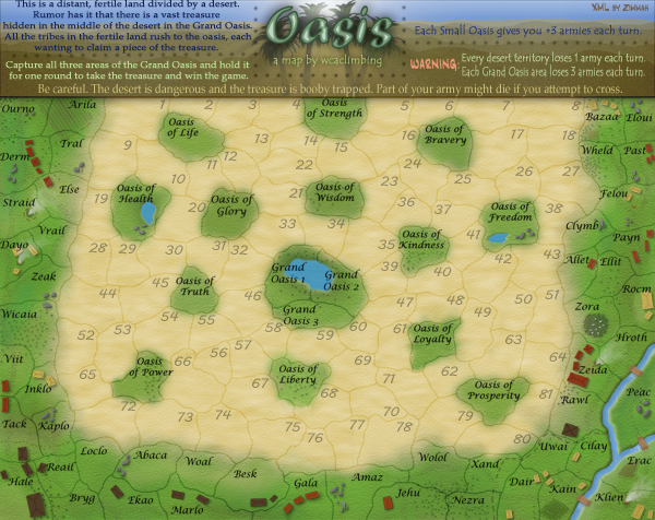
I hope that works for you. Good luck.
when you finish it, could you just quickly check to see if there are any that still overlap the names? No need to post the image if there are flaws in it. you could easily fix any issues and wait and post it until all the numbers fit.
EDIT: for the visuals, do you think that the font on the large version should be the same grey color I just used on the small? Or does the large look ok. it'd be an easy change. just a quick change of the layer setting.
And they are in a newer font that is much easier to read. and the font is a bit smaller at the same time. So lots of room for army numbers on the small version.
no updates to the large version. Large is finished.
So, here it is. I hope it gives Zimmah enough room to work with.
When you put the army numbers on, could you put them down lower than you had them?
From the little I know about Jota's XML coordinate thing, I think you'll have to enter the small coordinates seperately, and not use the scalable setting to make small and large at the same time (I think. Since the small image is now fairly different from the large, small will need different coordinates.)
I hope that works for you. Good luck.
when you finish it, could you just quickly check to see if there are any that still overlap the names? No need to post the image if there are flaws in it. you could easily fix any issues and wait and post it until all the numbers fit.
EDIT: for the visuals, do you think that the font on the large version should be the same grey color I just used on the small? Or does the large look ok. it'd be an easy change. just a quick change of the layer setting.

Re: Oasis -- XML & 88 tests: Pg 43 [Final Forge]
I think you should make the large version like the small one. Its looks much better now. =)wcaclimbing wrote:I've redone all of the desert territory names. Giving Zimmah tons of room to work with.
And they are in a newer font that is much easier to read. and the font is a bit smaller at the same time. So lots of room for army numbers on the small version.
no updates to the large version. Large is finished.
So, here it is. I hope it gives Zimmah enough room to work with.
When you put the army numbers on, could you put them down lower than you had them?
From the little I know about Jota's XML coordinate thing, I think you'll have to enter the small coordinates seperately, and not use the scalable setting to make small and large at the same time (I think. Since the small image is now fairly different from the large, small will need different coordinates.)
I hope that works for you. Good luck.
when you finish it, could you just quickly check to see if there are any that still overlap the names? No need to post the image if there are flaws in it. you could easily fix any issues and wait and post it until all the numbers fit.
EDIT: for the visuals, do you think that the font on the large version should be the same grey color I just used on the small? Or does the large look ok. it'd be an easy change. just a quick change of the layer setting.

-
wcaclimbing
- Posts: 5598
- Joined: Fri May 12, 2006 10:09 pm
- Location: In your quantum box....Maybe.
- Contact:
Re: Oasis -- XML & 88 tests: Pg 43 [Final Forge]
With the same font on both? Or just the grey text instead of tan?Androidz wrote: I think you should make the large version like the small one. Its looks much better now. =)

Re: Oasis -- Small Updated, Page 45 (june 24th) [Final Forge]
I think both the large and small would look good in a different color, neither the current tan nor grey. Maybe a darker tan? Something darker so it can be read, but with a bit more punch than grey.
Re: Oasis -- XML & 88 tests: Pg 43 [Final Forge]
I would go with Zeak suggestion, make the than darker in the bigger version. but i think the small is good as it is now.wcaclimbing wrote:With the same font on both? Or just the grey text instead of tan?Androidz wrote: I think you should make the large version like the small one. Its looks much better now. =)
-
whitestazn88
- Posts: 3128
- Joined: Mon Feb 05, 2007 2:59 pm
- Gender: Male
- Location: behind you
- Contact:
Re: Oasis -- Small Updated, Page 45 (june 24th) [Final Forge]
i haven't checked up on this in a while, but it looks good to me, i especially like that title top thingy
Re: Oasis -- Small Updated, Page 45 (june 24th) [Final Forge]
Eh, I'm not crazy about this font, but I admit it's very legible now.
-
wcaclimbing
- Posts: 5598
- Joined: Fri May 12, 2006 10:09 pm
- Location: In your quantum box....Maybe.
- Contact:
Re: Oasis -- Small Updated, Page 45 (june 24th) [Final Forge]
Does anyone know where Zimmah is?
I sent him a PM on thursday, and he still hasn't read it.....
*waits*
I sent him a PM on thursday, and he still hasn't read it.....
*waits*
-
wcaclimbing
- Posts: 5598
- Joined: Fri May 12, 2006 10:09 pm
- Location: In your quantum box....Maybe.
- Contact:
Re: Oasis -- Small Updated, Page 45 (june 24th) [Final Forge]
still waiting....
6 days so far.
is Zimmah on vacation?
he hasn't even opened the pm.
6 days so far.
is Zimmah on vacation?
he hasn't even opened the pm.
Re: Oasis -- Small Updated, Page 45 (june 24th) [Final Forge]
Can't you do it yourself...?
PS. I just checked his games, and he's deadbeating them...
PS. I just checked his games, and he's deadbeating them...
-
wcaclimbing
- Posts: 5598
- Joined: Fri May 12, 2006 10:09 pm
- Location: In your quantum box....Maybe.
- Contact:
Re: Oasis -- Small Updated, Page 45 (june 24th) [Final Forge]
I could, but it'd mean I'd have to learn how to work the XML coordinate tool thing.InkL0sed wrote:Can't you do it yourself...?
I've never even attempted anything with XML.
if zimmah doesn't show up soon, I might try it myself.
Re: Oasis -- Small Updated, Page 45 (june 24th) [Final Forge]
It's not that hard. The top left corner is (0, 0) and the bottom right is (xmax, ymax). Using that, you can mess around with the misplaced coords in the XML file by moving each a few pixels left/right/up/down until it's good, and then test it in the XML centering tester (clicky). Slow, a tiny bit tedious, but if I've found (in my limited experience) that even Jota's map assistant gives coordinates that need to be tweaked a bit.wcaclimbing wrote:I could, but it'd mean I'd have to learn how to work the XML coordinate tool thing.InkL0sed wrote:Can't you do it yourself...?
I've never even attempted anything with XML.
if zimmah doesn't show up soon, I might try it myself.
-
skanska

- Posts: 121
- Joined: Sat May 20, 2006 10:04 am
- Location: terrorist training camp, Washington DC
Re: Oasis -- Small Updated, Page 45 (june 24th) [Final Forge]
still not finished eh wca?
too bad
cuz i wanna play!!! this map has gotten a lot more interesting (both visually and strategically) since you first showed it to me, should be fun
too bad
cuz i wanna play!!! this map has gotten a lot more interesting (both visually and strategically) since you first showed it to me, should be fun
