Onwards and upwards!
Feudal Epic, L&S, Pg. 49 [D, Gp, Gr]
Moderator: Cartographers
Forum rules
Please read the Community Guidelines before posting.
Please read the Community Guidelines before posting.
-
gimil

- Posts: 8599
- Joined: Sat Mar 03, 2007 12:42 pm
- Gender: Male
- Location: United Kingdom (Scotland)
Re: Feudal Epic *The sequal to Feudal War!* Pg. 18 [I, Gp]
Thank you Ian 
Onwards and upwards!
Onwards and upwards!
What do you know about map making, bitch?
Top Score:2403natty_dread wrote:I was wrong

Re: Feudal Epic *The sequal to Feudal War!* Pg. 18 [I, Gp]
Let's get this show on the roaadd
-
Kotaro

- Posts: 3467
- Joined: Sat Mar 03, 2007 2:31 pm
- Location: TheJonah: You`re a fucking ruthless, little cunt!
Re: Feudal Epic *The sequal to Feudal War!* Pg. 18 [I, Gp]
Epic win!
Lakad Matataaag!
Normalin, normalin.

Normalin, normalin.
TheJonah wrote:I`m not really that arsed. Just supporting my mucker.

Re: Feudal Epic *The sequal to Feudal War!* Pg. 18 [I, Gp]
yaya cant wait for this map to be quenched


Re: Feudal Epic *The sequal to Feudal War!* Pg. 18 [I, Gp]
The rivers are too light in color. I wish the castles were more realistic and not so tinker-toy. It's would be nice to see some trees in there, this is a deforested land apparently.
-
Kotaro
- Posts: 3467
- Joined: Sat Mar 03, 2007 2:31 pm
- Location: TheJonah: You`re a fucking ruthless, little cunt!
Re: Feudal Epic *The sequal to Feudal War!* Pg. 18 [I, Gp]
mibi wrote:The rivers are too light in color.
Agreed.
I wish the castles were more realistic and not so tinker-toy.
Don't really agree, they look fine.
It's would be nice to see some trees in there, this is a deforested land apparently.
To build siege engines, one must harvest all the wood they can.
Lakad Matataaag!
Normalin, normalin.
Normalin, normalin.
TheJonah wrote:I`m not really that arsed. Just supporting my mucker.

Re: Feudal Epic *The sequal to Feudal War!* Pg. 18 [I, Gp]
im playing a lot of fuedals lately am exited to see the new fuedal map and more players to play is good too! cant wait : )
-
Kotaro
- Posts: 3467
- Joined: Sat Mar 03, 2007 2:31 pm
- Location: TheJonah: You`re a fucking ruthless, little cunt!
Re: Feudal Epic *The sequal to Feudal War!* Pg. 18 [I, Gp]
I agree with you guinni
Lakad Matataaag!
Normalin, normalin.
Normalin, normalin.
TheJonah wrote:I`m not really that arsed. Just supporting my mucker.
-
gimil
- Posts: 8599
- Joined: Sat Mar 03, 2007 12:42 pm
- Gender: Male
- Location: United Kingdom (Scotland)
Re: Feudal Epic *The sequal to Feudal War!* Pg. 19 [I, Gp]
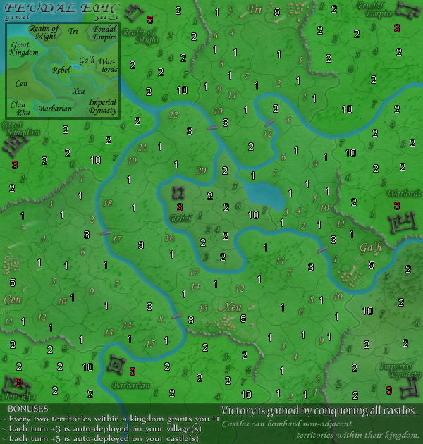
[bigimg]http://i25.photobucket.com/albums/c64/Gimil_01/FeudalEpic-5.png[/bigimg]
reduced the water colour a little and added moe trees.
reduced the water colour a little and added moe trees.
What do you know about map making, bitch?
Top Score:2403natty_dread wrote:I was wrong
Re: Feudal Epic *The sequal to Feudal War!* Pg. 19 [I, Gp]
reduce the color more. It's too Caribbean and unrealistic. Add more trees too in great densities.
Re: Feudal Epic *The sequal to Feudal War!* Pg. 19 [I, Gp]
Personaly I think it looks fine but then again. I am just wanting to play this map so badly so i'd want get it released as soon as posibule XD
But imo if posibule something that would make it look better would be to maybe add some sort of like... small houses and such in like the castle areas if its posibule. Like outside the walls or something. To make it look like its populated aswell and not just a fortress there standing guard.
Water color. Might be made darker but tbh to me it dont matter much.
Just what I think would make it look better. Keep up the good work ^^
-
gimil
- Posts: 8599
- Joined: Sat Mar 03, 2007 12:42 pm
- Gender: Male
- Location: United Kingdom (Scotland)
Re: Feudal Epic *The sequal to Feudal War!* Pg. 19 [I, Gp]
- Click image to enlarge.
What do you know about map making, bitch?
Top Score:2403natty_dread wrote:I was wrong

Re: Feudal Epic *The sequal to Feudal War!* Pg. 19 [I, Gp]
the only colours that need changing are the text
the yellow/gold ones might be ok but the greens are not. I really need to focus to see the numbers
perhaps with the gold/yellow made the shadow darker so the numbers come out crisper
with the greens I think a different colour and/or larger text would help a lot
the yellow/gold ones might be ok but the greens are not. I really need to focus to see the numbers
perhaps with the gold/yellow made the shadow darker so the numbers come out crisper
with the greens I think a different colour and/or larger text would help a lot

Re: Feudal Epic *The sequal to Feudal War!* Pg. 19 [I, Gp]
I agree....the numbers are very blurry for these old eyes.edbeard wrote:.... I really need to focus to see the numbers
perhaps with the gold/yellow made the shadow darker so the numbers come out crisper
with the greens I think a different colour and/or larger text would help a lot

* Pearl Harbour * Waterloo * Forbidden City * Jamaica * Pot Mosbi
-
gimil
- Posts: 8599
- Joined: Sat Mar 03, 2007 12:42 pm
- Gender: Male
- Location: United Kingdom (Scotland)
Re: Feudal Epic *The sequal to Feudal War!* Pg. 19 [I, Gp]
I am also in agreement, unfortunatly I can't find a better colour to fit with the map.cairnswk wrote:I agree....the numbers are very blurry for these old eyes.edbeard wrote:.... I really need to focus to see the numbers
perhaps with the gold/yellow made the shadow darker so the numbers come out crisper
with the greens I think a different colour and/or larger text would help a lot
What do you know about map making, bitch?
Top Score:2403natty_dread wrote:I was wrong
Re: Feudal Epic *The sequal to Feudal War!* Pg. 19 [I, Gp]
then go with larger text and we'll see how it looks
you have the space
you have the space
-
gimil
- Posts: 8599
- Joined: Sat Mar 03, 2007 12:42 pm
- Gender: Male
- Location: United Kingdom (Scotland)
Re: Feudal Epic *The sequal to Feudal War!* Pg. 19 [I, Gp]
How about grey instead of green?
What do you know about map making, bitch?
Top Score:2403natty_dread wrote:I was wrong
Re: Feudal Epic *The sequal to Feudal War!* Pg. 20 [I, Gp]
I think the shadows aren't dark enough
the problem right now is that the shadow blends in with the number especially the outside edges so you can't see the shape. you need more contrast on the outside to see the shape of the number properly
the problem right now is that the shadow blends in with the number especially the outside edges so you can't see the shape. you need more contrast on the outside to see the shape of the number properly
-
rishaed

- Posts: 1052
- Joined: Fri Jul 20, 2007 8:54 pm
- Location: Somewhere in the Foundry forums looking for whats going on!
Re: Feudal Epic *The sequal to Feudal War!* Pg. 20 [I, Gp]
i like the eveness on the villages, b/c they all get the same bonus so why should there be more neutral armies on one than another. Refering back to Feudal War where the villages have different amounts of troops on them. So keep up the good work  .
.
aage wrote: Maybe you're right, but since we receive no handlebars from the mod I think we should get some ourselves.

Re: Feudal Epic *The sequal to Feudal War!* Pg. 20 [I, Gp]
Superb work, cant wait for this now!!!

Re: Feudal Epic *The sequal to Feudal War!* Pg. 20 [I, Gp]
Agreed. Right now I find myself leaning in to get a good look at this map. Territory titles, regions names, river banks and borders lack needed definition, to the point where the fine line (creek?) through Magic 3 looked like a border at first glance.edbeard wrote:I think the shadows aren't dark enough
the problem right now is that the shadow blends in with the number especially the outside edges so you can't see the shape. you need more contrast on the outside to see the shape of the number properly
The village names are far easier to read than the region names... Clan Rhu is especially muddled in the main map.
Any chance of the territory titles (numbers) being placed in the same location within the territory across the map? I find Warlords the easiest region to follow because most of the numbering is in the lower left corner of the territory.
Some territory like Xeu 1 and 2 will be troule with 2/3 digit army counts bumping into the territory name... you can carve out some more space for both of those terits by moving the Barb 10 border in a few pixels. There are some others like this as well - Tri 5, Feudal 1 - but those are the worst that I see.
Carry on gimster.
-
Kotaro
- Posts: 3467
- Joined: Sat Mar 03, 2007 2:31 pm
- Location: TheJonah: You`re a fucking ruthless, little cunt!
Re: Feudal Epic *The sequal to Feudal War!* Pg. 20 [I, Gp]
Can we change the name now plz? Terrible name. Feudal Conquest!!!!
Lakad Matataaag!
Normalin, normalin.
Normalin, normalin.
TheJonah wrote:I`m not really that arsed. Just supporting my mucker.
-
sailorseal

- Posts: 2735
- Joined: Sun May 25, 2008 1:49 pm
- Gender: Male
- Location: conquerclub.com
Re: Feudal Epic *The sequal to Feudal War!* Pg. 20 [I, Gp]
Great map! I would like to see more bridges...
-
God Emperor Q
- Posts: 545
- Joined: Fri Jul 11, 2008 3:42 pm
- Gender: Male
- Location: Baltimore
Re: Feudal Epic *The sequal to Feudal War!* Pg. 20 [I, Gp]
this map is EPIC


Re: Feudal Epic *The sequal to Feudal War!* Pg. 20 [I, Gp]
how much longer must the dieing public await for the epic days? estimate before the map will be available?