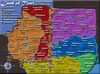
Greater China [Quenched] (thanks Widowmakers)
Moderator: Cartographers
Forum rules
Please read the Community Guidelines before posting.
Please read the Community Guidelines before posting.

-
Lone.prophet
- Posts: 1467
- Joined: Thu Oct 12, 2006 4:37 pm
- Location: Your basement Muahaha


then its still to tinysanton836 wrote:I like the font.
Nog eens:
Breid shanghai uit zodat het die uitstekende landpunt beslaat.
Je kan ook zeggen dat er 2 baaien zijn aan weerskanten, maar ik bedoel hetzelfde.
Er is namelijk zo'n punt:
_
>
-
Om het heel schematisch weer te geven.
i will make capitals


-
sam_levi_11
- Posts: 2872
- Joined: Mon Dec 11, 2006 2:48 pm
- Gender: Male
i know alot about china-and are you using the wade-giles names of places(ji zhou,yangzhou..).
also-i wanted to do a map based on the three kingdoms era of china
there is a book based on it called "ROMANCE OF THE THREE KINGDOMS".
and game of same name as well as "dynasty warriors" series-it was an intreating time in china and would make an intresting map-ut i dont know how to create one thats any good.
china was half the size making it a tense war.
maps:
http://www.threekingdoms.com/map2.htm
http://www.ibiblio.org/chineseart/conte ... ist04.html
i made a quick(5 min) rough outline of how the regoins were divided(but they were in littler clumps than that even.
http://img512.imageshack.us/my.php?image=chinadt2.png
also three were capitals wich could give bonus
is this an idea i should follow.
suprisingly-shu did very well(my favourite of the three)
Last edited by sam_levi_11 on Sat Jan 27, 2007 3:07 pm, edited 1 time in total.
-
sam_levi_11
- Posts: 2872
- Joined: Mon Dec 11, 2006 2:48 pm
- Gender: Male

-
Guiscard

- Posts: 4103
- Joined: Fri Dec 08, 2006 7:27 pm
- Location: In the bar... With my head on the bar
Get rid of the black/white country. Also your text is pretty unreadable. People tend to favour pretty simple fonts for the labels. Save the fancy nice-looking stuff for legends / titles. Whats the little line coming out of the lower star for?
qwert wrote:Can i ask you something?What is porpose for you to open these Political topic in ConquerClub? Why you mix politic with Risk? Why you not open topic like HOT AND SEXY,or something like that.
no mayby i can make a special route from the black/white country to yunnan,Guiscard wrote:Get rid of the black/white country. Also your text is pretty unreadable. People tend to favour pretty simple fonts for the labels. Save the fancy nice-looking stuff for legends / titles. Whats the little line coming out of the lower star for?
and i will try to make the font more clear, but do you like the places? and the names?


-
Guiscard
- Posts: 4103
- Joined: Fri Dec 08, 2006 7:27 pm
- Location: In the bar... With my head on the bar
I like the names and suchlike, and I'll say again that the visual style is striking... Very original. I seriously would get rid of the black and white territory. its a minor one, only small, and it doesn't need to be there really. Not gonna add much to gameplay.
Just out of interest where di the texture for the sea come from???
Just out of interest where di the texture for the sea come from???
qwert wrote:Can i ask you something?What is porpose for you to open these Political topic in ConquerClub? Why you mix politic with Risk? Why you not open topic like HOT AND SEXY,or something like that.
-
gavin_sidhu

- Posts: 1428
- Joined: Mon May 22, 2006 6:16 am
- Location: Brisbane, Australia
ok i will trow away that country with the next update this oneGuiscard wrote:I like the names and suchlike, and I'll say again that the visual style is striking... Very original. I seriously would get rid of the black and white territory. its a minor one, only small, and it doesn't need to be there really. Not gonna add much to gameplay.
Just out of interest where di the texture for the sea come from???
i have that texture, from the group "patters 2" and its called "water"
here i got some options for makeing the font readable, i will set up a poll for it

this poll will be standing there for 10 days
-
gavin_sidhu
- Posts: 1428
- Joined: Mon May 22, 2006 6:16 am
- Location: Brisbane, Australia
-
Lone.prophet
- Posts: 1467
- Joined: Thu Oct 12, 2006 4:37 pm
- Location: Your basement Muahaha