Moderator: Cartographers
samuelc812 wrote:Sorry it took me so long, but i'm here now . I have a few nitpicks that i think will improve the map, i don't think you're too far from getting the graphics stamp.
- Forest looks great, really suits the design of the map, well done.
Thanks!- I think the heading could be a little more appealing, it's called Rose City so maybe a fancy font with roses weaved in and out of the letters might look nice.
I'll play around with that. I was going for a guide book look with this version.- Swan Island looks like it's been punched in or something? Why doesn't it look like the rest of the mainland?
Swan Island is a land island - a long cliff separates it from University & Overlook in reality. Earlier, I had made the "Bluffs" impassable, so that Swan Island was only accessible from NW Industrial, but I found it to difficult to illustrate this impassable on the map, so I dropped it, but left the visual effect for accuracy. Now that I think about it, maybe I'll bring back the impassable element.- USS Blueback i think could look more like a ship and less like a black blob with a white outline. See cairnswk's Pearl Harbor map for an example of how the ship could look from an aerial view. Also what does OMSI stand for?
The USS Blueback isn't a ship - its a submarine. The visual is supposed to illustrate a sub just barely peeking out of the water. The white outline helps to differentiate it from the dark blue water and also to tie it in visually with the rose gardens and Shoe Town as a bonus group.
OMSI stands for Oregon Museum Science & Industry - which hosts the Blueback and is a riverside attraction in its own right. Maybe I'll drop the OMSI part since it is confusing and too big for further explanation on the map.- Are the train tracks supposed to just stop? I know they are just impassables and nothing more. However it seems a bit strange, perhaps putting a train station at the end to signal the end of the train track. In real life train tracks don't just cut-off in odd places. Just a though, you don't have to if you don't want to.
I'll try to blend these in better somehow. They kind of just disperse in industrial areas.- I think the park benches look nice. However i think the bike routes could look a little better, more so the icons, could have a better picture of a bike. But that is just a personal opinion.
These represent the images you see in a bike lane. Something like this: http://farm4.static.flickr.com/3128/2368678922_95b56d33b7.jpg- In the Downtown bonus, the lines are not evenly across. e.g. Nob Hill has some lines all bunched up to the right and more spaced out to the left, just looks a little strange, if it was all the same it would look a lot nicer. Also PSU doesn't have any lines on it?
This was just another visual touch to roughly illustrate how the blocks get longer in downtown NW, but I have no problem making it more uniform.
PSU is a university campus, so no roads there.- Also what is the point of having a bridge from St.Johns to Forest Park if it's blocked by a Railroad track?
I'll fix this. The old bridge clearly connected the two, but these new bridges don't look right to me (I hate the Irvington overlap) and I haven't figured out how to fix this yet.- What is the picture on Portland Airport/Cascadia, it looks a little out of place?
That is the airport.
Anyway that's all i've got for now, i hope it helps, keep up the good work and a graphics stamp will not be too far away
~Sam
MrBenn wrote:
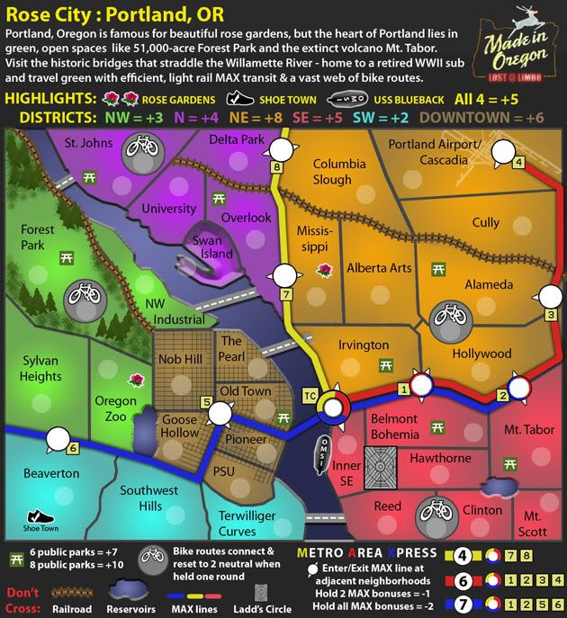
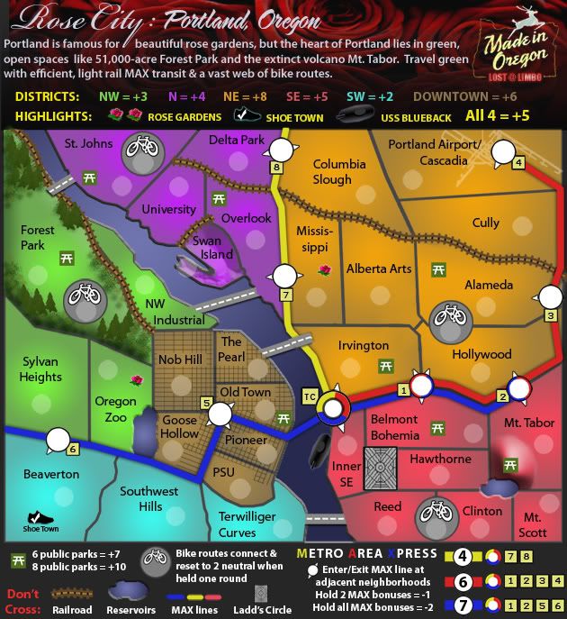
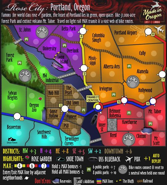
This map is vastly superior to some of your earlier drafts - you've done a really good job here.
Thanks
The only things that I would pick up on are as follows:
1. The railroad border between Swan Island and University looks a bit out of place, given that it is so short and doesn't connect to/with anything else. I think you could quite easily lose that as an impassable without any detriment to gameplay - the other option would be to link the railroad to another track, but that would be really difficult on the eye.
I dropped the railroad, but would like to keep this true to life, so I replaced it with the cautionary retainers you see along the bluffs between University & Swan Island (or any sharp, precarious drop).
2. There appears to be a slight inconsistency with the thickness of you territory border lines, and personally I think they're a little too thick.
This would require a complete re-draw of the map, essentially from the beginning. I simply do not have enough time to do something like this at the moment or in the forseeable future. I'm not opposed to it, but its going to take a while.
3. The lakes at Goose Hollow and Clinton appear to be raised up from the ground rather than sunken in. On the subject of strange bevels, the Picnic table at Mt Tabor looks strangely out of place... I get that it's supposed to be on a hill, but it might be more in keeping with the rest of the map to flatten it out again
I tried to sink the reservoirs a little bit more. Does that help? If I do another draft, I may add a border or something around the edges to make them look less lake-like and more reservoir-ish.
I also toned down the Mt. Tabor volcano. I left some contour, because I talk about Mt. Tabor in the intro and it is one of Portland's unique attributes, so I like the idea of displaying it visually.
4. At first glance, the blue MAX line looks like a river in the Beaverton area - is there any chance you could add a drop shadow in the same way as you have done with the road/bridges? I think the real concern is that the dedge by Beaverton is a bit fuzzy, and not as crisp as I'd expect it to be.
I tweaked these a little. Better?
5. The MAX station numbering doesn't appear to be very logical... Is that how they're numbered in real life? If not, then I'd suggest renaming them as follows: 8->1, 7->2, 4->3, 3->4, 2->5, 1->6, 5->7, 6->8. You've also not labeled TC anywhere - I'm guessing it's inferred by the circle symbol - but it might be worth adding TC to the legend too
I did re-order these, but a little differently than you suggested. This makes more sense in Portland terms as the Yellow MAX line was a later addition to the others.
As to the legend, I added the "TC", but then dropped that part altogether to make some more space down there. I think the MAX bonus is explanatory enough with the colors alone. If you disagree, I'll try to squeeze it back in somehow.
6. My final thought, is that the road/bridge between Terwilliger Curves and Reed might look a bit better if it was angled up slightly, to be vaguely orientated with the other bridges - this is more for consistency than anything
Done
As I said at the beginning of this post; the map is looking really good now.
I don;t think yiou're too far from getting the graphics stamp now
RedBaron0 wrote:Get some updates and community feedback into this map and you'll get a graphical review from us next fortnight.
lostatlimbo wrote:Perhaps it is too late in the process, but I wanted to float the idea of the "Highlights" starting neutral and then being +1 auto-deploy when owned. Among other benefits, it makes it impossible for a player to start with the SW or NW bonuses. Thoughts on this change?
AndyDufresne wrote:The new legend layout is more clear, I like it.
Was there any discussion as to why Downtown's names are confined to boxes, while other areas not?
Otherwise, things are looking good.
--Andy
jwithington wrote:I wish we weren't commemorating "Shoe Town," but that's just my bias. It does make that corner pretty powerful having auto-deploys clustered over there.
Users browsing this forum: No registered users