Better, and at the same time worse.
My eyes aren't as boggled by all of the lines crisscrossing, but the expeditions are much harder to pick out now... and they are the centerpiece of this map, methinks.
I wish I could give you some clear-cut suggestions here... Natty says to just use the army circle as a guide, but there's a downside to that. People (myself included) are comfortable with seeing routes depicted as lines on a map. Trying to follow the colors on the circles might not flow so well... can't say that for sure, but that's the feeling I get.
The real trouble for me is the lines used as sea borders. They stand out, often perpedicular to the expedition routes.
Meh, maybe Natty is right. I say, try the map without the lines, just the colored circles that you've got. You'll be able to judge its merits from the response it gets.
Oh, and you could always add the Barrow St. back in again, if you get rid of the lines. It bugs me that you had to take out a territory and thus shortened all of the expeditions by one.
As always, great work.
Northwest Passage [Quenched]
Moderator: Cartographers
Forum rules
Please read the Community Guidelines before posting.
Please read the Community Guidelines before posting.
-
MarshalNey

- Posts: 781
- Joined: Mon Sep 28, 2009 9:02 pm
- Gender: Male
- Location: St. Louis, MO
-
natty dread

- Posts: 12877
- Joined: Fri Feb 08, 2008 8:58 pm
- Location: just plain fucked
Re: Northwest Passage [Apr 1]
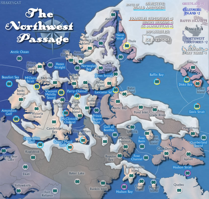
I have to say, the Tundra isn't working. It's too similar to the other colours... impassables need to stand out.


Re: Northwest Passage [Apr 1]
- Click image to enlarge.
Current Map Project: Tokyo
-
natty dread
- Posts: 12877
- Joined: Fri Feb 08, 2008 8:58 pm
- Location: just plain fucked
Re: Northwest Passage [Apr 1]
How about coloured outline on the territories? Could be worth a shot...
-
MarshalNey
- Posts: 781
- Joined: Mon Sep 28, 2009 9:02 pm
- Gender: Male
- Location: St. Louis, MO
Re: Northwest Passage [Apr 1]
Is there anything you can do to eliminate the sea territory border lines? I think those are the lines that really make the map look over-the-top busy.
Maybe if colored outlines don't work, you could try just different shades for each sea territory... dunno. Just shooting out ideas.
Maybe if colored outlines don't work, you could try just different shades for each sea territory... dunno. Just shooting out ideas.
Re: Northwest Passage [Apr 1]
MarshalNey thats an excellent idea, why not color code the sea's and make it like a puzzle pc w/ a straight line?
-
MarshalNey
- Posts: 781
- Joined: Mon Sep 28, 2009 9:02 pm
- Gender: Male
- Location: St. Louis, MO
Re: Northwest Passage [Apr 1]
yessss.... I think, I like 
And the tundra is much better too, btw. (Nice catch Natty, didn't even notice the 'tundra' under the impassables)
Although I do have one question: Why isn't Cornwallis part of the Franklin Expedition? The route seems to loop right around it.
Hopefully this goes to gameplay without delay.
And the tundra is much better too, btw. (Nice catch Natty, didn't even notice the 'tundra' under the impassables)
Although I do have one question: Why isn't Cornwallis part of the Franklin Expedition? The route seems to loop right around it.
Hopefully this goes to gameplay without delay.
Re: Northwest Passage [Apr 1]
Marshal, I'll have to ask the expert, but it sounds like Franklin went all the way around Cornwallis but did not stop there. He did, however, winter at the small Beechey Island just off Devon Island, so perhaps Devon will be where Franklin gets an extra territory (even though Cornwallis looks more obvious). Beechey is the site of those famous mummies. Good point!
Tundra: I just wanted something natural looking that mimics the terrain. This may not fly to the end, but I like it for now.
Tundra: I just wanted something natural looking that mimics the terrain. This may not fly to the end, but I like it for now.
Current Map Project: Tokyo

Re: Northwest Passage [Apr 1]
Some good improvements to this map, I like it, but it's still missing a few things.
Graphics
- The routes have a nasty tendency to arc, and then completely change direction to another arc. It doesn't look smooth. Now, I get the impression that you meant to show the stopping points on the route. If that is so, I would suggest that instead of smoothing the arcs out all the way, put some sort of "waypoint dot" on the point, to show that "hey, the expedition stopped here and took snapshots."
- I know you were just showing off different colors to sea, but here's my suggestion for improving it. Instead of abruptly different colors, have a fairly quick change in gradient. It's a fairly simple effect and will look better. Likely said graphics feature will change several times before we figure something out that looks good.
- The lines being expeditions is fairly apparent, but why not also make the text for the bonus the same color as the line? The white + line is jarring, even though I know you're intending for it to be thematically appropriate to the ice on the map.
Gameplay
- Bonuses are still a bit sparse, though the +1 per 3 is a good start with the islands. Why not add that sort of bonus to the seas, just lesser to account for the existence of the expeditions? It's something to try, even if you don't go with it.
I expect this map to switch into Gameplay Workshop soon, so keep up the good work.
Re: Northwest Passage [Apr 1]
Tactix - thank you, I'll get on this I thought it looked like some raggedy denim quilt too, it was done rather quickly to show a friend and see if I had the right idea.
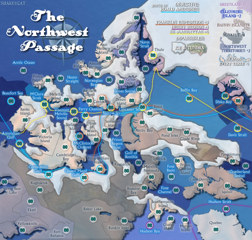
Here's something closer. Though this style does nothing at all for Barrow Strait and the Coronation Gulf.
I'll look into the route paths and water bonuses. I suppose having territories without bonuses isn't very fun, but bear in mind that water is necessary in these to reach the build-a-bonus of all the land except NWT. I still haven't calculated what is fair for each bonus, but upped Franklin, Nunavut, etc. because Franklin is just as long as Manhattan, and all the land bonuses other than NWT take three separate sections to hold.
Smoothed out Amundsen's line, but Manhattan still juts up in the west. I'm guessing those are the points you meant? I think Manhattan must've tried that path and found it wouldn't work, perhaps something like Franklin heading around Cornwallis.
Here's something closer. Though this style does nothing at all for Barrow Strait and the Coronation Gulf.
- Click image to enlarge.
Smoothed out Amundsen's line, but Manhattan still juts up in the west. I'm guessing those are the points you meant? I think Manhattan must've tried that path and found it wouldn't work, perhaps something like Franklin heading around Cornwallis.
Current Map Project: Tokyo

Re: Northwest Passage [Apr 3]
Here's another idea for sea territories: different areas could use different textures which resemble waves as seen from satellite or aerial photographs, with the waves running in different directions and/or with different wavelengths.
Re: Northwest Passage [Apr 6]
- Click image to enlarge.
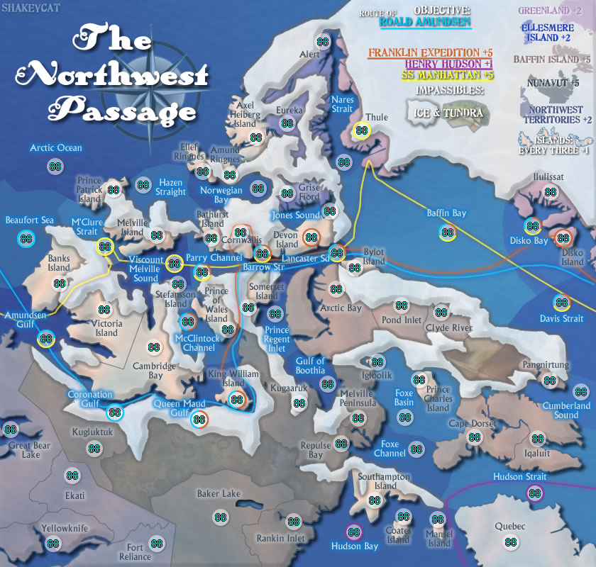
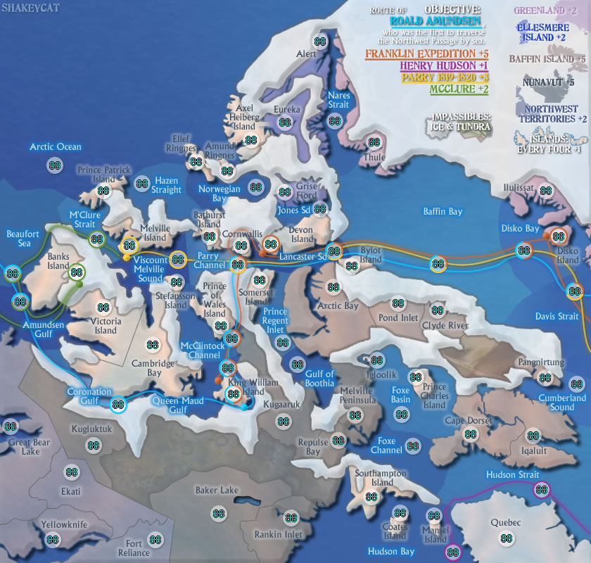
Changed SS Manhattan, a modern route, to the double route of Parry and McClure. Parry made it to Melville, and McClure later made it to Melville from the other side, confirming the existence of the passage. I am not liking the look of the +3 next to Parry.
Ocean bonuses. There are 9 ocean territories currently not included in any bonus, plus Quebec makes 10 unbonused places. If I wanted to go really nuts with expeditions, I could cover Foxe Basin + Channel [Parry or Foxe], Cumberland Sound [Parry again?], Nares Strait [people headed to North Pole], Boothia and Prince Regent [Ross], leaving only Arctic Ocean, Hazen, and Norwegian. Jones, not sure. But that seems overkill?
Jones and Nares are key to the Ellesmere bonus, Arctic as well. Cumberland key to Baffin, and Foxe Basin holds two internal islands. Foxes and Boothia+Regent key to Nunavut. The only place really lacking any play is Hazen and Norwegian.
Why are you still there, Quebec? What am I going to do with you? Did Henry Hudson, by chance, stop on your mystic northern shores? I want to know.
Barrow Strait is not going to work.
Current Map Project: Tokyo
-
Industrial Helix

- Posts: 3462
- Joined: Mon Jul 14, 2008 6:49 pm
- Gender: Female
- Location: Ohio
Re: Northwest Passage [Apr 6]
Hmm, looking at the map I think perhaps you could get away with just having the landing points and areas the explorers stopped at and expand the view of the middle bit which I find confusing. I mean, from my knowledge, there wasn't a whole lot of land exploration in these expeditions, why include them?
Perhaps you could penalize holding all water territories as ships need a place to stock up on supplies.
Perhaps you could penalize holding all water territories as ships need a place to stock up on supplies.
Sketchblog [Update 07/25/11]: http://indyhelixsketch.blogspot.com/
Living in Japan [Update 07/17/11]: http://mirrorcountryih.blogspot.com/
Russian Revolution map for ConquerClub [07/20/11]: http://www.conquerclub.com/forum/viewto ... 1&t=116575
Living in Japan [Update 07/17/11]: http://mirrorcountryih.blogspot.com/
Russian Revolution map for ConquerClub [07/20/11]: http://www.conquerclub.com/forum/viewto ... 1&t=116575
Re: Northwest Passage [Apr 6]
Water or land, either would work for supplies - fellow ships, shipwrecks, or natives.
The landing points aren't just where the fellows stopped for a quick washroom break, except perhaps Disko Island. King William Island is where remnants of the Franklin expedition were found, including the famous (and only) note. It's as far as the ships made it, and where the men set out on foot from. Amundsen spent two years there at Gjoa Haven with the natives, so named for his boat. Devon Island (Beechey, actually) is where the mummies from Franklin's crew were discovered. McClure, though I didn't show it, actually sledged across Banks Island (while camped there for winter) to the north coast, where he saw Melville Island, earlier landed by Parry, and then knew the Northwest Passage existed.
Penalize all water? Maybe dead ends - basically any water without a path on it. I could ring those ones in dark blue, to say "this is water, and you'll be losing men here." Logically, Hudson Strait/Bay would be losing territories too, but perhaps Hudson gets points for trying.
This may drive people to try to capture and travel only along the routes, and completely avoid Ellesmere Island and the whole Northwest section there.
If water territories lost men each turn, then wouldn't they have to all start neutral as well? Or at least be evenly distributed by starting positions.
and where exactly is it confusing in the middle? Is it Cornwallis, Stefansson? Is it the water, Parry, Lancaster? I see it could be confusing where Parry meets McClintock channel, it looks like it has to pass through this Stefansson first, perhaps. Somerset can certain be more in line with its circle. Is it the fact that three routes run through the middle, the lines confusing? And we do know the lines don't make a transit route of sorts, and are merely set below their water/land territories, yes?
Current Map Project: Tokyo
-
MarshalNey
- Posts: 781
- Joined: Mon Sep 28, 2009 9:02 pm
- Gender: Male
- Location: St. Louis, MO
Re: Northwest Passage [Apr 6]
This map has been sitting 2 weeks without a reply. Please tell me that it's still in development- it's too good to languish and suffer like this!
Re: Northwest Passage [Apr 6]
It is still in development. I've just needed some time to sit down and pull it further into formation. Thank you for your continued support.
Current Map Project: Tokyo
Re: Northwest Passage [May 4]
- Click image to enlarge.

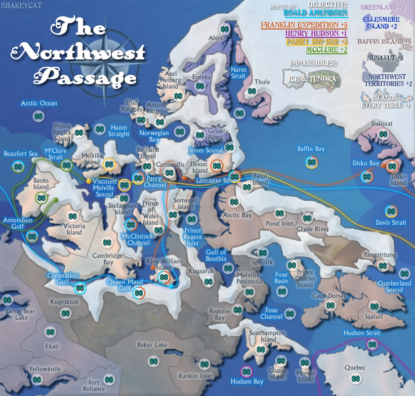
I added a 69th territory, so that in a 2 player game, each would start with 23 instead of 22 regions, with 7 armies for the region bonus. This is assuming that there are no neutral starts. If Amundsen's blue line starts neutral, this changes everything.
I lowered the island bonus to 1 for every 4. At 21 islands (composed of 22 regions), in a controlled drop, each player should start with 7 islands each, and an additional bonus of +1, total 8 armies to start with. To make sure that the players get 7 whole islands, if I understand starting positions correctly, I'll have to compensate for Victoria Island/Cambridge Bay by making sets of 8 territories instead of 7, and plugging in two dummy territories for the 2nd and 3rd sets. For safety sake, I'll be breaking up Greenland and Ellesmere Island as well. That makes at least 28 territories/69 that will have starting positions.
Does this make the game too controlled? If so, what are my alternatives?
By lowering the bonus from +1/3 to +1/4, I'm trying to prevent a predictable opening move and a great first player advantage. at 1/4 and 23, the player starts with 8, and has to take 3 territories from his opponent before the opponent's starting bonus drops to 7, and at least 4 territories to make it 6. It would not be easy to take 4 territories with 8 armies.
I will not give a build-a-bonus to water territories. Even a diluted one, say, +1 for 6 held, would mean players start with another +1 (total 9), and the first man has an even greater advantage. There are enough bonuses.
Other changes to the map include a tiny explanation of Amundsen, and shuffling of coloured circles OFF their lines. I'm trying to eliminate the subway look.
THE SUBWAY LOOK:
http://www.atomation.com/~thazzard/fun/ ... ssmay4.jpg
It gives the idea that coloured circles can only attack other of the same colour. Untrue.
Should Amundsen's entire line start neutral? Should the drop on his line be controlled instead, with starting positions? Or can it be completely uncontrolled?
I see that other objective-based wins always have the objective start entirely neutral (Oasis, 66). This is most like Route 66, where the objective bisects the map.
Current Map Project: Tokyo
Re: Northwest Passage [May 4]
I was just looking at the minimap continents and the actual ones, and I had a LOT of difficulty for a bit finding out what connected to what. Any chance of fixing that to an extent? The tundra/impassables are part of the reason they're harder to understand.
EDIT: And look into this map moving in the near future.
EDIT: And look into this map moving in the near future.
Re: Northwest Passage [May 4]
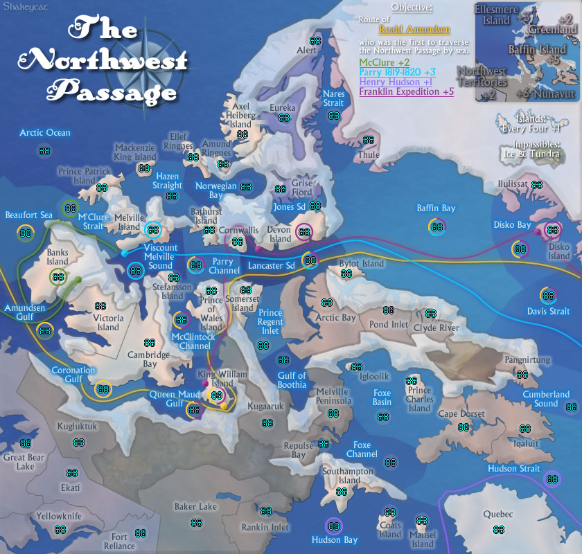
Changes made, map updated. Is this clearer? (Refresh the image if it doesn't look any different.)
http://www.atomation.com/~thazzard/fun/ ... smay4a.jpg
The tundra makes it more confusing, please explain? I can see how the white would, as it distorts the shape of everything.
edit coming later -----
http://www.atomation.com/~thazzard/fun/ ... smay4a.jpg
The tundra makes it more confusing, please explain? I can see how the white would, as it distorts the shape of everything.
edit coming later -----
Current Map Project: Tokyo
Re: Northwest Passage [May 5]
- Click image to enlarge.

Stopped mixing fonts so much. The other was cool, but this is clear.
Current Map Project: Tokyo
-
natty dread
- Posts: 12877
- Joined: Fri Feb 08, 2008 8:58 pm
- Location: just plain fucked
Re: Northwest Passage [May 5]
Orange on blue is not a good combination. They are opposite colours, which creates a really bright contrast, which also does not translate well into JPG (looks very fuzzy).
I suggest changing the colour of the franklin expedition.
I suggest changing the colour of the franklin expedition.
-
Industrial Helix
- Posts: 3462
- Joined: Mon Jul 14, 2008 6:49 pm
- Gender: Female
- Location: Ohio
Re: Northwest Passage [May 5]
I wonder if bringing back the clearer ice might be better because I'm having trouble identifying islands as two islands seem to me to be connected under the ice.
And personally, I still have a hard time reading this map. I think its connecting the numbers with the territories and the names. Perhaps reduce the opacity on the army circles or get rid of them all together.
Perhaps stretching the map a bit at the expense of the lower left corner would alleviate some congestion in the center. It's already pretty cramped in the middle as it is... do you know for sure that the small map is going to work?
Sketchblog [Update 07/25/11]: http://indyhelixsketch.blogspot.com/
Living in Japan [Update 07/17/11]: http://mirrorcountryih.blogspot.com/
Russian Revolution map for ConquerClub [07/20/11]: http://www.conquerclub.com/forum/viewto ... 1&t=116575
Living in Japan [Update 07/17/11]: http://mirrorcountryih.blogspot.com/
Russian Revolution map for ConquerClub [07/20/11]: http://www.conquerclub.com/forum/viewto ... 1&t=116575
-
Industrial Helix
- Posts: 3462
- Joined: Mon Jul 14, 2008 6:49 pm
- Gender: Female
- Location: Ohio
Re: Northwest Passage [May 5]
Either way, these are graphics and gameplay nitpicks better resolved in the proper forums. Onward and upward!
Sketchblog [Update 07/25/11]: http://indyhelixsketch.blogspot.com/
Living in Japan [Update 07/17/11]: http://mirrorcountryih.blogspot.com/
Russian Revolution map for ConquerClub [07/20/11]: http://www.conquerclub.com/forum/viewto ... 1&t=116575
Living in Japan [Update 07/17/11]: http://mirrorcountryih.blogspot.com/
Russian Revolution map for ConquerClub [07/20/11]: http://www.conquerclub.com/forum/viewto ... 1&t=116575
Re: Northwest Passage [May 7]
Thanks for the bump up to Gameplay!
And no, I don't think the small map will work as it is right now. I just need to sit down and make it look really smart.
I seem to have forgot this the first time through:
Done: and decided to make the objective route the yellow one.natty_dread wrote:Orange on blue is not a good combination. They are opposite colours, which creates a really bright contrast, which also does not translate well into JPG (looks very fuzzy).
Let's try 75%, does this work?Industrial Helix wrote:I wonder if bringing back the clearer ice might be better because I'm having trouble identifying islands as two islands seem to me to be connected under the ice.
Dropped to a mere 10%, better? Nix them?Industrial Helix wrote:And personally, I still have a hard time reading this map. I think its connecting the numbers with the territories and the names. Perhaps reduce the opacity on the army circles or get rid of them all together.
Shrunk left (NWT/ Nunavut), shrunk Victoria island and Baffin, enlarged some smaller islands (Igloolik), messed with some routes (will smooth later). Coronation, Parry, and Lancaster have improved, but not all areas look better. Messy around King William Island. And the water feels patchy again.Industrial Helix wrote:Perhaps stretching the map a bit at the expense of the lower left corner would alleviate some congestion in the center. It's already pretty cramped in the middle as it is... do you know for sure that the small map is going to work?
And no, I don't think the small map will work as it is right now. I just need to sit down and make it look really smart.
I seem to have forgot this the first time through:
- Click image to enlarge.
Last edited by shakeycat on Fri May 07, 2010 9:43 pm, edited 1 time in total.
Current Map Project: Tokyo